
«Today we published major updates to our institutional website, metmuseum.org, alongside The Met App, which is available in iOS and Android. Initially designed to coincide with the opening of The Met Breuer—our new location on Madison Avenue and 75th Street dedicated to modern and contemporary art—and to support the public launch of the Museum's new brand identity, we also used this as an opportunity to deliver a handful of important new features and functionalities on these products. We'd like to highlight a few of those changes here and share some of what we've learned along the way.»
A Refresh, Not a Relaunch
One of the first things you might notice on the "new" website—besides our new brand identity—is the BETA tag on top of the site. It's there to signal both to the outside world and to us that the site is a work in progress. While we will remove the tag in the months ahead, the work of constant, ongoing improvement will continue. As you will see from our recent blog post about The Met's digital strategy, we aim to make product ownership—including ownership of the website—a key part of the culture here.
It's interesting to note, too, that throughout this process we have referred to the website project as a "refresh" as opposed to a "redesign." A redesign implies that we were reconceiving the website from scratch, which was not something we could have achieved in the nine months we had since the creation of the brand identity.
Approaching this as a refresh better enabled the team to focus on our three goals:
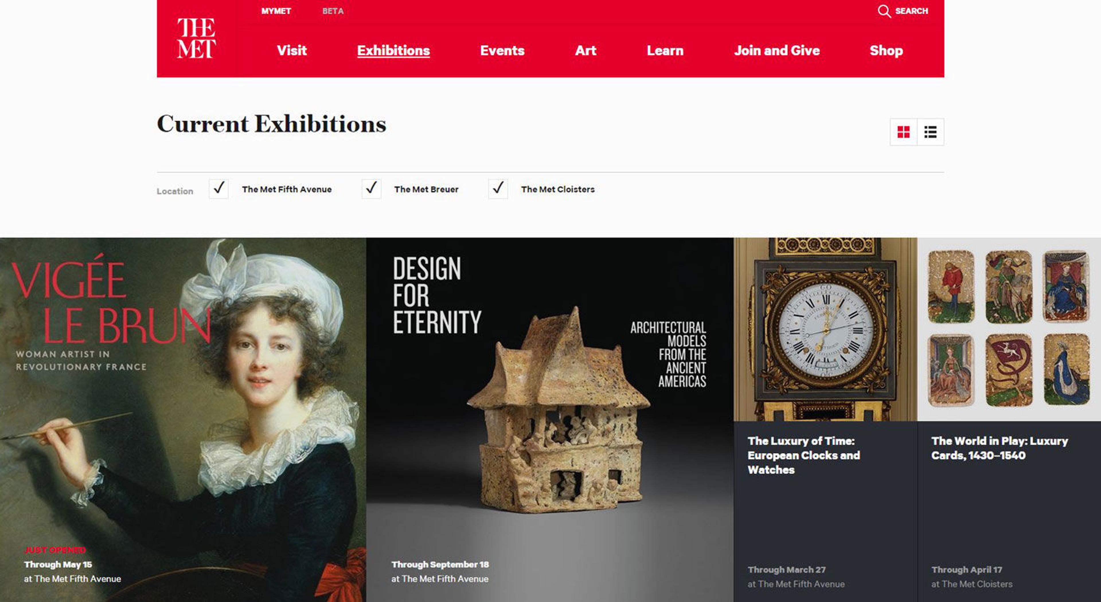
- Highlight The Met's three venues and place them on equal digital footing. Earlier, finding information about The Met Cloisters wasn't easy; we've now—with the opening of The Met Breuer—given equal prominence to information about all of our locations.
- Go responsive. Since our 2011 website relaunch, the world has gotten much more mobile, so we needed to make sure our site would work equally well on smartphones, tablets, and desktop computers (our traffic is about 30, 10, and 60 percent, respectively to those platforms). For the last five years, we have been operating two websites—one for desktop and another for mobile. We now have one, unified site.
- Embody the new institutional identity. As Director Tom Campbell says, we are introducing "greater clarity and consistency in all of our materials and communications," and that means everything digital, too, of course.
These goals are easy to articulate but not easy to implement on a website with 500,000-plus pages, 3,300 events a year, and a number of ways to transact and interact with The Met. To that end, our design and developer teams partnered with two respected outside agencies, Fantasy Interactive and Velir, to provide the heavy design and technical lift needed to refresh such a large site.
We also used this as an opportunity to simplify the site's back end, which benefits both the user and our internal team. When the folks creating content go from twenty templates to about six, the pages become easier to maintain, easier to find, and easier to read.
Changes to the Timeline of Art History
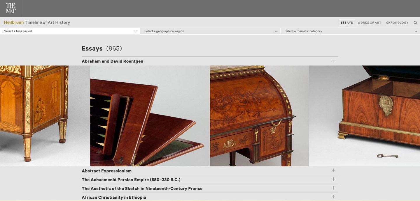
In January we launched The Met's Heilbrunn Timeline of Art History: The New Edition. The Timeline is an incredible resource that tells the story of global art history through 7,000 works of art in our collection, and accounts for just under 40 percent of our online traffic. For the new version, it was completely refreshed to work seamlessly on web and on mobile, with a new navigation and interface.
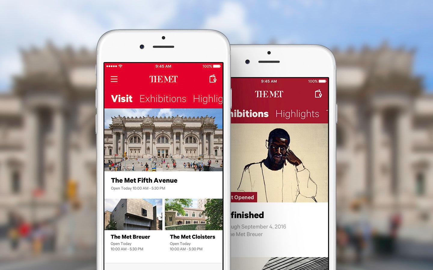
A Refreshed Met App
Our flagship Met App, which launched 18 months ago in iOS and later in Android, has been refreshed to integrate the new brand. We also further simplified the user experience and overall app structure so that users can access the most important content simply and easily.
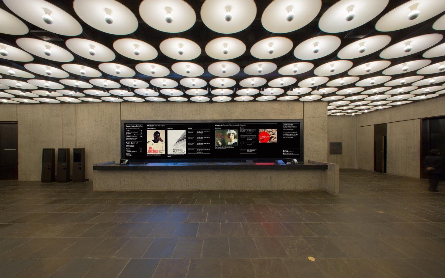
Photo by Thomas Ling
Twenty-Eight Feet of LEDs
Finally, over at The Met Breuer, one of the first things visitors will notice is a large-scale media wall in the lobby. This giant screen, made of 28 feet of LEDs and state-of-the-art display technology, is a critical component of the building's public experience. Marcel Breuer designed the lobby around the information desk, and we are updating its display wall to current technology—essentially allowing The Met Breuer a highly flexible and engaging means of delivering information, branding, and even digital art to our visitors.
Lessons Learned
- An immovable deadline is a wondrous thing. Since we had to have the website ready in time for the launch of The Met Breuer, we had to prioritize in ways that might not have happened if we had more time. This prioritization helped strengthen the end product.
- Data-driven decision making is crucial to making a launch date. Over the last couple of months, we used metrics on traffic, user feedback, etc., to decide where to focus our time.
- For all the data points, in the end, it's about the art. We worked closely with our internal stakeholders, including curators and conservators, to make sure we prioritized the right features.
We'd love to hear your thoughts on our efforts and look forward to continuing to offer a relevant, useful, engaging, and uplifting experience, whether you are in one of our three buildings or visiting us online.
All feedback is welcome: web.site@metmuseum.org. And follow us across all of our social media platforms: @metmuseum.