«If The Metropolitan Museum of Art has had a recurring theme over its 145-year history, it is that we have always sought to be more than a treasury of great art. Our mission is not simply to exhibit the visual achievement of all cultures, but to demonstrate why these objects are relevant to our lives. We now live in a time of shifting demographics, changing social behavior, and groundbreaking technology, all of which present significant opportunities to be more relevant to more people.»
For Everyone
Thomas P. Campbell, director and CEO of The Met from 2008 to 2017, challenged the organization to expand the reach and relevance of the Museum to the broadest, most diverse global audience. To be a museum that is not only of the world, but in the world—and where anyone can find their place.
To act on this charge, we partnered with the New York office of the branding agency Wolff Olins to help clarify and unify the Museum's experience and communication across all platforms. Together we canvassed a broad spectrum of constituents—from curators and staff to visitors, members, collectors, and artists—to collaborate in the process.
One. Iconic. Open.
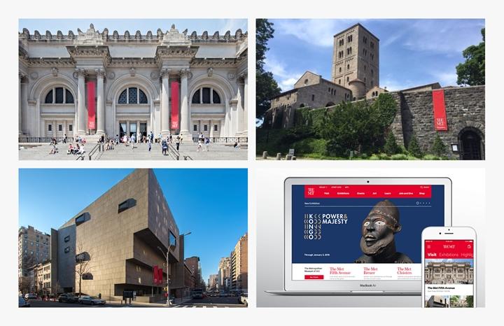
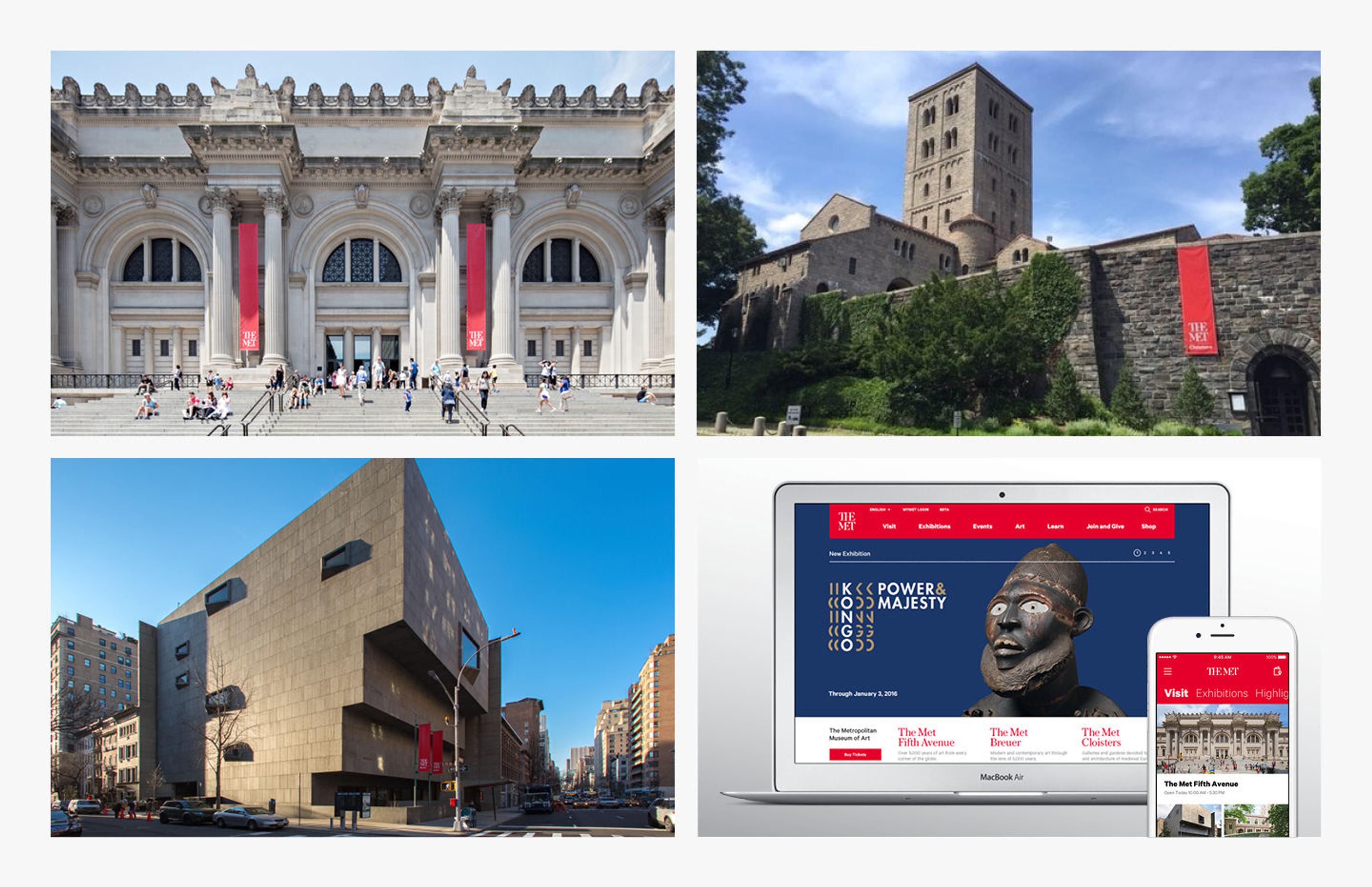
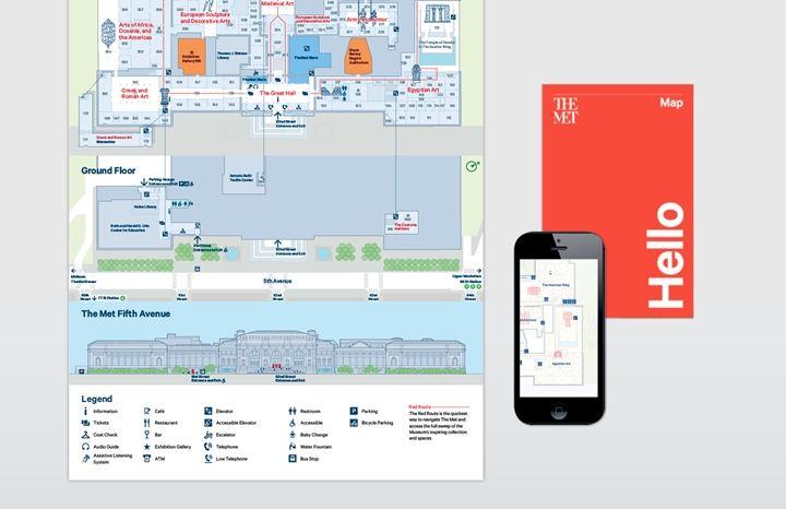
The Met is big—second only to the Louvre in scale—with a collection that spans more than 5,000 years of art from every corner of the world, and is home to over 60 exhibitions per year, as well as host to 6.7 million visitors and 33 million website visitors.
As the Museum prepared to open its third venue in the historic Marcel Breuer building on Madison Avenue—to present modern and contemporary art through the lens of art history—we wanted to unify the experience across physical and virtual spaces into a coherent whole that is reflective of stature and gravitas while being open and welcoming to everyone.
Visual Identity: Where We Started
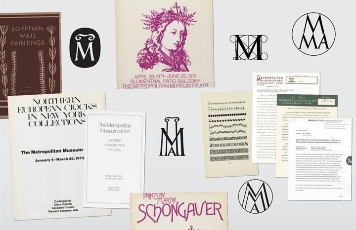
Our design process started with a deep investigation into our history. Visual innovation has always been a part of the spirit of the Museum.
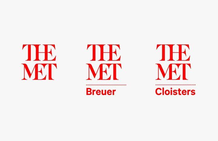
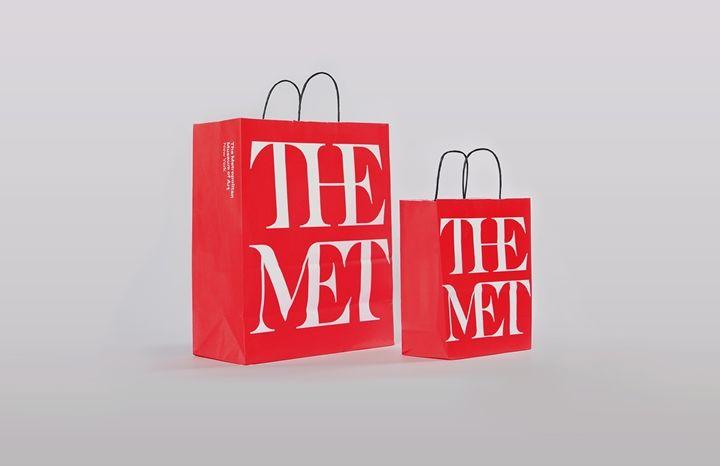
Call Me "The Met"
The cultural landscape has changed dramatically; the world is a more crowded, cacophonous place. In order to have impact, we needed to simplify. One of our most powerful assets is our nickname: The Met.

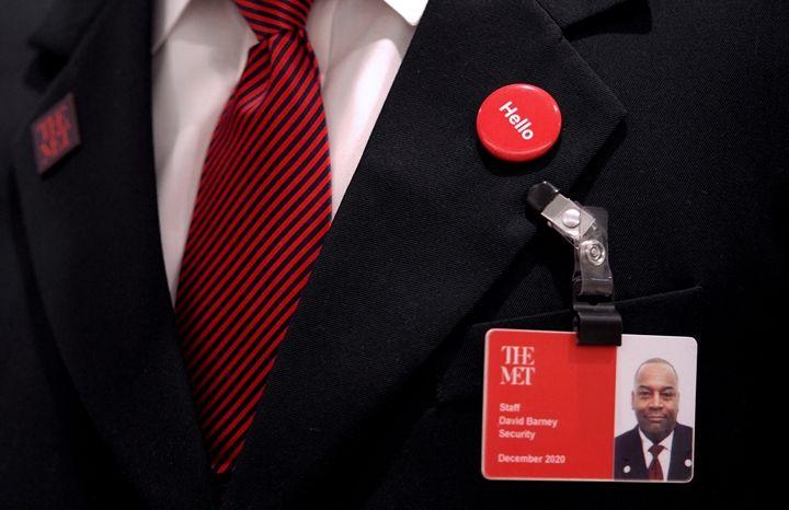
The most effective way to create intuitive and instant recognition was to focus on the name, not to rely on a symbol that needed to be interpreted or learned. The new naming is consistent but modified for individual locations: The Met Fifth Avenue, The Met Breuer, The Met Cloisters. The formal institutional name, The Metropolitan Museum of Art, remains unchanged.
What's in the Letters
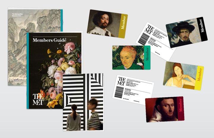
The strength of The Met has always been its exuberant eclecticism and diversity. While we were driven by typographic clarity, we also wanted to encourage creativity and diversity in the implementation of the design system. The new logo is an original drawing inspired by the strategic intent to draw "connections" throughout the Museum, across time and culture, and between people and art. The mark connects letters, deliberately combining serif and sans serif letter forms to acknowledge The Met's unique ability to hold classical and modern ideas and forms as part of a unified whole. It is fluid, lyrical, and distinctive, like an authentic signature.
Color
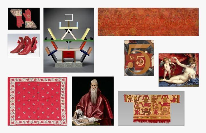
Color is key to The Met identity. While we will always use a broad spectrum, a single iconic color is essential for an organization as large and complex as the Museum. Red is a bold, provocative color that connotes strength, vitality, and passion in many cultures. The early use of the color has been explored by conservator and scholar Elena Phipps throughout The Met collection. In the winter 2010 Bulletin, Cochineal Red: The Art History of a Color, Phipps traces the vibrant hue achieved by drying and crushing the cochineal insect.
A Typographic Approach
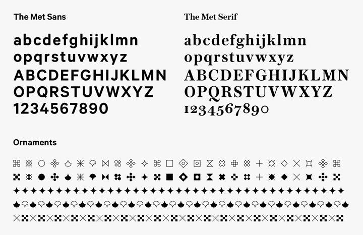
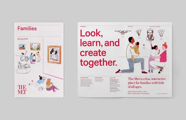
Our typographic system is based on two fonts: The Met Sans and The Met Serif. The Met Sans, based on Kilm Foundry's Calibre and adapted for the Museum's exclusive use by the font house Village. Designed by Commercial Type, The Met Serif is a personable, modern serif with extensive weights and characters inspired by 19th-century newsprint and display fonts.
The typography is augmented by a set of traditional printer's ornaments and decorative rules to divide diverse types of content on the page.
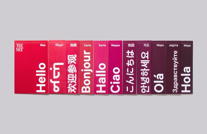
More Than a Logo
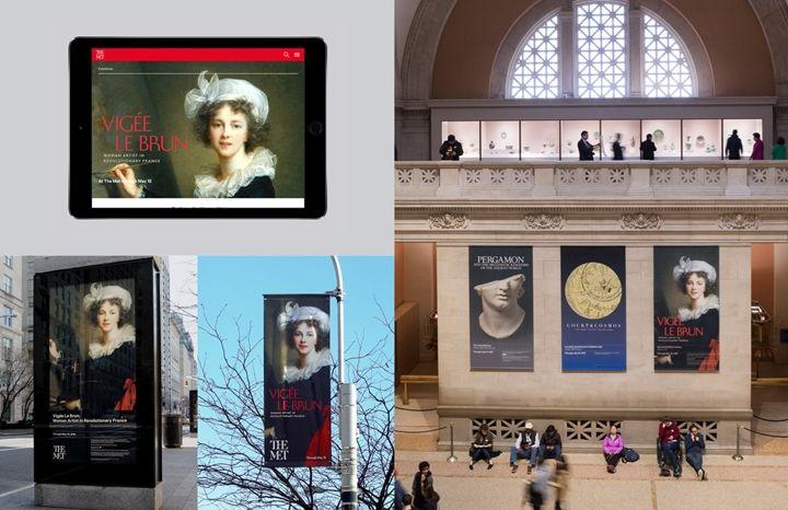
While logos often garner the most attention, a visual identity is a dynamic ecosystem of elements—font, color, graphic ornament, image treatment, material, composition, and visual strategy—all coordinated to help us connect with our visitors in a clear, vibrant voice from print to screen to gallery.
Bringing Art to Life
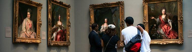
Making connections was a key principle to activating the experience as well as the identity. New uses for physical and online spaces make it easier for more people to connect to the art and connect the art to their lives. From Teens Take The Met! to MetFridays, the goal is bring art alive for more people in more places.