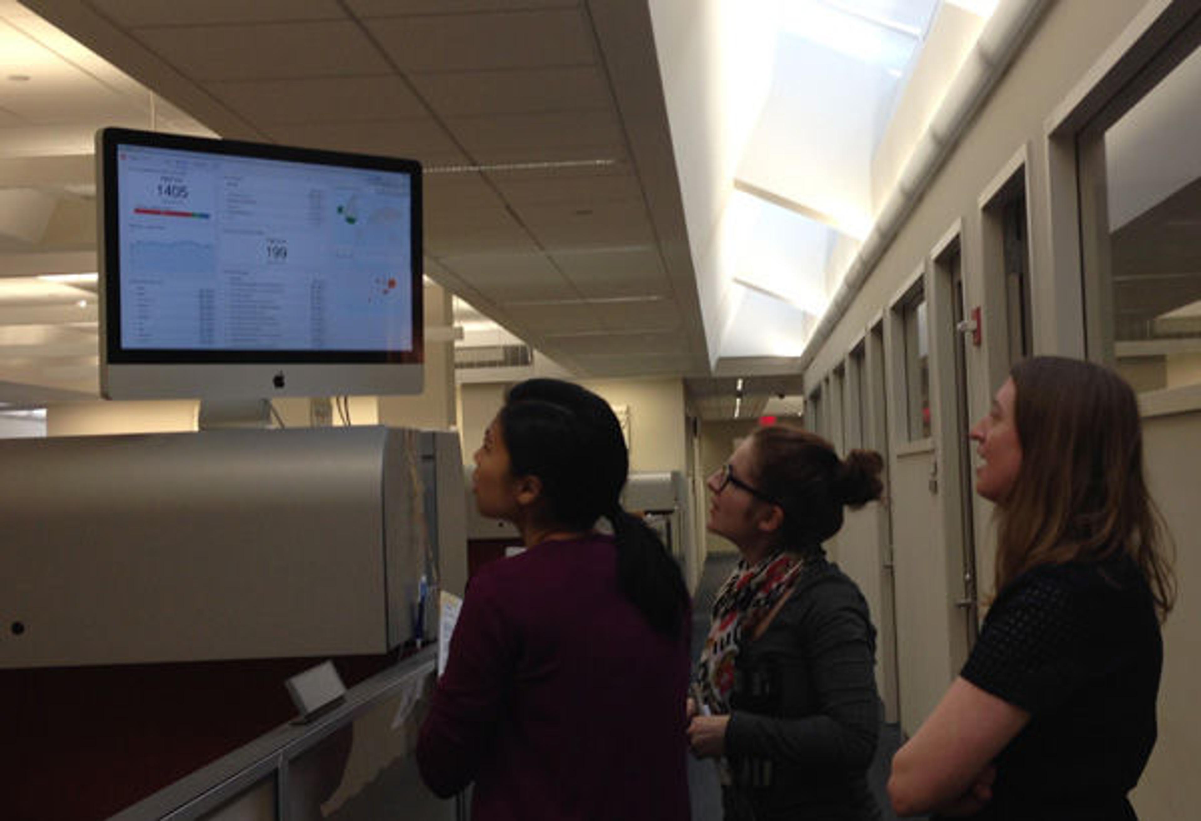

Met staffers checking out real-time analytics for the website
«The volume of digital activities generated at the Met is pretty impressive, reaching millions of users through multiple channels: videos, social media, website updates, email campaigns, blog posts, the app, audio guide, in-gallery interactives, and more. With so many activities, it's important to track the impact of each project in order to set priorities and allocate resources. This is where data can help, and one of the keys to establishing a data-driven culture within an organization is to report the results internally. My colleagues already send regular emails with metrics about their projects, but as the digital media analyst, my role is to go beyond individual reports and present a full picture of work carried out by the department. With that in mind, I've started working on a dashboard that will display all the data in a single place. This will help monitor trends and compare the results of each of the digital initiatives within a wider context. The main objective of having a dashboard is to communicate the impact of our digital initiatives and to be able to make decisions in an effective and rapid way.»
A Real-Time Dashboard
To start the conversation in the department, I set up a Google Analytics dashboard with live data so we could see in real time the number of website visitors, which pages they were visiting, how they reached the site, and their geographical location. Right away, we detected fluctuations in traffic based on factors such as the school calendar, new exhibitions, links from an article, or an artwork from the collection going viral on social media. Questions from my colleagues started to pour in: "Can I see people coming from this tweet? How is this metric calculated? Why is this artwork getting so many visits today? Can we see if people are using the website during their Museum visit?" Having the dashboard not only helped us start to see trends but also to discuss what other potential data we want to include. (I also discovered that I'm not the only one addicted to real-time data!)
In parallel, I started mapping the reports circulated in the department, assessing the gaps in data tracking and the opportunities to illustrate the performance of various digital activities. This mapping exercise also helped to identify data sources we'll be able to use to set up automated reporting. Automating the reports will save significant staff time and provide a standard, user-friendly presentation of data across the entire department.
Choosing the Metrics: A First Draft of the Dashboard
Based on the reporting requirements, I've sketched a basic mock-up—using dummy data—to discuss the metrics that should be included. The mock-up's overview page features Key Performance Indicators (KPIs) that can be used for high-level conversations about strategy. This page links to subsections that can show the metrics of specific digital initiatives. The data in the dashboard can be categorized in different ways according to strategic objectives, audiences, or usage context. For instance, one of the dashboard sections can focus on the digital experience of a visitor to the Museum, which means we would include data about the Met app, audio guide, Wi-Fi, in-gallery interactives, and website usage in relation to the visit.
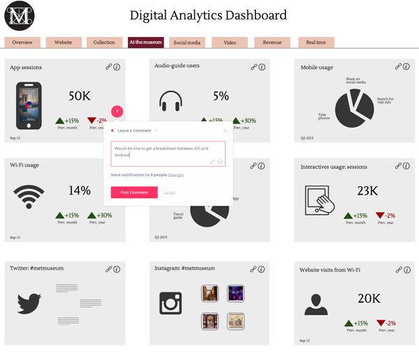
Screenshot of the interactive mock-up with comments from staff members
The result of this first phase—which included an opportunity for feedback from my colleagues—has been a definition of the main metrics that will be featured, and the identification of the different data sources for these metrics, including Google Analytics, Facebook Insights, Twitter Analytics, YouTube Analytics, and manually entered data such as survey results. Our next step will be to find a sustainable and effective tool and workflow to update the information in the dashboard.
Stay tuned for more posts about the production and implementation of the dashboard, as well as other digital projects from the department.