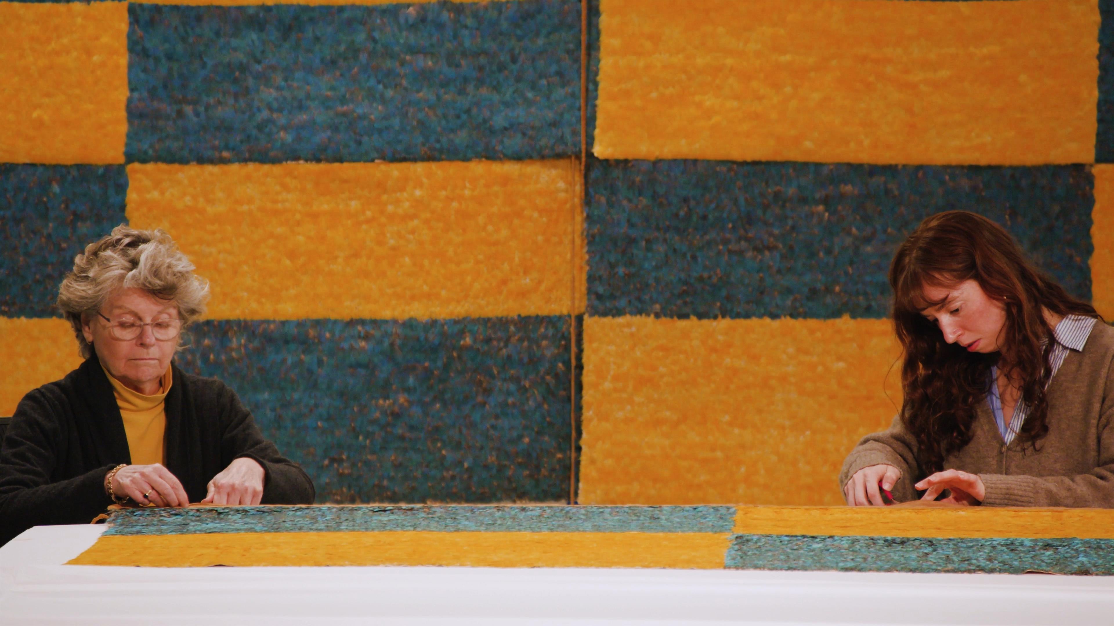
At the threshold of the new galleries for the Arts of the Ancient Americas in the Michael C. Rockefeller Wing an animated map serves as an invitation to consider the complex and layered stories of the places, histories, and cultures in Latin America prior to 1600. Designed to bridge the gap between the collection and the public, the past and the present, this digital feature involved years of research, discussions, and challenges.
Maps are essential, ubiquitous tools that help us navigate the complexity of today’s world. They simplify reality with information curated toward specific purposes, balancing accuracy and clarity for maximum efficacy. Subway maps, for instance, often prioritize the legibility of routes and stops over spatial accuracy to best serve commuters. In turn, historical maps may be more invested in reconstructing past or even overlapping realities––such as illustrating when New York City was New Amsterdam or affirming the island of Manhattan as part of Lenapehoking, the ancestral lands of the Lenape.
Maps are far from neutral. Their very production relies on methodically selecting, prioritizing, and sidelining information. How cartographers choose to display disputed territories may then have significant implications in reproducing or disrupting relations of power. For instance, the cartographic positioning of Greenwich, London, as the prime meridian (0° longitude) naturalizes a reference point for time and global geography that is not arbitrary, reflecting a worldview of European centrality. At the same time, comparative maps of Native American territories today and hundreds of years ago can tell a painful, though crucial, story of systematic dispossession.
The way maps are made and used in modern life is not universal or timeless. Indigenous communities in the Americas developed diverse strategies for representing space. The mid-sixteenth century Codex Boturini, for instance, combines geography, illustration, and pictographic text across twenty-two panels to narrate the migration history of the Mexica from their mythical homeland of Aztlán to the Valley of Mexico. Earlier, in the Andes, the Inca organized their sacred landscape along forty-two paths radiating from Cusco, their imperial and ritual capital. The cartography that predominates today, however, was shaped by European expeditionary needs during the fifteenth and sixteenth centuries. This colonial history persists in the preferred projection methods of contemporary maps––even as their functions have expanded in the Digital Age. The most obvious example is the Mercator projection. Originally developed in the sixteenth century as a tool for European navigators at sea, the Mercator is now ubiquitous and serves as the default projection for most web applications. Despite its popularity, there is now broad consensus among cartographers that the Mercator projection is both obsolete and misleading, as it severely distorts regions towards the north and south poles (including Europe) and makes them appear disproportionately large.
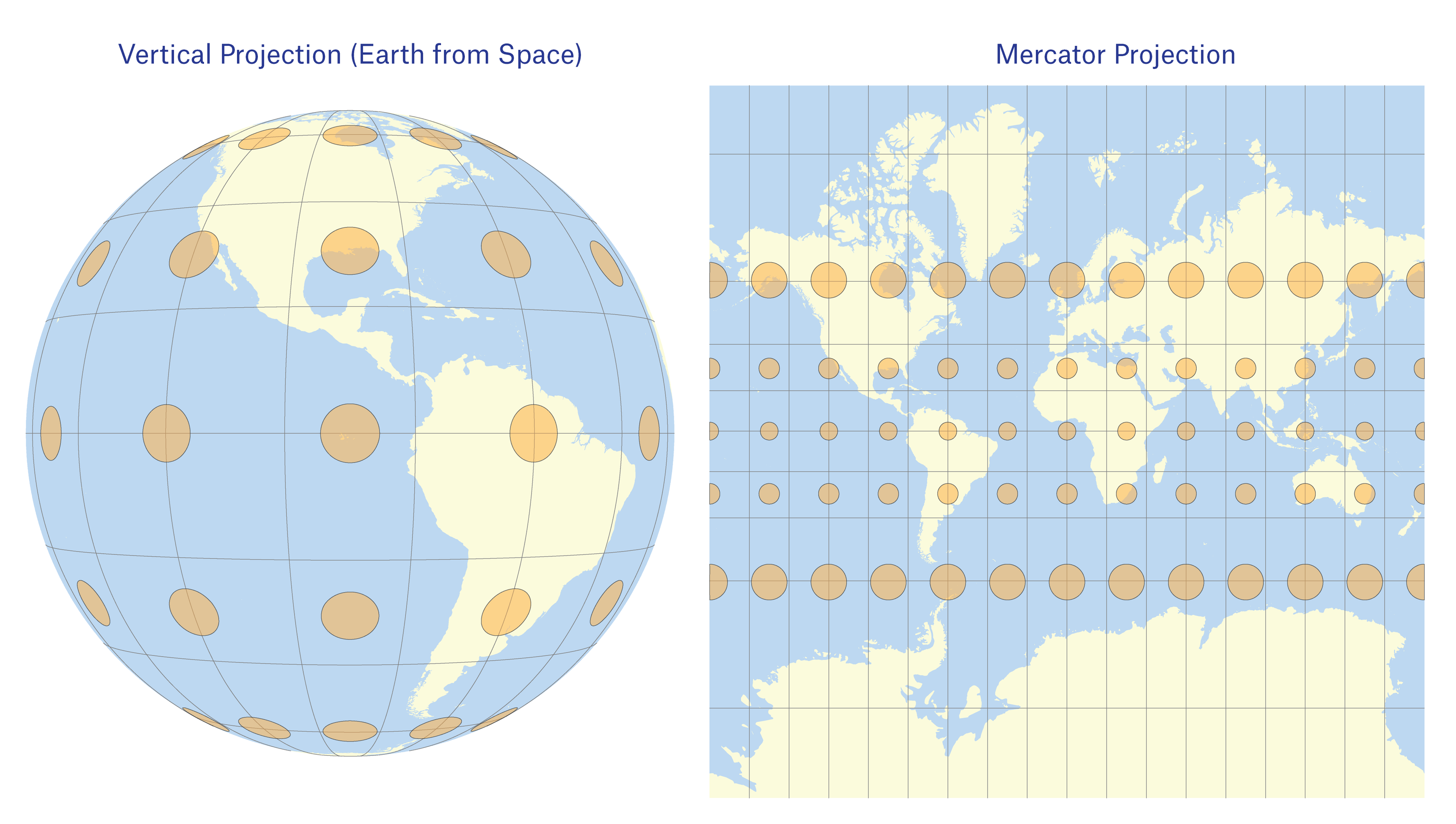
Earth viewed from space (L) compared to the Mercator Projection (R). The ellipses in the maps are called Tissot's Indicatrices; they show how the projection distorts different areas of the map.
In the context of museums, maps serve a unique set of purposes. They guide visitors through the galleries, visualize locations and their distances, and cue historical narratives. Our animated map aims to welcome and orient visitors upon entering the galleries for the Arts of the Ancient Americas.
As we began conceptualizing this project, we asked how the public connects with the collection. After all, these galleries exhibit a variety of centuries-old artistic expressions developed by Indigenous makers in what is now Latin America and the Caribbean. Today, much of this region’s descendant populations connect with these ancestral artworks through generational kinship ties and narratives of a shared, national past. A parallel connection is often true for the Latin American and Caribbean diasporas that comprise a substantial proportion of the United States and New York City. Our animated map seeks to visualize these connections across space and time, situating the thousands of years of creativity represented in these galleries in the complex cultural seedbed of who we are today.
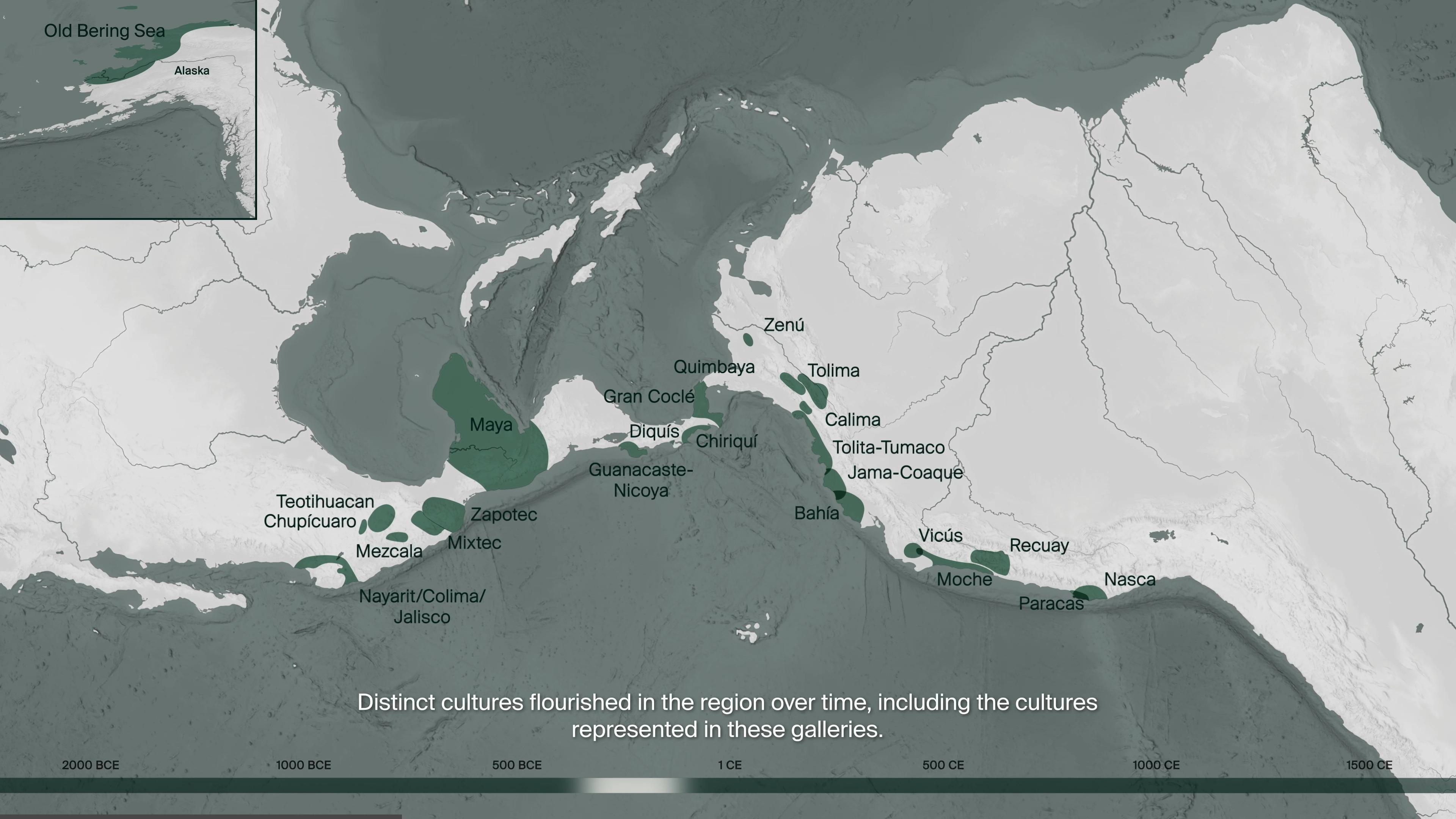
The locations of distinct cultures highlighted in the ancient Americas
Departing from a more typical, North-up position, the animated map begins with a rotation of the Americas to an East-up, landscape perspective. This rotated view not only maximizes the map’s display on a horizontal screen but also encourages visitors to reconsider their assumptions about the “logical placement” of landforms on a map. We also adopted a modified Mollweide projection that minimizes the distortion of land area, allowing viewers to encounter the true scale of the featured territories and cultural regions. At the base of the screen, the inclusion of a timeline bar similarly aids legibility by marking the chronology of each visual throughout the video.
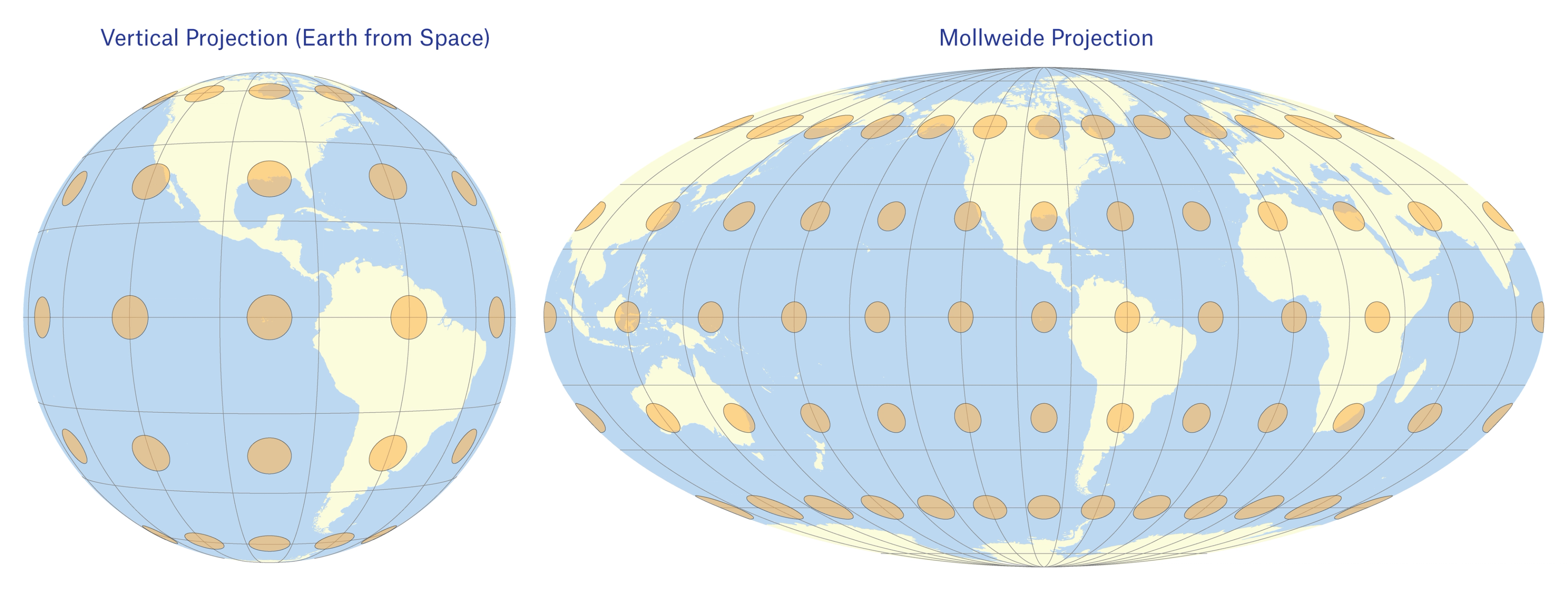
Earth viewed from space (L) compared to the Mollweide Projection (R), a version of which was used for the Americas map animation.
We aspired for the animated map to display the cultures, artistic styles, and civilizations that originated in the ancient Americas through time. Such aspirations demanded thorough and up-to-date archaeological and art historical research. For example, we reviewed the existing extensive literature to incorporate updated chronologies and the spatial extent of these ancient societies. To prioritize clarity and connection to the collection, this map includes only those cultures whose artistic traditions are represented in The Met’s Ancient American galleries. The map accordingly focuses on the area between Mexico and Bolivia––where most of the collection originated––to visualize the histories of these communities in closer detail. We nonetheless acknowledge that many more groups and cultures have existed for millennia, some yet to be identified.
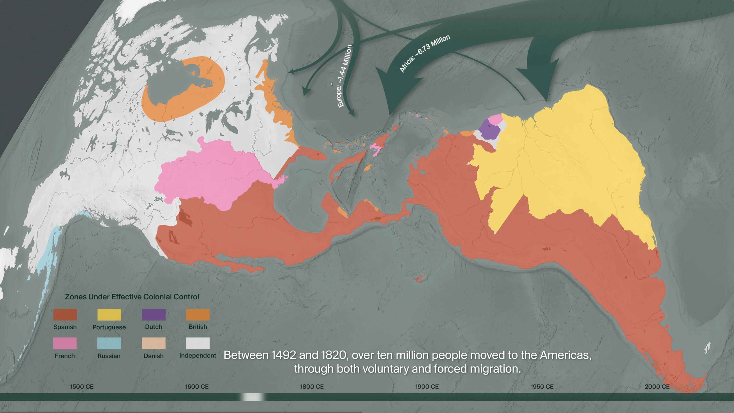
Highlighted areas showing "zones under effective colonial control"
After the sixteenth century, the map visually narrates the history of European colonial projects in the Americas. While there are a small number of viceregal items in these galleries, works from the colonial period in Latin America are primarily featured in Look Again: European Paintings 1300-1800, a reinstallation that explores Europe’s complex relationships with New Spain and the Viceroyalty of Peru. A common misconception is that European conquest was both rapid and thorough, when in fact, it took nearly 300 years. We’ve tried to show this by representing “zones under effective colonial control” rather than European territorial claims (which were far more expansive than the regions they actually controlled through military force). These imperial histories are critical to understanding and explaining the political landscape of Latin America and the Caribbean today.
The map animation then progresses to the era of revolutions when countries declared and fought for their independence from Europe. The divisions between these colonial units (viceroyalties, captaincies, audiencias, colonies, etc.) were the basis for the initial configuration of many modern countries. Yet, borders––imagined, imposed, and disputed––shifted over time, as more recent history (mid-nineteenth to mid-twentieth centuries) briefly visualizes.
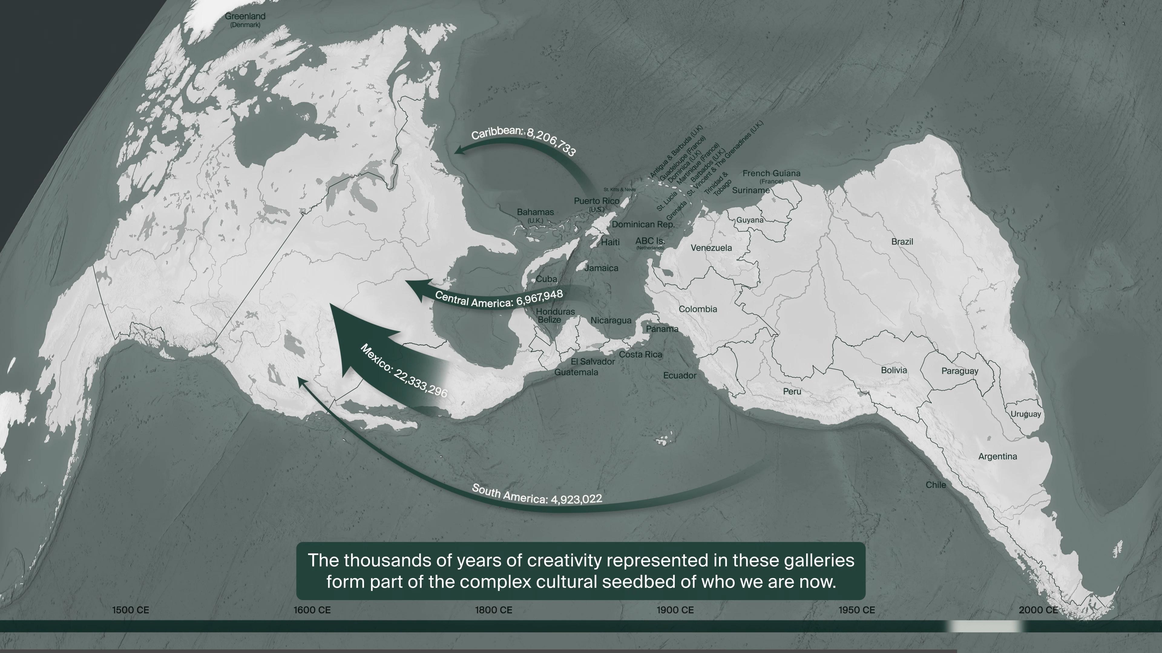
Latin American and Caribbean migration to the United States
Migration is a prominent theme in the animated map. Following recent archaeological findings, the animation illustrates the relocation of the first groups from Asia to Alaska more than 20,000 years ago. Between the sixteenth and twentieth centuries, the map then conveys the scale of the voluntary and forced migrations from other continents. We relied on historical research aimed at reconstructing these processes. This sequence finally visualizes Latin American and Caribbean migration to the United States during the twentieth and twenty-first centuries, as reported in U.S. census data. In this digital feature, migration is thus presented not as a recent phenomenon but as a process integral to defining the Americas of the past and present.
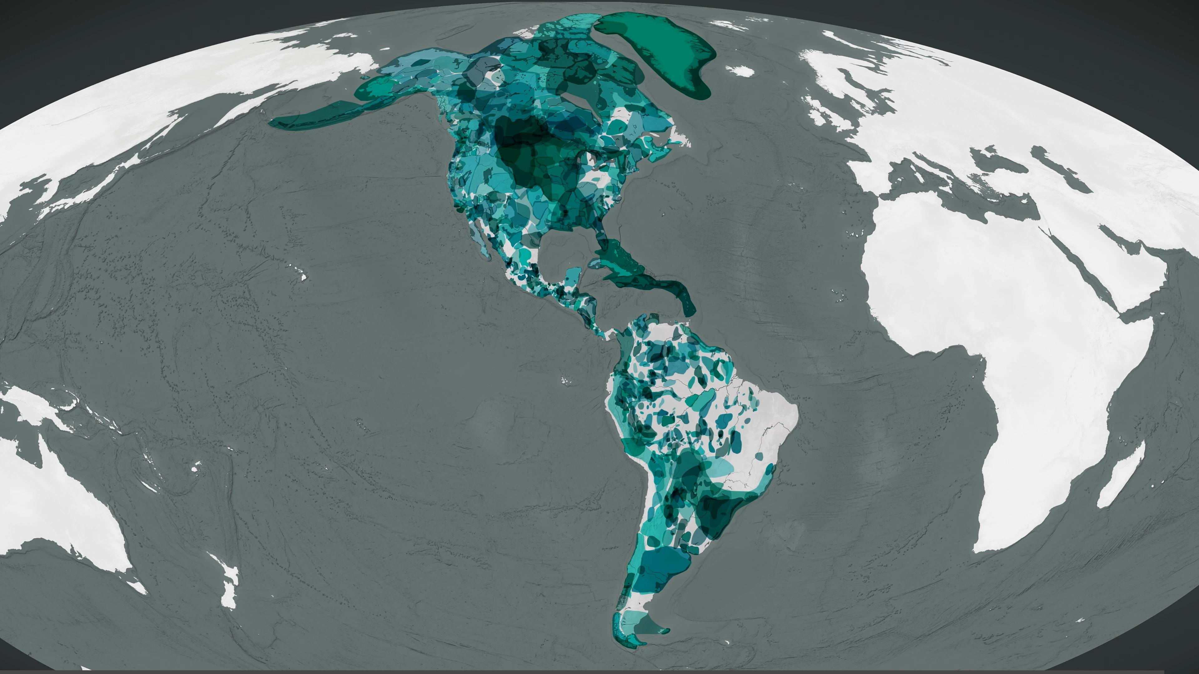
Linguistic map showing the distribution of Indigenous communities across the North and South American continents
We then dedicated the concluding frames of the animated map to the widespread survivance[1] of Indigenous communities on the continent. Across generations, Indigenous groups have been and continue to be keepers of a diversity of languages and cultures. A contemporary linguistic map thereby offered a suitable proxy for conveying this diversity while visualizing the present-day presence of Indigenous peoples in the Americas. Native Land Digital (native-land.ca) provided an invaluable linguistic database to this end.
As the screen fades to black, the animation loops back to the beginning in an assertion of circular time and connection between Native ancestors and present-day Indigenous communities.
Notes
[1] "Survivance," as coined by author and literary critic Gerald Vizenor, jointly addresses Native American stories of survival and resistance in the face of settler colonial projects. As Vizenor explains in Manifest Manners: Narratives on Postindian Survivance (1999), "Survivance is an active sense of presence, the continuance of native stories, not a mere reaction, or a survivable name. Native survivance stories are renunciations of dominance, tragedy, and victimry. Survivance means the right of succession or reversion of an estate, and in that sense, the estate of native survivancy" (Vizenor 1999, vii). For further reading, see below.