
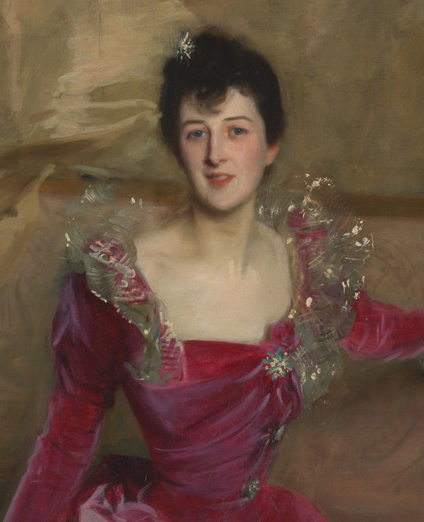
John Singer Sargent (American, 1856–1925). Mrs. Hugh Hammersley, 1892. Oil on canvas; 81 x 45 1/2 in. (205.7 x 115.6 cm). The Metropolitan Museum of Art, New York, Gift of Mr. and Mrs. Douglass Campbell, in memory of Mrs. Richard E. Danielson, 1998 (1998.365)
John Singer Sargent's portrait of Mrs. Hugh Hammersley, currently on view in Sargent: Portraits of Artists and Friends, portrays a captivating, vivacious woman gracefully posed on a French sofa. As a curator of costume, I am almost equally enchanted by her striking fuchsia velvet dress, which Sargent has so masterfully rendered with all its lush sheen and texture.
After reading contemporary reviews of the painting, published after it was first exhibited in London in 1893, I learned that many early reviewers were also captivated by Sargent's depiction of this vividly hued garment. The bold color was described as daring by many contemporary critics, which could be a positive or negative characterization depending on the reviewer. A critic for the Saturday Review described the velvet of the dress as being painted with "almost violent prominence," while the Athenaeum's art critic highly praised the work, lauding Sargent's use of color and the harmony between the intense colors and the sitter's flesh tones. A review in the Times (London) described the painting as "dashing and masterly" but "audacious," characterizing the dress's "red mauve" hue as "only one shade removed from something aniline and terrible."
Aniline dye was accidentally discovered in 1856 by English chemist William Henry Perkin (1838–1907) during experimentation to develop a synthetic form of the antimalarial drug quinine. This first aniline dye created a vibrant purple shade that became known as "aniline violet," or "mauveine." The novel brilliance of color that could be achieved with this and other, subsequently formulated, synthetic dyes proved very popular in dress. There was an existing taste for bright shades, previously produced using natural dyes, but the new synthetic dyes were unprecedentedly saturated, produced fairly fast colors, and were relatively inexpensive. They were soon embraced by the textile industry, making incredibly vivid hues available to a broad swath of consumers.
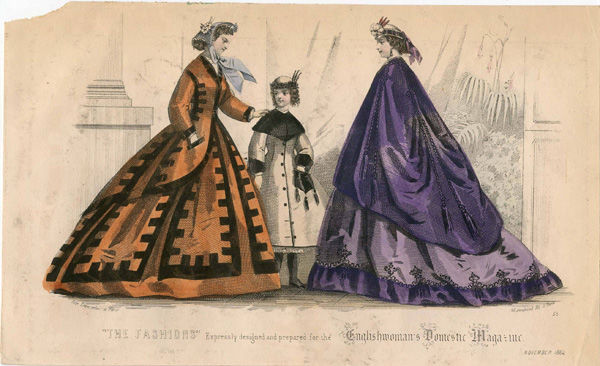
"The Fashions," November 1864. Englishwoman's Domestic Magazine (English, 1852–1879). Irene Lewisohn Costume Reference Library, The Metropolitan Museum of Art, New York, Gift of Woodman Thompson
These new aniline colors conveyed a sense of modernity, and were publicly showcased as great discoveries. A jury report on the International Exhibition of 1862 in London described samples of aniline-dyed fabrics and trimmings as having colors that were "the most superb and brilliant that have ever delighted the human eye" (International Exhibition, 120). Not all observers, however, were equally enthusiastic. Many viewed these colors as gaudy, and because of their wide availability across class levels, they came to be associated with a "common" taste. French literary and art critic Hippolyte Taine (1828–1893), on visiting England in the 1860s, wrote of women's dress that "taste is wanting. The colors are outrageously crude." He claimed, "The exaggeration of the dresses of the ladies or young girls belonging to the wealthy middle class is offensive," and cited shades of red and violet that seemed especially off-putting (Taine, 22, 68).
Women of taste, or those who aspired to be seen that way, had to be considered in the way that they wore vibrant colors. In an era when dress played a key role in establishing, maintaining, and displaying social distinction, both men and women of society were well versed in "reading" dress—judging the nuances of color, fabric, ornament, and silhouette as a reflection of good taste and propriety. Much attention was paid in popular fashion magazines and etiquette manuals to the use of color in dress, and women were encouraged to consider carefully the color combinations they chose, how those colors harmonized with their own complexions, and even how those fabrics would appear under different lighting conditions. This heightened attention to color and fabric existed not only on the pages of fashion magazines, but in women's engagement with high fashion in daily life.
Charles Frederick Worth (1825–1895), founder of haute couture, created at House of Worth a mirrored room lit by candlelight, and later gaslight—his salon de lumière. This showroom offered clients the opportunity to judge the effects that different lighting conditions, such as those they would experience at a ball or other evening affair, would have on the fabrics of their Worth creations.
By the 1890s, the House of Worth had been in existence for three decades, and was still widely considered one of the premier dressmakers in Paris, known for gowns that displayed a harmonious blend of colors and textures, formed by carefully selected textiles and trimmings. Refined construction details and a precise fit were also hallmarks of the couture garment, in a period that saw the rise of the sewing machine and an increase in the availability of ready-made clothing items.

Attributed to House of Worth (French, 1858–1956). Ball gown, 1898–1900. Silk velvet, silk satin, silk tulle. The Metropolitan Museum of Art, New York, Gift of Mrs. C. Phillip Miller, 1957 (C.I.57.17.9a, b)
A late-1890s ball gown in The Costume Institute's collection, attributed to the House of Worth and composed of a vivid cyclamen silk velvet, has a silhouette similar to that of Mrs. Hammersley's evening gown, and demonstrates how the elite fashion house worked with such daring colors. The appearance of the bodice is softened with panels of pale pink satin and white tulle across the left shoulder, and the gown is left largely unembellished, relying on its arresting color for effect.
Boldly colored fabrics, often with large-scale designs, were widely seen in fashions of the 1890s, represented in fashion plates, and exhibited at international expositions and world's fairs. In an 1897 issue of Harper’s Bazaar, the magazine's London correspondent declared, "The shops are aglow with crude colors—raw green, aggressive purple, impossible magenta (impossible to wear, I mean)…But the daring of women is wonderful." Whether a garment in a strong color was perceived as crude and common, or rich and dashing, depended not only upon the observer's personal taste but also on the fineness of the textiles, trims, and construction techniques.
John Singer Sargent (American, 1856–1925). Mrs. Hugh Hammersley (detail), 1892. Oil on canvas; 81 x 45 1/2 in. (205.7 x 115.6 cm). The Metropolitan Museum of Art, New York, Gift of Mr. and Mrs. Douglass Campbell, in memory of Mrs. Richard E. Danielson, 1998 (1998.365)
Like Mrs. Hammersley's dress, The Costume Institute's gown bears characteristics typical of late nineteenth-century evening dress—low décolletage; an asymmetrically draped, fitted bodice that tapers to an attenuated waist; and a skirt that extends into a sweeping train. They each demonstrate a refinement of fit that would have served as the mark of a skillfully made garment, conforming tightly to the torso in precise gathers. Both also exhibit an interruption of the plane of intense color at the top of the bodice, near the face. Sargent's sitter has been graced with a finely rendered lace collar that frames her face, moderating the effect of the fuchsia velvet. Sargent captures both the coruscating light against the metallic threads of her collar and hem embellishment, and the varied appearance of the silk velvet as the light hits it from different angles.
The color of Mrs. Hammersley's gown was daring because it risked being declared crude rather than refined, and discordant rather than harmonious with the rendering of the sitter herself. Although bold in color, it is relatively simple in design, lacking any patterning that might quickly mark the dress as outmoded. Its most dramatic embellishment, the face-framing collar, echoes the effect of standing lace collars worn during the seventeenth century, perhaps imparting some sense of timelessness despite the modernity of the color.
Another contemporary reviewer noted in the Spectator that "the dress is a daring color, a crying tint of rose velvet embroidered with silver; but the face and the neck hold their own in the encounter...as they should do in a portrait." While the bold shade stimulated a range of responses, it surely contributes to the vitality of Sargent's splendid portrait.
Sources
E, E. B. "Our London Letter." Harper's Bazaar 31, no. 24 (Jun 11, 1898): 505.
International Exhibition, 1862. Reports by the Juries on the Subjects in the Thirty-Six Classes into Which the Exhibition was Divided. Class II. London: William Clowes & Sons, 1863.
M[acColl], D. S. "Art. The New Gallery." The Spectator, 70 (May 6, 1893): 606–607.
Ormond, Richard, and Elaine Kilmurray. John Singer Sargent: Complete Paintings, vol. 2. New Haven: Yale University Press, 1998.
"The New Gallery." The Athenaeum, 3419 (May 6, 1893): 577–578.
"The New Gallery. Second Notice," Saturday Review, LXXV (June 10, 1893): 627–628.
"The New Gallery." The Times (London), May 1, 1893: 10.
Taine, Hippolyte. Notes on England. Translated by William Fraser Rae. London: W. Ibster & Co., 1874.