Exhibition
Gifts from the Fire: American Ceramics from the Collection of Martin Eidelberg
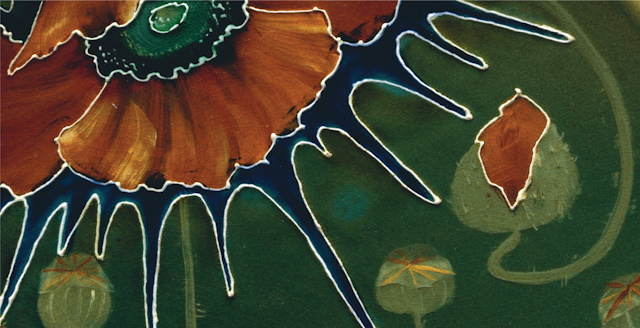
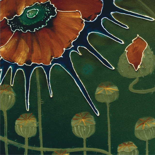
Vase with cornstalks
Tiffany Studios (1902–32)
ca. 1904–05
Vase with cornstalks
Tiffany Studios (1902–32)
Many of Tiffany Studios pottery vases and bowls began as enamels. This vase is a direct copy of an enamel copper model of the same design (see 1981.444). Unlike the bright, multihued naturalistic enamels, the pottery versions were often glazed in a semi-matte monochrome finish.
Covered bowl with Boston ivy
Tiffany Studios (1902–32)
ca. 1904–09
Covered bowl with Boston ivy
Tiffany Studios (1902–32)
Louis Comfort Tiffany (1848–1933) is renowned not only for his work in glass but also for his artistic endeavors in virtually every other medium. He embarked on experiments in ceramics shortly after he saw the avant-garde French ceramics at the Exposition Universelle in Paris in 1900. Tiffany debuted his pottery in 1904 at the Pan-American Exposition in Saint Louis, and the following year he sent two examples—a vase decorated with trumpet blossoms and this covered bowl—to the Salon of the Société des Artistes Français in Paris. Like most of Tiffany's work, the pottery from his furnaces relied heavily on nature for its inspiration. The leafy Virginia creeper vine that seems to grow up the sides and over the lid of the bowl also appears on his leaded-glass lampshades and windows. The glaze on the bowl is one of Tiffany's earliest. Called “Old Ivory,” it darkens when it pools in the interstices of the design, accentuating the sculptural relief. Like many other pieces of what Tiffany called his “Favrile Pottery,” this bowl relates to an enamel version, in this instance in the Chrysler Museum of Art in Norfolk, Virginia. Tiffany made several covered bowls in enamel, but this is the only known pottery example of the form.
Vase with arrowhead plants
Tiffany Studios (1902–32)
ca. 1904–09
Vase with arrowhead plants
Tiffany Studios (1902–32)
This vase features a snake hidden among the stems and leaves of an arrowhead plant. In overall form, subject, and design--most notably the pierced neck--the vase closely resembles models made by the Copenhagen porcelain manufacturer Bing & Grondahl at the turn of the century. The Danish wares were illustrated in the journal "Keramic Studios," and Edith Lautrup, a decorator at Bind & Grondahl prior to working at Tiffany Studios, also may have been instrumental in the transmission of their designs.
Vase with Queen Anne's lace
Tiffany Studios (1902–32)
ca. 1904–09
Vase with Queen Anne's lace
Tiffany Studios (1902–32)
Louis Comfort Tiffany employed the motif of Queen Anne’s lace, also known as wild carrot, in his pottery, glass, and jewelry designs. Here, the bracts (stems on the underside of the blossoms) curl upward to form the organic shape of the vase. Queen Anne’s lace was also the inspiration for the design of a cameo-cut glass vase and a hair ornament on view in this gallery (1997.409 and 2001.249).
Cream pitcher with water lilies
Tiffany Studios (1902–32)
ca. 1904–09
Cream pitcher with water lilies
Tiffany Studios (1902–32)
The form of this creamer is entirely shaped by the various parts of the water lily: the curling leafy pads form the spout while the handle comprises a stem and a bud.
Bowl with flowering vine
Tiffany Studios (1902–32)
ca. 1904–9
Vase with pussy willow
Tiffany Studios (1902–32)
ca. 1904–9
Vase with pussy willow
Tiffany Studios (1902–32)
Like most Tiffany Studios pottery, this vase was slip cast in a mold: the spout and handle, however, appear to have been crafted by hand afterward.
Lorelei Vase
Various Artists
1902
Lorelei Vase
Designed by Artus Van Briggle (American, Felicity, Ohio 1869–1904 Colorado Springs, Colorado)
Van Briggle Pottery Company (1901–present)
The Van Briggle Pottery Company was one of America’s most important and longest lasting art potteries, quintessentially associated with the Arts and Crafts movement. At the same time, few American designers responded to the international styles of Art Nouveau as did Artus Van Briggle. This vase synthesizes those influences, but especially highlights its European influence. The "Lorelei" was Van Briggle’s first figural vase form, the design of which he originally created while working at the Rookwood Pottery in Cincinnati, Ohio. This early model signaled the artist’s trademark of modeled decoration, whereby the motifs were rendered in relief rather than painted on the surface. While the majority of his motifs were drawn from plants and birds, his vases embodying the human figure are among his rarest, and similarly the most coveted.
Vase with mistletoe
Various Artists
1904
Vase with mistletoe
Designed by Artus Van Briggle (American, Felicity, Ohio 1869–1904 Colorado Springs, Colorado)
Metalwork by Yosakichi Asano (Japanese, active United States 1894 – ca. 1904.)
Van Briggle Pottery Company (1901–present)
Artus Van Briggle was one of America’s most important and longest lasting art potteries, quintessentially associated with the Arts and Crafts movement. At the same time, few American designers responded to the international styles of Art Nouveau as did Van Briggle. This vase synthesizes those influences. It exemplifies Van Briggle’s important contribution to the development of the matte glaze, especially in the wide variety of hues the pottery produced. The smooth soft robin’s-egg blue color of this particular vase is especially striking—and unusual in the pottery’s oeuvre. It’s also distinguished by its unusual metal mounts of highly stylized mistletoe leaves in copper, patinated to look like bronze. This vase was part of the Van Briggle’s display at the Louisiana Purchase Exposition in St. Louis in 1904, where the artist garnered a gold medal.
Vase
George E. Ohr (American, Biloxi, Mississippi 1857–1918 Biloxi, Mississippi)
ca. 1897–1900
Vase
George E. Ohr (American, Biloxi, Mississippi 1857–1918 Biloxi, Mississippi)
George Ohr of Biloxi, Mississippi, was arguably the quintessential American art potter: he built his own kiln, dug his clay, threw his vessels with extreme proficiency on the potter’s wheel to wafer thinness, altered those shapes, and then covered them with his own novel glazes. In form and decoration they are essentially Abstract Expressionist objects—almost 50 years before that movement was founded. These two vases illustrate especially well how Ohr’s lithe, flamboyant, ribbon handles transform a traditional vessel form. On one, the addition of the serpentine handles—with five points where the interior of the handle attaches to the body of the vase—give the vessel an entirely new profile. The second vase exhibits not only Ohr’s unusual serpentine handles, but also his fascination with altered form, where he squeezed and pinched the upper portion to form a double-necked vessel. The handles almost give the impression of wings attached to the slender waist of the vase. In both examples, the handles are reminiscent of the extravagant dragon stems on Venetian glass goblets.
The glazes on these vases also exhibit Ohr’s novel glazes, most of which were unlike anything ever seen in American ceramics at that date. The orange glaze is a hue that harks to the palette of Fauvist painting; the other vase, in an expression of Ohr’s disregard for convention, features two different glaze treatments, one on the front and the other on the back.
Ohr was a colorful character, and his quirky pottery became one of the added tourist attractions on Mississippi’s gulf coast. Self-proclaimed the "Greatest Art Potter on Earth," he was well ahead of his time, and the vases that he deemed "worth their weight in gold" would not command such prices until a few decades ago. Barely ten years after he began making such vases, Ohr closed his pottery, and packed up his pots, literally not to be discovered for another 50 years. Both of these vases came virtually straight from the artist’s cache, and were purchased by Martin Eidelberg, the donor, when the rediscovery of art pottery was in its infancy in the early 1970s
Vase
George E. Ohr (American, Biloxi, Mississippi 1857–1918 Biloxi, Mississippi)
ca. 1897–1900
Vase
George E. Ohr (American, Biloxi, Mississippi 1857–1918 Biloxi, Mississippi)
George Ohr of Biloxi, Mississippi, was arguably the quintessential American art potter: he built his own kiln, dug his clay, threw his vessels with extreme proficiency on the potter’s wheel to wafer thinness, altered those shapes, and then covered them with his own novel glazes. In form and decoration they are essentially Abstract Expressionist objects—almost 50 years before that movement was founded. These two vases illustrate especially well how Ohr’s lithe, flamboyant, ribbon handles transform a traditional vessel form. On one, the addition of the serpentine handles—with five points where the interior of the handle attaches to the body of the vase—give the vessel an entirely new profile. The second vase exhibits not only Ohr’s unusual serpentine handles, but also his fascination with altered form, where he squeezed and pinched the upper portion to form a double-necked vessel. The handles almost give the impression of wings attached to the slender waist of the vase. In both examples, the handles are reminiscent of the extravagant dragon stems on Venetian glass goblets.
The glazes on these vases also exhibit Ohr’s novel glazes, most of which were unlike anything ever seen in American ceramics at that date. The orange glaze is a hue that harks to the palette of Fauvist painting; the other vase, in an expression of Ohr’s disregard for convention, features two different glaze treatments, one on the front and the other on the back.
The glazes on these vases also exhibit Ohr’s novel glazes, most of which were unlike anything ever seen in American ceramics at that date. The orange glaze is a hue that harks to the palette of Fauvist painting; the other vase, in an expression of Ohr’s disregard for convention, features two different glaze treatments, one on the front and the other on the back.
Pitcher
George E. Ohr (American, Biloxi, Mississippi 1857–1918 Biloxi, Mississippi)
1896
Pitcher
George E. Ohr (American, Biloxi, Mississippi 1857–1918 Biloxi, Mississippi)
George Ohr of Biloxi, Mississippi, was arguably America’s quintessential art potter. He built his own kiln, dug his clay, threw his vessels with extreme proficiency on the potter’s wheel to wafer thinness, altered those shapes, and then covered them with his own novel glazes. In form and decoration they are essentially Abstract Expressionist objects—almost 50 years before that movement was founded. In fact, deemed ultimately very modern in this century, they had great appeal to such modern artists as Jasper Johns and Andy Warhol, who formed collections of them. Ohr’s work is extraordinarily idiosyncratic and he practiced his own mantra of "no two alike," as exemplified by these works.
Ohr was a colorful character, and his quirky pottery became one of the added tourist attractions on Mississippi’s gulf coast. Self-proclaimed the "Greatest Art Potter on Earth," he was well ahead of his time, and the vases that he deemed "worth their weight in gold" would not command such prices until a few decades ago. Barely ten years after he began making such vases, Ohr closed his pottery, and packed up his pots, literally not to be discovered for another 50 years. Both of these vases came virtually straight from the artist’s cache, and were purchased by Martin Eidelberg, the donor, when the rediscovery of art pottery was in its infancy in the early 1970s.
Ohr was a colorful character, and his quirky pottery became one of the added tourist attractions on Mississippi’s gulf coast. Self-proclaimed the "Greatest Art Potter on Earth," he was well ahead of his time, and the vases that he deemed "worth their weight in gold" would not command such prices until a few decades ago. Barely ten years after he began making such vases, Ohr closed his pottery, and packed up his pots, literally not to be discovered for another 50 years. Both of these vases came virtually straight from the artist’s cache, and were purchased by Martin Eidelberg, the donor, when the rediscovery of art pottery was in its infancy in the early 1970s.
Vase
George E. Ohr (American, Biloxi, Mississippi 1857–1918 Biloxi, Mississippi)
ca. 1897–1900
Vase
George E. Ohr (American, Biloxi, Mississippi 1857–1918 Biloxi, Mississippi)
George Ohr of Biloxi, Mississippi, was arguably America’s quintessential art potter. He built his own kiln, dug his clay, threw his vessels with extreme proficiency on the potter’s wheel to wafer thinness, altered those shapes, and then covered them with his own novel glazes. In form and decoration they are essentially Abstract Expressionist objects—almost 50 years before that movement was founded. In fact, deemed ultimately very modern in this century, they had great appeal to such modern artists as Jasper Johns and Andy Warhol, who formed collections of them. Ohr’s work is extraordinarily idiosyncratic and he practiced his own mantra of "no two alike," as exemplified by these works.
Ohr was a colorful character, and his quirky pottery became one of the added tourist attractions on Mississippi’s gulf coast. Self-proclaimed the "Greatest Art Potter on Earth," he was well ahead of his time, and the vases that he deemed "worth their weight in gold" would not command such prices until a few decades ago. Barely ten years after he began making such vases, Ohr closed his pottery, and packed up his pots, literally not to be discovered for another 50 years. Both of these vases came virtually straight from the artist’s cache, and were purchased by Martin Eidelberg, the donor, when the rediscovery of art pottery was in its infancy in the early 1970s.
Ohr was a colorful character, and his quirky pottery became one of the added tourist attractions on Mississippi’s gulf coast. Self-proclaimed the "Greatest Art Potter on Earth," he was well ahead of his time, and the vases that he deemed "worth their weight in gold" would not command such prices until a few decades ago. Barely ten years after he began making such vases, Ohr closed his pottery, and packed up his pots, literally not to be discovered for another 50 years. Both of these vases came virtually straight from the artist’s cache, and were purchased by Martin Eidelberg, the donor, when the rediscovery of art pottery was in its infancy in the early 1970s.
Vase
George E. Ohr (American, Biloxi, Mississippi 1857–1918 Biloxi, Mississippi)
ca. 1898–1910
Vase
George E. Ohr (American, Biloxi, Mississippi 1857–1918 Biloxi, Mississippi)
George Ohr of Biloxi, Mississippi, was arguably America’s quintessential art potter. He built his own kiln, dug his clay, threw his vessels with extreme proficiency on the potter’s wheel to wafer thinness, altered those shapes, and then covered them with his own novel glazes. In form and decoration they are essentially Abstract Expressionist objects—almost 50 years before that movement was founded. In fact, deemed ultimately very modern in this century, they had great appeal to such modern artists as Jasper Johns and Andy Warhol, who formed collections of them. Ohr’s work is extraordinarily idiosyncratic and he practiced his own mantra of "no two alike," as exemplified by these works.
Ohr was a colorful character, and his quirky pottery became one of the added tourist attractions on Mississippi’s gulf coast. Self-proclaimed the "Greatest Art Potter on Earth," he was well ahead of his time, and the vases that he deemed "worth their weight in gold" would not command such prices until a few decades ago. Barely ten years after he began making such vases, Ohr closed his pottery, and packed up his pots, literally not to be discovered for another 50 years. Both of these vases came virtually straight from the artist’s cache, and were purchased by Martin Eidelberg, the donor, when the rediscovery of art pottery was in its infancy in the early 1970s.
Ohr was a colorful character, and his quirky pottery became one of the added tourist attractions on Mississippi’s gulf coast. Self-proclaimed the "Greatest Art Potter on Earth," he was well ahead of his time, and the vases that he deemed "worth their weight in gold" would not command such prices until a few decades ago. Barely ten years after he began making such vases, Ohr closed his pottery, and packed up his pots, literally not to be discovered for another 50 years. Both of these vases came virtually straight from the artist’s cache, and were purchased by Martin Eidelberg, the donor, when the rediscovery of art pottery was in its infancy in the early 1970s.
Vase with moths
Adelaide Alsop Robineau (American, Middletown, Connecticut, 1865–1929 Syracuse, New York)
1905
Vase with moths
Adelaide Alsop Robineau (American, Middletown, Connecticut, 1865–1929 Syracuse, New York)
Adelaide Alsop Robineau, arguably America’s greatest potter, was the first artist-potter in America to produce porcelain objects that rivalled those from Sevres and other French porcelain factories in both design and execution. Robineau, like many women of her era, began her career as a china painter. Soon she began forming, decorating, and glazing vessels on her own and with the aid of her husband, Samuel Robineau. Her early porcelains with carved decoration features stylized naturalistic motifs, such as the bees carved on the shoulder of the vase, typical of the conventionalized designs published in Keramic Studio, the influential periodical that was edited by Robineau and published by her husband. Upon her death in 1929, Robineau was accorded the rare honor of being the first artist-potter to be given a retrospective exhibition at The Metropolitan Museum of Art.
Vase
Adelaide Alsop Robineau (American, Middletown, Connecticut, 1865–1929 Syracuse, New York)
ca. 1910
Vase
Adelaide Alsop Robineau (American, Middletown, Connecticut, 1865–1929 Syracuse, New York)
Adelaide Alsop Robineau was a consummate craftsman and a brilliant designer, who, working on her own, tackled the challenging medium of porcelain in an era when the medium was the domain of large-scale commercial factories. Like many talented women of her era, she began her career as a china painter and teacher, and with her husband, Samuel Robineau, founded the extraordinarily influential periodical Keramic Studio (later Design). She was a pioneer in the field of ceramics, and challenged traditional gender roles in her trail-blazing career, throwing the clay herself, decorating, and glazing her vessels. Her artistic porcelains are today acknowledged to surpass the work of any other American studio potter.
Through her exceptional work which was exhibited widely both throughout the United States and abroad and both her editorial voice and articles in Keramic Studio, Robineau left an indelible print on the history of American ceramic, and was significant in paving the way for American studio potters that follow in the decades after her death.
Through her exceptional work which was exhibited widely both throughout the United States and abroad and both her editorial voice and articles in Keramic Studio, Robineau left an indelible print on the history of American ceramic, and was significant in paving the way for American studio potters that follow in the decades after her death.
Cup with beetles
Adelaide Alsop Robineau (American, Middletown, Connecticut, 1865–1929 Syracuse, New York)
1901
Cup with beetles
Adelaide Alsop Robineau (American, Middletown, Connecticut, 1865–1929 Syracuse, New York)
Adelaide Alsop Robineau was a consummate craftsman and a brilliant designer, who, working on her own, tackled the challenging medium of porcelain in an era when the medium was the domain of large-scale commercial factories. Like many talented women of her era, she began her career as a china painter and teacher, and with her husband, Samuel Robineau, founded the extraordinarily influential periodical Keramic Studio (later Design). She was a pioneer in the field of ceramics, and challenged traditional gender roles in her trail-blazing career, throwing the clay herself, decorating, and glazing her vessels. Her artistic porcelains are today acknowledged to surpass the work of any other American studio potter.
This is one of the very first works in porcelain that the artist ever executed. Robineau’s husband, Samuel Robineau, referenced this little pot, in discussing his wife’s early years as a potter: “In 1901 one day she went to visit her friend Chas. Volkmar in his little pottery in New Jersey [sic—referring to Volkmar’s studio in New York], and there she took a little clay and made by hand a shapeless little cup, then decorated it with three carved beetles on the edge. Volkmar baked it and later in her own pottery Mrs. R. marked the date 1901, her initials A. R. and glazed the cup in blue and beetles in white. I have the piece yet, it is very interesting not only because of the date, the first piece of pottery she made, but because in that decoration of beetles she instinctively and unknowingly showed the kind of carved decoration in relief which she was going to use so much later on.” [From an undated letter (ca. 1935) from S. E. Robineau to Carlton Atherton, who was writing an essay on Robineau, in Weiss, Peg, ed. Adelaide Alsop Robineau: Glory in Porcelain (Syracuse, New York: Syracuse University Press, 1981), p. 205, fn. 16.]
Through her exceptional work which was exhibited widely both throughout the United States and abroad and both her editorial voice and articles in Keramic Studio, Robineau left an indelible print on the history of American ceramic, and was significant in paving the way for American studio potters that follow in the decades after her death.
Covered jar
Adelaide Alsop Robineau (American, Middletown, Connecticut, 1865–1929 Syracuse, New York)
ca. 1905–15
Covered jar
Adelaide Alsop Robineau (American, Middletown, Connecticut, 1865–1929 Syracuse, New York)
Adelaide Alsop Robineau was a consummate craftsman and a brilliant designer, who, working on her own, tackled the challenging medium of porcelain in an era when the medium was the domain of large-scale commercial factories. Like many talented women of her era, she began her career as a china painter and teacher, and with her husband, Samuel Robineau, founded the extraordinarily influential periodical Keramic Studio (later Design). She was a pioneer in the field of ceramics, and challenged traditional gender roles in her trail-blazing career, throwing the clay herself, decorating, and glazing her vessels. Her artistic porcelains are today acknowledged to surpass the work of any other American studio potter.
Robineau slip cast numerous tiny vases in the shape of this one that she used as glaze test pots. When she deemed the glaze especially successful, she elevated the form by crafting a tiny cover for it out of porcelain. With its carved decoration and matte gunmetal glaze, it resembles a carved wood top in the manner of the Chinese.
Through her exceptional work which was exhibited widely both throughout the United States and abroad and both her editorial voice and articles in Keramic Studio, Robineau left an indelible print on the history of American ceramic, and was significant in paving the way for American studio potters that follow in the decades after her death.
Vase
Adelaide Alsop Robineau (American, Middletown, Connecticut, 1865–1929 Syracuse, New York)
1903
Vase
Adelaide Alsop Robineau (American, Middletown, Connecticut, 1865–1929 Syracuse, New York)
Adelaide Alsop Robineau was a consummate craftsman and a brilliant designer, who, working on her own, tackled the challenging medium of porcelain in an era when the medium was the domain of large-scale commercial factories. Like many talented women of her era, she began her career as a china painter and teacher, and with her husband, Samuel Robineau, founded the extraordinarily influential periodical Keramic Studio (later Design). She was a pioneer in the field of ceramics, and challenged traditional gender roles in her trail-blazing career, throwing the clay herself, decorating, and glazing her vessels. Her artistic porcelains are today acknowledged to surpass the work of any other American studio potter.
This vase is one of Robineau’s rare works with carved rice-grain decoration, whereby slots about the size and shape of a grain of rice are carved into the porcelain body in its leather-hard pre-fired state, and then the cuts are filled in with glaze, leaving a translucent lacy effect. This vase was clearly an experimental work in that many of that the glaze did not cover many of the cuts. In addition, this is likely a very early attempt at crystalline glazes. Only in one spot on the bulbous mid-section are the crystals successful; much of the glaze has badly bubbled and blistered. Nonetheless, the artist deemed it important for she included it in a photograph of some of her early porcelains that she published in Keramic Studio in 1903.
Through her exceptional work which was exhibited widely both throughout the United States and abroad and both her editorial voice and articles in Keramic Studio, Robineau left an indelible print on the history of American ceramic, and was significant in paving the way for American studio potters that follow in the decades after her death.
Vase with cicadas
Adelaide Alsop Robineau (American, Middletown, Connecticut, 1865–1929 Syracuse, New York)
ca. 1907–10
Vase with cicadas
Adelaide Alsop Robineau (American, Middletown, Connecticut, 1865–1929 Syracuse, New York)
Adelaide Alsop Robineau was a consummate craftsman and a brilliant designer, who, working on her own, tackled the challenging medium of porcelain in an era when the medium was the domain of large-scale commercial factories. Like many talented women of her era, she began her career as a china painter and teacher, and with her husband, Samuel Robineau, founded the extraordinarily influential periodical Keramic Studio (later Design). She was a pioneer in the field of ceramics, and challenged traditional gender roles in her trail-blazing career, throwing the clay herself, decorating, and glazing her vessels. Her artistic porcelains are today acknowledged to surpass the work of any other American studio potter.
Robineau often published in Keramic Studio designs of various insects to inspire ceramic artists in their decorative work. This was subject matter that appealed to many of the European designers at the turn of the century, examples of which would have been known to Robineau. Here, five sculptural cicadas are arranged rhythmically around the vase. The dark brown glaze on the cicadas forms a thin drip over the more brilliant orange crystalline glaze overall.
Through her exceptional work which was exhibited widely both throughout the United States and abroad and both her editorial voice and articles in Keramic Studio, Robineau left an indelible print on the history of American ceramic, and was significant in paving the way for American studio potters that follow in the decades after her death.
Tazza with elephants
Adelaide Alsop Robineau (American, Middletown, Connecticut, 1865–1929 Syracuse, New York)
ca. 1910
Tazza with elephants
Adelaide Alsop Robineau (American, Middletown, Connecticut, 1865–1929 Syracuse, New York)
Adelaide Alsop Robineau was a consummate craftsman and a brilliant designer, who, working on her own, tackled the challenging medium of porcelain in an era when the medium was the domain of large-scale commercial factories. Like many talented women of her era, she began her career as a china painter and teacher, and with her husband, Samuel Robineau, founded the extraordinarily influential periodical Keramic Studio (later Design). She was a pioneer in the field of ceramics, and challenged traditional gender roles in her trail-blazing career, throwing the clay herself, decorating, and glazing her vessels. Her artistic porcelains are today acknowledged to surpass the work of any other American studio potter.
In 1909 Robineau and her husband were invited to join several other noted ceramists, notably Taxile Doat from Sèvres, and Frederick Hurten Rhead for what proved to be a short-lived educational enterprise in University City, outside St. Louis, Missouri. She was given a studio and opportunity to work unencumbered, and she experimented with a number of new techniques and worked to further perfect her carved and crystalline glazed work. This tazza is one such example, dating to her time at University City. It features a mesmerizing dense crystalline glaze in an icy blue all over the bowl; and she skillfully excised an elephant, seen frontally, in a medallion at the center. Three fully sculptural elephants make up the base. The glaze on the bottom and covering the base is a creamy yellow, the cover of ivory, and perhaps even referencing the elephants’ ivory tusks.
Through her exceptional work which was exhibited widely both throughout the United States and abroad and both her editorial voice and articles in Keramic Studio, Robineau left an indelible print on the history of American ceramic, and was significant in paving the way for American studio potters that follow in the decades after her death.
Vase
Adelaide Alsop Robineau (American, Middletown, Connecticut, 1865–1929 Syracuse, New York)
1905
Vase
Adelaide Alsop Robineau (American, Middletown, Connecticut, 1865–1929 Syracuse, New York)
Adelaide Alsop Robineau was a consummate craftsman and a brilliant designer, who, working on her own, tackled the challenging medium of porcelain in an era when the medium was the domain of large-scale commercial factories. Like many talented women of her era, she began her career as a china painter and teacher, and with her husband, Samuel Robineau, founded the extraordinarily influential periodical Keramic Studio (later Design). She was a pioneer in the field of ceramics, and challenged traditional gender roles in her trail-blazing career, throwing the clay herself, decorating, and glazing her vessels. Her artistic porcelains are today acknowledged to surpass the work of any other American studio potter.
This vase is from Robineau’s brief stint in 1905 making slip-cast vessels that were canvases on which she displayed some of her finest and well-perfected crystalline glazes.
Through her exceptional work which was exhibited widely both throughout the United States and abroad and both her editorial voice and articles in Keramic Studio, Robineau left an indelible print on the history of American ceramic, and was significant in paving the way for American studio potters that follow in the decades after her death.
Vase
Adelaide Alsop Robineau (American, Middletown, Connecticut, 1865–1929 Syracuse, New York)
1905
Vase
Adelaide Alsop Robineau (American, Middletown, Connecticut, 1865–1929 Syracuse, New York)
Adelaide Alsop Robineau was a consummate craftsman and a brilliant designer, who, working on her own, tackled the challenging medium of porcelain in an era when the medium was the domain of large-scale commercial factories. Like many talented women of her era, she began her career as a china painter and teacher, and with her husband, Samuel Robineau, founded the extraordinarily influential periodical Keramic Studio (later Design). She was a pioneer in the field of ceramics, and challenged traditional gender roles in her trail-blazing career, throwing the clay herself, decorating, and glazing her vessels. Her artistic porcelains are today acknowledged to surpass the work of any other American studio potter.
This vase is from Robineau’s brief stint in 1905 making slip-cast vessels that were canvases on which she displayed some of her finest and well-perfected crystalline glazes.
Through her exceptional work which was exhibited widely both throughout the United States and abroad and both her editorial voice and articles in Keramic Studio, Robineau left an indelible print on the history of American ceramic, and was significant in paving the way for American studio potters that follow in the decades after her death.
This vase is from Robineau’s brief stint in 1905 making slip-cast vessels that were canvases on which she displayed some of her finest and well-perfected crystalline glazes.
Through her exceptional work which was exhibited widely both throughout the United States and abroad and both her editorial voice and articles in Keramic Studio, Robineau left an indelible print on the history of American ceramic, and was significant in paving the way for American studio potters that follow in the decades after her death.
Covered Vase
Adelaide Alsop Robineau (American, Middletown, Connecticut, 1865–1929 Syracuse, New York)
1919
Covered Vase
Adelaide Alsop Robineau (American, Middletown, Connecticut, 1865–1929 Syracuse, New York)
Adelaide Alsop Robineau was a consummate craftsman and a brilliant designer, who, working on her own, tackled the challenging medium of porcelain in an era when the medium was the domain of large-scale commercial factories. Like many talented women of her era, she began her career as a china painter and teacher, and with her husband, Samuel Robineau, founded the extraordinarily influential periodical Keramic Studio (later Design). She was a pioneer in the field of ceramics, and challenged traditional gender roles in her trail-blazing career, throwing the clay herself, decorating, and glazing her vessels. Her artistic porcelains are today acknowledged to surpass the work of any other American studio potter.
This nearly spherical vase shows pronounced throwing rings on its exterior surface, a feature found from time to time on Robineau’s work dating to the teens and twenties. A thick brilliant turquoise and blue glaze drips over the more translucent glaze below. Robineau often crafted decorative porcelain lids for vases that she felt were worthy. Here, the carved lid is covered in a matte gun-metal dark glaze to simulate metal. The Chinese or Chinese style wooden base bears an original paper label with Robineau’s monogram, indicating that it was original to the piece.
Through her exceptional work which was exhibited widely both throughout the United States and abroad and both her editorial voice and articles in Keramic Studio, Robineau left an indelible print on the history of American ceramic, and was significant in paving the way for American studio potters that follow in the decades after her death.
Vase with water nymphs
Various Artists
1899
Vase with water nymphs
Decorated by Adelaide Alsop Robineau (American, Middletown, Connecticut, 1865–1929 Syracuse, New York)
Rosenthal (German, Selb, Germany, 1876–1920)
Adelaide Alsop Robineau was a consummate craftsman and a brilliant designer, who, working on her own, tackled the challenging medium of porcelain in an era when the medium was the domain of large-scale commercial factories. Like many talented women of her era, she began her career as a china painter and teacher, and with her husband, Samuel Robineau, founded the extraordinarily influential periodical Keramic Studio (later Design). She was a pioneer in the field of ceramics, and challenged traditional gender roles in her trail-blazing career, throwing the clay herself, decorating, and glazing her vessels. Her artistic porcelains are today acknowledged to surpass the work of any other American studio potter.
This vase is one of the few known works by Robineau as a china decorator, and the earliest work in the group. Robineau sent nine examples of her china decoration to the Paris World’s Fair of 1900; only this vase survives. Based on an illustration of the group of vases, they were all based on decorative schemes copied from different foreign journals and design albums. The most modern decoration appears on this vase which depicts dancing water nymphs with water lilies. The women are rhythmically interlaced, their streaming hair arranged in whiplash curves–all imitating a design by Hans Christiansen that Robineau copied from the German magazine Deutsche Kunst und Dekoration . If the women are related to the Symbolist maidens so common in European decoration, the conventionalized water lily plants with their rhythmic, whip-lash stems are more closely related to Art Nouveau.
Through her exceptional work which was exhibited widely both throughout the United States and abroad and both her editorial voice and articles in Keramic Studio, Robineau left an indelible print on the history of American ceramic, and was significant in paving the way for American studio potters that follow in the decades after her death.
Covered jar
Adelaide Alsop Robineau (American, Middletown, Connecticut, 1865–1929 Syracuse, New York)
Jar: ca. 1905–10; lid: 1912
Covered jar
Adelaide Alsop Robineau (American, Middletown, Connecticut, 1865–1929 Syracuse, New York)
Adelaide Alsop Robineau was a consummate craftsman and a brilliant designer, who, working on her own, tackled the challenging medium of porcelain in an era when the medium was the domain of large-scale commercial factories. Like many talented women of her era, she began her career as a china painter and teacher, and with her husband, Samuel Robineau, founded the extraordinarily influential periodical Keramic Studio (later Design). She was a pioneer in the field of ceramics, and challenged traditional gender roles in her trail-blazing career, throwing the clay herself, decorating, and glazing her vessels. Her artistic porcelains are today acknowledged to surpass the work of any other American studio potter.
This jewel-like vase features a brilliant streaky allover turquoise glaze. Robineau must have thought it significant enough some years later when she made a tiny porcelain cover for it dated 1912. The cover, with its excised decoration and creamy yellow glaze, simulates carved ivory.
Through her exceptional work which was exhibited widely both throughout the United States and abroad and both her editorial voice and articles in Keramic Studio, Robineau left an indelible print on the history of American ceramic, and was significant in paving the way for American studio potters that follow in the decades after her death.
Covered vase on stand with teasel
Adelaide Alsop Robineau (American, Middletown, Connecticut, 1865–1929 Syracuse, New York)
1912
Covered vase on stand with teasel
Adelaide Alsop Robineau (American, Middletown, Connecticut, 1865–1929 Syracuse, New York)
Adelaide Alsop Robineau was a consummate craftsman and a brilliant designer, who, working on her own, tackled the challenging medium of porcelain in an era when the medium was the domain of large-scale commercial factories. Like many talented women of her era, she began her career as a china painter and teacher, and with her husband, Samuel Robineau, founded the extraordinarily influential periodical Keramic Studio (later Design). She was a pioneer in the field of ceramics, and challenged traditional gender roles in her trail-blazing career, throwing the clay herself, decorating, and glazing her vessels. Her artistic porcelains are today acknowledged to surpass the work of any other American studio potter.
This bulbous vase features an allover extraordinary crystalline glaze. The soft celadon color of the glaze is further enhanced by the decorative cover and base that Robineau fashioned of porcelain, then carved and glazed them in a yellowy cream color to simulate old ivory. The artist exhibited this covered vase three years after she made it as part of her impressive showing at the Panama-Pacific Exposition in San Francisco in 1915.
Through her exceptional work which was exhibited widely both throughout the United States and abroad and both her editorial voice and articles in Keramic Studio, Robineau left an indelible print on the history of American ceramic, and was significant in paving the way for American studio potters that follow in the decades after her death.
Violet holder with moths
Adelaide Alsop Robineau (American, Middletown, Connecticut, 1865–1929 Syracuse, New York)
ca. 1905–6
Violet holder with moths
Adelaide Alsop Robineau (American, Middletown, Connecticut, 1865–1929 Syracuse, New York)
Adelaide Alsop Robineau was a consummate craftsman and a brilliant designer, who, working on her own, tackled the challenging medium of porcelain in an era when the medium was the domain of large-scale commercial factories. Like many talented women of her era, she began her career as a china painter and teacher, and with her husband, Samuel Robineau, founded the extraordinarily influential periodical Keramic Studio (later Design). She was a pioneer in the field of ceramics, and challenged traditional gender roles in her trail-blazing career, throwing the clay herself, decorating, and glazing her vessels. Her artistic porcelains are today acknowledged to surpass the work of any other American studio potter.
Robineau called this form a “violet holder,” but it is in the shape of an Aladdin’s lamp, in a deep green crystalline glaze with four moths carved into the border around the opening. She is only known to have made two, this one and one larger example.
Through her exceptional work which was exhibited widely both throughout the United States and abroad and both her editorial voice and articles in Keramic Studio, Robineau left an indelible print on the history of American ceramic, and was significant in paving the way for American studio potters that follow in the decades after her death.
Vase with dogwood blossoms
John Bennett (1840–1907)
1882
Vase with dogwood blossoms
John Bennett (1840–1907)
John Bennett had headed the division of Lambeth Faience at the Doulton Pottery in England before immigrating to the United States in 1877 and setting up his own workshops in New York City. His work is dominated by floral decoration in a highly decorative mode, harking back to his days at Doulton, with the use of colored oxides. Here, the artist has painted striking pink and white dogwood blossoms and foliage on a brilliant deep mustard-colored background.
Vase with bleeding hearts
John Bennett (1840–1907)
ca. 1877–8
Vase with bleeding hearts
John Bennett (1840–1907)
John Bennett had headed the division of Lambeth Faience at the Doulton Pottery in England before immigrating to the United States in 1877 and setting up his own workshops in New York City. His work is dominated by floral decoration in a highly decorative mode, harking back to his days at Doulton, with the use of colored oxides. Here, the artist has painted bleeding heart, a flowering plant that many artists of the period favored. The main part of the vase features bleeding heart in a naturalistic mode; the collar at the base of the neck and the band at the rim feature the same plant, but interpreted in a highly decorative, conventionalized mode. The vase bears a cypher belonging to an unidentified decorator working in Bennett’s studio. The vase is marked with the address 101 Lexington Avenue, the location of Bennett’s first workrooms in New York City, before he moved to 312 East 24th Street some time in 1878.
"Shelledge" dinner and luncheon plate with flowers
Various Artists
ca. 1936–42
"Shelledge" dinner and luncheon plate with flowers
Designed by R. Guy Cowan (American, East Liverpool, Ohio 1884–1957 Tuscon, Arizona)
Onondaga Pottery Company (1871–1966)
This plate is part of one of the most elegant American Art Deco dinnerware sets to appear on the market—the Shelledge line made by the Onondaga Pottery Company of Syracuse China. It was designed by R. Guy Cowan, who in 1931 assumed the position of art director at the well-established Syracuse firm. The forms are clean-lined versions of traditional tableware, but the boldly fluted edges offer a strong, mechanistic quality. At the center of each pure white porcelain plate are intaglio designs of flowers, fruit, and tropical fish that are conventionalized into Art Deco geometric elements. These decorative schemes reflect the French modern style of the mid 1920s—which in America saw vibrant expression in architectural decoration, such as on New York City’s Chanin building. While the Art Deco style is generally synonymous with a distinctive, bright palette, here it is colorless and only subtly perceptible. In contrast to the majority of the new wave of American modern dinnerware of the 1930s, which was of a more informal character and was usually produced in heavier earthenware, here the white porcelain emphasizes the stateliness of the serving pieces and the set’s overall formal qualities.
"Shelledge" lunch plate with fish and seaweed
Various Artists
ca. 1936–42
"Shelledge" lunch plate with fish and seaweed
Designed by R. Guy Cowan (American, East Liverpool, Ohio 1884–1957 Tuscon, Arizona)
Onondaga Pottery Company (1871–1966)
This plate is part of one of the most elegant American Art Deco dinnerware sets to appear on the market—the Shelledge line made by the Onondaga Pottery Company of Syracuse China. It was designed by R. Guy Cowan, who in 1931 assumed the position of art director at the well-established Syracuse firm. The forms are clean-lined versions of traditional tableware, but the boldly fluted edges offer a strong, mechanistic quality. At the center of each pure white porcelain plate are intaglio designs of flowers, fruit, and tropical fish that are conventionalized into Art Deco geometric elements. These decorative schemes reflect the French modern style of the mid 1920s—which in America saw vibrant expression in architectural decoration, such as on New York City’s Chanin building. While the Art Deco style is generally synonymous with a distinctive, bright palette, here it is colorless and only subtly perceptible. In contrast to the majority of the new wave of American modern dinnerware of the 1930s, which was of a more informal character and was usually produced in heavier earthenware, here the white porcelain emphasizes the stateliness of the serving pieces and the set’s overall formal qualities.
Vase with Pre-Raphaelite woman
Various Artists
1902–3
Vase with Pre-Raphaelite woman
Designed by Frederick Hurten Rhead (American (born England), Hanley, Stoke-on-Trent 1880–1942 New York)
Decorated by Albert L. Cusick (1881–1946)
Avon Faience Company (1902–5)
Born and trained in England, Frederick Hurten Rhead became one of America’s most influential ceramist, working at potteries across the country. An important teacher, he was also one of the leading American champions of modern design, not only in theory but in practice. Rhead came to the United States in 1902, and his first position was with the Avon Pottery in Tiltonsville, Ohio, near Zanesville and the location of a number of important American art potteries. This important vase features a graceful Pre-Raphaelite woman in a medievalizing gown patterned with Japanesque motifs, standing in a highly stylized landscape. It is likely that Rhead conceived of this design in England, and for this vase, it was then decorated by Rhead’s compatriot, the highly skilled Albert Cusick. Indeed, it is entirely English in its approach, and brings to mind similar Pre-Raphaelite women in long flowing gowns of patterned textiles such as those seen in the figural windows of a few decades earlier by Daniel Cottier (see 2007.43). The technique is one that Rhead also favored—utilizing flat washes of colored slip and raised clay tube lining, or piping.
Plaque with gazelles
Wilhelm Hunt Diederich (American (born Hungary), Szent-Grot 1884–1953 Tappan, New York)
ca. 1925–35
Plaque with gazelles
Wilhelm Hunt Diederich (American (born Hungary), Szent-Grot 1884–1953 Tappan, New York)
Wilhelm Hunt Diederich was a Hungarian-born artist, whose American mother was the daughter of famed architect William Morris Hunt. He studied painting and sculpture both in the United States and abroad. Like many of his era, he embraced several media, most notably paper cutouts and metalwork. By 1916 he was also working in clay. Diederich particular favored chargers or large plates like this one that served as blank canvases for his energetic designs. They can be most characterized as highly charged silhouetted forms, in this case a stag and a dog, that echo his interest in a folk tradition of intricately cut paper popular in Austria and Switzerland. Typical of his designs in all media are the thin elegantly elongated bodies of the animals, which appear as highly expressive, almost whimsical forms. Diederich explored different traditions in clay, including a sgrafitto technique exposing the red earthenware clay with which he worked (see 1018.294.82), and that of sixteenth-century Italian majolica, which utilized colored oxides on a lighter ground, such as on this plaque.
Plaque with stag and dog
Wilhelm Hunt Diederich (American (born Hungary), Szent-Grot 1884–1953 Tappan, New York)
ca. 1925–35
Plaque with stag and dog
Wilhelm Hunt Diederich (American (born Hungary), Szent-Grot 1884–1953 Tappan, New York)
Wilhelm Hunt Diederich was a Hungarian-born artist, whose American mother was the daughter of famed architect William Morris Hunt. He studied painting and sculpture both in the United States and abroad. Like many of his era, he embraced several media, most notably paper cutouts and metalwork. By 1916 he was also working in clay. Diederich particular favored chargers or large plates like this one that served as blank canvases for his energetic designs. They can be most characterized as highly charged silhouetted forms, in this case a stag and a dog, that echo his interest in a folk tradition of intricately cut paper popular in Austria and Switzerland. Typical of his designs in all media are the thin elegantly elongated bodies of the animals, which appear as highly expressive, almost whimsical forms. Diederich explored different traditions in clay, including a sgrafitto technique exposing the red earthenware clay with which he worked (see 2018.294.82), and that of sixteenth-century Italian majolica, which utilized colored oxides on a lighter ground, such as on this plaque.
Water
Edris Eckhardt (1905–1998)
1930–40
Water
Edris Eckhardt (1905–1998)
Edris Eckhardt few women were prominent in the so-called Cleveland School. She studied at the Cleveland Institute before working at the Cowan Pottery. She is best remembered for her figurines illustrating popular children’s books, a project that was commissioned as part of the Works Progress Administration (the government-sponsored program that supported artists during the difficult days of the Depression). This figurine shows another facet of her work. The allegorical figure and its base are sleekly stylized in the Art Deco manner, with streamlined waves adding to the dynamic sense. As in most of her work, the sculpture is cast since serial production, albeit limited.
Design for footed bowl
Various Artists
1913
Design for footed bowl
Parke Edwards (American, Lancaster County, Pennsylvania 1890–1973 Pennsylvania)
Pennsylvania Museum and School of Industrial Art
This design drawing is for a footed stoneware bowl in the neo-Gothic style by Parke Edwards, artist, designer, and craftsman. The artist has taken pains to make the design a finished drawing where the volume of the piece is admirably captured by the application of darkening hues of gray, blue, and black, and the bright bluish-green highlights give life to the drawing. Edwards studied at the Pennsylvania Museum School of Industrial Art (now the University of the Arts), and is primarily known for his work in arts and crafts metalwork in the Gothic Style, studied further under Samuel Yellin, a blacksmith who was the premier decorative metalworker of the early twentieth century. Dated December 7, 1912, the design dates to the moment just prior to Edwards’ work on his most famous undertaking, the metalwork and other designs for Bryn Athyn Cathedral in the Swedenborgian community just outside of Philadelphia.
Footed bowl
Various Artists
1913
Footed bowl
Parke Edwards (American, Lancaster County, Pennsylvania 1890–1973 Pennsylvania)
Pennsylvania Museum and School of Industrial Art
Parke Edwards executed this vase and several other stoneware vases while studying at the Pennsylvania Museum School of Industrial Art (see also 1991.216.1). Edwards is primarily known for his metalwork in the Gothic style; his ceramics are the least well known. Utilizing salt-glazed stoneware with cobalt blue decoration that was a staple of utilitarian jugs and jars throughout most of the nineteenth century, Edwards has here reinterpreted the material with its deeply carved decoration and heavy buttress-like feet, harking back to a Gothic style, one that he embraced in his other decorative designs. His most celebrated commission remains the decorations—primarily metalwork— for the Swedenborgian cathedral in Bryn Athyn, Pennsylvania from 1913 and 1929. Edwards’ original drawing for this bowl is also part of the collection (2020.64.18)
Footed bowl
Various Artists
1913
Footed bowl
Parke Edwards (American, Lancaster County, Pennsylvania 1890–1973 Pennsylvania)
Pennsylvania Museum and School of Industrial Art
Parke Edwards executed this vase and several other stoneware vases while studying at the Pennsylvania Museum School of Industrial Art (see also 1991.216.1). Edwards is primarily known for his metalwork in the Gothic style; his ceramics are the least well known. Utilizing salt-glazed stoneware with cobalt blue decoration that was a staple of utilitarian jugs and jars throughout most of the nineteenth century, Edwards has here reinterpreted the material with its deeply carved decoration and heavy buttress-like feet, harking back to a Gothic style, one that he embraced in his other decorative designs. His most celebrated commission remains the decorations—primarily metalwork— for the Swedenborgian cathedral in Bryn Athyn, Pennsylvania from 1913 and 1929.
Plaque with nudes and birds
Various Artists
1930
Plaque with nudes and birds
Decorated by Thelma Frazer
Cowan Pottery (1920–1931)
Thelma Frazier was a graduate from the influential Cleveland Institute of Art in 1929, and as a student there and shortly after she graduated, she worked as a designer for the Cowan Pottery, where she would have encountered a number of other significant Cleveland-based ceramists, notably Waylande Gregory, Viktor Schreckengost, Edris Eckhardt, and Edward Winter (whom she married in 1939). The Cowan Pottery fully embraced the modern style in the ceramics they produced. This plaque of three nude women feeding birds exemplifies the high French art deco style that Cowan advocated. The design derives from a much –publicized painting by Jean Dupas from the time of the 1925 Exposition in Paris. While Frazier did not capture the sensuosity of the French painting, she nevertheless brought to the design an energetic, modernist design, with its stylized figures and angular lines.
Equestrian clown
Waylande Gregory (American, Baxter Springs, Kansas 1905–1971 Warren Township, New Jersey)
ca. 1935–40
Equestrian clown
Waylande Gregory (American, Baxter Springs, Kansas 1905–1971 Warren Township, New Jersey)
Waylande Gregory’s artistic beginnings were rooted in traditional monumental sculpture. He was one of a number of designers working for the Cowan Pottery, where he created sleek, Art Deco table sculpture. After Cowan closed, he went to the famed Cranbrook Academy, outside of Detroit, where he had a studio and taught. His Cranbrook stay was cut short when the school temporarily closed due to the effects of the Great Depression. Following that, he moved to New Jersey where he set up his own ceramic studio in Metuchen. He became known for his large-scale monumental sculpture. This sculpture of a clown seated on a horse responds in one sense to the popular subject of circus entertainment, but the neoclassical sharpness of the forms and the pensive mood of the rider suggest his higher ambitions.
Maquette for Atoms fountain "Earth"
Waylande Gregory (American, Baxter Springs, Kansas 1905–1971 Warren Township, New Jersey)
ca. 1939
Maquette for Atoms fountain "Earth"
Waylande Gregory (American, Baxter Springs, Kansas 1905–1971 Warren Township, New Jersey)
Waylande Gregory’s artistic beginnings were rooted in traditional monumental sculpture. He was one of a number of designers working for the Cowan Pottery, where he created sleek, Art Deco table sculpture. After Cowan closed, he went to the famed Cranbrook Academy, outside of Detroit, where he had a studio and taught. His Cranbrook stay was cut short when the school temporarily closed due to the effects of the Great Depression. Following that, he moved to New Jersey where he set up his own ceramic studio in Metuchen. He became known for his large-scale monumental sculpture. Two of Gregory’s most successful sculptural commissions in the 1930s were his Light Dispelling Darkness, a memorial to Thomas Edison, and the Fountain of the Atom, made for the 1938 New York World’s Fair. This work is one of the small-scale modellos Gregory made while working out his large-scale sculptures. Here, a bare-chested woman sits against a crystalline structure, and represents Earth, one of the four elements represented in the final work.
Polo Player plate
Waylande Gregory (American, Baxter Springs, Kansas 1905–1971 Warren Township, New Jersey)
ca. 1930–36
Polo Player plate
Waylande Gregory (American, Baxter Springs, Kansas 1905–1971 Warren Township, New Jersey)
One of Gregory’s most successful ideas for dinnerware was a striking set of plates which feature polo players, each with a variant of the design. The sport of polo enjoyed a heyday in America during the 1920s and 1930s, especially among the moneyed leisure classes. This upper-echelon sport was brought over from England, and private clubs in America dominated the game. But its popularity as a spectator sport was farther reaching. Literally thousands would throng to the matches such as those at the famed Meadow Brook Polo Club in Old Westbury, Long Island, made famous by the writings of Damon Runyon and others, and it became a popular and distinctive subject for artistic expression in diverse media. Gregory was among those who witnessed the energetic games there, and it provided the impetus for this set of highly decorative plates. The figures are fully Cubist in spirit, abstracted and with clever contrasts of solids and voids. Their undulant profile of their novel shape parallels other innovative designs at the time, from the curving walls of Alvar Aalto’s glass vases of about the same date to Wilhelm Käge’s Soft Forms dinnerware.
Curiously, Gregory did not extend the Polo Players into a full dinner service. There were no plates of other sizes, no platters, no cups and saucers, pitchers, or tea pots. On the other hand, Gregory did produce many other domestic items with related polo player designs—ash trays, coasters, even lamp bases—all executed in the same sgraffito technique and in the same palette of soft brown or gray. The setting also included small polo player figurines in poses similar to those on the plates.
Curiously, Gregory did not extend the Polo Players into a full dinner service. There were no plates of other sizes, no platters, no cups and saucers, pitchers, or tea pots. On the other hand, Gregory did produce many other domestic items with related polo player designs—ash trays, coasters, even lamp bases—all executed in the same sgraffito technique and in the same palette of soft brown or gray. The setting also included small polo player figurines in poses similar to those on the plates.
Polo Player plate
Waylande Gregory (American, Baxter Springs, Kansas 1905–1971 Warren Township, New Jersey)
ca. 1930–36
Polo Player plate
Waylande Gregory (American, Baxter Springs, Kansas 1905–1971 Warren Township, New Jersey)
One of Gregory’s most successful ideas for dinnerware was a striking set of plates which feature polo players, each with a variant of the design. The sport of polo enjoyed a heyday in America during the 1920s and 1930s, especially among the moneyed leisure classes. This upper-echelon sport was brought over from England, and private clubs in America dominated the game. But its popularity as a spectator sport was farther reaching. Literally thousands would throng to the matches such as those at the famed Meadow Brook Polo Club in Old Westbury, Long Island, made famous by the writings of Damon Runyon and others, and it became a popular and distinctive subject for artistic expression in diverse media. Gregory was among those who witnessed the energetic games there, and it provided the impetus for this set of highly decorative plates. The figures are fully Cubist in spirit, abstracted and with clever contrasts of solids and voids. Their undulant profile of their novel shape parallels other innovative designs at the time, from the curving walls of Alvar Aalto’s glass vases of about the same date to Wilhelm Käge’s Soft Forms dinnerware.
Curiously, Gregory did not extend the Polo Players into a full dinner service. There were no plates of other sizes, no platters, no cups and saucers, pitchers, or tea pots. On the other hand, Gregory did produce many other domestic items with related polo player designs—ash trays, coasters, even lamp bases—all executed in the same sgraffito technique and in the same palette of soft brown or gray. The setting also included small polo player figurines in poses similar to those on the plates.
Curiously, Gregory did not extend the Polo Players into a full dinner service. There were no plates of other sizes, no platters, no cups and saucers, pitchers, or tea pots. On the other hand, Gregory did produce many other domestic items with related polo player designs—ash trays, coasters, even lamp bases—all executed in the same sgraffito technique and in the same palette of soft brown or gray. The setting also included small polo player figurines in poses similar to those on the plates.
Plaque with Madonna and Child
Various Artists
ca. 1928–38
Plaque with Madonna and Child
Maija Grotell (American (born Finland), Helsinki 1899–1973 Pontiac, Michigan)
Henry Street Settlement
The Finnish-born Maija Grotell was one of the most influential potters working in the vessel tradition during the 1930s and 1940s. Even though a relatively large number of women had played important roles in the Art Pottery movement of the early twentieth Century, few female ceramists were active between the wars. Grotell was one of the exceptions. After first studying in her native Finland, in 1927 Grotell immigrated to the United States to study under master potter and influential teacher, Charles Fergus Binns at the New York State Clayworking School at Alfred University. Like so many other potters, Grotell soon began teaching to sustain her ceramics career. This plaque was executed while Grotell was teaching ceramics at the Henry Street Settlement House in New York City. Grotell’s interpretation of the Mother and Christ child reveal the influence of Matisse and the School of Paris. She had begun work in this style while still in her native Finland, and then emphasized it when she came to New York.
Vase
Various Artists
ca. 1938–45
Vase
Maija Grotell (American (born Finland), Helsinki 1899–1973 Pontiac, Michigan)
Cranbrook Academy of Art
The Finnish-born Maija Grotell was one of the most influential potters working in the vessel tradition during the 1930s and 1940s. Even though a relatively large number of women had played important roles in the Art Pottery movement of the early twentieth Century, few female ceramists were active between the wars. Grotell was one of the exceptions. After first studying in her native Finland, in 1927 Grotell immigrated to the United States to study under master potter and influential teacher, Charles Fergus Binns at the New York State Clayworking School at Alfred University. Like so many other potters, Grotell soon began teaching to sustain her ceramics career. She worked in the crafts program at the Henry Street Settlement House in New York until she moved to Cranbrook in 1938; while in New York, she also taught at Rutgers University in New Brunswick, New Jersey, for two years beginning in 1936. Grotell moved to the Cranbrook Academy of Art, outside Detroit, to teach pottery, and it marked a turning point in her career. A consummate craftsman, Grotell developed a sophisticated geometric style at Cranbrook, as seen in this vase. She now also had access to a large kiln so that she could create pots on a scale grander than previously possible.
Bowl with fish
Various Artists
ca. 1941
Bowl with fish
Maija Grotell (American (born Finland), Helsinki 1899–1973 Pontiac, Michigan)
Cranbrook Academy of Art
The Finnish-born Maija Grotell was one of the most influential potters working in the vessel tradition during the 1930s and 1940s. Even though a relatively large number of women had played important roles in the Art Pottery movement of the early twentieth Century, few female ceramists were active between the wars. Grovel was one of the exceptions. After first studying in her native Finland, in 1927 Grotell immigrated to the United States to study under master potter and influential teacher, Charles Fergus Binns at the New York State Clay-Working School at Alfred University. Like so many other potters, Grotell soon began teaching to sustain her ceramics career. She worked in the crafts program at the Henry Street Settlement House in New York until she moved to Cranbrook in 1938; while in New York, she also taught at Rutgers University in New Brunswick, New Jersey, for two years beginning in 1936. Grovel moved to the Cranbrook Academy of Art, outside Detroit, to teach pottery, and it marked a turning point in her career. A consummate craftsman, Grovel developed a sophisticated geometric style at Cranbrook, as seen in this vase. She now also had access to a large kiln so that she could create pots on a scale grander than previously possible. This vase with schematic fish in blue-green over a white crackle glaze demonstrates that while at Cranbrook, Grotell worked in a bold geometric mold but for a time continued her work in schematic folk style. At the same time, the decoration retains something of the lyrical line that she learnt from Matisse. This vase won Honorable Mention in the Robineau Memorial Exhibition, Syracuse, New York in 1941. This vase or a version of it was exhibited widely over decades. A related design was illustrated in the Studio Magazine Yearbook, 1954-55. A similar vase was shown at the University of Wisconsin Memorial Union Gallery, no. 8m, described as “a fish bowl, copper reduction, $150.00” Later, the bowl was shown in Cranbrook in 1967 at a Maija Grotell exhibition, No. 12.
Vase with cityscape
Various Artists
ca. 1928–35
Vase with cityscape
Maija Grotell (American (born Finland), Helsinki 1899–1973 Pontiac, Michigan)
Henry Street Settlement
The Finnish-born Maija Grotell was one of the most influential potters working in the vessel tradition during the 1930s and 1940s. Even though a relatively large number of women had played important roles in the Art Pottery movement of the early twentieth Century, few female ceramists were active between the wars. Grotell was one of the exceptions. After first studying in her native Finland, in 1927 Grotell immigrated to the United States to study under master potter and influential teacher, Charles Fergus Binns at the New York State Clay-Working School at Alfred University. Like so many other potters, Grotell soon began teaching to sustain her ceramics career. She worked in the crafts program at the Henry Street Settlement House in New York until she moved to Cranbrook in 1938; while in New York, she also taught at Rutgers University in New Brunswick, New Jersey, for two years beginning in 1936. Her vase with a décor of New York City skyscrapers, with its emphasis on rectangular blocks, adumbrates the magisterial designs she began to produce by 1940. Its silvery color speaks to the modernism of the 1930s and, as she later explained, her preference for metallic colors was a response to the aluminum and chrome furniture then in vogue.
Vase
Maija Grotell (American (born Finland), Helsinki 1899–1973 Pontiac, Michigan)
ca. 1930–45
Vase
Maija Grotell (American (born Finland), Helsinki 1899–1973 Pontiac, Michigan)
The Finnish-born Maija Grotell was one of the most influential potters working in the vessel tradition during the 1930s and 1940s. Even though a relatively large number of women had played important roles in the Art Pottery movement of the early twentieth Century, few female ceramists were active between the wars. Grotell was one of the exceptions. After first studying in her native Finland, in 1927 Grotell immigrated to the United States to study under master potter and influential teacher, Charles Fergus Binns at the New York State Clay-Working School at Alfred University. Like so many other potters, Grotell soon began teaching to sustain her ceramics career. She worked in the crafts program at the Henry Street Settlement House in New York until she moved to Cranbrook in 1938; while in New York, she also taught at Rutgers University in New Brunswick, New Jersey, for two years beginning in 1936. The silver luster geometric abstraction decoration on a bright canary ground speaks to the modernism of the 1930s and, as she later explained, her preference for metallic colors was a response to the aluminum and chrome furniture then in vogue.
Vase with picnickers
Various Artists
ca. 1930–5
Vase with picnickers
Maija Grotell (American (born Finland), Helsinki 1899–1973 Pontiac, Michigan)
Henry Street Settlement
The Finnish-born Maija Grotell was one of the most influential potters working in the vessel tradition during the 1930s and 1940s. Even though a relatively large number of women had played important roles in the Art Pottery movement of the early twentieth Century, few female ceramists were active between the wars. Grotell was one of the exceptions. After first studying in her native Finland, in 1927 Grotell immigrated to the United States to study under master potter and influential teacher, Charles Fergus Binns at the New York State Clay-Working School at Alfred University. Like so many other potters, Grotell soon began teaching to sustain her ceramics career. She worked in the crafts program at the Henry Street Settlement House in New York until she moved to Cranbrook in 1938; while in New York, she also taught at Rutgers University in New Brunswick, New Jersey, for two years beginning in 1936. Grotell expressed herself in a graceful, calligraphic idiom comparable to the French artist. Her scene of picnicking figures on this vase exemplifies how she turned to the essentials of the decorative approach of Matisse and the so-called School of Paris. Actually, she had begun work in this style while still in her native Finland, and then emphasized it when she came to New York. The figures are rendered as linear elements—arcs that express the joy of relaxing and eating al fresco.
Vase
Various Artists
ca. 1930
Vase
Maija Grotell (American (born Finland), Helsinki 1899–1973 Pontiac, Michigan)
Henry Street Settlement
The Finnish-born Maija Grotell was one of the most influential potters working in the vessel tradition during the 1930s and 1940s. Even though a relatively large number of women had played important roles in the Art Pottery movement of the early twentieth Century, few female ceramists were active between the wars. Grotell was one of the exceptions. After first studying in her native Finland, in 1927 Grotell immigrated to the United States to study under master potter and influential teacher, Charles Fergus Binns at the New York State Clayworking School at Alfred University. Like so many other potters, Grotell soon began teaching to sustain her ceramics career. She worked in the crafts program at the Henry Street Settlement House in New York until she moved to Cranbrook in 1938; while in New York, she also taught at Rutgers University in New Brunswick, New Jersey, for two years beginning in 1936. Grotell moved to the Cranbrook Academy of Art, outside Detroit, to teach pottery, and it marked a turning point in her career. A consummate craftsman, Grotell developed a sophisticated geometric style at Cranbrook, as seen in this vase. She now also had access to a large kiln so that she could create pots on a scale grander than previously possible.
Vase
Grueby Faience Company (1894–ca. 1911)
ca. 1898–1909
Vase
Grueby Faience Company (1894–ca. 1911)
William H. Grueby founded his art pottery in Boston, Massachusetts, after first operating a successful tile works. His exposure to contemporary French ceramics at the 1893 World’s Columbian Exposition in Chicago marked a turning point in his career. He admired the novel matte glazes of the French studio potters, and was especially attracted to the relief designs he saw on the stoneware of August Delaherche. He developed his distinctive glazes, notably his dense, opaque matte green glaze, often with irregular veining that critics compared to the skin of a watermelon. Most of his vessels feature relatively simple modeled decoration of stylized broad leaves. Many of his designers were conceived by Boston architects, George Prentiss Kendrick and Addison Le Boutillier. In customary practice, the throwing, glazing, and firing was done by men, and the decoration was executed by a small staff of mainly women. They would roll out thin ropes of clay and apply them to the vase’s surface, further modeling, tooling, and carving them to finish the designs.
Vase
Grueby Faience Company (1894–ca. 1911)
ca. 1898–1900
Vase
Grueby Faience Company (1894–ca. 1911)
William H. Grueby founded his art pottery in Boston, Massachusetts, after first operating a successful tile works. His exposure to contemporary French ceramics at the 1893 World’s Columbian Exposition in Chicago marked a turning point in his career. He admired the novel matte glazes of the French studio potters, and was especially attracted to the relief designs he saw on the stoneware of August Delaherche. He developed his distinctive glazes, notably his dense, opaque matte green glaze, often with irregular veining that critics compared to the skin of a watermelon. Colors, such as the yellow of this vase, are rarer in the firm’s oeuvre. Most of his vessels feature relatively simple modeled decoration of stylized broad leaves. Many of his designers were conceived by Boston architects, George Prentiss Kendrick and Addison Le Boutillier. In customary practice, the throwing, glazing, and firing was done by men, and the decoration was executed by a small staff of mainly women. They would roll out thin ropes of clay and apply them to the vase’s surface, further modeling, tooling, and carving them to finish the designs.
Vase
Grueby Faience Company (1894–ca. 1911)
ca. 1900–9
Vase
Grueby Faience Company (1894–ca. 1911)
William H. Grueby founded his art pottery in Boston, Massachusetts, after first operating a successful tile works. His exposure to contemporary French ceramics at the 1893 World’s Columbian Exposition in Chicago marked a turning point in his career. He admired the novel matte glazes of the French studio potters, and was especially attracted to the relief designs he saw on the stoneware of August Delaherche. This vase with its design of stylized overlapping leaves and upright stems with buds is one of the closest to contemporary Delaherche examples. The interpretation by the Boston firm, however, is more rigid and contained than the French. Grueby developed his distinctive glazes, notably his dense, opaque matte green glaze, often with irregular veining that critics compared to the skin of a watermelon. Here, the green is enlivened only by the small touches of yellow on the buds. Most of his vessels feature relatively simple modeled decoration of stylized broad leaves. Many of his designers were conceived by Boston architects, George Prentiss Kendrick and Addison Le Boutillier. In customary practice, the throwing, glazing, and firing was done by men, and the decoration was executed by a small staff of mainly women. They would roll out thin ropes of clay and apply them to the vase’s surface, further modeling, tooling, and carving them to finish the designs.
Tobacco jar
Various Artists
1906
Tobacco jar
Designed by Wilhelmina Post (American, 1867 - unknown)
Grueby Faience Company (1894–ca. 1911)
William H. Grueby founded his art pottery in Boston, Massachusetts, after first operating a successful tile works. His exposure to contemporary French ceramics at the 1893 World’s Columbian Exposition in Chicago marked a turning point in his career. He admired the novel matte glazes of the French studio potters, and was especially attracted to the relief designs he saw on the stoneware of August Delaherche. This vase with its design of stylized overlapping leaves and upright stems with buds is one of the closest to contemporary Delaherche examples. The interpretation by the Boston firm, however, is more rigid and contained than the French. Grueby developed his distinctive glazes, notably his dense, opaque matte green glaze, often with irregular veining that critics compared to the skin of a watermelon. Here, the green is enlivened only by the small touches of yellow on the buds. Most of his vessels feature relatively simple modeled decoration of stylized broad leaves. Many of his designers were conceived by Boston architects, George Prentiss Kendrick and Addison Le Boutillier. In customary practice, the throwing, glazing, and firing was done by men, and the decoration was executed by a small staff of mainly women. They would roll out thin ropes of clay and apply them to the vase’s surface, further modeling, tooling, and carving them to finish the designs.
This covered tobacco jar is an unusual form within the Grueby Pottery oeuvre. The lid is specially designed to be double-walled with an opening to accommodate a sponge, to absorb moisture so that the cigars within would keep fresh. Unusually, this examples retains its original sponge. The stylized blossoms just under the rim are appropriately tobacco blossoms
This covered tobacco jar is an unusual form within the Grueby Pottery oeuvre. The lid is specially designed to be double-walled with an opening to accommodate a sponge, to absorb moisture so that the cigars within would keep fresh. Unusually, this examples retains its original sponge. The stylized blossoms just under the rim are appropriately tobacco blossoms
Vase
Various Artists
ca. 1899–1910
Vase
Decorated by Annie V. Lingley (American, 1873–unknown)
Grueby Faience Company (1894–ca. 1911)
William H. Grueby founded his art pottery in Boston, Massachusetts, after first operating a successful tile works. His exposure to contemporary French ceramics at the 1893 World’s Columbian Exposition in Chicago marked a turning point in his career. He admired the novel matte glazes of the French studio potters, and was especially attracted to the relief designs he saw on the stoneware of August Delaherche. This vase with its design of stylized overlapping leaves and upright stems with buds is one of the closest to contemporary Delaherche examples. The interpretation by the Boston firm, however, is more rigid and contained than the French. Grueby developed his distinctive glazes, notably his dense, opaque matte green glaze, often with irregular veining that critics compared to the skin of a watermelon. Here, the green is enlivened only by the small touches of yellow on the buds. Most of his vessels feature relatively simple modeled decoration of stylized broad leaves. Many of his designers were conceived by Boston architects, George Prentiss Kendrick and Addison Le Boutillier. In customary practice, the throwing, glazing, and firing was done by men, and the decoration was executed by a small staff of mainly women. They would roll out thin ropes of clay and apply them to the vase’s surface, further modeling, tooling, and carving them to finish the designs.
Vase
Grueby Faience Company (1894–ca. 1911)
ca. 1898–1900
Vase
Grueby Faience Company (1894–ca. 1911)
William H. Grueby founded his art pottery in Boston, Massachusetts, after first operating a successful tile works. His exposure to contemporary French ceramics at the 1893 World’s Columbian Exposition in Chicago marked a turning point in his career. He admired the novel matte glazes of the French studio potters, and was especially attracted to the relief designs he saw on the stoneware of August Delaherche. He developed his distinctive glazes, notably his dense, opaque matte green glaze, often with irregular veining that critics compared to the skin of a watermelon. Colors, such as the yellow of this vase, are rarer in the firm’s oeuvre. Most of his vessels feature relatively simple modeled decoration of stylized broad leaves. Many of his designers were conceived by Boston architects, George Prentiss Kendrick and Addison Le Boutillier. In customary practice, the throwing, glazing, and firing was done by men, and the decoration was executed by a small staff of mainly women. They would roll out thin ropes of clay and apply them to the vase’s surface, further modeling, tooling, and carving them to finish the designs.
Vase with landscape
Grueby Faience Company (1894–ca. 1911)
1909–10
Vase with landscape
Grueby Faience Company (1894–ca. 1911)
William H. Grueby founded his art pottery in Boston, Massachusetts, after first operating a successful tile works. His exposure to contemporary French ceramics at the 1893 World’s Columbian Exposition in Chicago marked a turning point in his career. He admired the novel matte glazes of the French studio potters, and was especially attracted to the relief designs he saw on the stoneware of August Delaherche. He developed his distinctive glazes, notably his dense, opaque matte green glaze, often with irregular veining that critics compared to the skin of a watermelon. Most of his vessels feature relatively simple modeled decoration of stylized broad leaves. Many of his designers were conceived by Boston architects, George Prentiss Kendrick and Addison Le Boutillier. In customary practice, the throwing, glazing, and firing was done by men, and the decoration was executed by a small staff of mainly women. They would roll out thin ropes of clay and apply them to the vase’s surface, further modeling, tooling, and carving them to finish the designs.
The decoration of this vase is especially rare—few examples of this model are known. It is unusual not only for its subject matter of a full-blown landscape (as on a number of Grueby tiles), but also for the technique of building cloisonné-like walls of lines of slip to contain the flow of the different colored glazes, a technique akin to cloisonné and practiced by Grueby in his tile production but rarely on vessel forms.
The decoration of this vase is especially rare—few examples of this model are known. It is unusual not only for its subject matter of a full-blown landscape (as on a number of Grueby tiles), but also for the technique of building cloisonné-like walls of lines of slip to contain the flow of the different colored glazes, a technique akin to cloisonné and practiced by Grueby in his tile production but rarely on vessel forms.
Butter Bus
Helen E. Hokinson (American, Mendota, Illinois 1893–1949 Washington, D.C.)
1932
Butter Bus
Helen E. Hokinson (American, Mendota, Illinois 1893–1949 Washington, D.C.)
Helen Hokinson, one of the country’s most celebrated cartoonists, also worked briefly in pottery, creating small ceramic figural works. Her cartoons, featured in the New Yorker magazine, humorously portrayed matronly suburban women facing the problems of modern life from a female point of view—a feminist stance which though humorous, often had serious undertones. Her ceramics are essentially three-dimensional extensions of her cartoons. This sculpture shows a rather stout woman paddling a small canoe that is aptly named “Butterball.” Neither her dress nor hat, much less her ample figure, stop her from partaking in this physical exercise. Originally this sculpture had as its companion an equally stout woman carrying a sign asking for the return of beer—a rather comic response to the deprivations of Prohibition. Much of the humor of Hokinson’s sculptures, of course, come from her inversion of traditionally gendered roles.
Round platter with map of the United States
Various Artists
1940–43
Round platter with map of the United States
Designed by Rockwell Kent (American, Tarrytown, New York 1882–1971 Plattsburgh, New York)
Gale Turnbull (American, 1889–1962)
Vernon Kilns (Vernon, California, 1931–1958)
The modernist artist was among those involved in promoting a nationalistic spirit, stemming in part from his efforts against the spread of fascism in Europe. His concern with promoting American ideals extended to designs he provided in the late 1930s for three different sets of dinnerware, all produced by the California pottery of Vernon Kiln. For Kent and others, this was also another way of democratizing his art. Many artists were gravitating to printmaking, as a way of making their art more accessible to the public, especially middle- class consumers. While the designs for his other two services were based on his book illustrations, those he executed for Our America were created afresh. His stark wood-cuts were adapted to transfers on china, to be printed in three monochrome hues—blue, mahogany, and brown. The service depicts American scenes ranging geographically from the metropolis of Manhattan to the Great Lakes to the Florida everglades to the West Coast. A number of the scenes represent laborers at work, championing Kent’s nationalistic beliefs in the America of the common man, the workers who made this country. Kent's reverence for the diversity of the American landscape and for "the working man" shines through the decoration. The star-spangled borders are wholly consistent with the patriotic theme.
Our America dinner plate with bird's eye view of lower Manhattan
Various Artists
ca. 1940–43
Our America dinner plate with bird's eye view of lower Manhattan
Designed Rockwell Kent (American, Tarrytown, New York 1882–1971 Plattsburgh, New York)
Gale Turnbull (American, 1889–1962)
Vernon Kilns (Vernon, California, 1931–1958)
The modernist artist was among those involved in promoting a nationalistic spirit, stemming in part from his efforts against the spread of fascism in Europe. His concern with promoting American ideals extended to designs he provided in the late 1930s for three different sets of dinnerware, all produced by the California pottery of Vernon Kiln. For Kent and others, this was also another way of democratizing his art. Many artists were gravitating to printmaking, as a way of making their art more accessible to the public, especially middle- class consumers. While the designs for his other two services were based on his book illustrations, those he executed for Our America were created afresh. His stark wood-cuts were adapted to transfers on china, to be printed in three monochrome hues—blue, mahogany, and brown. The service depicts American scenes ranging geographically from the metropolis of Manhattan to the Great Lakes to the Florida everglades to the West Coast. A number of the scenes represent laborers at work, championing Kent’s nationalistic beliefs in the America of the common man, the workers who made this country. Kent's reverence for the diversity of the American landscape and for "the working man" shines through the decoration. The star-spangled borders are wholly consistent with the patriotic theme.
Our America platter
Various Artists
1940–43
Our America platter
Designed by Rockwell Kent (American, Tarrytown, New York 1882–1971 Plattsburgh, New York)
Gale Turnbull (American, 1889–1962)
Vernon Kilns (Vernon, California, 1931–1958)
The modernist artist was among those involved in promoting a nationalistic spirit, stemming in part from his efforts against the spread of fascism in Europe. His concern with promoting American ideals extended to designs he provided in the late 1930s for three different sets of dinnerware, all produced by the California pottery of Vernon Kiln. For Kent and others, this was also another way of democratizing his art. Many artists were gravitating to printmaking, as a way of making their art more accessible to the public, especially middle- class consumers. While the designs for his other two services were based on his book illustrations, those he executed for Our America were created afresh. His stark wood-cuts were adapted to transfers on china, to be printed in three monochrome hues—blue, mahogany, and brown. The service depicts American scenes ranging geographically from the metropolis of Manhattan to the Great Lakes to the Florida everglades to the West Coast. A number of the scenes represent laborers at work, championing Kent’s nationalistic beliefs in the America of the common man, the workers who made this country. Kent's reverence for the diversity of the American landscape and for "the working man" shines through the decoration. The star-spangled borders are wholly consistent with the patriotic theme.
Our America luncheon plate with Chicago's Michigan Avenue Bridge
Various Artists
ca. 1940–43
Our America luncheon plate with Chicago's Michigan Avenue Bridge
Designed by Rockwell Kent (American, Tarrytown, New York 1882–1971 Plattsburgh, New York)
Gale Turnbull (American, 1889–1962)
Vernon Kilns (Vernon, California, 1931–1958)
The modernist artist was among those involved in promoting a nationalistic spirit, stemming in part from his efforts against the spread of fascism in Europe. His concern with promoting American ideals extended to designs he provided in the late 1930s for three different sets of dinnerware, all produced by the California pottery of Vernon Kiln. For Kent and others, this was also another way of democratizing his art. Many artists were gravitating to printmaking, as a way of making their art more accessible to the public, especially middle- class consumers. While the designs for his other two services were based on his book illustrations, those he executed for Our America were created afresh. His stark wood-cuts were adapted to transfers on china, to be printed in three monochrome hues—blue, mahogany, and brown. The service depicts American scenes ranging geographically from the metropolis of Manhattan to the Great Lakes to the Florida everglades to the West Coast. A number of the scenes represent laborers at work, championing Kent’s nationalistic beliefs in the America of the common man, the workers who made this country. Kent's reverence for the diversity of the American landscape and for "the working man" shines through the decoration. The star-spangled borders are wholly consistent with the patriotic theme.
Soup bowl with New England Fishing Boats
Various Artists
ca. 1940–43
Soup bowl with New England Fishing Boats
Designed by Rockwell Kent (American, Tarrytown, New York 1882–1971 Plattsburgh, New York)
Gale Turnbull (American, 1889–1962)
Vernon Kilns (Vernon, California, 1931–1958)
The modernist artist was among those involved in promoting a nationalistic spirit, stemming in part from his efforts against the spread of fascism in Europe. His concern with promoting American ideals extended to designs he provided in the late 1930s for three different sets of dinnerware, all produced by the California pottery of Vernon Kiln. For Kent and others, this was also another way of democratizing his art. Many artists were gravitating to printmaking, as a way of making their art more accessible to the public, especially middle- class consumers. While the designs for his other two services were based on his book illustrations, those he executed for Our America were created afresh. His stark wood-cuts were adapted to transfers on china, to be printed in three monochrome hues—blue, mahogany, and brown. The service depicts American scenes ranging geographically from the metropolis of Manhattan to the Great Lakes to the Florida everglades to the West Coast. A number of the scenes represent laborers at work, championing Kent’s nationalistic beliefs in the America of the common man, the workers who made this country. Kent's reverence for the diversity of the American landscape and for "the working man" shines through the decoration. The star-spangled borders are wholly consistent with the patriotic theme.
Our America with Florida Coconut Palms, Small dish
Various Artists
1940–43
Our America with Florida Coconut Palms, Small dish
Designed by Rockwell Kent (American, Tarrytown, New York 1882–1971 Plattsburgh, New York)
Gale Turnbull (American, 1889–1962)
Vernon Kilns (Vernon, California, 1931–1958)
The modernist artist was among those involved in promoting a nationalistic spirit, stemming in part from his efforts against the spread of fascism in Europe. His concern with promoting American ideals extended to designs he provided in the late 1930s for three different sets of dinnerware, all produced by the California pottery of Vernon Kiln. For Kent and others, this was also another way of democratizing his art. Many artists were gravitating to printmaking, as a way of making their art more accessible to the public, especially middle- class consumers. While the designs for his other two services were based on his book illustrations, those he executed for Our America were created afresh. His stark wood-cuts were adapted to transfers on china, to be printed in three monochrome hues—blue, mahogany, and brown. The service depicts American scenes ranging geographically from the metropolis of Manhattan to the Great Lakes to the Florida everglades to the West Coast. A number of the scenes represent laborers at work, championing Kent’s nationalistic beliefs in the America of the common man, the workers who made this country. Kent's reverence for the diversity of the American landscape and for "the working man" shines through the decoration. The star-spangled borders are wholly consistent with the patriotic theme.
Our America bread and butter plate with Southern plantation
Various Artists
ca. 1940–43
Our America bread and butter plate with Southern plantation
Designed by Rockwell Kent (American, Tarrytown, New York 1882–1971 Plattsburgh, New York)
Gale Turnbull (American, 1889–1962)
Vernon Kilns (Vernon, California, 1931–1958)
The modernist artist was among those involved in promoting a nationalistic spirit, stemming in part from his efforts against the spread of fascism in Europe. His concern with promoting American ideals extended to designs he provided in the late 1930s for three different sets of dinnerware, all produced by the California pottery of Vernon Kiln. For Kent and others, this was also another way of democratizing his art. Many artists were gravitating to printmaking, as a way of making their art more accessible to the public, especially middle- class consumers. While the designs for his other two services were based on his book illustrations, those he executed for Our America were created afresh. His stark wood-cuts were adapted to transfers on china, to be printed in three monochrome hues—blue, mahogany, and brown. The service depicts American scenes ranging geographically from the metropolis of Manhattan to the Great Lakes to the Florida everglades to the West Coast. A number of the scenes represent laborers at work, championing Kent’s nationalistic beliefs in the America of the common man, the workers who made this country. Kent's reverence for the diversity of the American landscape and for "the working man" shines through the decoration. The star-spangled borders are wholly consistent with the patriotic theme.
Maple Syrup Gathering cup and saucer
Various Artists
1939
Maple Syrup Gathering cup and saucer
Designed by Rockwell Kent (American, Tarrytown, New York 1882–1971 Plattsburgh, New York)
Gale Turnbull (American, 1889–1962)
Vernon Kilns (Vernon, California, 1931–1958)
The modernist artist was among those involved in promoting a nationalistic spirit, stemming in part from his efforts against the spread of fascism in Europe. His concern with promoting American ideals extended to designs he provided in the late 1930s for three different sets of dinnerware, all produced by the California pottery of Vernon Kiln. For Kent and others, this was also another way of democratizing his art. Many artists were gravitating to printmaking, as a way of making their art more accessible to the public, especially middle- class consumers. While the designs for his other two services were based on his book illustrations, those he executed for Our America were created afresh. His stark wood-cuts were adapted to transfers on china, to be printed in three monochrome hues—blue, mahogany, and brown. The service depicts American scenes ranging geographically from the metropolis of Manhattan to the Great Lakes to the Florida everglades to the West Coast. A number of the scenes represent laborers at work, championing Kent’s nationalistic beliefs in the America of the common man, the workers who made this country. Kent's reverence for the diversity of the American landscape and for "the working man" shines through the decoration. The star-spangled borders are wholly consistent with the patriotic theme.
Salt and pepper shakers
Various Artists
1939
Salt and pepper shakers
Designed by Rockwell Kent (American, Tarrytown, New York 1882–1971 Plattsburgh, New York)
Gale Turnbull (American, 1889–1962)
Vernon Kilns (Vernon, California, 1931–1958)
The modernist artist was among those involved in promoting a nationalistic spirit, stemming in part from his efforts against the spread of fascism in Europe. His concern with promoting American ideals extended to designs he provided in the late 1930s for three different sets of dinnerware, all produced by the California pottery of Vernon Kiln. For Kent and others, this was also another way of democratizing his art. Many artists were gravitating to printmaking, as a way of making their art more accessible to the public, especially middle- class consumers. While the designs for his other two services were based on his book illustrations, those he executed for Our America were created afresh. His stark wood-cuts were adapted to transfers on china, to be printed in three monochrome hues—blue, mahogany, and brown. The service depicts American scenes ranging geographically from the metropolis of Manhattan to the Great Lakes to the Florida everglades to the West Coast. A number of the scenes represent laborers at work, championing Kent’s nationalistic beliefs in the America of the common man, the workers who made this country. Kent's reverence for the diversity of the American landscape and for "the working man" shines through the decoration. The star-spangled borders are wholly consistent with the patriotic theme.
Our America sugar bowl
Various Artists
ca. 1940–43
Our America sugar bowl
Designed by Rockwell Kent (American, Tarrytown, New York 1882–1971 Plattsburgh, New York)
Gale Turnbull (American, 1889–1962)
Vernon Kilns (Vernon, California, 1931–1958)
The modernist artist was among those involved in promoting a nationalistic spirit, stemming in part from his efforts against the spread of fascism in Europe. His concern with promoting American ideals extended to designs he provided in the late 1930s for three different sets of dinnerware, all produced by the California pottery of Vernon Kiln. For Kent and others, this was also another way of democratizing his art. Many artists were gravitating to printmaking, as a way of making their art more accessible to the public, especially middle- class consumers. While the designs for his other two services were based on his book illustrations, those he executed for Our America were created afresh. His stark wood-cuts were adapted to transfers on china, to be printed in three monochrome hues—blue, mahogany, and brown. The service depicts American scenes ranging geographically from the metropolis of Manhattan to the Great Lakes to the Florida everglades to the West Coast. A number of the scenes represent laborers at work, championing Kent’s nationalistic beliefs in the America of the common man, the workers who made this country. Kent's reverence for the diversity of the American landscape and for "the working man" shines through the decoration. The star-spangled borders are wholly consistent with the patriotic theme.
Teapot with Southwestern Pueblo
Various Artists
1939
Teapot with Southwestern Pueblo
Designed by Rockwell Kent (American, Tarrytown, New York 1882–1971 Plattsburgh, New York)
Gale Turnbull (American, 1889–1962)
Vernon Kilns (Vernon, California, 1931–1958)
The modernist artist was among those involved in promoting a nationalistic spirit, stemming in part from his efforts against the spread of fascism in Europe. His concern with promoting American ideals extended to designs he provided in the late 1930s for three different sets of dinnerware, all produced by the California pottery of Vernon Kiln. For Kent and others, this was also another way of democratizing his art. Many artists were gravitating to printmaking, as a way of making their art more accessible to the public, especially middle- class consumers. While the designs for his other two services were based on his book illustrations, those he executed for Our America were created afresh. His stark wood-cuts were adapted to transfers on china, to be printed in three monochrome hues—blue, mahogany, and brown. The service depicts American scenes ranging geographically from the metropolis of Manhattan to the Great Lakes to the Florida everglades to the West Coast. A number of the scenes represent laborers at work, championing Kent’s nationalistic beliefs in the America of the common man, the workers who made this country. Kent's reverence for the diversity of the American landscape and for "the working man" shines through the decoration. The star-spangled borders are wholly consistent with the patriotic theme.
Our America with Bridge Building, Coffee pot
Various Artists
ca. 1940–43
Our America with Bridge Building, Coffee pot
Designed by Rockwell Kent (American, Tarrytown, New York 1882–1971 Plattsburgh, New York)
Gale Turnbull (American, 1889–1962)
Vernon Kilns (Vernon, California, 1931–1958)
The modernist artist was among those involved in promoting a nationalistic spirit, stemming in part from his efforts against the spread of fascism in Europe. His concern with promoting American ideals extended to designs he provided in the late 1930s for three different sets of dinnerware, all produced by the California pottery of Vernon Kiln. For Kent and others, this was also another way of democratizing his art. Many artists were gravitating to printmaking, as a way of making their art more accessible to the public, especially middle- class consumers. While the designs for his other two services were based on his book illustrations, those he executed for Our America were created afresh. His stark wood-cuts were adapted to transfers on china, to be printed in three monochrome hues—blue, mahogany, and brown. The service depicts American scenes ranging geographically from the metropolis of Manhattan to the Great Lakes to the Florida everglades to the West Coast. A number of the scenes represent laborers at work, championing Kent’s nationalistic beliefs in the America of the common man, the workers who made this country. Kent's reverence for the diversity of the American landscape and for "the working man" shines through the decoration. The star-spangled borders are wholly consistent with the patriotic theme.
Covered bowl
Edgar Littlefield
ca. 1940–50
Covered bowl
Edgar Littlefield
Edgar Littlefield studied ceramic with Arthur Baggs at Ohio State University in Columbus, Ohio. He worked in a number of different modes and participated in the Ceramic National Exhibitions for a number of decades. This lidded bowl features prominent throwing rings for decorative effect, and a brilliant red glaze—one that the artist much admired. The distinct separation between the red and black glazes is an effect which suggests skilled technical control.
Plaque
Edgar Littlefield
1935
Plaque
Edgar Littlefield
Edgar Littlefield studied ceramic with Arthur Baggs at Ohio State University in Columbus, Ohio. He worked in a number of different modes and participated in the Ceramic National Exhibitions for a number of decades. This dish features a design that is expressive and energetic. The brilliant turquoise and black glaze is one that captured the imagination of many artists of the period, referencing both brightly colored Egyptian faience and Islamic wares.
Bowl
Glen Lukens (American, Cowgill, Missouri 1887–1967 Los Angeles, California)
ca. 1940–50
Bowl
Glen Lukens (American, Cowgill, Missouri 1887–1967 Los Angeles, California)
American ceramists continued to explore new directions, especially in the years immediately preceding and following World War II. Just as painting and sculpture of the 1940s broke new boundaries, moving into daring abstraction and more aggressive approaches to process, so too ceramists took ever greater liberties. Glen Lukens, who headed the ceramic program at the University of Southern California, exemplified this new approach to materials. He championed going into the desert with his students, searching for raw substances such as borax and alkaline materials. This plaque typifies his bold, elemental approach. The clay is rough and porous-looking, and the heavy pool of crazed glaze looks as though it was poured somewhat unevenly.
Bowl
Glen Lukens (American, Cowgill, Missouri 1887–1967 Los Angeles, California)
ca. 1935–36
Bowl
Glen Lukens (American, Cowgill, Missouri 1887–1967 Los Angeles, California)
American ceramists continued to explore new directions, especially in the years immediately preceding and following World War II. Just as painting and sculpture of the 1940s broke new boundaries, moving into daring abstraction and more aggressive approaches to process, so too ceramists took ever greater liberties. Glen Lukens, who headed the ceramic program at the University of Southern California, exemplified this new approach to materials.
Vase with chestnut leaves
Various Artists
1907
Vase with chestnut leaves
Arthur E. Baggs (1886–1947)
Marblehead Pottery (1905–36)
The Marblehead Pottery started out as part of a therapeutic program at a clinic for women suffering from nervous disorders, founded by Dr. Henry J. Hall in 1905. Patients were to benefit from the practice of handwork in different media, but it was the pottery that was the longest lasting enterprise. Hall hired the young Arthur E. Baggs, a student of Charles F. Binns at the New York State School of Clay-Working and Ceramics at Alfred, to lead the ceramics operations in the coastal town. The therapeutic workshop for convalescing patients soon gave way to an independent pottery operated by Baggs. The predominant palette of the pottery tended toward grayed hues of green blue, and brown in soft, matte glazes in accord with the general tendencies of the Arts and Crafts style. The decorative motifs were often associated with images native to New England, and the designs adhered to the tenets of conventionalization then in vogue, with differing degrees of abstraction. When it debuted in Chicago and New York in 1907, it was well-received by the critics and public alike. Dated 1907, this vase is one of the earliest dated examples known from the Marblehead Pottery. It bears Baggs’ initials, indicating that he was the designer of the vase. It is unusual in its deeply-carved relief decoration and the stylized overlapping chestnut leaves which cover nearly the entire surface of the vase. Its ochre glaze infused with red and green is also unusual.
Covered jar
Various Artists
1907–8
Covered jar
Designed by Maude Milner (active 1907–11)
Decorated by Sarah Tutt (1859–1947)
Marblehead Pottery (1905–36)
The Marblehead Pottery started out as part of a therapeutic program at a clinic for women suffering from nervous disorders, founded by Dr. Henry J. Hall in 1905. Patients were to benefit from the practice of handwork in different media, but it was the pottery that was the longest lasting enterprise. Hall hired the young Arthur E. Baggs, a student of Charles F. Binns at the New York State School of Clay-Working and Ceramics at Alfred, to lead the ceramics operations in the coastal town. The therapeutic workshop for convalescing patients soon gave way to an independent pottery operated by Baggs. The predominant palette of the pottery tended toward grayed hues of green blue, and brown in soft, matte glazes in accord with the general tendencies of the Arts and Crafts style. The decorative motifs were often associated with images native to New England, and the designs adhered to the tenets of conventionalization then in vogue, with differing degrees of abstraction. This exceptional example of the Marblehead Pottery features a rigidly symmetrical repeated design of highly stylized trees—essentially abstracted forms—that connect one to another around the vase. Although unsigned by the designer, it was published in 1908 shortly after it was introduced, and identified as the work of Maud Milner, one of Marblehead’s chief designers.
Vase with plants
Various Artists
ca. 1907–8
Vase with plants
Designed by Arthur E. Baggs (1886–1947)
Decorated by Sarah Tutt (1859–1947)
Marblehead Pottery (1905–36)
The Marblehead Pottery started out as part of a therapeutic program at a clinic for women suffering from nervous disorders, founded by Dr. Henry J. Hall in 1905. Patients were to benefit from the practice of handwork in different media, but it was the pottery that was the longest lasting enterprise. Hall hired the young Arthur E. Baggs, a student of Charles F. Binns at the New York State School of Clay-Working and Ceramics at Alfred, to lead the ceramics operations in the coastal town. The therapeutic workshop for convalescing patients soon gave way to an independent pottery operated by Baggs. The predominant palette of the pottery tended toward grayed hues of green blue, and brown in soft, matte glazes in accord with the general tendencies of the Arts and Crafts style. The decorative motifs were often associated with images native to New England, and the designs adhered to the tenets of conventionalization then in vogue, with differing degrees of abstraction.
Vase with plants
Various Artists
ca. 1910–15
Vase with plants
Designed by Arthur Irwin Hennessey (American, 1882–1923)
Decorated by Sarah Tutt (1859–1947)
Marblehead Pottery (1905–36)
The Marblehead Pottery started out as part of a therapeutic program at a clinic for women suffering from nervous disorders, founded by Dr. Henry J. Hall in 1905. Patients were to benefit from the practice of handwork in different media, but it was the pottery that was the longest lasting enterprise. Hall hired the young Arthur E. Baggs, a student of Charles F. Binns at the New York State School of Clay-Working and Ceramics at Alfred, to lead the ceramics operations in the coastal town. The therapeutic workshop for convalescing patients soon gave way to an independent pottery operated by Baggs. The predominant palette of the pottery tended toward grayed hues of green blue, and brown in soft, matte glazes in accord with the general tendencies of the Arts and Crafts style. The decorative motifs were often associated with images native to New England, and the designs adhered to the tenets of conventionalization then in vogue, with differing degrees of abstraction.
Losanti vase
M. Louise McLaughlin (American, Cincinnati, Ohio 1847–1939 Cincinnati, Ohio)
ca. 1900–4
Losanti vase
M. Louise McLaughlin (American, Cincinnati, Ohio 1847–1939 Cincinnati, Ohio)
Louise McLaughlin was a pioneering figure in the history of American ceramics. Like many women of her time, she began her artistic career as a china painter. One of her earliest innovations was her discover of the barbotine technique in the late 1870s and early 1880s. One of her most challenging endeavors was her decision to work in artistic porcelain, a medium that had traditionally been confined to a large factory setting. McLaughlin began her experiments in porcelain in 1898 in a studio in her home, which she called “Losanti;” although a small enterprise, she hired assistants to slip-cast models she created, and then she carved or excised designs into the vases, glazed them, and had them fired in a kiln in her back yard in Cincinnati. McLaughlin and her colleagues in Cincinnati were especially influenced by the work of contemporary Scandinavian potteries, notably the Royal Copenhagen Porcelain Manufactory and Bing and Grøndahl firm in Denmark and the Rørstrand in Sweden. This vase in particular channels the work of Bing and Grøndahl with its pierced neck of scrolling stems.
Losanti vase
M. Louise McLaughlin (American, Cincinnati, Ohio 1847–1939 Cincinnati, Ohio)
ca. 1900–04
Losanti vase
M. Louise McLaughlin (American, Cincinnati, Ohio 1847–1939 Cincinnati, Ohio)
Louise McLaughlin was a pioneering figure in the history of American ceramics. Like many women of her time, she began her artistic career as a china painter. One of her earliest innovations was her discover of the barbotine technique in the late 1870s and early 1880s. One of her most challenging endeavors was her decision to work in artistic porcelain, a medium that had traditionally been confined to a large factory setting. McLaughlin began her experiments in porcelain in 1898 in a studio in her home, which she called “Losanti;” although a small enterprise, she hired assistants to slip-cast models she created, and then she carved or excised designs into the vases, glazed them, and had them fired in a kiln in her back yard in Cincinnati. McLaughlin and her colleagues in Cincinnati were especially influenced by the work of contemporary Scandinavian potteries, notably the Royal Copenhagen Porcelain Manufactory and Bing and Grøndahl firm in Denmark and the Rørstrand in Sweden. This small vase has tiny pink blossoms strewn over the surface, encircled by meandering lines in a manner that recalls Japanese textiles.
Losanti vase with grape leaves
M. Louise McLaughlin (American, Cincinnati, Ohio 1847–1939 Cincinnati, Ohio)
ca. 1900–4
Losanti vase with grape leaves
M. Louise McLaughlin (American, Cincinnati, Ohio 1847–1939 Cincinnati, Ohio)
Louise McLaughlin was a pioneering figure in the history of American ceramics. Like many women of her time, she began her artistic career as a china painter. One of her earliest innovations was her discover of the barbotine technique in the late 1870s and early 1880s. One of her most challenging endeavors was her decision to work in artistic porcelain, a medium that had traditionally been confined to a large factory setting. McLaughlin began her experiments in porcelain in 1898 in a studio in her home, which she called “Losanti;” although a small enterprise, she hired assistants to slip-cast models she created, and then she carved or excised designs into the vases, glazed them, and had them fired in a kiln in her back yard in Cincinnati. McLaughlin and her colleagues in Cincinnati were especially influenced by the work of contemporary Scandinavian potteries, notably the Royal Copenhagen Porcelain Manufactory and Bing and Grøndahl firm in Denmark and the Rørstrand in Sweden. This vase also demonstrates McLaughlin’s interest in Chinese glazes—the almost mahogany red may have been an attempt to replicate the coveted Chinese sang de boeuf glaze.
Vase with primroses
M. Louise McLaughlin (American, Cincinnati, Ohio 1847–1939 Cincinnati, Ohio)
1881
Vase with primroses
M. Louise McLaughlin (American, Cincinnati, Ohio 1847–1939 Cincinnati, Ohio)
Louise McLaughlin was a pioneering figure in the history of American ceramics. Like many women of her time, she began her artistic career as a china painter. One of her earliest innovations was her discover of the barbotine technique in the late 1870s and early 1880s.This vase exemplifies McLaughlin’s work in that mode. It depicts in colored slips, the naturalistic floral composition of white primroses and foliage, in often heavy impasto, surrounded by green foliage, all on a deep blue mottled slip-decorated ground.
Plaque with poppies
Decorated by M. Louise McLaughlin (American, Cincinnati, Ohio 1847–1939 Cincinnati, Ohio)
1889
Plaque with poppies
Decorated by M. Louise McLaughlin (American, Cincinnati, Ohio 1847–1939 Cincinnati, Ohio)
Louise McLaughlin was a pioneering figure in the history of American ceramics. Like many women of her time, she began her artistic career as a china painter. One of her earliest innovations was her discover of the barbotine technique in the late 1870s and early 1880s. By the mid-1880s when the vogue for barbotine ware had waned, she turned back to china painting and other artistic endeavors. This plaque is rather unusual within McLaughlin’s oeuvre. In the china painting mode, it depicts a bunch of poppies in a naturalistic fashion, but almost as an oil painting, with the background fully covered in a deep yellowish gold and her signature on the front at the lower right. Even the molded rim has been painted a dark brown, almost as if it were meant to simulate a frame.
Plaque with marsh scene
M. Louise McLaughlin (American, Cincinnati, Ohio 1847–1939 Cincinnati, Ohio)
1881
Plaque with marsh scene
M. Louise McLaughlin (American, Cincinnati, Ohio 1847–1939 Cincinnati, Ohio)
Louise McLaughlin was a pioneering figure in the history of American ceramics. Like many women of her time, she began her artistic career as a china painter. One of her earliest innovations was her discover of the barbotine technique in the late 1870s and early 1880s. By the mid-1880s when the vogue for barbotine ware had waned, she turned back to china painting and other artistic endeavors. McLaughlin and others were exceedingly influenced by Japanese design as the decoration on this plaque, which features three white herons landing in a marsh with cattails, sea grasses, iris, and waterlilies. These Japanese subjects, of the kind often represented in Western manuals on Japanese design, show a charming naiveté, exaggerated by the disproportion of scale of the birds and plants, as well as the awkward pose of the descending herons. In an ironic twist, McLaughlin’s mark on the reverse side imitates the celebrated cypher of crossed L’s used on eighteenth-century Sevres porcelain, except that here the letters form a monogram for “Louise” and “Laughlin.” These unlikely cross-cultural references suggest the complicated patterns of thought that then prevailed.
Ceramic Form No. 25
Leza McVey (American, Cleveland, Ohio, 1907–1984, Cleveland, Ohio)
1950
Ceramic Form No. 25
Leza McVey (American, Cleveland, Ohio, 1907–1984, Cleveland, Ohio)
Leza McVey was one of the leaders in moving the traditional ceramic vessel form toward asymmetrical and freeform forms. Cleveland-born, McVey studied at the Cleveland Institute of Art in the late 1920s and early 1930s, and married a fellow student, William McVey. An important turning point for her career was through her studies with Maija Grotell at Cranbrook. She continued to make vessels, but rather than throwing them on the wheel, she began to build them by hand, and so doing eschewed the traditional emphasis on symmetry. This work, while having the pretense of a vessel with a stopper, is one of a series she created, titled “Ceramic Forms.” Zoomorphic in shape, they make reference to different animals, but are essentially abstractions. McVey’s work is also indebted to the sculptures of Henry Moore, an exhibition of whose work she saw in 1949 during a trip to New York.
Vase with flowers
Various Artists
1905
Vase with flowers
Decorated by Roberta Beverly Kennon (American, 1877–1931)
Newcomb Pottery (1894–1940)
The Newcomb Pottery grew out of the arts program initiated for the newly formed Sophie Newcomb College, founded as part of Tulane University to provide higher education opportunities for women. As was typical of many Arts and Crafts potteries, men were employed to handle the more demanding tasks of throwing, glazing, and firing, while the women executed the decoration. The designs were largely based on the flora of the south, the motifs of which were conventionalized and repeated in a rhythmic manner around the vessel. Such was the success of their products that they exhibited not only across the country, but also in Paris in 1900, at the Paris Exposition Universelle. The dominant palette was one of blues and greens on the cream-colored clay body, making this vase something of an exception in its deep purplish red against a lighter red glaze. The decorator was Louisiana native, Roberta Beverly Kennon, who was a decorator at Newcomb from 1901 to 1905. The design of the vase exhibits the influence of the design teachings of Arthur Wesley Dow, whose summer school Kennon attended in 1902.
Vase with bellflowers
Various Artists
1901
Vase with bellflowers
Decorated by Esther Huger Elliot (American, 1872–1957)
Newcomb Pottery (1894–1940)
The Newcomb Pottery grew out of the arts program initiated for the newly formed Sophie Newcomb College, founded as part of Tulane University to provide higher education opportunities for women. As was typical of many Arts and Crafts potteries, men were employed to handle the more demanding tasks of throwing, glazing, and firing, while the women executed the decoration. The designs were largely based on the flora of the south, the motifs of which were conventionalized and repeated in a rhythmic manner around the vessel. Such was the success of their products that they exhibited not only across the country, but also in Paris in 1900, at the Paris Exposition Universelle. The dominant palette was one of blues and greens on the cream-colored clay body. This vase is somewhat rare in the oeuvre of Newcomb Pottery in that the decorator, Esther Huger Elliot, executed the repeated motif of conventionalized bluebells with a rhythmic quality suggestive of the Art Nouveau style. While much of the inspiration for Newcomb’s designers, such as Elliot, derived from Southern flora and fauna, the decorators also had access to European publications as well as issues of the highly influential periodical Keramic Studio, which regularly reported on and illustrated the work of French, German, English, and Scandinavian firms.
Vase with flowers
Various Artists
ca. 1902–04
Vase with flowers
Decorated by Harriet Coulter Joor (American, Navarro County, Texas 1875–1965 Lafayette, Louisiana)
Newcomb Pottery (1894–1940)
The Newcomb Pottery grew out of the arts program initiated for the newly formed Sophie Newcomb College, founded as part of Tulane University to provide higher education opportunities for women. As was typical of many Arts and Crafts potteries, men were employed to handle the more demanding tasks of throwing, glazing, and firing, while the women executed the decoration. The designs were largely based on the flora of the south, the motifs of which were conventionalized and repeated in a rhythmic manner around the vessel. Such was the success of their products that they exhibited not only across the country, but also in Paris in 1900, at the Paris Exposition Universelle. The dominant palette was one of blues and greens on the cream-colored clay body, sometimes with yellow highlights. The design of the vase exhibits the influence of the design teachings of Arthur Wesley Dow, whose summer school the decorator, Harriet Joor, attended in 1900, the first of many Newcomb decorators to do so. It has a decoration of an unidentified plant of upright striated leaves, and buds or seed pods containing smaller circles—the repeated in frieze-like sequence.
Mug with landscape
Various Artists
1902
Mug with landscape
Decorated by Emilie de Hoa LeBlanc (1870–1941)
Newcomb Pottery (1894–1940)
The Newcomb Pottery grew out of the arts program initiated for the newly formed Sophie Newcomb College, founded as part of Tulane University to provide higher education opportunities for women. As was typical of many Arts and Crafts potteries, men were employed to handle the more demanding tasks of throwing, glazing, and firing, while the women executed the decoration. The designs were largely based on the flora of the south, the motifs of which were conventionalized and repeated in a rhythmic manner around the vessel. Such was the success of their products that they exhibited not only across the country, but also in Paris in 1900, at the Paris Exposition Universelle. The dominant palette was one of blues and greens on the cream-colored clay body. Although neither sister, Emilie or Marie LeBlanc, attended the summer school of Arthur Wesley Dow in Ipswich, Massachusetts, like a number of the Newcomb decorators, Dow’s influence can be seen in the design of the trees in the stylized southern landscape.
Pitcher with figures
Adolf Odorfer
1937
Pitcher with figures
Adolf Odorfer
Austrian by birth, Adolf Odorfer spent time in Brazil and Mexico before settling in Fresno, California, in 1935. He made a series of elongated pitcher forms in the mid-1930s, shortly after he settled on the West Coast. In a bold palette of lemon yellow, white, and black, the two sides feature designs that show that Odorfer was responsive to the modernist language of French painting. In particular, the female nude, holding a jug, is flattened and painted in the arbitrary blue slip that one cannot mistake as bearing the influence of Matisse’s dancing figures of a decade or so earlier.
Feroza vase with handles
J. B. Owens Pottery Company (1891–1907)
ca. 1901–07
Feroza vase with handles
J. B. Owens Pottery Company (1891–1907)
The J. B. Owens Pottery was one of the largest potteries in operation in Zanesville, Ohio, during the end of the nineteenth and very early twentieth centuries. They produced a number of different lines of art pottery, some in emulation of those popularized by the Rookwood Pottery in Cincinnati. They introduced their Feroza, or Feroza Faience, line in 1901, and produced a little over twenty different forms, generally characterized by their organic forms and decoration and the lustrous slightly metallic dark glaze.
Vase with tulips
Various Artists
ca. 1904
Vase with tulips
Mary Chase Perry (1867–1961)
Pewabic Pottery (1903–1961)
Mary Chase Perry is best known for her highly unusual and lustrous glazes on the work that she produced at her Pewabic Pottery. Early in her career, however, and highly influenced by the Grueby Pottery in Boston, she produced a series of vases with matte green glazes. Here, she has produced an organic design of tulips, achieved by cutting out the forms from thick rolled slabs of clay, and then applying them and further modeling them on the vase itself.
Vase with snowdrops
Various Artists
ca. 1904
Vase with snowdrops
Mary Chase Perry (1867–1961)
Pewabic Pottery (1903–1961)
Mary Chase Perry is best known for her highly unusual and lustrous glazes on the work that she produced at her Pewabic Pottery. Early in her career, however, and highly influenced by the Grueby Pottery in Boston, she produced a series of vases with matte green glazes. Here, she has produced an organic designs of snowdrops, formed by applying rolls of clay and further modeling them on the vase itself.
Plaque with nude
Henry Varnum Poor (American, Chapman, Kansas 1887–1970 New City, New York)
ca. 1925–30
Plaque with nude
Henry Varnum Poor (American, Chapman, Kansas 1887–1970 New City, New York)
Henry Varnum Poor was an artist, who like many, worked in multiple mediums. His work shows the influence of international art movements. Trained as a painter, Poor traveled and studied abroad, first in London at the Slade School of Fine Art, where he became acquainted with the work of of the Omega Workshops and Roger Fry, as well as modern French painting, and especially the work of Cezanne, Picasso, Matisse, and others. After World War I, Poor established a small studio and home in Rockland County, New York. He often treated his ceramic surfaces as if they were canvases, primarily decorating tiles, plates, plaques, as seen here, and only occasionally vessel forms. Poor’s plate here of a standing nude woman recalls the cubism of Paul Cezanne.
Plaque with still life
Henry Varnum Poor (American, Chapman, Kansas 1887–1970 New City, New York)
ca. 1925–30
Plaque with still life
Henry Varnum Poor (American, Chapman, Kansas 1887–1970 New City, New York)
Henry Varnum Poor was an artist, who like many, worked in multiple mediums. His work shows the influence of international art movements. Trained as a painter, Poor traveled and studied abroad, first in London at the Slade School of Fine Art, where he became acquainted with the work of of the Omega Workshops and Roger Fry, as well as modern French painting, and especially the work of Cezanne, Picasso, Matisse, and others. After World War I, Poor established a small studio and home in Rockland County, New York. He often treated his ceramic surfaces as if they were canvases, primarily decorating tiles, plates, plaques, as seen here, and only occasionally vessel forms. The design on this plaque, with its bold coloration and painted design reveals the influence of French modernist painters, such as Matisse, Andre Derain, Maurice Vlaminck, Kees Van Dongen, and many others.
Plaque with woman's head
Henry Varnum Poor (American, Chapman, Kansas 1887–1970 New City, New York)
ca. 1925–30
Plaque with woman's head
Henry Varnum Poor (American, Chapman, Kansas 1887–1970 New City, New York)
Henry Varnum Poor was an artist, who like many, worked in multiple mediums. His work shows the influence of international art movements. Trained as a painter, Poor traveled and studied abroad, first in London at the Slade School of Fine Art, where he became acquainted with the work of of the Omega Workshops and Roger Fry, as well as modern French painting, and especially the work of Cezanne, Picasso, Matisse, and others. After World War I, Poor established a small studio and home in Rockland County, New York. He often treated his ceramic surfaces as if they were canvases, primarily decorating tiles, plates, plaques, as seen here, and only occasionally vessel forms. The strong coloration and exaggerated features suggest the influence of the French modernist painters such as Matisse, Picasso, Andre Derain, and Maurice Denis.
Vase with storks
Various Artists
1904
Vase with storks
Designed by Frederick Hurten Rhead (American (born England), Hanley, Stoke-on-Trent 1880–1942 New York)
S. A. Weller Pottery (1888–1948)
Frederick Hurten Rhead, an Englishman by birth and training, was one of America’s leading ceramists at the turn of the twentieth century. As a potter, designer, decorator, teacher, and author, his influence was far-reaching. Rhead’s career extended across the nation and included positions not only at large commercial establishments but also at small art potteries, educational facilities, and therapeutic institutions. Well versed in many of the major techniques of decoration employed during the late nineteenth and early twentieth centuries, Rhead throughout his long career embraced the English Arts and Crafts and Art Nouveau styles, and ultimately, Art Deco. Developing relationships with many of the key figures in the international Art Pottery movement, among them William Percival Jervis, Taxile Doat, and Adelaide Alsop Robineau, Rhead proved to be one of the most diverse and influential ceramists working in the United States. He also became one of the leading champions of modern design in America, in both theory and practice.
This vase employs the technique of slip-trailed outlines through the use of a squeeze bag, one that Rhead brought over from England and employed in various modes throughout his career. He also appropriated motifs from his earlier English work as seen on this vase with an amusing scene of bespectacled storks wearing nightcaps and a band of irregularly spaced sgraffito hearts filling in the lower band in the English manner.
This vase employs the technique of slip-trailed outlines through the use of a squeeze bag, one that Rhead brought over from England and employed in various modes throughout his career. He also appropriated motifs from his earlier English work as seen on this vase with an amusing scene of bespectacled storks wearing nightcaps and a band of irregularly spaced sgraffito hearts filling in the lower band in the English manner.
Aztec vase
Various Artists
ca. 1904–08
Aztec vase
Designed by Frederick Hurten Rhead (American (born England), Hanley, Stoke-on-Trent 1880–1942 New York)
Roseville Pottery (1892–1954)
Frederick Hurten Rhead, an Englishman by birth and training, was one of America’s leading ceramists at the turn of the twentieth century. As a potter, designer, decorator, teacher, and author, his influence was far-reaching. Rhead’s career extended across the nation and included positions not only at large commercial establishments but also at small art potteries, educational facilities, and therapeutic institutions. Well versed in many of the major techniques of decoration employed during the late nineteenth and early twentieth centuries, Rhead throughout his long career embraced the English Arts and Crafts and Art Nouveau styles, and ultimately, Art Deco. Developing relationships with many of the key figures in the international Art Pottery movement, among them William Percival Jervis, Taxile Doat, and Adelaide Alsop Robineau, Rhead proved to be one of the most diverse and influential ceramists working in the United States. He also became one of the leading champions of modern design in America, in both theory and practice.
Rhead’s longest tenure in years and perhaps his most productive period began when he started at the Roseville factory in late 1904. Given the large scale of Roseville’s production, he developed a number of different lines, with varied stylistic approaches and technical concerns. This vase is from his Aztec line, whose name might have sounded exotic, but whose designs bear no relation to Mesoamerican culture. Rhead’s designs were executed in the British squeeze bag technique, and are highly stylized representations of nature. Here the plant is so conventionalized and architectonic that it resembles more a column with a capital than a living plant.
Rhead’s longest tenure in years and perhaps his most productive period began when he started at the Roseville factory in late 1904. Given the large scale of Roseville’s production, he developed a number of different lines, with varied stylistic approaches and technical concerns. This vase is from his Aztec line, whose name might have sounded exotic, but whose designs bear no relation to Mesoamerican culture. Rhead’s designs were executed in the British squeeze bag technique, and are highly stylized representations of nature. Here the plant is so conventionalized and architectonic that it resembles more a column with a capital than a living plant.
Aztec vase
Various Artists
ca. 1904–08
Aztec vase
Designed by Frederick Hurten Rhead (American (born England), Hanley, Stoke-on-Trent 1880–1942 New York)
Roseville Pottery (1892–1954)
Frederick Hurten Rhead, an Englishman by birth and training, was one of America’s leading ceramists at the turn of the twentieth century. As a potter, designer, decorator, teacher, and author, his influence was far-reaching. Rhead’s career extended across the nation and included positions not only at large commercial establishments but also at small art potteries, educational facilities, and therapeutic institutions. Well versed in many of the major techniques of decoration employed during the late nineteenth and early twentieth centuries, Rhead throughout his long career embraced the English Arts and Crafts and Art Nouveau styles, and ultimately, Art Deco. Developing relationships with many of the key figures in the international Art Pottery movement, among them William Percival Jervis, Taxile Doat, and Adelaide Alsop Robineau, Rhead proved to be one of the most diverse and influential ceramists working in the United States. He also became one of the leading champions of modern design in America, in both theory and practice.
Rhead’s longest tenure in years and perhaps his most productive period, began when he started at the Roseville factory in late 1904. Given the large scale of Roseville’s production, he developed a number of different lines, with varied stylistic approaches and technical concerns. This vase is from his Aztec line, whose name might have sounded exotic, but whose designs bear no relation to Mesoamerican culture. Rhead’s designs were executed in the British squeeze bag technique.
Rhead’s longest tenure in years and perhaps his most productive period, began when he started at the Roseville factory in late 1904. Given the large scale of Roseville’s production, he developed a number of different lines, with varied stylistic approaches and technical concerns. This vase is from his Aztec line, whose name might have sounded exotic, but whose designs bear no relation to Mesoamerican culture. Rhead’s designs were executed in the British squeeze bag technique.
Della Robbia vase with trees
Various Artists
ca. 1904–08
Della Robbia vase with trees
Designed by Frederick Hurten Rhead (American (born England), Hanley, Stoke-on-Trent 1880–1942 New York)
Roseville Pottery (1892–1954)
Frederick Hurten Rhead, an Englishman by birth and training, was one of America’s leading ceramists at the turn of the twentieth century. As a potter, designer, decorator, teacher, and author, his influence was far-reaching. Rhead’s career extended across the nation and included positions not only at large commercial establishments but also at small art potteries, educational facilities, and therapeutic institutions. Well versed in many of the major techniques of decoration employed during the late nineteenth and early twentieth centuries, Rhead throughout his long career embraced the English Arts and Crafts and Art Nouveau styles, and ultimately, Art Deco. Developing relationships with many of the key figures in the international Art Pottery movement, among them William Percival Jervis, Taxile Doat, and Adelaide Alsop Robineau, Rhead proved to be one of the most diverse and influential ceramists working in the United States. He also became one of the leading champions of modern design in America, in both theory and practice.
Rhead’s longest tenure in years and perhaps his most productive period, began when he started at the Roseville factory in late 1904, staying there until 1908. Given the large scale of Roseville’s production, he developed a number of different lines, with varied stylistic approaches and technical concerns. One of his most exciting lines was called Della Robbia, named after the Italian Renaissance dynasty of ceramist who were renowned for their richly colored enamel glazes. Rhead’s Della Robbia vases, such as this example, are steeped in the English modern movement of the turn of the nineteenth century. Typical of Rhead’s designs are the incised bubble-like stones of the path.
Rhead’s longest tenure in years and perhaps his most productive period, began when he started at the Roseville factory in late 1904, staying there until 1908. Given the large scale of Roseville’s production, he developed a number of different lines, with varied stylistic approaches and technical concerns. One of his most exciting lines was called Della Robbia, named after the Italian Renaissance dynasty of ceramist who were renowned for their richly colored enamel glazes. Rhead’s Della Robbia vases, such as this example, are steeped in the English modern movement of the turn of the nineteenth century. Typical of Rhead’s designs are the incised bubble-like stones of the path.
Vase
Various Artists
ca. 1904–08
Vase
Designed by Frederick Hurten Rhead (American (born England), Hanley, Stoke-on-Trent 1880–1942 New York)
Roseville Pottery (1892–1954)
Frederick Hurten Rhead, an Englishman by birth and training, was one of America’s leading ceramists at the turn of the twentieth century. As a potter, designer, decorator, teacher, and author, his influence was far-reaching. Rhead’s career extended across the nation and included positions not only at large commercial establishments but also at small art potteries, educational facilities, and therapeutic institutions. Well versed in many of the major techniques of decoration employed during the late nineteenth and early twentieth centuries, Rhead throughout his long career embraced the English Arts and Crafts and Art Nouveau styles, and ultimately, Art Deco. Developing relationships with many of the key figures in the international Art Pottery movement, among them William Percival Jervis, Taxile Doat, and Adelaide Alsop Robineau, Rhead proved to be one of the most diverse and influential ceramists working in the United States. He also became one of the leading champions of modern design in America, in both theory and practice.
Rhead’s longest tenure in years and perhaps his most productive period, began when he started at the Roseville factory in late 1904. Given the large scale of Roseville’s production, he developed a number of different lines, with varied stylistic approaches and technical concerns. This vase is from his Aztec line, whose name might have sounded exotic, but whose designs bear no relation to Mesoamerican culture. Rhead’s designs were executed in the British squeeze bag technique.
Rhead’s longest tenure in years and perhaps his most productive period, began when he started at the Roseville factory in late 1904. Given the large scale of Roseville’s production, he developed a number of different lines, with varied stylistic approaches and technical concerns. This vase is from his Aztec line, whose name might have sounded exotic, but whose designs bear no relation to Mesoamerican culture. Rhead’s designs were executed in the British squeeze bag technique.
Aztec Vase
Various Artists
ca. 1904–08
Aztec Vase
Designed by Frederick Hurten Rhead (American (born England), Hanley, Stoke-on-Trent 1880–1942 New York)
Roseville Pottery (1892–1954)
Frederick Hurten Rhead, an Englishman by birth and training, was one of America’s leading ceramists at the turn of the twentieth century. As a potter, designer, decorator, teacher, and author, his influence was far-reaching. Rhead’s career extended across the nation and included positions not only at large commercial establishments but also at small art potteries, educational facilities, and therapeutic institutions. Well versed in many of the major techniques of decoration employed during the late nineteenth and early twentieth centuries, Rhead throughout his long career embraced the English Arts and Crafts and Art Nouveau styles, and ultimately, Art Deco. Developing relationships with many of the key figures in the international Art Pottery movement, among them William Percival Jervis, Taxile Doat, and Adelaide Alsop Robineau, Rhead proved to be one of the most diverse and influential ceramists working in the United States. He also became one of the leading champions of modern design in America, in both theory and practice.
Rhead’s longest tenure in years and perhaps his most productive period, began when he started at the Roseville factory in late 1904. Given the large scale of Roseville’s production, he developed a number of different lines, with varied stylistic approaches and technical concerns. This vase is from his Aztec line, whose name might have sounded exotic, but whose designs bear no relation to Mesoamerican culture. Rhead’s designs were executed in the British squeeze bag technique, and as demonstrated here, hark back to English conventionalized design.
Rhead’s longest tenure in years and perhaps his most productive period, began when he started at the Roseville factory in late 1904. Given the large scale of Roseville’s production, he developed a number of different lines, with varied stylistic approaches and technical concerns. This vase is from his Aztec line, whose name might have sounded exotic, but whose designs bear no relation to Mesoamerican culture. Rhead’s designs were executed in the British squeeze bag technique, and as demonstrated here, hark back to English conventionalized design.
Della Robbia vase with daffodils
Various Artists
1906–8
Della Robbia vase with daffodils
Designed by Frederick Hurten Rhead (American (born England), Hanley, Stoke-on-Trent 1880–1942 New York)
Decorated by W. Meyers
Roseville Pottery (1892–1954)
Frederick Hurten Rhead, an Englishman by birth and training, was one of America’s leading ceramists at the turn of the twentieth century. As a potter, designer, decorator, teacher, and author, his influence was far-reaching. Rhead’s career extended across the nation and included positions not only at large commercial establishments but also at small art potteries, educational facilities, and therapeutic institutions. Well versed in many of the major techniques of decoration employed during the late nineteenth and early twentieth centuries, Rhead throughout his long career embraced the English Arts and Crafts and Art Nouveau styles, and ultimately, Art Deco. Developing relationships with many of the key figures in the international Art Pottery movement, among them William Percival Jervis, Taxile Doat, and Adelaide Alsop Robineau, Rhead proved to be one of the most diverse and influential ceramists working in the United States. He also became one of the leading champions of modern design in America, in both theory and practice.
Rhead’s longest tenure in years and perhaps his most productive period, began when he started at the Roseville factory in late 1904. Given the large scale of Roseville’s production, he developed a number of different lines, with varied stylistic approaches and technical concerns. One of his most exciting lines was called Della Robbia, named after the Italian Renaissance dynasty of ceramist who were renowned for their richly colored enamel glazes. Rhead’s Della Robbia vases, such as this example, are steeped in the English modern movement of the turn of the nineteenth century. This model was illustrated in the Roseville Pottery’s company catalogue of 1906-1907, where it was listed as “No. 6,” and sold for $16.00.
Rhead’s longest tenure in years and perhaps his most productive period, began when he started at the Roseville factory in late 1904. Given the large scale of Roseville’s production, he developed a number of different lines, with varied stylistic approaches and technical concerns. One of his most exciting lines was called Della Robbia, named after the Italian Renaissance dynasty of ceramist who were renowned for their richly colored enamel glazes. Rhead’s Della Robbia vases, such as this example, are steeped in the English modern movement of the turn of the nineteenth century. This model was illustrated in the Roseville Pottery’s company catalogue of 1906-1907, where it was listed as “No. 6,” and sold for $16.00.
Della Robbia vase with trees
Various Artists
ca. 1904–08
Della Robbia vase with trees
Designed by Frederick Hurten Rhead (American (born England), Hanley, Stoke-on-Trent 1880–1942 New York)
Roseville Pottery (1892–1954)
Frederick Hurten Rhead, an Englishman by birth and training, was one of America’s leading ceramists at the turn of the twentieth century. As a potter, designer, decorator, teacher, and author, his influence was far-reaching. Rhead’s career extended across the nation and included positions not only at large commercial establishments but also at small art potteries, educational facilities, and therapeutic institutions. Well versed in many of the major techniques of decoration employed during the late nineteenth and early twentieth centuries, Rhead throughout his long career embraced the English Arts and Crafts and Art Nouveau styles, and ultimately, Art Deco. Developing relationships with many of the key figures in the international Art Pottery movement, among them William Percival Jervis, Taxile Doat, and Adelaide Alsop Robineau, Rhead proved to be one of the most diverse and influential ceramists working in the United States. He also became one of the leading champions of modern design in America, in both theory and practice.
Rhead’s longest tenure in years and perhaps his most productive period, began when he started at the Roseville factory in late 1904, staying there until 1908. Given the large scale of Roseville’s production, he developed a number of different lines, with varied stylistic approaches and technical concerns. One of his most exciting lines was called Della Robbia, named after the Italian Renaissance dynasty of ceramist who were renowned for their richly colored enamel glazes. Rhead’s Della Robbia vases, such as this example, are steeped in the English modern movement of the turn of the nineteenth century. The trees are upright and highly conventionalized.
Rhead’s longest tenure in years and perhaps his most productive period, began when he started at the Roseville factory in late 1904, staying there until 1908. Given the large scale of Roseville’s production, he developed a number of different lines, with varied stylistic approaches and technical concerns. One of his most exciting lines was called Della Robbia, named after the Italian Renaissance dynasty of ceramist who were renowned for their richly colored enamel glazes. Rhead’s Della Robbia vases, such as this example, are steeped in the English modern movement of the turn of the nineteenth century. The trees are upright and highly conventionalized.
Della Robbia vase with cypress trees
Various Artists
ca. 1904–08
Della Robbia vase with cypress trees
Designed by Frederick Hurten Rhead (American (born England), Hanley, Stoke-on-Trent 1880–1942 New York)
Roseville Pottery (1892–1954)
Frederick Hurten Rhead, an Englishman by birth and training, was one of America’s leading ceramists at the turn of the twentieth century. As a potter, designer, decorator, teacher, and author, his influence was far-reaching. Rhead’s career extended across the nation and included positions not only at large commercial establishments but also at small art potteries, educational facilities, and therapeutic institutions. Well versed in many of the major techniques of decoration employed during the late nineteenth and early twentieth centuries, Rhead throughout his long career embraced the English Arts and Crafts and Art Nouveau styles, and ultimately, Art Deco. Developing relationships with many of the key figures in the international Art Pottery movement, among them William Percival Jervis, Taxile Doat, and Adelaide Alsop Robineau, Rhead proved to be one of the most diverse and influential ceramists working in the United States. He also became one of the leading champions of modern design in America, in both theory and practice.
Rhead’s longest tenure in years and perhaps his most productive period, began when he started at the Roseville factory in late 1904, staying there until 1908. Given the large scale of Roseville’s production, he developed a number of different lines, with varied stylistic approaches and technical concerns. One of his most exciting lines was called Della Robbia, named after the Italian Renaissance dynasty of ceramist who were renowned for their richly colored enamel glazes. Rhead’s Della Robbia vases, such as this example, are steeped in the English modern movement of the turn of the nineteenth century. The trees are upright and highly conventionalized.
Rhead’s longest tenure in years and perhaps his most productive period, began when he started at the Roseville factory in late 1904, staying there until 1908. Given the large scale of Roseville’s production, he developed a number of different lines, with varied stylistic approaches and technical concerns. One of his most exciting lines was called Della Robbia, named after the Italian Renaissance dynasty of ceramist who were renowned for their richly colored enamel glazes. Rhead’s Della Robbia vases, such as this example, are steeped in the English modern movement of the turn of the nineteenth century. The trees are upright and highly conventionalized.
Plaque with poppies
Various Artists
1904
Plaque with poppies
Designed by Frederick Hurten Rhead (American (born England), Hanley, Stoke-on-Trent 1880–1942 New York)
S. A. Weller Pottery (1888–1948)
Frederick Hurten Rhead, an Englishman by birth and training, was one of America’s leading ceramists at the turn of the twentieth century. As a potter, designer, decorator, teacher, and author, his influence was far-reaching. Rhead’s career extended across the nation and included positions not only at large commercial establishments but also at small art potteries, educational facilities, and therapeutic institutions. Well versed in many of the major techniques of decoration employed during the late nineteenth and early twentieth centuries, Rhead throughout his long career embraced the English Arts and Crafts and Art Nouveau styles, and ultimately, Art Deco. Developing relationships with many of the key figures in the international Art Pottery movement, among them William Percival Jervis, Taxile Doat, and Adelaide Alsop Robineau, Rhead proved to be one of the most diverse and influential ceramists working in the United States. He also became one of the leading champions of modern design in America, in both theory and practice.
Rhead had a one-year stint at the Weller Pottery in Zanesville, Ohio, in 1904, where he employed the technique of slip-trailed outlines through the use of a squeeze bag, a mode that Rhead brought over from England and employed throughout his career. This striking plaque features an energetic design of an almost exploding flowering poppy, accentuated by a starburst in cobalt blue delicately outline in thin white slip-trailing. The rigidity of the repeated stems and seed pods is altered with one stem in a dramatic whiplash curve.
Rhead had a one-year stint at the Weller Pottery in Zanesville, Ohio, in 1904, where he employed the technique of slip-trailed outlines through the use of a squeeze bag, a mode that Rhead brought over from England and employed throughout his career. This striking plaque features an energetic design of an almost exploding flowering poppy, accentuated by a starburst in cobalt blue delicately outline in thin white slip-trailing. The rigidity of the repeated stems and seed pods is altered with one stem in a dramatic whiplash curve.
Card tray with Loie Fuller
Various Artists
1901
Card tray with Loie Fuller
Designed by Anna Marie Valentien (American, 1862–1947)
Rookwood Pottery Company (American, Cincinnati, Ohio 1880–1967)
It was in Cincinnati at the Rookwood Pottery that the drive toward more organic, plant-based forms found fruition. Whether it was a result of the general Zeitgeist of 1900 or more specific influences from Europe, some Rookwood artists gradually freed their designs from the constraints of wheel-based forms and painted decoration. Concurrent with the rise of a nature-based ornament was another one that was figurative and emotive, epitomized by the Symbolist painters. This mode found its most notable expression in the work of Artus Van Briggle, especially his famed Lorelei, featuring a lightly veiled nude woman encircling the vase, her arms embracing and forming the vase’s opening, her head and flowing hair similarly subsumed into the walls of the vessel itself (see 2015.548.1). Van Briggle first designed the model while still employed at Rookwood, later carrying on his work at the eponymous pottery he founded in Colorado Springs. His figurative work was carried on at Rookwood by Anna Marie Valentien, who created a number of vessels with Symbolist maidens, such as this card tray depicting a woman dynamically emerging from swirling veils of drapery, her hair flying outward. She represents the famous American-born dancer Loie Fuller, who was a sensation in Paris at the turn of the century. At the 1900 World’s Fair, Fuller had her own theater whose entrance boasted a gigantic representation of her and her flowing veils, all sculpted by the French artist Raoul Larche. Many objects were sculpted in her image, by Larche and other French designers, but Anne Valentien’s is one of the few American interpretations of her sexually-charged dance.
Vase
Various Artists
1931
Vase
Decorated by Wilhelmina Rehm
Rookwood Pottery Company (American, Cincinnati, Ohio 1880–1967)
During the 1920s and 1930s, the Rookwood Pottery at times responded to contemporary artistic trends, and a few of their decorators, like Wilhelmina Rehn, were attracted to the new French mode, as seen in this vase. Its depiction of stylized deer standing beside staggered blocks, it relates to the stylish silk screen prints made by another Rookwood decorator, William Henschel, in the 1920s. Rehn’s vase is as sleek as an enameled surface, and the air-brushed color is now presented as an openly mechanical process.
Vase with globe thistles
Various Artists
1904
Vase with globe thistles
Designed by Anna Marie Valentien (American, 1862–1947)
Rookwood Pottery Company (American, Cincinnati, Ohio 1880–1967)
It was in Cincinnati at the Rookwood Pottery that the drive toward more organic, plant-based forms found fruition. Whether it was a result of the general Zeitgeist of 1900 or more specific influences from Europe, some Rookwood artists gradually freed their designs from the constraints of wheel-based forms and painted decoration. The decorator of this vase, Anna Marie Valentien, designed many of Rookwood’s figural works in the early years of the twentieth century. This large vase, with its rigid symmetry and stylized rhythmic natural forms, is more in keeping with earlier modes, while here executed in a relief-molded vase.
Vase with lotus flower
Various Artists
1904
Vase with lotus flower
Decorated by Kataro Shirayamadani (American (born Japan), Tokyo 1865–1948 Cleveland, Ohio)
Rookwood Pottery Company (American, Cincinnati, Ohio 1880–1967)
It was at the Rookwood Pottery that the drive toward more organic, plant-based forms found fruition in American art pottery. Whether it was a result of the general zeitgeist of 1900 or more specific influences from Europe, some Rookwood artists gradually freed their designs from the constraints of wheel-based forms and painted decoration. Rookwood decorator Kataro Shirayamadani broke the norm with great daring in a bowl, which is wholly in high relief and is shaped like a lotus leaf and flower. The artist was likely looking at Eastern models, possibly Japanese bronzes shaped like a lotus plant. There is a Japanese tradition of lotus-shaped vessels, often with small perforations in the leaves, as are found in Shirayamadani’s vase.
Vase with gingko
Various Artists
1901
Vase with gingko
Decorated by Kataro Shirayamadani (American (born Japan), Tokyo 1865–1948 Cleveland, Ohio)
Rookwood Pottery Company (American, Cincinnati, Ohio 1880–1967)
It was at the Rookwood Pottery that the drive toward more organic, plant-based forms found fruition in American art pottery. Whether it was a result of the general zeitgeist of 1900 or more specific influences from Europe, some Rookwood artists gradually freed their designs from the constraints of wheel-based forms and painted decoration. Kataro Shirayamadani, a Japanese decorator, led Rookwood to embrace a more organic repertoire, seen in this large vase decorated with gingko leaves and nuts. It is a thrown vase with an essentially cylindrical shape, but heavily modeled relief decoration covers and disguises the vase’s symmetrical walls. As a final touch, at the top, a branch of gingko extends upward, beyond the lip, creating an organic silhouette. This small organic gesture parallels ideas in French Art Nouveau pottery.
Vase with violets
Various Artists
1901
Vase with violets
Decorated by John D. Wareham (1871–1954)
Rookwood Pottery Company (American, Cincinnati, Ohio 1880–1967)
It was in Cincinnati at the Rookwood Pottery that the drive toward more organic, plant-based forms found fruition. Whether it was a result of the general Zeitgeist of 1900 or more specific influences from Europe, some Rookwood artists gradually freed their designs from the constraints of wheel-based forms and painted decoration. Here, the vase is wholly in relief with its decoration of African violets, the neck with an openwork design created by the tangled stems.
Vase with nudes
Various Artists
1900
Vase with nudes
Designed by Anna Marie Valentien (American, 1862–1947)
Rookwood Pottery Company (American, Cincinnati, Ohio 1880–1967)
It was in Cincinnati at the Rookwood Pottery that the drive toward more organic, plant-based forms found fruition. Whether it was a result of the general Zeitgeist of 1900 or more specific influences from Europe, some Rookwood artists gradually freed their designs from the constraints of wheel-based forms and painted decoration. . Concurrent with the rise of a nature-based ornament was another one that was figurative and emotive, epitomized by the Symbolist painters. This mode found its most notable expression in the work of Artus Van Briggle, especially his famed Lorelei, featuring a lightly veiled nude woman encircling the vase, her arms embracing and forming the vase’s opening, her head and flowing hair similarly subsumed into the walls of the vessel itself (see 2015.548.1). Van Briggle first designed the model while still employed at Rookwood, later carrying on his work at the eponymous pottery he founded in Colorado Springs. His figurative work was carried on at Rookwood by Anna Marie Valentien, who created a number of vessels with Symbolist maidens, such as this vase with two nude figures displayed around the vase.
Vase with nude
Various Artists
1901
Vase with nude
Designed by Anna Marie Valentien (American, 1862–1947)
Rookwood Pottery Company (American, Cincinnati, Ohio 1880–1967)
It was in Cincinnati at the Rookwood Pottery that the drive toward more organic, plant-based forms found fruition. Whether it was a result of the general Zeitgeist of 1900 or more specific influences from Europe, some Rookwood artists gradually freed their designs from the constraints of wheel-based forms and painted decoration. Concurrent with the rise of a nature-based ornament was another one that was figurative and emotive, epitomized by the Symbolist painters. This mode found its most notable expression in the work of Artus Van Briggle, especially his famed Lorelei, featuring a lightly veiled nude woman encircling the vase, her arms embracing and forming the vase’s opening, her head and flowing hair similarly subsumed into the walls of the vessel itself (see 2015.548.1). Van Briggle first designed the model while still employed at Rookwood, later carrying on his work at the eponymous pottery he founded in Colorado Springs. His figurative work was carried on at Rookwood by Anna Marie Valentien, who created a number of vessels with Symbolist maidens, such as this small bowl with the figure swimming around the vessel, the maiden’s head turned inward at the lip.
Paperweight with lizard and lotus leaf
Various Artists
1904
Paperweight with lizard and lotus leaf
Decorated by Kataro Shirayamadani (American (born Japan), Tokyo 1865–1948 Cleveland, Ohio)
Rookwood Pottery Company (American, Cincinnati, Ohio 1880–1967)
It was at the Rookwood Pottery that the drive toward more organic, plant-based forms found fruition in American art pottery. Whether it was a result of the general zeitgeist of 1900 or more specific influences from Europe, some Rookwood artists gradually freed their designs from the constraints of wheel-based forms and painted decoration. A small paperweight designed by Kataro Shirayamadani, depicting a lizard momentarily alighting on a leaf, is a charming example of the sort of sculptural object that Rookwood began producing after the turn of the century.
The intimacy of the small lizard clambering about the leaf is similar to designs observed in Japanese netsuke, where the humblest members of the animal kingdom became the subject of endlessly charming variations. Rookwood was not the only pottery to mimic the playful, sculptural compositions of these small toggles. The Royal Copenhagen pottery in Demark produced a popular line of realistic animal sculptures in the early twentieth century. The popularity of these Japanese-inspired objects with European and American consumers reflected their longstanding fascination with Japanese art.
The intimacy of the small lizard clambering about the leaf is similar to designs observed in Japanese netsuke, where the humblest members of the animal kingdom became the subject of endlessly charming variations. Rookwood was not the only pottery to mimic the playful, sculptural compositions of these small toggles. The Royal Copenhagen pottery in Demark produced a popular line of realistic animal sculptures in the early twentieth century. The popularity of these Japanese-inspired objects with European and American consumers reflected their longstanding fascination with Japanese art.
Vase with peacock feathers
Various Artists
1913
Vase with peacock feathers
Designed by Sara Sax (1870–1949)
Rookwood Pottery Company (American, Cincinnati, Ohio 1880–1967)
It was in Cincinnati at the Rookwood Pottery that the drive toward more organic, plant-based forms found fruition. Whether it was a result of the general Zeitgeist of 1900 or more specific influences from Europe, some Rookwood artists gradually freed their designs from the constraints of wheel-based forms and painted decoration. This vase, marked with an incised V, was sheathed in a new type of glaze developed at Rookwood that they called their “Vellum” line, noted for its soft, matte surface. The peacock feather here, both incised and painted, is a rigid conventionalized design that is a more modernist version of developments in America at the end of the nineteenth century.
Bowl with nude
Various Artists
1901
Bowl with nude
Designed by Anna Marie Valentien (American, 1862–1947)
Rookwood Pottery Company (American, Cincinnati, Ohio 1880–1967)
It was in Cincinnati at the Rookwood Pottery that the drive toward more organic, plant-based forms found fruition. Whether it was a result of the general Zeitgeist of 1900 or more specific influences from Europe, some Rookwood artists gradually freed their designs from the constraints of wheel-based forms and painted decoration. It was in Cincinnati at the Rookwood Pottery that the drive toward more organic, plant-based forms found fruition. Whether it was a result of the general Zeitgeist of 1900 or more specific influences from Europe, some Rookwood artists gradually freed their designs from the constraints of wheel-based forms and painted decoration. Concurrent with the rise of a nature-based ornament was another one that was figurative and emotive, epitomized by the Symbolist painters. This mode found its most notable expression in the work of Artus Van Briggle, especially his famed Lorelei, featuring a lightly veiled nude woman encircling the vase, her arms embracing and forming the vase’s opening, her head and flowing hair similarly subsumed into the walls of the vessel itself (see 2015.548.1). Van Briggle first designed the model while still employed at Rookwood, later carrying on his work at the eponymous pottery he founded in Colorado Springs. His figurative work was carried on at Rookwood by Anna Marie Valentien, who created a number of vessels with Symbolist maidens, such as this large green bowl with the nude woman’s body turned outward, her breasts voluptuously displayed to the viewer.
Vase with narcissus
Various Artists
1905
Vase with narcissus
Decorated by Anna Marie Valentien (American, 1862–1947)
Rookwood Pottery Company (American, Cincinnati, Ohio 1880–1967)
It was in Cincinnati at the Rookwood Pottery that the drive toward more organic, plant-based forms found fruition. Whether it was a result of the general Zeitgeist of 1900 or more specific influences from Europe, some Rookwood artists gradually freed their designs from the constraints of wheel-based forms and painted decoration. It was in Cincinnati at the Rookwood Pottery that the drive toward more organic, plant-based forms found fruition. While most of the painted floral decoration tended to a more naturalistic mode, Anna Marie Valentien responded in this vase with a design of narcissi and stems that reflect the influence of turn-of-the-century European design. This vase, marked with an incised V, was sheathed in a new type of glaze developed at Rookwood that they called their “Vellum” line, noted for its soft, matte surface.
Vase with poppies
Various Artists
1901
Vase with poppies
Designed by Sara Sax (1870–1949)
Rookwood Pottery Company (American, Cincinnati, Ohio 1880–1967)
Rookwood introduced its new matte glazed line at the Pan American exposition in Buffalo in 1901. Bearing an original paper label that the pottery had printed for their exhibition pieces, this vase was included in that debut in Buffalo. Decorated by one of the firm’s most noted artists, Sara Sax, this painterly vase depicts pink peonies in an almost impressionistic rendition, given an additional softness by the new matte glaze.
"Animal Kingdom" coffee cup
Various Artists
ca. 1935–40
"Animal Kingdom" coffee cup
Designed by Viktor Schreckengost (American, Sebring, Ohio 1906–2008 Cleveland, Ohio)
American Limoges China Company (1901–1955)
Viktor Schreckengost was a most prolific and influential industrial designer, who enjoyed a long career during the 20th century. He was literally born into the ceramics industry, in Sebring, Ohio, where his father worked at a ceramics factory. Schreckengost studied at the highly influential Cleveland School (now the Cleveland Institute of Art), graduating in 1929, and launching into a successful career, both designing and teaching. By the mid-1930s Schreckengost had already established his fame as a ceramic sculptor. He also worked as a designer in the tableware industry, and by that time had begun designing it in a modernist mode, providing designs for both the forms and the decoration. One of his most successful, was his “Manhattan” shape, with its rounded, ample, simple, and spare forms, with unornamented rims. Its very name, “Manhattan,” implies modern, urban life. The shape was conceived as a vehicle for transfer-printed decoration, allowing for new designs to be issued annually. In about 1935 the American Limoges China Company (later Sebring Pottery), where he serve as artistic director, introduced his Animal Kingdom line on “Manhattan” forms. It features various simplified animal motifs—humorous stylized designs of elephants, donkeys, pigs, squirrels, and fish, each accompanied by a carefully placed star. The designs were not hand-decorated, but rather were applied with decals. In many ways the chubby and cheerful silhouettes in vibrant colors are almost childishly naïve.
"Animal Kingdom" cake plate
Various Artists
ca. 1935–40
"Animal Kingdom" cake plate
Designed by Viktor Schreckengost (American, Sebring, Ohio 1906–2008 Cleveland, Ohio)
American Limoges China Company (1901–1955)
Viktor Schreckengost was a most prolific and influential industrial designer, who enjoyed a long career during the 20th century. He was literally born into the ceramics industry, in Sebring, Ohio, where his father worked at a ceramics factory. Schreckengost studied at the highly influential Cleveland School (now the Cleveland Institute of Art), graduating in 1929, and launching into a successful career, both designing and teaching. By the mid-1930s Schreckengost had already established his fame as a ceramic sculptor. He also worked as a designer in the tableware industry, and by that time had begun designing it in a modernist mode, providing designs for both the forms and the decoration. One of his most successful, was his “Manhattan” shape, with its rounded, ample, simple, and spare forms, with unornamented rims. Its very name, “Manhattan,” implies modern, urban life. The shape was conceived as a vehicle for transfer-printed decoration, allowing for new designs to be issued annually. In about 1935 the American Limoges China Company (later Sebring Pottery), where he serve as artistic director, introduced his Animal Kingdom line on “Manhattan” forms. It features various simplified animal motifs—humorous stylized designs of elephants, donkeys, pigs, squirrels, and fish, each accompanied by a carefully placed star. The designs were not hand-decorated, but rather were applied with decals. In many ways the chubby and cheerful silhouettes in vibrant colors are almost childishly naïve.
"Animal Kingdom" cream pitcher
Various Artists
ca. 1935–40
"Animal Kingdom" cream pitcher
Designed by Viktor Schreckengost (American, Sebring, Ohio 1906–2008 Cleveland, Ohio)
American Limoges China Company (1901–1955)
Viktor Schreckengost was a most prolific and influential industrial designer, who enjoyed a long career during the 20th century. He was literally born into the ceramics industry, in Sebring, Ohio, where his father worked at a ceramics factory. Schreckengost studied at the highly influential Cleveland School (now the Cleveland Institute of Art), graduating in 1929, and launching into a successful career, both designing and teaching. By the mid-1930s Schreckengost had already established his fame as a ceramic sculptor. He also worked as a designer in the tableware industry, and by that time had begun designing it in a modernist mode, providing designs for both the forms and the decoration. One of his most successful, was his “Manhattan” shape, with its rounded, ample, simple, and spare forms, with unornamented rims. Its very name, “Manhattan,” implies modern, urban life. The shape was conceived as a vehicle for transfer-printed decoration, allowing for new designs to be issued annually. In about 1935 the American Limoges China Company (later Sebring Pottery), where he serve as artistic director, introduced his Animal Kingdom line on “Manhattan” forms. It features various simplified animal motifs—humorous stylized designs of elephants, donkeys, pigs, squirrels, and fish, each accompanied by a carefully placed star. The designs were not hand-decorated, but rather were applied with decals. In many ways the chubby and cheerful silhouettes in vibrant colors are almost childishly naïve.
"Animal Kingdom" sugar bowl
Various Artists
ca. 1935–40
"Animal Kingdom" sugar bowl
Designed by Viktor Schreckengost (American, Sebring, Ohio 1906–2008 Cleveland, Ohio)
American Limoges China Company (1901–1955)
Viktor Schreckengost was a most prolific and influential industrial designer, who enjoyed a long career during the 20th century. He was literally born into the ceramics industry, in Sebring, Ohio, where his father worked at a ceramics factory. Schreckengost studied at the highly influential Cleveland School (now the Cleveland Institute of Art), graduating in 1929, and launching into a successful career, both designing and teaching. By the mid-1930s Schreckengost had already established his fame as a ceramic sculptor. He also worked as a designer in the tableware industry, and by that time had begun designing it in a modernist mode, providing designs for both the forms and the decoration. One of his most successful, was his “Manhattan” shape, with its rounded, ample, simple, and spare forms, with unornamented rims. Its very name, “Manhattan,” implies modern, urban life. The shape was conceived as a vehicle for transfer-printed decoration, allowing for new designs to be issued annually. In about 1935 the American Limoges China Company (later Sebring Pottery), where he serve as artistic director, introduced his Animal Kingdom line on “Manhattan” forms. It features various simplified animal motifs—humorous stylized designs of elephants, donkeys, pigs, squirrels, and fish, each accompanied by a carefully placed star. The designs were not hand-decorated, but rather were applied with decals. In many ways the chubby and cheerful silhouettes in vibrant colors are almost childishly naïve.
Wall sconce
Susi Singer (Austrian, Vienna 1891–1965 California)
ca. 1937–50
Wall sconce
Susi Singer (Austrian, Vienna 1891–1965 California)
The vogue for such Viennese-inspired sculpture was widespread in America. One of the leading exponents of such work was Susi Singer. An Austrian emigré, Singer produced ceramics for the Wiener Werkstatte studied at the Kunstgewerbeschule in Vienna, under Professor Michael Powolny, and she quickly a leading ceramic artists in Europe, winning awards at world’s fairs including the International Paris Exposition of 1925. Like many artists, she fled Europe in 1937, and soon received a teaching position at the ceramics department at Scripps College in Claremont, California. As can be seen by this figural wall sconce, Singer’s geographical shift did not greatly alter her aesthetic. Its imagery of a young girl in fluttering drapery bespeaks the artist’s earlier Austrian training.
Vase
Various Artists
ca. 1910
Vase
Emile Diffloth (1856–1933)
University City Pottery (1909–14)
The pottery established at University City, outside of Saint Louis, Missouri, was the brainchild of visionary Edward Gardner Lewis. He sought to experiment with a new approach to women’s education, which included publishing a journal and offering mail-order classes. To launch his pottery enterprise, Lewis lured Taxile Doat, the eminent French ceramist from Sèvres; Adelaide Alsop Robineau, master porcelain artist from Syracuse, New York, and her husband, Samuel; and English–born potter Frederick Hurten Rhead to University City. Having discovered a vein of kaolin clay (the key ingredient for porcelain) during the excavation for Lewis’s publishing headquarters, he decided that the pottery would exclusively focus on porcelain. The intimate environment of these superbly talented potters fostered close collaboration among the artists there.
Doat encouraged the Belgian ceramist Émile Diffloth, formerly art director at La Louvière, to join the enterprise. Few vases at University City were solely the work of Diffloth. He was responsible for this unusual squat vase, which bears his initials, and with scattered dark green crystals over a light beige glaze. It is the same form, but with a decidedly different overall appearance due to the glaze, as another vase in the Metropolitan Museum’s collection (see 2018.294.253), which has a striking dark brown iridescent glaze.
Doat encouraged the Belgian ceramist Émile Diffloth, formerly art director at La Louvière, to join the enterprise. Few vases at University City were solely the work of Diffloth. He was responsible for this unusual squat vase, which bears his initials, and with scattered dark green crystals over a light beige glaze. It is the same form, but with a decidedly different overall appearance due to the glaze, as another vase in the Metropolitan Museum’s collection (see 2018.294.253), which has a striking dark brown iridescent glaze.
Vase
University City Pottery (1909–14)
ca. 1912–13
Vase
University City Pottery (1909–14)
The pottery established at University City, outside of Saint Louis, Missouri, was the brainchild of visionary Edward Gardner Lewis. He sought to experiment with a new approach to women’s education, which included publishing a journal and offering mail-order classes. To launch his pottery enterprise, Lewis lured Taxile Doat, the eminent French ceramist from Sèvres; Adelaide Alsop Robineau, master porcelain artist from Syracuse, New York, and her husband, Samuel; and English –born potter Frederick Hurten Rhead to University City. Having discovered a vein of kaolin clay (the key ingredient for porcelain) during the excavation for Lewis’s publishing headquarters, he decided that the pottery would exclusively focus on porcelain. The intimate environment of these superbly talented potters fostered close collaboration among the artists there. Doat introduced the high-fired crystalline glazes that had been perfected at Sèvres, and although many of the shapes were rather simple and restrained, as seen on this example, they often featured among the most sophisticated and shimmering crystalline glazes known in the United States.
Vase
Various Artists
ca. 1910
Vase
Emile Diffloth (1856–1933)
University City Pottery (1909–14)
The pottery established at University City, outside of Saint Louis, Missouri, was the brainchild of visionary Edward Gardner Lewis. He sought to experiment with a new approach to women’s education, which included publishing a journal and offering mail-order classes. To launch his pottery enterprise, Lewis lured Taxile Doat, the eminent French ceramist from Sèvres; Adelaide Alsop Robineau, master porcelain artist from Syracuse, New York, and her husband, Samuel; and English –born potter Frederick Hurten Rhead to University City. Having discovered a vein of kaolin clay (the key ingredient for porcelain) during the excavation for Lewis’s publishing headquarters, he decided that the pottery would exclusively focus on porcelain. The intimate environment of these superbly talented potters fostered close collaboration among the artists there.
Doat encouraged the Belgian ceramist Émile Diffloth, formerly art director at La Louvière, to join the enterprise. Few vases at University City were solely the work of Diffloth. He was responsible for thisvase with its unusual streaky yellow-brown glaze and tiny crystals.
Doat encouraged the Belgian ceramist Émile Diffloth, formerly art director at La Louvière, to join the enterprise. Few vases at University City were solely the work of Diffloth. He was responsible for thisvase with its unusual streaky yellow-brown glaze and tiny crystals.
Vase
University City Pottery (1909–14)
ca. 1912
Vase
University City Pottery (1909–14)
The pottery established at University City, outside of Saint Louis, Missouri, was the brainchild of visionary Edward Gardner Lewis. He sought to experiment with a new approach to women’s education, which included publishing a journal and offering mail-order classes. To launch his pottery enterprise, Lewis lured Taxile Doat, the eminent French ceramist from Sèvres; Adelaide Alsop Robineau, master porcelain artist from Syracuse, New York, and her husband, Samuel; and English –born potter Frederick Hurten Rhead to University City. Having discovered a vein of kaolin clay (the key ingredient for porcelain) during the excavation for Lewis’s publishing headquarters, he decided that the pottery would exclusively focus on porcelain. The intimate environment of these superbly talented potters fostered close collaboration among the artists there. Doat introduced the high-fired crystalline glazes that had been perfected at Sèvres, and although many of the shapes were rather simple and restrained, as seen on this example, they often featured among the most sophisticated and shimmering crystalline glazes known in the United States.
Vase
University City Pottery (1909–14)
1912
Vase
University City Pottery (1909–14)
The pottery established at University City, outside of Saint Louis, Missouri, was the brainchild of visionary Edward Gardner Lewis. He sought to experiment with a new approach to women’s education, which included publishing a journal and offering mail-order classes. To launch his pottery enterprise, Lewis lured Taxile Doat, the eminent French ceramist from Sèvres; Adelaide Alsop Robineau, master porcelain artist from Syracuse, New York, and her husband, Samuel; and English –born potter Frederick Hurten Rhead to University City. Having discovered a vein of kaolin clay (the key ingredient for porcelain) during the excavation for Lewis’s publishing headquarters, he decided that the pottery would exclusively focus on porcelain. The intimate environment of these superbly talented potters fostered close collaboration among the artists there. Doat introduced the high-fired crystalline glazes that had been perfected at Sèvres, and although many of the shapes were rather simple and restrained, as seen on this example, they often featured among the most sophisticated and shimmering crystalline glazes known in the United States.
Gourd-shaped vase
Various Artists
ca. 1912–13
Gourd-shaped vase
Designed by Taxile Doat (1851–1938)
University City Pottery (1909–14)
The pottery established at University City, outside of Saint Louis, Missouri, was the brainchild of visionary Edward Gardner Lewis. He sought to experiment with a new approach to women’s education, which included publishing a journal and offering mail-order classes. To launch his pottery enterprise, Lewis lured Taxile Doat, the eminent French ceramist from Sèvres; Adelaide Alsop Robineau, master porcelain artist from Syracuse, New York, and her husband, Samuel; and English –born potter Frederick Hurten Rhead to University City. Having discovered a vein of kaolin clay (the key ingredient for porcelain) during the excavation for Lewis’s publishing headquarters, he decided that the pottery would exclusively focus on porcelain. The intimate environment of these superbly talented potters fostered close collaboration among the artists there. University City put into production several gourd-shaped vases that Doat had originally introduced at Sèvres. These organic shapes had great appeal. When they were reissued at University City, Doat modified his delicate shaped gourd forms—flattening the bottom and shortening and thickening the neck—to make the vessels easier, and thus cheaper, to produce.
Gourd-shaped vase
Various Artists
1913
Gourd-shaped vase
Designed by Taxile Doat (1851–1938)
University City Pottery (1909–14)
The pottery established at University City, outside of Saint Louis, Missouri, was the brainchild of visionary Edward Gardner Lewis. He sought to experiment with a new approach to women’s education, which included publishing a journal and offering mail-order classes. To launch his pottery enterprise, Lewis lured Taxile Doat, the eminent French ceramist from Sèvres; Adelaide Alsop Robineau, master porcelain artist from Syracuse, New York, and her husband, Samuel; and English –born potter Frederick Hurten Rhead to University City. Having discovered a vein of kaolin clay (the key ingredient for porcelain) during the excavation for Lewis’s publishing headquarters, he decided that the pottery would exclusively focus on porcelain. The intimate environment of these superbly talented potters fostered close collaboration among the artists there. University City put into production several gourd-shaped vases that Doat had originally introduced at Sèvres. These organic shapes had great appeal. When they were reissued at University City, Doat modified his delicate shaped gourd forms—flattening the bottom and shortening and thickening the neck—to make the vessels easier, and thus cheaper, to produce.
Gourd-shaped vase
Various Artists
1912
Gourd-shaped vase
Designed by Taxile Doat (1851–1938)
University City Pottery (1909–14)
The pottery established at University City, outside of Saint Louis, Missouri, was the brainchild of visionary Edward Gardner Lewis. He sought to experiment with a new approach to women’s education, which included publishing a journal and offering mail-order classes. To launch his pottery enterprise, Lewis lured Taxile Doat, the eminent French ceramist from Sèvres; Adelaide Alsop Robineau, master porcelain artist from Syracuse, New York, and her husband, Samuel; and English –born potter Frederick Hurten Rhead to University City. Having discovered a vein of kaolin clay (the key ingredient for porcelain) during the excavation for Lewis’s publishing headquarters, he decided that the pottery would exclusively focus on porcelain. The intimate environment of these superbly talented potters fostered close collaboration among the artists there. University City put into production several gourd-shaped vases that Doat had originally introduced at Sèvres. These organic shapes had great appeal. When they were reissued at University City, Doat modified his delicate shaped gourd forms—flattening the bottom and shortening and thickening the neck—to make the vessels easier, and thus cheaper, to produce.
Vase
Various Artists
1910
Vase
Adelaide Alsop Robineau (American, Middletown, Connecticut, 1865–1929 Syracuse, New York)
University City Pottery (1909–14)
The pottery established at University City, outside of Saint Louis, Missouri, was the brainchild of visionary Edward Gardner Lewis. He sought to experiment with a new approach to women’s education, which included publishing a journal and offering mail-order classes. To launch his pottery enterprise, Lewis lured Taxile Doat, the eminent French ceramist from Sèvres; Adelaide Alsop Robineau, master porcelain artist from Syracuse, New York, and her husband, Samuel; and English –born potter Frederick Hurten Rhead to University City. Having discovered a vein of kaolin clay (the key ingredient for porcelain) during the excavation for Lewis’s publishing headquarters, he decided that the pottery would exclusively focus on porcelain. The intimate environment of these superbly talented potters fostered close collaboration among the artists there. Doat introduced the high-fired crystalline glazes that had been perfected at Sèvres, and although many of the shapes were rather simple and restrained, as seen on this vase made by Robineau at University. Dark crystals cover the neck and shoulder and then descending randomly over the apple green glaze on this vase. Robineau would continue to work with crystalline glazes after she left University City and returned to her own studio in Syracuse, New York, and would produce some of the most sumptuous examples known.
Despondency vase
Various Artists
Designed in 1902; 1905
Despondency vase
Designed by Artus Van Briggle (American, Felicity, Ohio 1869–1904 Colorado Springs, Colorado)
Van Briggle Pottery Company (1901–present)
Artus Van Briggle began his career in ceramics at the Rookwood Pottery, but because of respiratory issues, moved to Colorado, where, with his wife Anna Van Briggle, he established his own pottery in Colorado Springs in 1901. The Van Briggles and some other designers produced models from which molds were made, and the vases were then slip-cast in multiple forms. They were particularly noteworthy for their glazes in satiny soft textures in unusual colors, sometimes one or more combine on a single piece. Like many American artists, Artus Van Briggle had traveled to and studied in Paris in the late 1890s and was much influenced by not only the artistic ceramics he saw there, but much of the French art that was on exhibition. Van Briggle’s early work often exhibits the stylistic characteristics of the Art Nouveau, especially in the sinuous curves of the stems on his floral-decorative vases. This “Despondency” vase is noteworthy in that it recalls the brooding sculptural work of August Rodin.
Vase with leaves
Various Artists
1903
Vase with leaves
Designed by Artus Van Briggle (American, Felicity, Ohio 1869–1904 Colorado Springs, Colorado)
Van Briggle Pottery Company (1901–present)
Artus Van Briggle began his career in ceramics at the Rookwood Pottery, but because of respiratory issues, moved to Colorado, where, with his wife Anna Van Briggle, he established his own pottery in Colorado Springs in 1901. The Van Briggles and some other designers produced models from which molds were made, and the vases were then slip-cast in multiple forms. They were particularly noteworthy for their glazes in satiny soft textures in unusual colors, sometimes one or more combine on a single piece. Like many American artists, Artus Van Briggle had traveled to and studied in Paris in the late 1890s and was much influenced by not only the artistic ceramics he saw there, but much of the French art that was on exhibition. Van Briggle’s early work often exhibits the stylistic characteristics of the Art Nouveau, especially in the sinuous curves of the stems on his floral-decorative vases. As seen in this vase, the botanic identity of the plant has been overshadowed by the sense of organic vitality in the whiplash curves of the stems.
Vase with peacock feathers
Various Artists
1904
Vase with peacock feathers
Designed by Artus Van Briggle (American, Felicity, Ohio 1869–1904 Colorado Springs, Colorado)
Van Briggle Pottery Company (1901–present)
Artus Van Briggle began his career in ceramics at the Rookwood Pottery, but because of respiratory issues, moved to Colorado, where, with his wife Anna Van Briggle, he established his own pottery in Colorado Springs in 1901. The Van Briggles and some other designers produced models from which molds were made, and the vases were then slip-cast in multiple forms. They were particularly noteworthy for their glazes in satiny soft textures in unusual colors, sometimes one or more combine on a single piece. Like many American artists, Artus Van Briggle had traveled to and studied in Paris in the late 1890s and was much influenced by not only the artistic ceramics he saw there, but much of the French art that was on exhibition. Van Briggle’s early work often exhibits the stylistic characteristics of the Art Nouveau, especially in the sinuous curves of the stems on his floral-decorative vases. As seen in this vase, he emphasized the abstracted design of the peacock feather, while also integrating it into the shape of the vase.
Vase with daffodils
Various Artists
1902
Vase with daffodils
Designed by Artus Van Briggle (American, Felicity, Ohio 1869–1904 Colorado Springs, Colorado)
Van Briggle Pottery Company (1901–present)
Artus Van Briggle began his career in ceramics at the Rookwood Pottery, but because of respiratory issues, moved to Colorado, where, with his wife Anna Van Briggle, he established his own pottery in Colorado Springs in 1901. The Van Briggles and some other designers produced models from which molds were made, and the vases were then slip-cast in multiple forms. They were particularly noteworthy for their glazes in satiny soft textures in unusual colors, sometimes one or more combine on a single piece. Like many American artists, Artus Van Briggle had traveled to and studied in Paris in the late 1890s and was much influenced by not only the artistic ceramics he saw there, but much of the French art that was on exhibition. Van Briggle’s early work often exhibits the stylistic characteristics of the Art Nouveau, especially in the sinuous curves of the stems on his floral-decorative vases. As seen in this vase, he kept the botanic identity of the daffodil, but emphasized a sense of organic vitality in the whiplash curves of the stems.
Vase with crocuses
Designed by Artus Van Briggle (American, Felicity, Ohio 1869–1904 Colorado Springs, Colorado)
1902
Vase with crocuses
Designed by Artus Van Briggle (American, Felicity, Ohio 1869–1904 Colorado Springs, Colorado)
Artus Van Briggle began his career in ceramics at the Rookwood Pottery, but because of respiratory issues, moved to Colorado, where, with his wife Anna Van Briggle, he established his own pottery in Colorado Springs in 1901. The Van Briggles and some other designers produced models from which molds were made, and the vases were then slip-cast in multiple forms. They were particularly noteworthy for their glazes in satiny soft textures in unusual colors, sometimes one or more combine on a single piece. Like many American artists, Artus Van Briggle had traveled to and studied in Paris in the late 1890s and was much influenced by not only the artistic ceramics he saw there, but much of the French art that was on exhibition. Van Briggle’s early work often exhibits the stylistic characteristics of the Art Nouveau, especially in the sinuous curves of the stems on his floral-decorative vases. As seen in this vase, he kept the botanic identity of the tulip, with only the most gentle sense of organic vitality in the subtle curves of the stems.
Vase with poppy seed pods
Various Artists
1903
Vase with poppy seed pods
Designed by Artus Van Briggle (American, Felicity, Ohio 1869–1904 Colorado Springs, Colorado)
Van Briggle Pottery Company (1901–present)
Artus Van Briggle began his career in ceramics at the Rookwood Pottery, but because of respiratory issues, moved to Colorado, where, with his wife Anna Van Briggle, he established his own pottery in Colorado Springs in 1901. The Van Briggles and some other designers produced models from which molds were made, and the vases were then slip-cast in multiple forms. They were particularly noteworthy for their glazes in satiny soft textures in unusual colors, sometimes one or more combine on a single piece. Like many American artists, Artus Van Briggle had traveled to and studied in Paris in the late 1890s and was much influenced by not only the artistic ceramics he saw there, but much of the French art that was on exhibition. Van Briggle’s early work often exhibits the stylistic characteristics of the Art Nouveau, especially in the sinuous curves of the stems on his floral-decorative vases. As seen in this vase, he kept the botanic identity of the poppy, but emphasized a sense of organic vitality in the whiplash curves of the stems.
Vase with geese
Various Artists
Design dates to 1900; 1902
Vase with geese
Designed by Artus Van Briggle (American, Felicity, Ohio 1869–1904 Colorado Springs, Colorado)
Van Briggle Pottery Company (1901–present)
Artus Van Briggle began his career in ceramics at the Rookwood Pottery, but because of respiratory issues, moved to Colorado, where, with his wife Anna Van Briggle, he established his own pottery in Colorado Springs in 1901. The Van Briggles and some other designers produced models from which molds were made, and the vases were then slip-cast in multiple forms. They were particularly noteworthy for their glazes in satiny soft textures in unusual colors, sometimes one or more combine on a single piece. Like many American artists, Artus Van Briggle had traveled to and studied in Paris in the late 1890s and was much influenced by not only the artistic ceramics he saw there, but much of the French art that was on exhibition. Van Briggle’s early work often exhibits the stylistic characteristics of the Art Nouveau, especially in the sinuous curves of the stems on his floral-decorative vases. Although most of the Van Briggle designs feature plant forms, this is a departure in displaying the heads and necks of geese. However, they are treated in a similar manner—the birds’ heads as the blossoms and the slender necks as the sinuous stems.
Vase with poppy seed pods
Various Artists
ca. 1905–07
Vase with poppy seed pods
Designed by Artus Van Briggle (American, Felicity, Ohio 1869–1904 Colorado Springs, Colorado)
Van Briggle Pottery Company (1901–present)
Artus Van Briggle began his career in ceramics at the Rookwood Pottery, but because of respiratory issues, moved to Colorado, where, with his wife Anna Van Briggle, he established his own pottery in Colorado Springs in 1901. The Van Briggles and some other designers produced models from which molds were made, and the vases were then slip-cast in multiple forms. They were particularly noteworthy for their glazes in satiny soft textures in unusual colors, sometimes one or more combine on a single piece. Like many American artists, Artus Van Briggle had traveled to and studied in Paris in the late 1890s and was much influenced by not only the artistic ceramics he saw there, but much of the French art that was on exhibition. Van Briggle’s early work often exhibits the stylistic characteristics of the Art Nouveau, especially in the sinuous curves of the stems on his floral-decorative vases. As seen in this vase, he kept the botanic identity of the poppy, but emphasized a sense of organic vitality in the whiplash curves of the stems.
Vase
William J. Walley (1852–1919)
ca. 1898–1918
Vase
William J. Walley (1852–1919)
William J. Walley was one of Grueby’s many followers in the Northeast. Working in his small pottery in West Sterling, Massachusetts, and inspired by Grueby’s leaf-based designs, Walley turned from historicizing shapes to vessels with richly modeled plant forms that are variations on Grueby’s inventions. Whereas the Boston pottery relied on decorators to apply thin ropes of clay to delineate the leaves, in many instances Walley created designs where the leaves are modeled with greater relief.
Vase
William J. Walley (1852–1919)
ca. 1898–1918
Vase
William J. Walley (1852–1919)
William J. Walley was one of Grueby’s many followers in the Northeast. Working in his small pottery in West Sterling, Massachusetts, and inspired by Grueby’s leaf-based designs, Walley turned from historicizing shapes to vessels with richly modeled plant forms that are variations on Grueby’s inventions. Whereas the Boston pottery relied on decorators to apply thin ropes of clay to delineate the leaves, in many instances Walley created designs where the leaves are modeled with greater relief. Here, the bulbous base is encircled by leaves that part to allow the long, thin neck—a sort of stem—to emerge.
Vase
William J. Walley (1852–1919)
ca. 1898–1918
Vase
William J. Walley (1852–1919)
William J. Walley was one of Grueby’s many followers in the Northeast. Working in his small pottery in West Sterling, Massachusetts, and inspired by Grueby’s leaf-based designs, Walley turned from historicizing shapes to vessels with richly modeled plant forms that are variations on Grueby’s inventions. Whereas the Boston pottery relied on decorators to apply thin ropes of clay to delineate the leaves, in many instances Walley created designs where the leaves are modeled with greater relief.
Vase
Frederick E. Walrath (1870–1921)
ca. 1908–15
Vase
Frederick E. Walrath (1870–1921)
Frederick Walrath was among the first students at the newly-established ceramics program at Alfred University, where he studied with Charles Ferguson Binns from 1901 to 1904. He taught for a couple of years at the University of Chicago’s School of Education, but he returned to his home in Rochester, New York, to look after his father, and soon set up his own pottery there. He also joined the faculty at the Mechanics Institute in Rochester (late the Rochester Institute of Technology), where he taught modeling and pottery. He developed some highly successful colored and textured matte glazes, and even experimented with crystalline glazes. This type of English-inspired design epitomizes Walrath’s mature style. The conscious verticality of the design accentuated by the plants’ double stems complements the tall form of the vessel. The design also recalls the design teachings of Arthur Wesley Dow in the stencil-like abstraction of the flowers and the delicately harmonized muted colors of the glazes. Walrath’s promising career, however, was cut short by an early death after operating his independent pottery for only about a decade and a half.
Vase
Frederick E. Walrath (1870–1921)
ca. 1908–15
Vase
Frederick E. Walrath (1870–1921)
Frederick Walrath was among the first students at the newly-established ceramics program at Alfred University, where he studied with Charles Ferguson Binns from 1901 to 1904. He taught for a couple of years at the University of Chicago’s School of Education, but he returned to his home in Rochester, New York, to look after his father, and soon set up his own pottery there. He also joined the faculty at the Mechanics Institute in Rochester (late the Rochester Institute of Technology), where he taught modeling and pottery. He developed some highly successful colored and textured matte glazes, and even experimented with crystalline glazes. This type of English-inspired design epitomizes Walrath’s mature style. The design also recalls the design teachings of Arthur Wesley Dow in the stencil-like abstraction of the flowers and the delicately harmonized muted colors of the glazes. Walrath’s promising career, however, was cut short by an early death after operating his independent pottery for only about a decade and a half.
Bowl
Frederick E. Walrath (1870–1921)
ca. 1908–15
Bowl
Frederick E. Walrath (1870–1921)
Frederick Walrath was among the first students at the newly-established ceramics program at Alfred University, where he studied with Charles Ferguson Binns from 1901 to 1904. He taught for a couple of years at the University of Chicago’s School of Education, but he returned to his home in Rochester, New York, to look after his father, and soon set up his own pottery there. He also joined the faculty at the Mechanics Institute in Rochester (late the Rochester Institute of Technology), where he taught modeling and pottery. He developed some highly successful colored and textured matte glazes, and even experimented with crystalline glazes. This type of English-inspired design epitomizes Walrath’s mature style. The conscious verticality of the design accentuated by the plants’ double stems complements the tall form of the vessel. The design also recalls the design teachings of Arthur Wesley Dow in the stencil-like abstraction of the flowers and the delicately harmonized muted colors of the glazes. Walrath’s promising career, however, was cut short by an early death after operating his independent pottery for only about a decade and a half.
Vase with marine life
Thomas J. Wheatley (1853–1917)
1882
Vase with marine life
Thomas J. Wheatley (1853–1917)
Many of the Cincinnati potters and decorators of the late 1870s and early 1880s were skilled practitioners of the French technique of barbotine, or painting with colored slips under the glaze. Another aspect of barbotine decoration was introducing applied elements of flowers, or in this exceptional example, marine life. Thomas J. Wheatley demonstrated an affinity for Japanese art that aligned with French ceramics in the 1880s. Known primarily for his barbotine, this vase and a small numbers in this mode, reflect the influence of Asia in their motifs and inspiration, as well as demonstrating his reverence for the French sixteenth-century pottery of Bernard Palissy. Palissy, a prominent figure in all histories of ceramics, is often considered the father of modern ceramic art. Wheatley’s distinctive vase drew upon the Renaissance master’s work in portraying sea life realistically and in high relief. It literally pulsates with life as the fish, crustacean, and seaweed surge around the gourd-shaped vase, and boldly extend beyond the vase’s lip.
Vase with farmyard scene
Frans Wildenhain (German, 1905–1980)
1947–50
Vase with farmyard scene
Frans Wildenhain (German, 1905–1980)
German-born Franz Wildenhain studied at the Bauhaus, where he worked with Laszlo Moholy-Nagy, and also studied with Paul Klee. While there, he met his future wife, Marguerite Friedlaender, who was one of the other potters at the Bauhaus workshop in Domburg. They were married in 1930, at which time they were at the pottery workshop at the State School of Applied Art at Burg Giebichenstein, Halle. The couple left Germany when Marguerite, being Jewish, was fired from her position, and the set up a pottery workshop in the Netherlands. When they finally immigrated to the United states, they joined the artists’ colony of Pond Farm, in California, north of San Francisco. Wildenhain moved to Rochester in 1950, now separated from his wife, and became a founding faculty member of the School for American Craftsmen at the Rochester Institute of Technology, where he likely made this vase.
Plaque with horses
Wilhelm Hunt Diederich (American (born Hungary), Szent-Grot 1884–1953 Tappan, New York)
ca. 1925–35
Plaque with horses
Wilhelm Hunt Diederich (American (born Hungary), Szent-Grot 1884–1953 Tappan, New York)
Wilhelm Hunt Diederich was a Hungarian-born artist, whose American mother was the daughter of famed architect William Morris Hunt. He studied painting and sculpture both in the United States and abroad. Like many of his era, he embraced several media, most notably paper cutouts and metalwork. By 1916 he was also working in clay. Diederich particular favored chargers or large plates like this one that served as blank canvases for his energetic designs. They can be most characterized as highly charged silhouetted forms, in this case two horses, which echo his interest in a folk tradition of intricately cut paper popular in Austria and Switzerland. Typical of his designs in all media are the thin elegantly elongated bodies of the animals, which appear as highly expressive, almost whimsical forms. Diederich explored different traditions in clay, including a sgrafitto technique exposing the red earthenware clay with which he worked, visible here on the horse’s manes and that of sixteenth-century Italian majolica, which utilized colored oxides on a lighter ground, such as on this plaque. The unconventional palette of the eye-catching blue and yellow horses suggests Diederich’s admiration of Fauvist painting.