This essay is part of La Fin du monde: A Modernist Book, a research project from the Leonard A. Lauder Research Center for Modern Art.
Introduction
On September 28, 1915, Blaise Cendrars’s time as a combatant in World War I came to a sudden end. He was seriously wounded at the Battle of Champagne, lost his right arm below the elbow—his writing hand—and was de-mobilized. The term “(auto)mythography” has been coined for the arresting combination of dream and memory that characterizes his many autobiographical writings. At one point Cendrars claimed to have written La Fin du monde filmée par l’Ange N.-D on his twenty-ninth birthday, September 1, 1916, but it is now accepted that his dating elsewhere of the event to September 1, 1917, is more likely. He recalled its creation as a kind of rebirth, when at last he had learned to write with his left hand, the whole text spilling onto the page in a single night: “my most beautiful night as a writer.” He remembered writing “without a single erasure, and without having to search for words,” and how, that night in his rented room in the French countryside, when he lifted his head he could hear “front-line gunfire . . . like rumbling under the ground.” La Fin du monde was written as a film script. It was not Cendrars’s first; he later recalled having had scripts refused by both the Pathé and Gaumont film companies before the war.
Cendrars and Fernand Léger had become friends before the war within the circle of writers and artists around the poet and critic Guillaume Apollinaire, who was one of the first champions of Cubism. The first book on which they collaborated was J’ai tué, which Cendrars wrote in 1918. The five drawings by Léger that illustrated the book are inscribed “FL/Vernon/18.” They were made that summer, after mid-June, beside the Seine, downriver from Paris, in the small provincial town of Vernon. Léger was convalescing there with his future wife Jeanne-Augustine Lohy, between hospital stays being treated for the effects of years as a frontline combatant. The book was published on November 8, 1918, three days before the Armistice. The following month, the text of La Fin du monde was published without illustrations in the literary journal Mercure de France with the title “Le Film de la fin du monde.” It was still a film script, and in the period leading up to its publication as a book with Léger’s “color compositions,” it was envisioned as part of an impossibly ambitious project to publish a book on cinema with a preface by Charlie Chaplin and contributions from Apollinaire, Pablo Picasso, Jean Cocteau, Jules Romains, and François Porché.
In February 1919, the dealer Léonce Rosenberg, who had become the wartime representative of the leading Cubists based in Paris, mounted a solo exhibition of Léger’s works at his Galerie L’Effort Moderne on the rue de la Baume in the fashionable eighth arrondissement of Paris. Its centerpiece was La Partie de cartes, Léger’s most important war painting, a re-imagining of Paul Cézanne’s peasant cardplayers as soldiers on the Western Front. On February 16, 1919, Cendrars gave a reading of J’ai tué in front of La Partie de cartes, intercut with music by Eric Satie: according to the Catalan poet and critic Joan Pérez-Jorba, “Varying the appeal of his voice, Cendrars gave a reading of his J’ai tué and the poem was the poet himself.”
Work on La Fin du monde with “Compositions en Couleurs par Fernand Léger” was begun by June. The book was published on October 15, 1919. Although the text is the same that appeared in the Mercure de France, it is no longer presented as a film script but on the title page is described as a novel (roman).
La Fin du Monde and J’ai tué in the context of World War I
La Fin du monde filmée par l’Ange N.-D, with J’ai tué, came out of Cendrars’s and Léger’s wars. While their experiences as combatants were very different, the major themes of the responses that are carried through into Cendrars’s texts and Léger’s visual accompaniment are closely related.
Cendrars as combatant
Although he was not anti-German, and despite his later involvement in Abel Gance’s anti-war film J’accuse, Cendrars volunteered as a Swiss national to fight with the French Foreign Legion and was promoted to corporal because of his courage in combat. Seriously wounded on the front, he left active service as a young veteran, with a Médaille militaire and a Croix de Guerre with two palms. As a foreigner who had fought for France, he was granted French citizenship.
J’ai tué ends with an intensely relived account of Cendrars’s most brutal experience of combat, killing a German soldier in hand-to-hand fighting. It communicates not only the intoxication of violence as he lived it but also his profound understanding of how calculation and mechanization in this modern war had erased the individual, turning into numbers men whose mass deaths were the result of the coldest, abstract reasoning. That conflicted response, with human trauma and dehumanized abstraction confronting one another, was, as will become clear, also the crux of Léger’s response to his frontline experience.
The art historian Bénédicte Duvernay illuminates this confrontation between lived, individual experience and mass killing in her discussion of J’ai tué. She stresses Cendrars’s dominant use of the indefinite pronoun “on” as giving the text a beat: “It is the impersonal ‘one’ of the collective mass of soldiers.” The effect is redoubled by the font chosen for the printing of the text, Morland. Used in urban advertising, it is without individual quirks; it would also be used for La Fin du monde. Cendrars juxtaposes the “breathing of a million men. An unheard pulse” with the unseen, commanding “généralissime,” an “ombre amorphe” (amorphous shadow) who is in the grip of logarithmic tables and probability calculations. Cendrars’s description of the advance that leads to his own act of murder on the battlefield is indeed driven by that pronoun, “on”: “In the air are locomotives, invisible trains, pileups. . . . the mad whine of the 75.” Duvernay observes that Léger’s five illustrations echo this impersonal shattering of all that holds experience together in Cendrars’ writing.
It is only at the end of the text that the “je” (I) emerges to challenge directly the anonymous, inhuman force of mechanized murder:
J’ai tué was written three years after Cendrars was invalided out of the war, at a distance from the event it recalls. He had had time to reflect upon the life and death conflict that it condenses. La Fin du monde was written with Cendrars’s combat experience a much more immediate memory, with the war still in full view in the press and newsreels and, if we are to believe his mythologizing of the night the book was written, with the rumble of the guns on the front within hearing. It opens up a space where the temporal and spatial freedoms delivered by film liberate fantasy and the imagination, a space that could be said to shield Cendrars from the presence of the war. Yet when he wrote the book, he did not forget the war’s reality, and neither does the reader now when reading it and looking at the illustrations.
Léger as combatant
The war correspondence between Léger and his friend Louis Poughon, published by Christian Derouet, reveals just how unwilling a soldier he was. In his letters, the painter repeatedly expresses the hope that Poughon, who was a lawyer with connections, might arrange a transfer to duties behind the lines. It was not as a war-wounded “hero” that Léger was hospitalized from 1917; it was for what is described in the letters as rheumatic complaints. Nonetheless, Léger served first as a sapper (digging trenches and tunnels) and then as a stretcher-bearer, the latter a particularly dangerous job that required great strength and stamina.
It was as a stretcher-bearer that he served at Verdun, and it was there that he had one of his most intense frontline experiences. His account of it is remarkable in its unflinching, matter-of-fact directness, even by the standards of the many examples of published correspondence from the war. In a long letter dated November 7, 1916, he remembers six days and nights spent in a landscape transformed into a colorless desert, pockmarked with shell craters, close to Fort of Douaumont, which had been re-taken by the French on October 24 as the Battle of Verdun neared its end. Earlier, in a letter dated October 25, he had described watching while the French 75 mm field guns delivered, as he saw it, the victory at Douaumont, by killing as many as possible in that landscape. Two weeks later, describing the devastation they had created, he wrote that the artillery was “formidable, intelligent, striking everywhere required, infuriating in its regularity.” Most shockingly, however, the anonymity of death in a lifeless landscape is brought home by Léger’s description of sharing a shell hole alone with a German corpse. “The gunners must have been satisfied. They achieved a total result. To make a defined area of earth impassable by destroying absolutely everything to a depth of 3 meters”; in the shell-hole, “One lives with the dead as good companions.” After the war, both Cendrars and Léger would drive home the death/life paradox by making of the 75 mm field gun an icon of the beauty and efficiency of the machine, an emblem of the hope in technological progress that accompanied the return to peace and reconstruction. Later in the November 7 letter, Léger describes walking back from the killing field and beginning to find “areas on the earth where there was a little grass! And then trees with a few branches. So, my old friend, my moral torment was gone, and that means I am allowed to taste life as children taste it.” Underlying Léger’s postwar “return to the subject” and rejection of the abstraction inherent in his prewar idea of Cubism would be the opposition between abstraction and life dramatized by his war experience: it is there behind his work with Cendrars on both J’ai tué and La Fin du monde.
The Typographer as intermediary between La Fin du monde and Léger’s painting, 1918–20
On December 6, 1917, Léger wrote to the dealer Léonce Rosenberg confirming the terms of a contract setting out the prices to be paid for his paintings (following the standard French sizes for canvases) but agreeing that the contract would not come into force until the war ended. Between 1915 and 1917, Rosenberg had signed contracts with many of the artists then called “Cubist,” including Georges Braque, Juan Gris, Jacques Lipchitz, and Jean Metzinger; he had, from 1915, also bought from Picasso. The day after he confirmed his agreement with Rosenberg, Léger wrote to his friend Louis Poughon, delighted at the terms he had negotiated: “You see, I’ve got no worries now about after the war.” The contract would finally be signed on August 1, 1918, as the end of the war approached. But from December 1917, Rosenberg was already buying Léger’s paintings, beginning that month with La Partie de cartes, for which he paid three thousand francs; it exceeded the canvas sizes covered by the agreement, and the dealer paid an encouragingly high price for it. It would be the centerpiece of Léger’s solo exhibition at Rosenberg’s Galerie L’Effort Moderne in February 1919. Yet on January 9, 1918, before the contract was signed, Léger could write to Rosenberg, still anxious for reassurance that the dealer would give him the support he needed to make a successful return to the Paris art world. “For me,” he writes, “this is a critical moment. If I make it out I will be able to paint, I would be able to work. There, my world ends.”
Léger’s contract with Rosenberg was crucial in ensuring that he had a postwar future as a painter. One detail that most pleased him about it, as he told Poughon, was that the largest pictures were left out, giving him the right to sell them independently. Also left out was anything he produced apart from paintings, including, for instance, “compositions en couleurs” for books. Making and marketing J’ai tué and La Fin du monde filmée par l’Ange N.-D would be his and Cendrars’s business with the publishers, free of any interference from his dealer. The contract incentivized high productivity from Léger as a painter, to which he responded, energized first by his escape from the front, then by allied victories as summer moved into autumn 1918, and, after the Armistice, by peace.
Although contractually his painting and his books were separate, for Léger they were intimately related activities, as demonstrated especially persuasively by a series of pictures, painted in 1919, in which Léger makes the typographer a hero and icon of postwar modernity. They bring into his painting the typographers with whom he and Cendrars worked on their books. Lettering became a prime pictorial element in the compositions Léger produced for chapters 4, 6, and 7 of La Fin du monde, although these are pochoirs produced not by the typographers of Frazier-Soye, who were responsible for the type setting and printing in black, but in the workshop of Richard, the colorist.
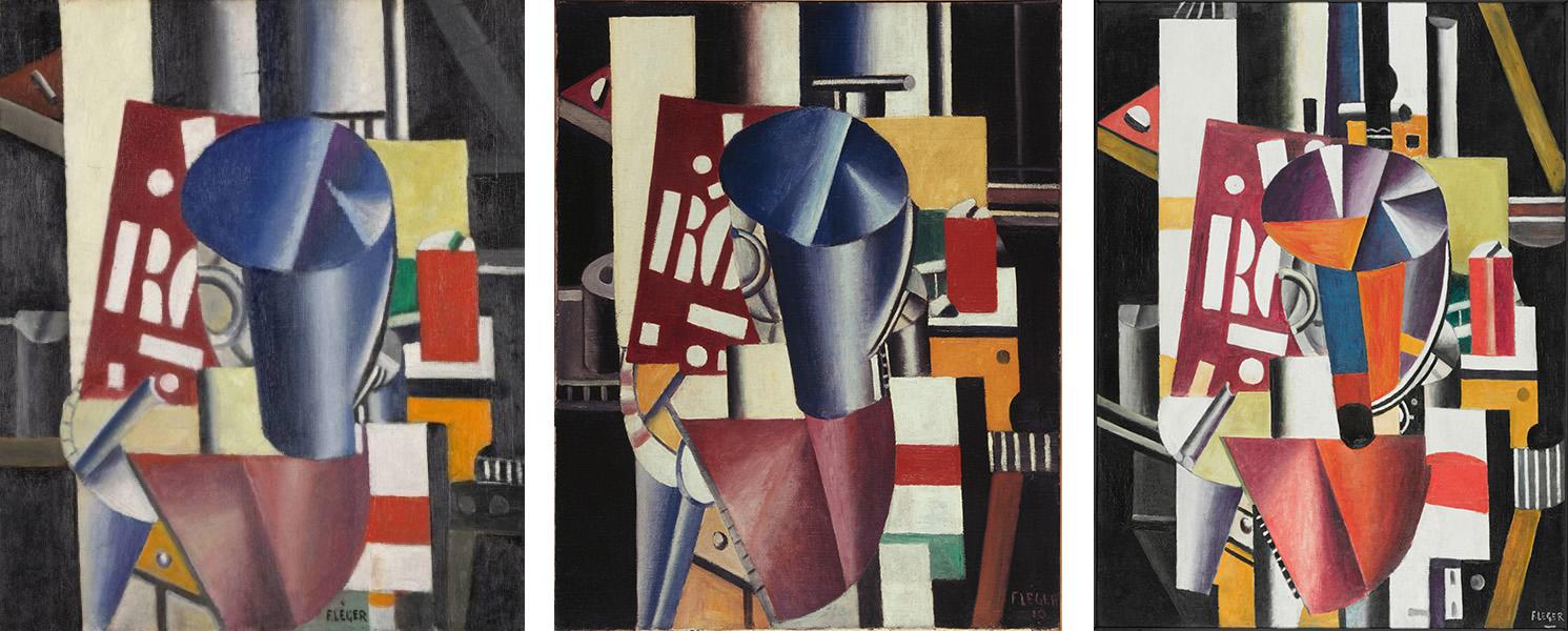
Left: Fernand Léger (French, 1881–1955). The Typographer, 1919, first state. Oil on canvas, 21 1/4 x 18 1/8 in. (54 x 46 cm). Collection Kröller-Müller Museum, Otterlo, the Netherlands. © 2026 Artists Rights Society (ARS), New York. Center: Fernand Léger (French, 1881–1955). The Typographer, 1919, second state. Oil on canvas, 31 7/8 x 25 1/2 in. (81 x 65 cm). bpk Bildagentur / Sammlung Moderne Kunst, Pinakothek der Moderne, Bayerische Staatsgemäldesammlungen, Munich, Germany / Art Resource, NY Inv. GV 16. © 2026 Artists Rights Society (ARS), New York. Right: Fernand Léger (French, 1881–1955). The Typographer, 1919, final state. Oil on canvas, 51 3/8 x 38 3/8 in. (130.3 x 97.5 cm). Philadelphia Museum of Art: The Louise and Walter Arensberg Collection, 1950-134-125 © Fernand Léger / Artists Rights Society (ARS), New York / ADAGP, Paris © 2026 Artists Rights Society (ARS), New York
The chronology of J’ai tué and La Fin du monde aligns tellingly with that of the first three paintings in the Typographer series, as shown by a receipt dated April 28, 1919, sent by Léger to Rosenberg listing seven paintings, their sizes (“figure”), and the prices to be paid for them. Included are: “Un tableau le typographe 60 figure, 800f”; “un tableau le typographe (1e état) 25 figure, 500 f”; and “un tableau “le typographe (esquisse) 10 figure 300 f.” The receipts sent to Rosenberg that precede this, dated February 1, 1918, and January 17, 1919, include no Typographer paintings. These receipts establish the likelihood that by April 28, 1919, Léger had finished the small picture (the size 10, 54 x 46 cm “esquisse,” or sketch) now in the Kröller-Müller Museum, Otterlo; the “2me état,” now in the Staatsgalerie Moderner Kunst, Staatsgemäldesammlungen, Munich (the size 25 figure, 81 x 65 cm); and the larger painting sometimes referred to as the état définitif, now at the Philadelphia Museum of Art (the size 60 figure, 130 x 97 cm). These three Typographer paintings were, therefore, painted between the beginning of January and late April 1919, probably in the months not long after Léger had worked with Cendrars on J’ai tué. They were finished before Léger began work on the La Fin du monde project, which was probably, as the Paris maquette indicates, by June 1919.
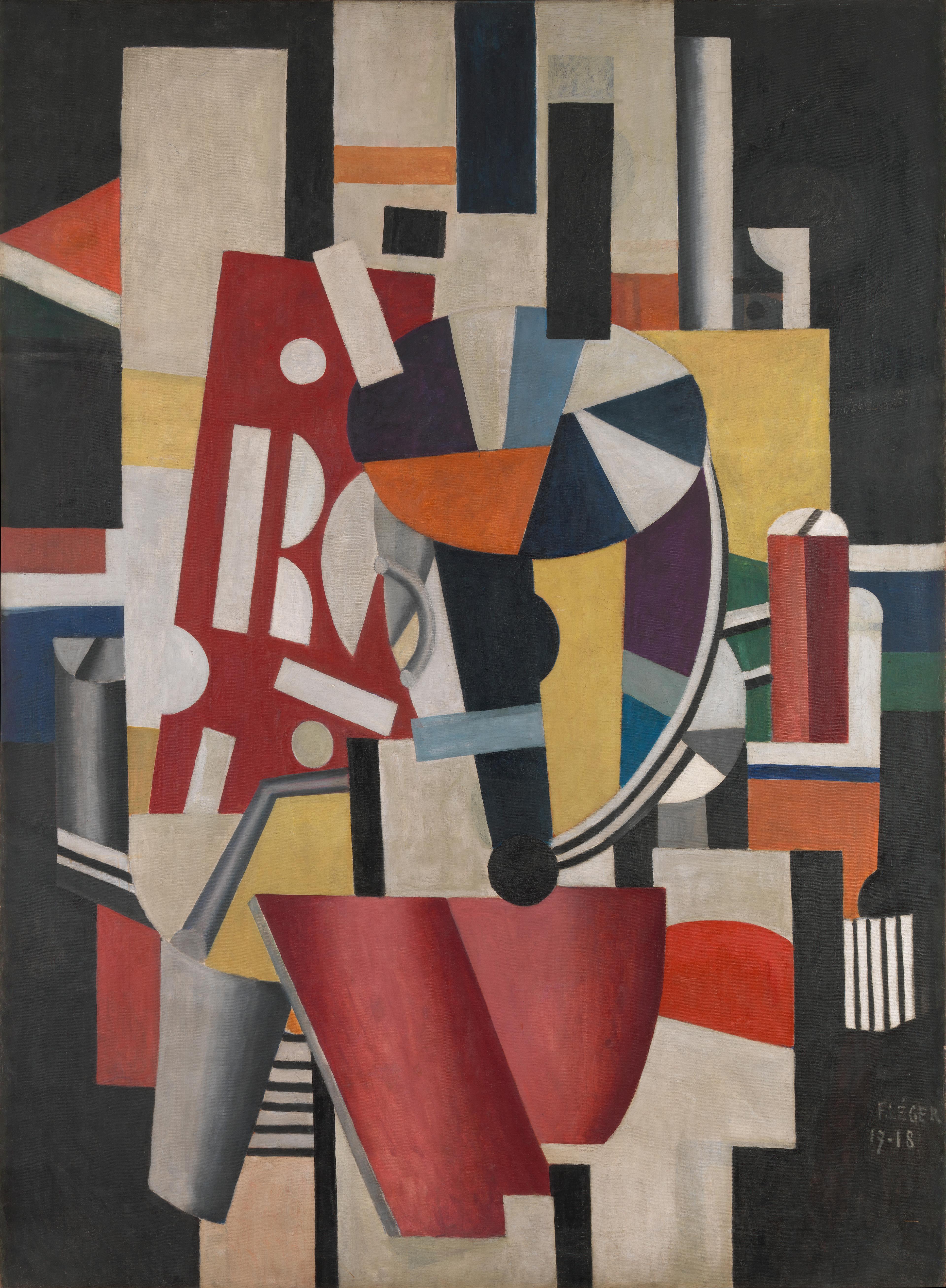
Fernand Léger (French, 1881–1955). Composition (The Typographer), 1918–19. Oil on canvas, 98 1/4 × 72 1/4 in. (249.6 × 183.5 cm). The Metropolitan Museum of Art, New York. Leonard A. Lauder Cubist Collection, Gift of Leonard A. Lauder, 2025. (2025.616.22). © 2026 Artists Rights Society (ARS), New York
As I have argued elsewhere, in pictorial terms the Philadelphia painting stands between the smaller Munich “2me état” and the much more planar and much larger picture in the New York collection of Leonard A. Lauder. In the latter, Léger edits details to simplifying effect and introduces hovering planes in the manner of interwar geometric abstract painting. The picture is now known simply as Composition. Léger dated this large scale version “17–18,” but this cannot be correct, given his method of working methodically from smaller états (states) through larger ones to états définitifs, which was fully in evidence through 1919, specifically in this series. Initially he wrote the title “Typographer” on the back of the New York picture, and only later, possibly when he sold it to Mary (Meric) Callery in the 1930s after reworking it, did he add the new title, Composition. The likelihood must be that the initial titling happened when the work was left as finished, probably in 1919 during the months following April 28, very possibly in the autumn or early winter. He may well have been working on it alongside the “compositions en couleurs” for La Fin du monde, which as the Paris maquette establishes would have been especially between September and the October 15 publication date of the book. If the typographer stage of this picture happened then, this hugely enlarged version would have been Léger’s first postwar attempt at a grand prestige painting with which to make his return to the progressive Salons. Ultimately he would decide on two other large-scale pictures, La Ville and Les Disques dans la ville, as his attention-grabbing statements at the Salon des Indépendants of 1920, the first after the war. He certainly painted it as a work he could promote and sell independently, its scale freeing it from the terms of the contract he had signed with Rosenberg.
As subject, the typographer clearly had an iconic place in his developing postwar idea of industrialized modernity and of the role he imagined the men who had survived the war could play in postwar reconstruction. Strikingly, in 1918–19, before Léger moved into classical figure painting, he took almost exclusively men as his figure painting subjects—the mechanic as well as the typographer. No female figures appear in his contributions to J’ai tué, and, besides the Angel with a trumpet heralding chapter 4, it is questionable whether any appear in La Fin du monde.
Just how often and directly Léger actually worked on the typography of La Fin du monde is unclear. The Paris maquette makes it clear that Cendrars probably made all or almost all the detailed typographic decisions and that he was closely involved in thinking creatively about highly contrasted font sizes, the placement of illustrations, and using the space of the page for typographic effect. Léger’s black and white drawings, however, which often use lettering, would certainly have put him in direct working contact with the typographers at Frazier-Soye, and the New York maquette shows him working for and with the artisans in the workshop of Richard, the colorist. We do not know who worked as typographers on the text and printing in black of the illustrations for La Fin du monde, but in 1952 Cendrars recalled both the identity of the typographer, employed by A la Belle Edition, with whom he worked on J’ai tué and how closely he worked with him to produce the final printing of the book in autumn 1918: Pere Creixams, a Catalan who later made a reputation as a painter. Cendrars says that they worked together into the early morning of November 8, 1918, to produce the final printed copies of the book, with Creixams supervising the press, inking and sliding the sheets under the roller while Cendrars corrected the proofs for typesetting.
The poet’s highly personal memory contrasts with Léger’s refusal to identify a particular individual or character as the subject of his typographer pictures. There is a foreshadowing here of his determination when writing about film to proof his painting against sentimental storytelling or anecdote. As he would argue in his response to Abel Gance’s film La Roue in 1922, he accepted that a story is told in the film, creating “an emotional state,” but reacts positively above all to how the “mechanical element” becomes the “lead actor” when it takes over the screen with a speeded-up rhythm “that crushes and eliminates the human object, reduces its interest, pulverizes it.” In the typographer series, the print worker disintegrates into pictorial elements whose contrasts and rhythmic combinations generate a visual experience, which Léger intended to rival as well as represent the visual experiences that most impressed him on his return to Paris after serving as a combatant.
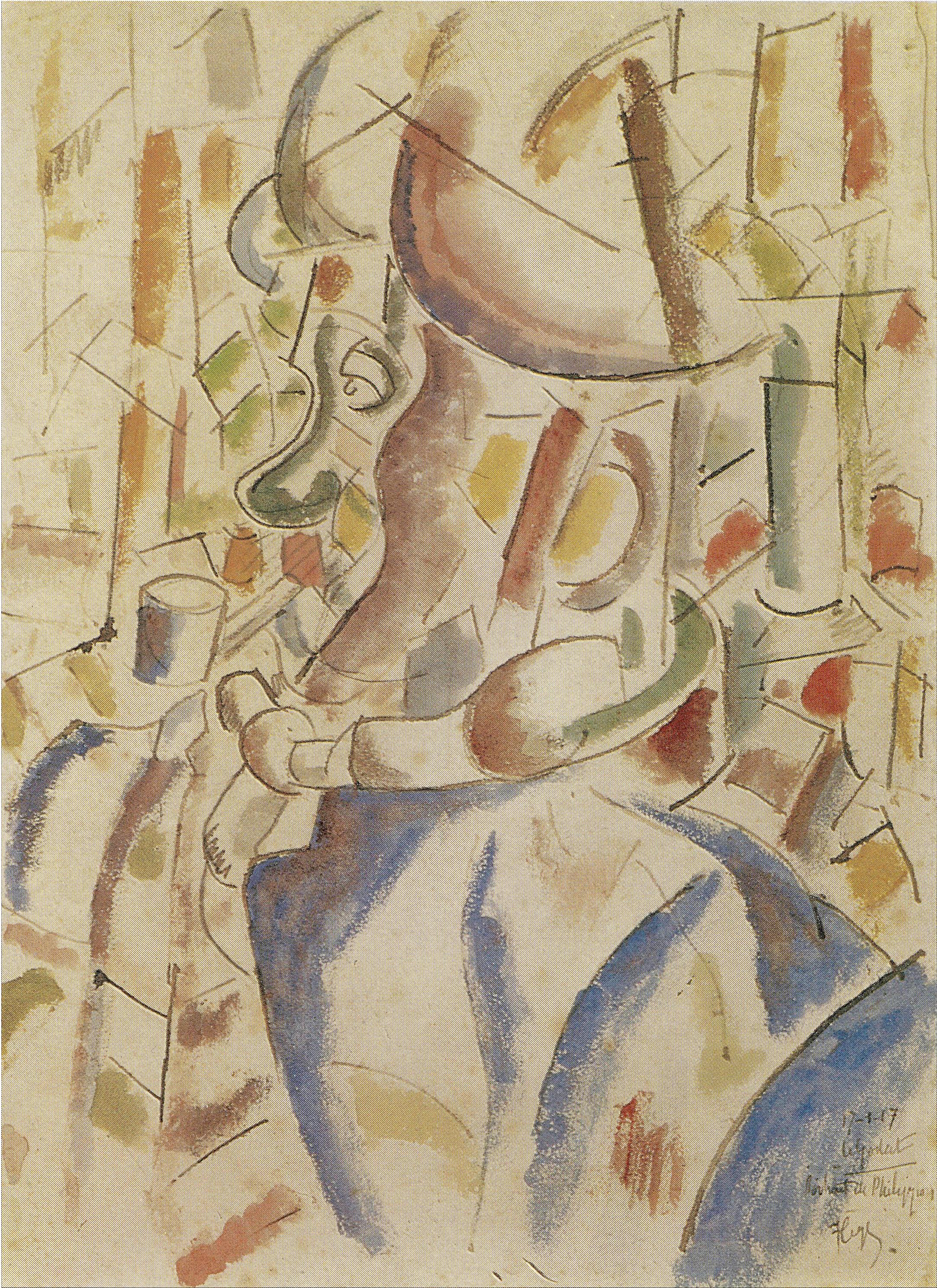
Fernand Léger (French, 1881–1955). Portrait de Philippon, January 1917. Pencil, brush and watercolor on paper, 14 x 10 1/2 in. (35.6 x 26.7 cm), location unknown. © 2026 Artists Rights Society (ARS), New York
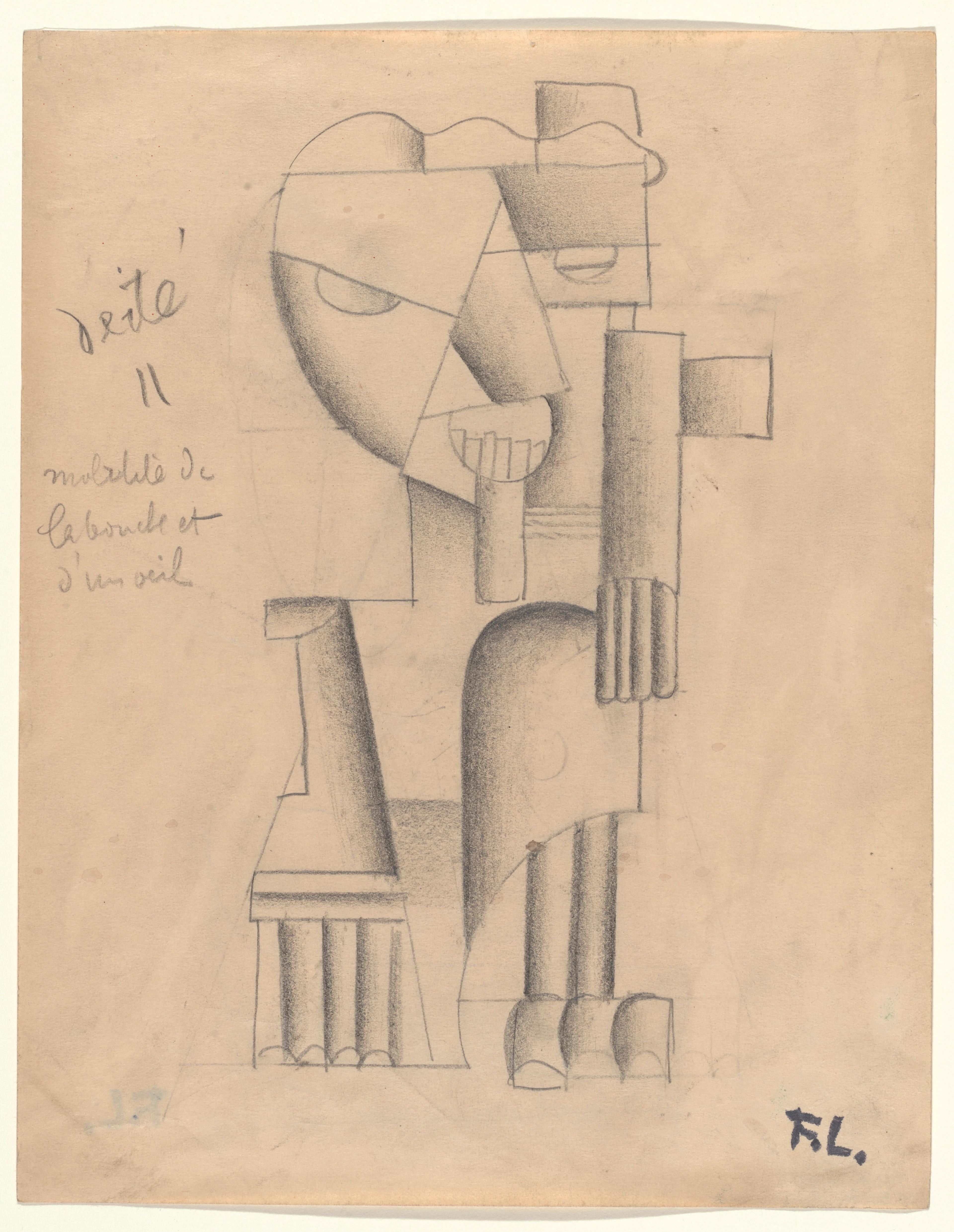
Léger may have thought later that the largest of the Typographers was painted in 1917–18 because the 1919 series has its origins in drawings made on the Front in Champagne in the freezing winter of 1917. One drawing with watercolor, which is especially clearly related to the Typographers, is inscribed “17-1-17 Le Godert, Portrait de Philippon”; it was made just a few months after Cendrars wrote his first draft of La Fin du monde. Its subject is a soldier companion, Philippon, who wears either a muffler to ward against the cold or a head bandage, which becomes the elliptical disk central to the Typographer paintings. Philippon’s ear and open tunic also become mechanical elements in all of them. The way Léger erased Philippon, the soldier, so that the typographer could take his place says something profound about how Léger separated the optimistic thrust of his peacetime work from his war experience. He not only made a peacetime icon out of a wartime companion, but he also eliminated the character Philippon in favor of what he later called the creation by combinations of mechanical elements of an état plastique that could represent the intense vitality he experienced visually in the working of machines—including printing presses run by typographers—and the life of the streets, especially where posters the size of buildings bombarded the eye. It is certainly possible that, as Jody Hauptman has suggested, Léger identified with the typographers while working on J’ai tué and La Fin du monde, but his commitment to making paintings that do without storytelling was strong enough for him to allow the energy —the “life”—generated by the “mechanical” and “plastic” elements deployed in the Typographer to take over from any “self” that might be associated with that subject, including his own. In the Philadelphia painting and especially in the largest in the series, the Leonard A. Lauder Collection picture, Léger takes us into something much bigger than a single identity or any imagined typographer. The sheer scale of Composition, with its billboard-like dimensions, keeps viewers at a distance as posters do, resisting detailed readings. Yet, simultaneously they are pulled into a limitless, teeming space. The typographer becomes the city.
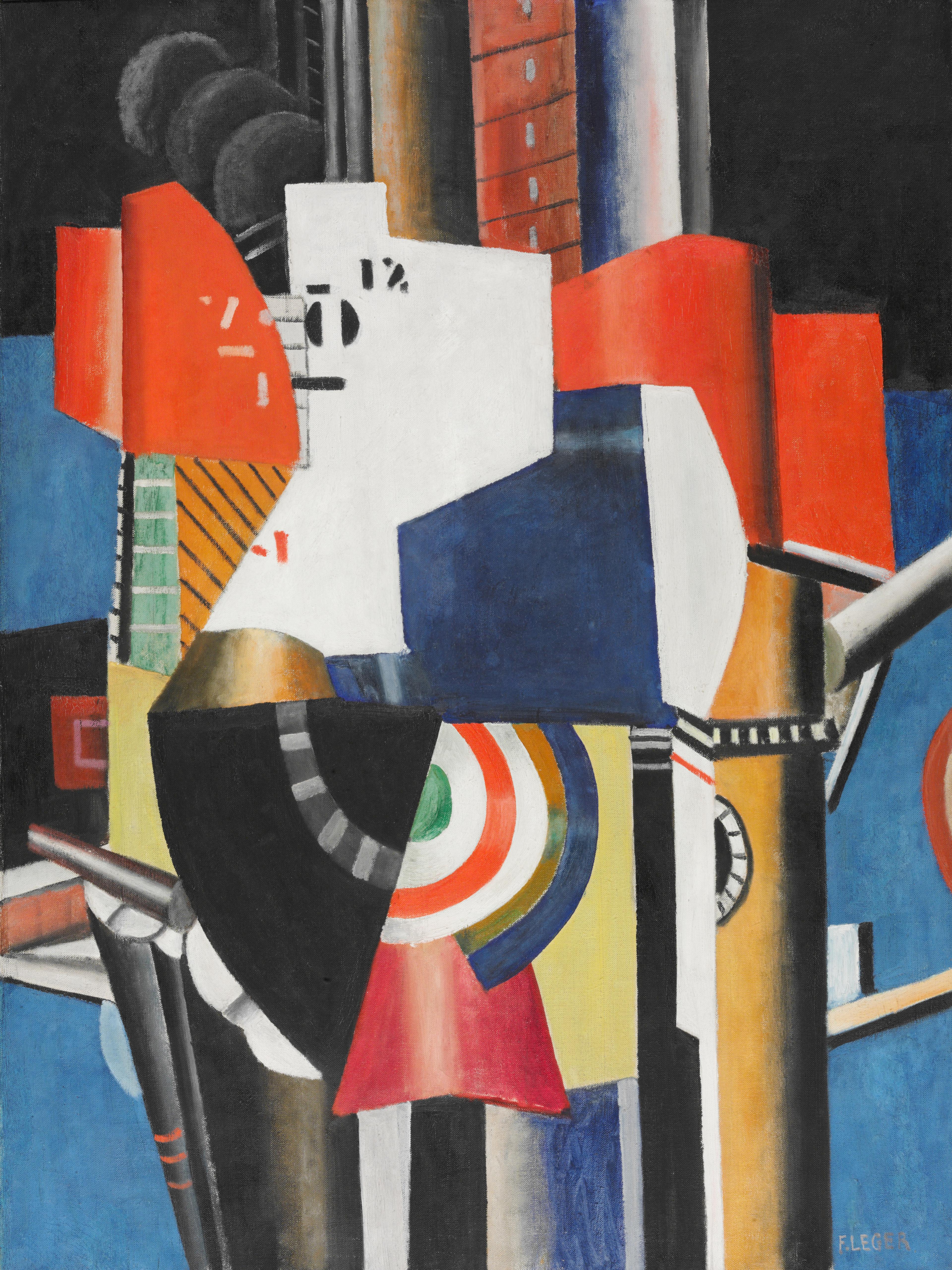
Fernand Léger (French, 1881–1955). La Ville, (fragment, third state), 1919. Oil on canvas, 51 1/8 x 38 1/4 in. (129.9 x 97.1 cm). Philadelphia Museum of Art: The Louise and Walter Arensberg Collection, 1950-134-124 © 2026 Fernand Léger / Artists Rights Society (ARS), New York / ADAGP, Paris
There is, in fact, a demonstrable relationship between the Typographer paintings and the early sketches and états of La Ville, which culminated in La Ville (fragment, 3e état), now in the Philadelphia Museum of Art. This series of studies on paper and paintings was probably produced late in 1919, when Léger was working on the large canvas that he retitled Composition, and when he and Cendrars were producing La Fin du monde. Just how he moved from the climax of the Typographer series to this new series and to the final La Ville cannot now be unravelled work by work, but it is clear that method and impulse were both involved, as he moved from smaller to larger états.
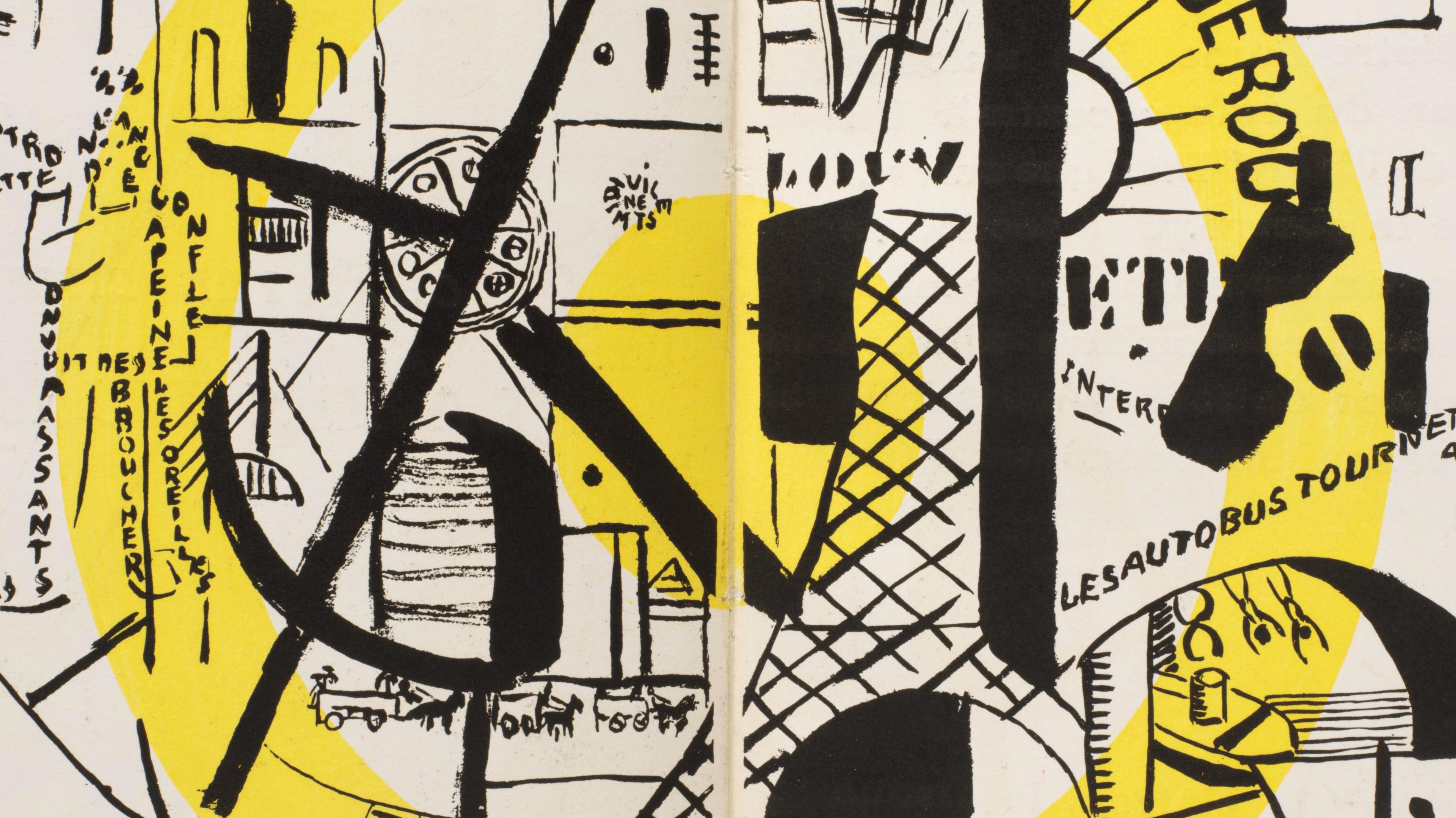
In La Fin du monde, printed lettering—typography itself—becomes a primary element. It becomes also a primary pictorial element in Léger’s painting between 1918 and 1920. There is one case of a prewar work that anticipates this. In 1914, Léger “drew” the objects of a still life using only type, printed and over-printed in violet ink using a stamp. To make the move he made in 1918–19, however, he needed the lived experience of working with the typographers, and in La Fin du monde especially he needed the experience of working with the artisans in the workshop of Richard, the colorist, to be able so freely to compose the lettering compositions for chapters 4, 6, and 7. With Frazier-Soye printing in black he would have seen how the moveable type was put together in the process of typesetting, the placing of the letters and the em and en “quads” (for spaces) to produce page images, formes. With Richard, he would have seen how the letters to be colored for his images and the inscriptions he added were cut to size and placed before the color was added by hand (the pochoir technique).
Fernand Léger (French, 1881–1955). Untitled, 1914. Colored ink, 11 x 8 1/2 in. (27.9 x 21.6 cm). Centre Georges Pompidou, Musée national d’art moderne, AM 1986-81. © 2026 Artists Rights Society (ARS), New York. Digital Image © CNAC/MNAM, Dist. RMN-Grand Palais / Art Resource, NY
Disintegration was a principle that went alongside dissonance in the making of all Léger’s visual work in 1918–19, but, of the two books, it has most impact in La Fin du monde, where it is not only representational elements that disintegrate. As letters are given primacy, words disintegrate. Individual impressions in J’ai tué might be given force by pictorial disintegration, but they are kept safely apart in their own compartments, drawn from Léger’s memories to resonate with Cendrars’s account of the dehumanized abstraction of the war and of his intensely personal memory of killing an enemy in action. What gives the “illustrations” for La Fin du monde their new forcefulness is that, in both the chapter opening frontispieces and double spreads and the lettering frontispiece compositions, they are not merely in dialogue with the text: they threaten to take over from it through their sheer visual impact, as they pull words and recognizable images apart. Figures, words, and elements lifted from Cendrars’s text slice each other apart and are scattered as fragments across the page space, much like the elements combined in the Typographer paintings. The fact that in the Paris maquette Cendrars tried out using together fonts of dramatically different sizes suggests that Cendrars, working with Léger, might have anticipated the challenge to the text created by giving letters primacy; the question is left unanswered: did he foresee the challenge to his text posed by Léger’s pugnacious visual interventions?
Unsurprisingly, the destructive compulsion that characterizes both Léger’s paintings of 1918–19 and his interventions in pages of La Fin du monde may have its origins in a war experience, his response in November 1916 to the bombardment and destruction of Verdun. Briefly away from danger, Léger found something positive in the trauma of destruction and death: the recuperative therapy of drawing the town in ruins. A letter written to Poughon reveals the role of these drawings in making disintegration a central feature of Léger’s immediate postwar painting: “Me, I’ve spent my 6 rest days producing drawings of Verdun. I adore Verdun . . . That old town in ruins, so impressively calm.” He has made, Léger tells Poughon, many drawings, which he has sent to Paris, hoping to “make an exhibition of my drawings of the Front. There’s Verdun in them.” He explains that “[there are] completely unexpected subjects, well adapted to revive my cubist soul . . . For example, you come upon a tree with a chair perched on top of it. It is the ‘académie du cubisme.’” By giving destruction so central a role, Léger again brings out the death/life confrontation to which he repeatedly returned in his war correspondence with Poughon. By pulling objects and individuals apart, he released the new paintings produced in 1918–19 from the dehumanizing, controlling grip of abstract calculation. They are impelled rather by what Léger experiences as the spirit and sense of purpose of a society rebuilding after massive loss—a return to life lived intensely—and yet they are also impelled by the memory of the “absolute destruction” Léger had seen the gunners achieve with such inhuman, calculating intelligence at Verdun.
That confrontation between destruction and life is present in “Construction,” the poem with which Cendrars celebrated Léger. “Construction" is the nineteenth of Cendrars’s Nineteen Elastic Poems (Dix-neuf poèmes élastiques), the only one of the poems that was written after the war. It is dated February 1919, the month of Léger’s exhibition at Galerie L’Effort Moderne. The poem places Léger in a world that is infused with life, where the machine, with the 75 mm field gun named, is alive, human:
The poem is an echo of the story Léger told Poughon in the letter of November 7, 1916, in which he recounts his night with a dead German soldier in the combat zone devastated by the “beautiful” 75 mm field gun, his emergence from the shell hole they shared, and his walk back to where there was life, where grass grew under the sun.
The contradiction between the impersonal and the intensely personal—integral to the paintings themselves and especially in the way image and text interact in La Fin du monde—is manifest in the very way Léger worked at this moment in making his paintings. He worked methodically from état to état and yet allowed himself an impulsive directness in the making of each état, which is visible in the coarse, handmade look he gave them. Even the états définitifs, including those on the grand scale of La Ville, have a handmade appearance when viewed closely.
This handmade look is least to be seen in the lettering compositions attached to chapters 4, 6, and 7 of La Fin du monde, but is evident in all the storytelling images in their final printed state: the double-page spreads for chapters 1, 2, and 5, and the left page (verso) frontispieces for chapters 3 and 4—those images that can accurately be called illustrations. It is most obviously and deliberately a feature in the chapter 5 double-page spread, which anticipates and insists on comparison with La Ville. The moon and Léger’s Angel with loudspeaker in that crowded illustration have precursors in the poems of Guillaume Apollinaire, beginning in 1914, where the poet arranges the words on the page so that they form images. A collection that included some of them was compiled with the title Calligrammes in 1918 and published by Mercure de France. As published, many were converted from handwritten to typeset, and so tidied up, but Apollinaire himself had published in 1915 and 1917 several whose printing preserved the direct immediacy of their making. It is certainly possible that Léger knew these, but especially likely that he knew “Horloge de demain,” a calligram composed in 1917 that was published in a magazine easily available in Paris, Francis Picabia’s Barcelona-based 391. As printed, it gives the impression of faithfully reproducing Apollinaire’s handwriting and drawing. Just as relevant, however, as Apollinaire’s calligrams to the look of Léger’s storytelling illustrations for La Fin du monde were certain ink drawings by Picabia himself, published in 391, that combine mechanistic structures and printed names and words, quickly added by hand. The handwriting of the words to form Léger’s Angel in the chapter 5 double-page spread is left untidy, as are many of the other words scattered across the composition, and indeed included in the other storytelling chapter openings too. The sure but careless hand that wrote most of the figure of the Angel sets the tone for the whole double-page spread. Every word, element, and Parisian scene-setting icon is quickly, messily written or drawn, even the upper-case letters that spell out, in part, “CHAPTER 5” and its title “LA FIN DU MONDE.” These latter may be stenciled, but if they are, Léger has cut the stencils roughly, leaving the look of the handmade, but with none of the crisp precision of professional work.
Francis Picabia (French, 1879–1953). Molécule, Reproduced in 391 no. 8 (February 1919). From the Spencer Collection, The New York Public Library. New York Public Library Digital Collections. © 2026 Artists Rights Society (ARS), New York
In the New York maquette, the double-page spread with which chapter 1 opens reveals how Léger was still willing at this late stage, with pencil in hand, to make small additions and changes in the shaping and placing of elements. In all the maquette studies, the color, gouache and watercolor, is applied directly and quickly. Care is not a priority. As in his painting, Léger moves methodically from stage to stage: in the case of La Fin du monde from the drawing stage to be printed in black to the color stage to be realized by pochoir, but he does not close himself off from the possibility of change until the illustrations are ready for printing.
There is a possibility that Léger’s decision to work so methodically from smaller, more unresolved états towards états définitifs during the period when he worked with Cendrars on J’ai tué and La Fin du monde was encouraged by the writer. In a text Cendrars dated “13 août 1917,” he outlines his method of developing a piece of writing:
In Léger’s case, even when “fixation” is achieved, he does not allow the work to look as if everything is completely under control. When he “finished” the monumental version of the typographer in the Leonard A. Lauder Collection and inscribed “Le Typographe” on the back of the canvas, it had still not achieved “fixation.” He would rework it and give the picture the new title it now has, Composition, years later.
Alternative modernisms: Léger, Cendrars, the Delaunays, and Thorvald Hellesen
At the heart of Léonce Rosenberg’s campaign to revive the Cubist movement at his Galerie L’Effort Moderne in 1918–19 were the artists Juan Gris, Jean Metzinger, and Jacques Lipchitz, whose work during this moment has been called “crystal Cubist.” Their emphasis on compositional order and on using Cubist codes in lucidly legible ways have been associated with what has been called a postwar “Call to Order” in French culture. It has been easy to see their Cubism as conforming to the “classical” image of the “French Tradition” promoted during the war and in its aftermath.
Despite the fact that Léger was a Galerie L’Effort Moderne painter, his and Cendrars’s postwar work is more easily seen as restoring continuity with the dynamic, simultanist picturing of modernity for which Robert and Sonia Delaunay, alongside Cendrars, had been recognized in 1913–14. Echoing Cendrars’s abrupt switches, most influentially in his long poem La Prose du Transsibérien et de la petite Jehanne de France (1913), between contrasting images drawn from different places, experiences, and memories, the prewar painting of Robert in particular brings simultaneously together iconic images from different Parisian spaces and experiences. Cendrars himself was the key link between their prewar painting and Léger. His writing between 1917 and 1919 often carried unmistakeable echoes of the Delaunays’ prewar paintings, in particular his prose piece Profond Aujourd’hui, written in 1917, the same year that he wrote La Fin du monde, published by A la Belle Ėdition, which would also publish J’ai tué the following year. Profond Aujourd’hui was illustrated with five drawings in a sharp-edged Cubist style by the Spanish artist Angel Zarraga. Léger would certainly have known that he was not the first artist to have worked on books with Cendrars. Most important as forerunner was the edition of La Prose du Transsibérien et de la petite Jehanne de France, published in 1914, for which Sonia made a color accompaniment printed by pochoir in a small edition. Dubbed “le premier livre simultanée” (the first simultaneous book), it unfolded like a map so that the “simultaneous” flow of words and colors could continue without a break. In La Fin du monde, the page divisions determine a successive appreciation of images and text rather than a continuous flow, but the brilliantly colored letters in Léger’s frontispieces for chapters 6 and 7 do not come together to form easily read words. They are not illustrations but, as color accompaniments for Cendrars’s text, are broadly comparable to Sonia’s for La Prose du Transsibérien. Their letters without words, working with and against each other as brilliant colored elements, ready readers for the chapters that follow: chapter 6 a narrative of the world destroyed, chapter 7 of its return.
Sonia Delaunay-Terk (French [born Ukraine], 1885–1979). La Prose du Transsibérien et de la petite Jehanne de France, 1913. Color stencil print (pochoir) with brush applied watercolor, gouache, and printing ink on four joined sheets of imitation Japan paper, accordion-folded, 78 1/2 × 13 7/8 in. (199.4 × 35.2 cm). The Metropolitan Museum of Art, New York. Gift of Merrill C. Berman, in celebration of the Museum’s 150th Anniversary, 2020 (2020.34.1) © Pracusa 20260426
The Delaunays still had not returned to Paris in 1919, when La Fin du monde was produced by Cendrars and Léger, but Cendrars had kept in touch with them throughout their period of self-imposed exile from France through the war. He had been in correspondence with them and had the key to their studio at 3, rue des Grands Augustins.
By October 15, 1919, and the publication of La Fin du monde, Léger, championed by Cendrars, was engaged in promoting a postwar alternative to crystal Cubism that looked forward, not back. Immediately after the publication of La Fin du monde, he made his first postwar trip outside France. On October 25th, just ten days after the publication of La Fin du monde, Léger was at the opening of an exhibition at the Tivoli Gallery in Kristiana (Oslo), Norway, for the first show of a new friend, the Norwegian painter Thorvald Hellesen.
Although Hellesen’s exhibition had a mixed reception, it drew considerable interest as Norway’s first exposure to Cubism. Léger, however, is quoted in the Norwegian press declaring that Hellesen, as Cendrars had said a few months earlier of his own work in the periodical La Rose rouge, was not to be taken as simply another Cubist. “Cubism,” Léger insists,
Briefly, in 1919–20, alongside La Fin du monde, the largest of the Typographer paintings and the development of the city as a theme, Léger presented his new work, with Hellesen’s, as an alternative Cubism, something new that was bigger than the work of one painter.
Before 1919, Hellesen had been a little-mentioned peripheral artist exploring Cubism but not exhibiting. Like Gris, Lipchitz, and also Angel Zarraga, he frequented the centers of wartime Parisian avant-garde activity, the Dôme and La Rotonde cafés, and by 1916 knew Picasso, as well as Apollinaire, Max Jacob, and the critic Pierre Reverdy, whose little magazine, Nord-Sud, founded in 1917, actively shaped debates around Cubism in Paris. Between 1915 and 1917–18 he was making pictures that were flat, lucidly coded, and orderly in ways that would have fitted in well if put alongside “crystal Cubist” work. He did not, however, need the monthly stipends that came with the contracts given by Léonce Rosenberg. Unlike other foreign artists in Paris working through the war with Cubist discoveries, he benefited from a wealthy circle of industrialists in neutral Norway who were his backers. His alliance with Léger extracted him from comfortable obscurity.
What happened in Hellesen’s painting in 1919 released him from the quiet constraints of crystal Cubism, and it happened because he took his painting into a sustained dialogue with the strident brilliance of Léger’s 1918–19 work. The dialogue between the two was probably at its most intense in the months between spring 1919 and early 1920. Cendrars himself brought Hellesen into a piece in the journal La Rose rouge in midsummer 1919, mentioning that he paints the propellor of a plane and an engine component, and likening his color to a gust of wind. By July, Hellesen was talking to Léonce Rosenberg about the possibility of a show at L’Effort Moderne and of a possible London exhibition, which would have preceded the Tivoli Kristiana show. Léger had begun to think of Hellesen’s painting as strong enough actually to rival his, as demonstrated by the pained tone and the content of a letter written that July to Rosenberg expressing his concern at hearing of Hellesen’s plan to show in London in September. The letter infers that Rosenberg was also planning to show Léger there, but not until later; Léger tells the dealer that he has decided to send a large painting (he does not name it) to “Mr Sitwell” in London, “in order to pair this with Hellesen, who I like a lot and who is one of my friends. But,” he adds, “this doesn’t keep me from feeling it is unpleasant to be the ‘rear guard’ in a race I’m forecast to ‘win’, does it? There’s a close relation especially between his latest works and mine.” He fears that if his painting is not seen with the Hellesen in London, it will seem as if Rosenberg has declared the Norwegian the winner.
Léger might have mentioned in the Norwegian press only Picasso and Braque as the Cubists he measured his and Hellesen’s alternative against, but with Braque, whom Léonce Rosenberg had taken on, it is especially from the “crystal Cubism”of Gris, Metzinger, and Lipchitz that their “alternative” is to be differentiated. Together, Hellesen and Léger made a real impact only in the few months between the October Hellesen exhibition in Kristiana and the February 1920 Salon des Indépendants. Following Léger’s exhibition at L’Effort Moderne in February 1919, the publication of La Fin du monde inevitably would have been thought of by Cendrars and Léger as part of their campaign for an alternative Cubism. At the Salon des Indépendants, when Léger showed La Ville and Les Disques dans la Ville, Hellesen showed six pictures, Peintures I–VI. Their paintings, taken together, declared an unqualified optimism for the future of a world committed to mechanization and modernity despite the de-humanization of mechanized murder that had made such an impression on Cendrars in Champagne and Léger at Verdun.
Hellesen’s confidence in modernity followed from his personal relationships with entrepreneurs who were mechanizing Norwegian industry as it expanded, profiting from Norway’s neutrality. Léger’s fascination with American big business, which he shared with Cendrars, found an echo on his Norwegian trip, and there is evidence that his response was not necessarily qualified by the debunking tone set in La Fin du monde by Cendrars’s war profiteer God the Father. One of Hellesen’s industrialist backers, Halver Schou, had Léger to stay in his palatial villa when he was in Kristiana. Léger’s return to modern subjects in his painting may have been driven by his determination to make his pictures speak to the workers and peasants he had served with on the front, but in a letter dated October 31, 1919, to Ragnor Hoppe, the director of the National Museum in Stockholm, he expresses nothing but admiration for the world of this Norwegian magnate: “These are very rich people with several automobiles and living in an old house in a very old and interesting Norwegian style. They see all high Norwegian society, and I think that your trip here will be most enjoyable.”
Left: Thorvald Hellesen (Norwegian, 1888–1937). Composition, 1919. © Eckbo Foundation. Photo: Børre Høstland/Nasjonalmuseet. Right: Thorvald Hellesen (Norwegian, 1888–1937). Peinture, 1920. Oil on canvas, 58 4/5 x 58 4/5 in. (57.7 x 157.7 cm). Musée d'art Moderne de la Ville de Paris, AMVP 2195
Only two of Hellesen’s paintings are securely dateable to 1919. One of them, now known simply as Composition (National Museum, Oslo), not only sets in rotating motion flattened variants of the cones and cylinders, rods and pistons of Léger’s 1918–19 machine element paintings, but also introduces lettering as if stenciled from a very bold typographer’s font of the kind Léger used in the Typographer paintings alongside J’ai tué and La Fin du monde. It was probably shown in the Tivoli exhibition. The other, which is still titled Peinture (Musée d’art moderne de la Ville de Paris), was probably one of the six Peintures shown at the 1920 Salon des Indépendants; it deploys a comparably Léger-like array of machine elements, to which are added ball-bearing motifs of Hellesen’s own. The Hellesens are saved from being merely Léger pastiches by their total refusal of modeling, their distinctive color contrasts, and their upfront abstraction, which is underlined by the refusal of any title but Peinture. They are also more conspicuously immaculate in their facture. The return to easily read “real” objects, figurative fragments, mechanical elements, and Paris or city icons so central to Léger’s new work, and so prominently present in the legibility and directness of his compositions for Chapters 1, 2, 3, and 5 of La Fin du monde, played no part in Hellesen’s alternative Cubism. His surviving Peinture of 1919, probably shown at the 1920 Salon des Indépendants, attracted the attention that year of Theo van Doesburg in De Stijl, the periodical he founded in The Netherlands to promote abstraction across the visual arts. Van Doesburg illustrates it and mentions both Hellesen and Léger as “potent personalities, operating with primary color constructions,” but distinguishes Hellesen in particular from “the colorless French Cubism.” The Norwegian’s upfront commitment to abstraction and the uncompromising flatness of his painting encouraged Van Doesburg to give him precedence and to reproduce a work of his, not Léger’s.
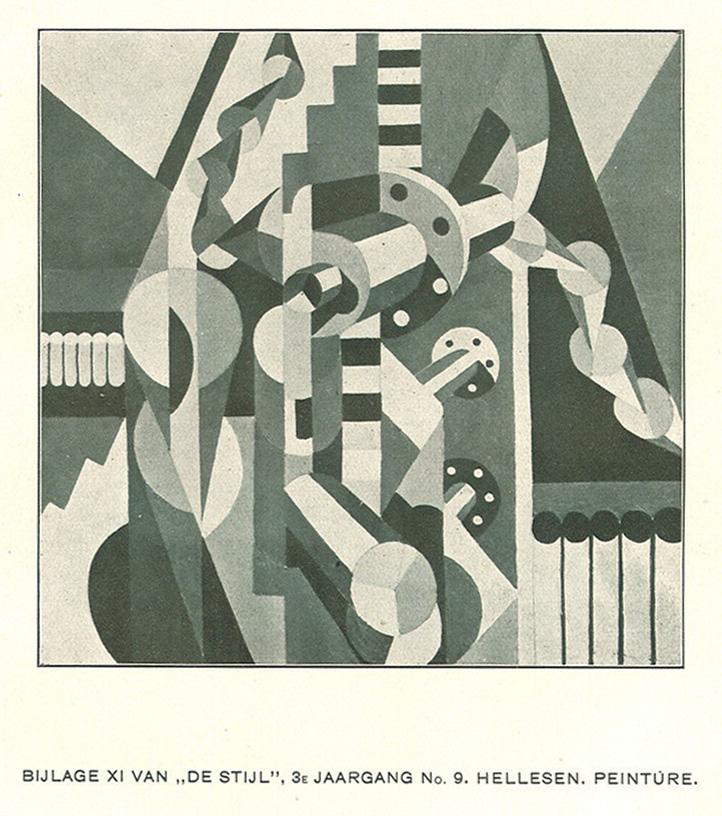
Thorvald Hellesen (Norwegian, 1888–1937). Peinture, 1920, as reproduced in De Stijl vol. 3, no. 9, p. 80a
Léger and Hellesen may have consciously challenged the “crystal Cubism” at the heart of Léonce Rosenberg’s L’Effort Moderne, but the dealer’s interest in Hellesen in 1919 was real, and his support for Léger was unflagging, lasting into the 1920s. Cubism, for him, had ample room for alternatives.
La Fin du monde and avant-garde populism: Advertising, cinema, and the book
Cendrars’s and Léger’s decision to print 1,200 copies of La Fin du monde on relatively low quality paper allowed a price to be set per copy of 20 francs for the main printing of the book, which put it in reach of an unusually wide readership in 1919–20. Cendrars and Sonia Delaunay’s edition of Cendrars’s La Prose du Transsibérien et de la petite Jehanne de France (1914) with Sonia’s color accompaniment was expensively produced and printed, sold exclusively by subscription, and many fewer than the 150 copies planned for it could be printed. Except for the deluxe edition de la tête, La Fin du monde was not a book issued to be hidden away in the collections of bibliophiles or consulted in libraries; it was written and presented as an entertainment with a wide range of associations: religious, anti-religious, idolizing of the modern, anti-capitalist, Parisian, transnational, transcultural. Cendrars and Léger’s hope was that, published this way with Léger’s “compositions en couleurs,” it could reach a different kind of market, more inclusive of the public for popular culture as well as picture-buying connoisseurs in the know.
Cendrars’s creation of La Fin du monde on that mythic night of September 1, 1917, was the beginning of his move as a writer from poetry exclusively for a progressive readership into a much more populist cultural world. J’ai tué, with its attention-grabbing combination of extreme violence and intensely relived autobiography, was also part of the move, and so would be the collection of African stories brought together in his Anthologie nègre, published by Ėditions de la Sirène in 1921. The transnational, transcultural character of La Fin du monde shows Cendrars very much aware of social and cultural mixing through travel and migration as a diversifying force. Léger would also respond to this dynamic when he collaborated with the Ballet Suédois in 1923 to produce the designs for La Création du monde, the ballet inspired by Cendrars’s Anthologie nègre, as a positive, primitivizing antidote to the apocalyptic theme of La Fin du monde. Léger’s costume designs amounted to a visual anthology of African sculpture types. From a twenty-first-century perspective, the Anthologie and the ballet are, however, acts of appropriation as well as of recognition, as are Léger’s “African” costume designs, and, as we have seen, God the Father’s servant in La Fin du monde, Ménélik, as Léger presents him, is a crude Black stereotype.
Fernand Léger (French, 1881–1955). Deity, costume design for the ballet La Création du monde (The Creation of the World), 1922. Pencil on paper, 10 3/4 x 8 3/8 in. (27.3 x 21.0 cm). Museum of Modern Art, New York, Gift of R.L.B. Tobin. 314.1980. © 2026 Artists Rights Society (ARS), New York
Cendrars’s active interest in film, which deepened with his involvement with Abel Gance, was very much a part of this drive to open up progressive high culture to a more diverse public; Hellesen, too, was highly responsive to popular culture and would move into working in the performing arts in the 1920s. Cinema and the cinematic in relation to La Fin du monde are addressed in Lauren Rosati’s essay on Léger’s paper cinema. Advertising is another ingredient in early twentieth-century popular culture that deserves notice here. The way that letters and lettering command attention in La Fin du monde and the Typographer paintings was a direct response to the impact of advertising on both Cendrars and Léger. The expanded public that they imagined as the readership of La Fin du monde included those the messages of advertising were aimed at, as well as those who consumed fantastic stories that took the imagination into Space, and who went to the cinema.
The dissonant impact of posters in the countryside is the key theme of a lecture Léger published in 1914, in the journal Les Soirées de Paris. In 1918 the publisher of La Fin du monde, Ėditions de la Sirène, produced Cendrars’s long poem Le Panama, ou les aventures de mes sept oncles, in which, as in the case of La Fin du monde, Cendrars made key typographic and, in this case, design decisions, including using sections of the mapped route of the Union Pacific Railroad as dividers between parts of the poem. Eric Robertson has drawn attention to the fact that Cendrars also designed the cover, which repeats the small-scale advertisement for the company used as the cover of its timetable. He replaces the logo of the Union Pacific Railroad with “Blaise Cendrars,” overprinted with the announcement: “ou les aventures” (or the adventures). Like the timetable, which was folded in two, the badge is duplicated. Cendrars and Léger responded to both small-scale advertising copy like this and building-sized posters—billboards—but, looking back at the period when La Fin du monde was made into a book, and when Léger’s La Ville was painted, it is billboards that they especially remembered.
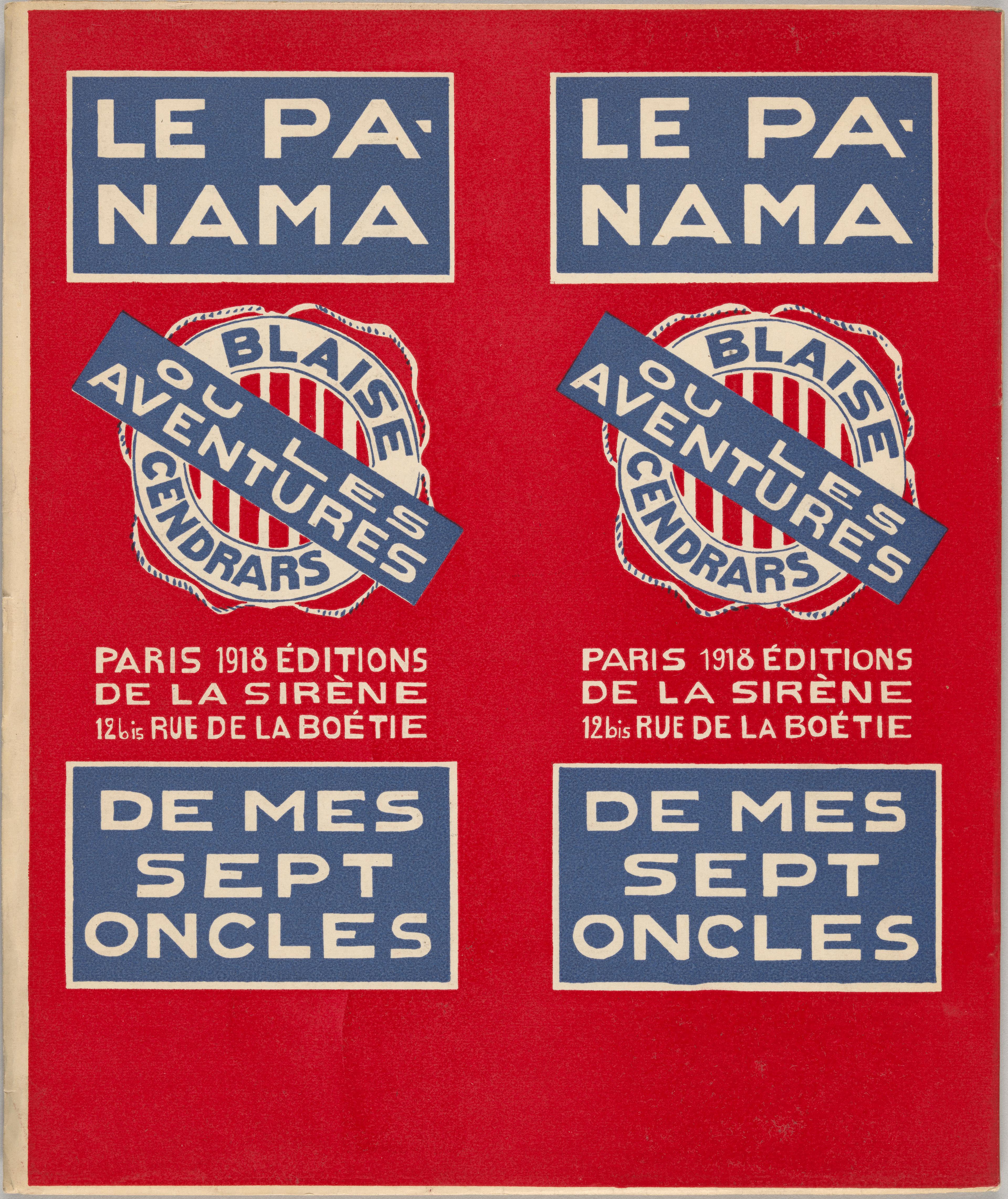
Blaise Cendrars (Swiss, 1887–1961). Cover for Le Panama, ou les aventures de mes sept oncles, 1918. Les Éditions de la sirène, Paris. The Morgan Library & Museum, New York
In a conversation recorded in 1954 involving Léger and his post-1945 dealer Louis Carré, Cendrars brings in La Ville and is reminded of the impact of billboards on him and Léger. “The City,” he says, “it’s very important. One wandered Paris; one met in the most varied corners, often on the Place Clichy. That’s why I go back, myself, to The City.” He goes on to remark that in The City, even the distribution of colors in the composition and the “extraordinary colors” themselves, “were those of the place Clichy. Do you remember that this was where there were the biggest of Paris’s posters?” Léger answers, “Yes, it’s the birth of advertising, isn’t it ?”
It is clear that cinema and advertising provide contexts for how Cendrars and Léger aimed to popularize modernism and diversify the market for La Fin du monde. Yet there was in their pursuit of an expanded market more than a hint of ambivalence. After all, twenty-five deluxe copies, exemplaires de tête, of La Fin du monde were printed as well as the 1200 copies for those with more limited means. The deluxe copies are still sought after by bibliophiles and command high prices. Moreover, Léger was an adept marketer of his work. His decision to exhibit at the Salon des Indépendants of 1920 only the huge La Ville and Les Disques dans la ville, shows him, independently of Rosenberg, aware of the boost to the market for his paintings that could be given by outsized exhibition statements because of the press response they attracted. The last Salon des Indépendants before the War, with for instance Robert Delaunay’s Homage à Blériot (Kunstmuseum Basel) and Sonia Delaunay’s Prismes électriques (Musée National d’art moderne, Centre Georges Pompidou, Paris) had provided a demonstration of how the spectacular on a grand scale could attract progressive critical as well as popular press attention. Léger wanted both elite buyers and a more diverse public for his painting.
But the wish to connect with as wide a public as possible was deep and real. It comes across in Cendrars’s L’ABC du cinéma. Cinema, for him here, is “captured life. Life of the depths.” He writes, “The least pulsation germinates and bears fruit. Crystallizations come to life. . . . And this is not some abstract, obscure, and complicated symbolism, it is part of a living organism, that we startle, flush out, pursue, and which has never been seen before.”
Notes
Eric Robertson cites Claude Louis-Combet as the source of this term for Cendrars’s writing. Claude Louis-Combet, Ecrire de langue morte (Rennes: Editions Ubacs, 1985), 41; cited in Eric Robertson, Blaise Cendrars: The Invention of Life (London: Reaktion, 2022), 9.
Cendrars’s complete works are published in fifteen volumes as Tout autour d’aujourd’hui, abbreviated hereafter as TADA. For the 1916 reference, see Blaise Cendrars, L’Homme foudroyé (1945), in TADA, vol. 5, ed. Claude Leroy (Paris: Denoël, 2002), 232; for 1917, see Blaise Cendrars, Le sans-nom, in TADA, vol. 5, 394–95. The manuscript in which Cendrars identified his thirtieth birthday as the date of creation is dated by Leroy “vers 1935.” Cendrars, L’Homme foudroyé, 232.
“Ma plus belle nuit d’écriture” (my translation). Blaise Cendrars, L’Homme foundroyé, in TADA, vol. 5, 232.
“Sans une rature, et sans avoir à chercher les mots”; “le canon du front . . . comme un grondement souterrain” (my translations). Blaise Cendrars, Le sans-nom, in TADA, vol. 5, 394–96.
Blaise Cendrars, “Pro Domo: Comment j’ai écrit Moravagine,” in TADA, vol. 7, ed. Jean-Carlo Flückiger (Paris: Denoël, 2001), 230–31.
See Guillaume Apollinare, The Cubist Painters, trans. Peter Read (Forest Row, East Sussex: Artists Bookworks, 2002), and in particular Read’s essay, “Apollinaire and Cubism,” 12–17; for Cendrars, see Eric Robertson, Blaise Cendrars: The Invention of Life (Chicago: University of Chicago Press, 2022); for Léger, seeMatthew Affron, “Léger’s Modernism: Subjects and Objects,” in Carolyn Lanchner, ed., Fernand Léger, exh.cat. (New York: Museum of Modern Art, 1998).
Blaise Cendrars, “Le Film de la fin du monde,” Mercure de France, December 1, 1918, 419–30.
For Léonce Rosenberg, see Giovanni Casini, Léonce Rosenberg’s Cubism: The Galerie L’Effort Moderne in Interwar Paris (Philadelphia: Pennsylvania State University Press, 2023).
“Cendrars de sa voix aux multiples appels a lu son J’ai tué et le poème était le poète lui-même. Tragique, énergetique” (my translation). Christian Derouet, “Blaise Cendrars et ‘L’Effort moderne,’” in Cendrars, Le Bourlingueur des deux rives, ed. Claude Leroy and Jean-Carlo Flückiger (Paris: Armand Colin, 1995), 68.
Bénédicte Duvernay, “Fernand Léger: peinture, poésie et ‘vie moderne,’” (PhD diss., Ecole des hautes études en sciences sociales de Paris, 2017), 208–11.
“C’est le ‘on’ impersonnel de la masse des soldats” (my translation). Duvernay, “Fernand Léger,” 209.
“Respiration d’un million d’hommes. Pulsation sourde” (my translation). Cendrars’s complete works are published in fifteen volumes as Tout autour d’aujourd’hui, abbreviated hereafter as TADA.Blaise Cendrars, J’ai tué, in TADA, vol. 11, ed. Claude Leroy (Paris: Denoël, 2005), 11
“Il y a des locomotives dans l’air, des trains invisibles, des téléscopages. . . . de miaulement fou du 75” (my translation). Cendrars, J’ai tué, in TADA, vol. 11, 14.
“Me voici l’eustache à la main. C’est à ça qu’aboutit toute cette immense machine de guerre. . . . J’ai bravé la torpille, le canon, les mines, le feu, les gaz, les mitrailleuses, toute la machinerie anonyme, démoniaque, systématiquement aveugle. Je vais braver l’homme. Mon semblable. Un singe. . . . Je saute sur mon antagoniste. Je lui porte un coup terrible. La tête est presque décollée. J’ai tué le Boche. J’étais plus vif et plus rapide que lui. Plus direct. J’ai frappé le premier. J’ai le sens de la réalité, moi, poète. J’ai agi. J’ai tué. Comme celui qui veut vivre” (my translation). Cendrars, J’ai tué, in TADA, vol. 5, 15–16.
Christian Derouet, ed., Fernand Léger: Une Correspondance de Guerre à Louis Poughon, 1914–1918, Les Cahiers du Musée national d’art moderne, Hors Série/Archives (Paris: Centre Georges Pompidou, 1990).
Fernand Léger to Louis Poughon, October 25, 1916, in Derouet, Une Correspondance de Guerre, 63.
“Formidable, intelligente, frappant partout où il faut, désespérante par sa régularité” (my translation). Léger to Poughon, November 7, 1916, in Derouet, Une Correspondance de Guerre, 68.
“Les artilleurs doivent être satisfaits. Ils sont arrivés à un résultat absolu. Rendre non viable une zone de terre déterminée en détruissant absolument tout dans un profondeur de 3 mètres”; “On vit avec les morts en bon camarade” (translations mine). Ibid., 68 and 70.
“Des places sur la terre où il y avait un peu d’herbe! Et puis des arbres où il y a quelques branches. Alors, mon vieux, l’angoisse morale disparaît, et ça permet de goûter la vie intensément comme des enfants” (my translation). Ibid, 70.
Fernand Léger to Léonce Rosenberg, December 6, 1917, ms 6, in Christian Derouet, ed., Fernand Léger: Une Correspondance d’affaires, Les Cahiers du Musée national d’art moderne, Hors Série/Archives (Paris: Centre Georges Pompidou, 1996), 22.
“Me voilà tranquille pour l’après-guerre” (my translation). Fernand Léger to Louis Poughon, December 7, 1916, letter 42, in Christian Derouet, ed., Fernand Léger: Une Correspondance de Guerre à Louis Poughon, 1914–1918,Les Cahiers du Musée national d’art moderne, Hors Série/Archives (Paris: Centre Georges Pompidou, 1990), 84.
Contract between Léger and Rosenberg, signed and dated August 1, 1918, ms 34, in Derouet, Une Correspondance d’affaires, 35.
Receipt for works purchased by Rosenberg, December 5, 1917, ms 4, in Derouet, Une Correspondance d’affaires, 22.
Léger to Rosenberg, December 6, 1917, ms 6, in Derouet, Une Correspondance d’affaires, 22.
“Pour moi, c’est un moment critique. Si je sors je pourrai peindre, je pourrais travailler. Mon horizon s’arrête là” (my translation). Léger to Rosenberg, January 9, 1918, ms 13, in Derouet, Une Correspondance d’affaires, 24.
Léger to Poughon, December 7, 1917, letter 42, in Derouet, Une Correspondance de guerre, 84.
Léger to Rosenberg, April 28, 1919, ms 49, in Derouet, Une Correspondance d’affaires, 49.
Christopher Green, “Fernand Léger’s Multiplicative Vision for a ‘Post-War Generation,’” in Cubism: The Leonard A.Lauder Collection, ed. Emily Braun and Rebecca Rabinow (New York: The Metropolitan Museum of Art, 2014), 319n28.
Ibid, 202–4.
It is possible that a mother and child are in the back of one of the carts depicted in the double spread for chapter 5.
Blaise Cendrars, “Blaise Cendrars vous parle,” in TADA, vol. 15, ed. Claude Leroy (Paris: Denoël, 2006), 185.
Italics in original. Fernand Léger, “A Critical Essay on the Plastic Quality of Abel Gance’s Film The Wheel (1922),” in Functions of Painting, trans. Alexandra Anderson, ed. Edward F. Fry (New York: Viking Press, 1973), 20.
For a fuller discussion of this work on paper, see Christopher Green, Leger and the Avant-Garde (New Haven: Yale University Press, 1976), 153–56. Its present whereabouts are unknown.
Jodi Hauptman, “Imagining Cities,” in Fernand Léger, ed. Carolyn Lanchner, exh. cat. (New York: Museum of Modern Art, 1998), 81.
For twelve of this series of studies on paper and paintings in oil, including La Ville (fragment, 3e état), see Anna Vallye, ed., Léger: Modern Art and the Metropolis, exh. cat., Philadelphia Museum of Art, 2013–14 (New Haven: Yale University Press, 2013), 91–97.
“Moi, j’ai passé mes 6 jours de repos à produire des dessins de Verdun. J’adore Verdun. . . . Cette vieille ville toute en ruine avec son calme impressionnant”;“faire une exposition de mes dessins du Front. Il y a dans ce Verdun; des sujets tout à fait inattendus et bien faits pour réjouir mon âme cubiste. . . . Par exemple, tu découvris un arbre avec une chaise perchée dessus. . . . Verdun autorise toutes les fantaisies picturales” (my translations). Léger to Poughon, November 23, 1916, letter 30, in Derouet, Une Correspondance de guerre, 72.
Blaise Cendrars, “Construction,” in Blaise Cendrars: Complete Poems, trans. Ron Padgett (Berkeley: University of California Press, 1992), 80.
My thanks to Peter Read, who has given me in detail the necessary information concerning the wartime publication of Apollinaire’s calligrams in handwritten form. “1915,” “Carte postale,” “Madeleine,” and “Venu de Dieuze” were all printed as handwriting in Case d’armons, which was published at the front in a tiny edition of only twenty-five copies in June 1915. Other calligrams printed in handwritten form were published in a catalogue written and designed by Apollinaire for the exhibition of works by Léopold Survage and Irène Lagut in January 1917. See Peter Read, Apollinaire: Lettres, Calligrammes, Manuscrits (Paris: Textuel, 2016), 224–27.
391, no.4 (Barcelona, 25 March 1917), 5. Publication was actually significantly later than this date, given that Apollinaire was seriously wounded on the front on March 17, 1917. Apollinaire’s original version of “Horloge de demain” is reproduced with the calligram as published. Ibid, 231 and 233. In fact, Picabia was not faithful to Apollinaire’s version: he added sweeping curves in opaque metallic grey gouache, in part forming a heart.
“Mes manuscrits passent par trois états:
1e un état de pensée: je vise l’horizon, je trace un angle déterminé, je fouille, je happe les pensées au vol et les encage toutes vivantes, pêle-mêle, vite et beaucoup: sténographie;
2e un état de style: sonorité et images, je trie mes pensées, je les caresse, je les lave, je les pomponne, je les dresse, elles courent harnachées dans la phrase: calligraphie;
3e un état de mot: correction et souci du détail neuf, le terme juste comme un coup de fouet qui fait se cabrer la pensée de surprise: typographie.
Le premier état est le plus difficile: formulation; le deuxième, le plus aisé: modulation; le troisième, le plus dur: fixation.”
(My translation.) Blaise Cendrars, “Comment j’ai écrit Moravagine,” in Cendrars, TADA, vol. 7, ed. Jean-Carlo Flückiger (Paris: Denoël, 2001), 233.
The metaphor of the crystal was first used, not specifically to apply to the Cubism of 1916-19 but more to that of Picasso and Braque in 1912, by Amédée Ozenfant and Charles-Edouard Jeanneret (Le Corbusier) in “Vers le crystal,” L’Esprit Nouveau, no. 25 (July 1924). I apply it to wartime Cubism, having coined the term “crystal cubism” in Christopher Green, Léger and the Avant-Garde (New Haven and London: Yale University Press, 1976), 130–31.
The fullest and most influential treatment of “the Call to Order” is Kenneth E.Silver, Esprit de Corps: The Art of the Parisian Avant-garde and the First World War, 1914–1925 (London: Thames & Hudson; Princeton University Press, 1989). For crystal Cubism and ‘the Call to Order,” see Christopher Green with a contribution by Neil Cox, Cubism and War: The Crystal in the Flame, exh.cat. (Barcelona: Museu Picasso, 2016–17).
See especially Robert Delaunay’s l’Equipe de Paris (1913, Musée d’Art Moderne de la Ville de Paris).
The plan was to publish only 150 copies, but it was sold by subscription, and many fewer were actually printed.
The fact that the Delaunays were in touch with Cendrars and had the key to their studio was confirmed by Sonia Delaunay in answers to a questionnaire sent to her. See Christopher Green, Léger and the Avant-garde (New Haven: Yale University Press, 1976), 330n19.
For Hellesen, see Thorvald Hellesen. Kubistisk Pioner/Pioneering Cubism, exh. cat. (Oslo: Nasjonalmuseet, 2023), especially the essays by Ingvild Krogvig, “An Incorrigible Cubist,” 109–18; and Christopher Green, "Thorvald Hellesen: War-time Cubism and Post-War Alliance with Fernand Léger,” 119–23.
Blaise Cendrars, “Modernités 1, Quelle sera la nouvelle peinture?” La Rose rouge (May 3, 1919), 53–54; see “Aujourd’hui” (1931), in Cendrars, TADA, vol. 11, 53.
“Malerkunst, dynamit o gen tilgivelig misforstaaelse,” Tidens Tegn, October 28, 1919; cited in Hilda March, “Thorvald Hellesen and L’Effort Moderne: Artistic Practice and Life,” in Dag Blakkisrud and Matthew Drutt, eds., Thorvald Hellesen 1888–1937, trans. Arlyne Moi (Stuttgart: Arnoldsche Art Publishers, 2021), 96–97.
On this see especially March, “Thorvald Hellesen and L’Effort Moderne.”
On this see especially Green, “Thorvald Hellesen,” 119–20.
His two most important backers were his friend from military service, Elvind Eckbo, and his sister’s husband, Halver Schou. Between 1916 and 1919, he married Hélène Perdriat, who was from a wealthy French family (she became a painter under his influence and exhibited in Kristiana at the same time that he showed at the Tivoli). For biographical material, see Dag Blakkisrud, “Thorvald Hellesen: A Search for Clues,” in Blakkisrud and Drutt, Thorvald Hellesen 1888–1937, 11–59.
Blaise Cendrars, “Modernités 7, Delaunay,” La Rose rouge (July 24, 1919), 68; see “Aujourd’hui” (1931), in Cendrars, TADA, vol. 11 (2005), 68.
Cited in March, “Thorvald Hellesen and L’Effort Moderne,” 101.
Cited in March, “Thorvald Hellesen and L’Effort Moderne,” 95.
Theo van Doesburg in De Stijl, no. 2 (1920), 99; and no. 5 (1920), 47.
Blaise Cendrars, Anthologie nègre (Paris: Ėditions de la Sirène, 1921).
Fernand Léger, “Les Réalisations picturales actuelles,” Les Soirées de Paris, no.25, June 15, 1914.
Eric Robertson, Blaise Cendrars: The Invention of Life (London: Reaktion, 2022), 48–49.
“La Ville, c’est très important. On se baladait dans Paris; on se donnait des rendez-vous dans les coins les plus différents, souvent place Clichy. C’est pourquoi je ramène, moi, La Ville à la place Clichy”; “étaient celles de la place Clichy. Te souviens-tu qu’il y avait là les plus grands affiches à Paris ?”; “Oui, c’est la naissance de la publicité, n’est-ce pas ?” (My translations.) Transcription of a conversation between Louis Carré, Fernand Léger and Blaise Cendrars, October 27, 1954, in TADA, vol.15, ed. Claude Leroy (Paris: Denoël, 2006), 262.
Sonia Delaunay, Prismes électriques, 1914, oil on canvas, 98⅜ x 98⅜ in. (250 x 250 cm), Musée National d’art moderne, Centre Georges Pompidou, Paris; Robert Delaunay, Hommage à Blériot, 1914, oil on canvas, 98⅝ x 99 in. (250.5 x 251.5 cm), Kunstmuseum, Basel.
“Vie captée. Vie de la profondeur” (my translation). Blaise Cendrars, L’ABC du cinema, in TADA, vol. 3, ed. Francis Vanoye (Paris: Denoël, 2001), 143.
“La moindre pulsation germe et se fructifie. Les cristallisations s’animent. . . . Et ceci n’est pas d’un symbolisme abstrait, obscur et compliqué, mais fait partie d’un organisme vivant que nous surprenons, que nous délogeons, que nous traquons et qui n’avait jamais été vu” (my translation). Cendrars, L’ABC du cinema, 142.