At The Met’s Watson Library, we track, visualize, and analyze library activity using the best business intelligence software on the market. In this post, we share a few revelations the data has shown us about library activities. We also discuss our business intelligence (BI) software, Microsoft Power BI.
Recently, we meticulously compiled six years of data from “Sierra” the library’s database. The categories of focus include acquisitions, cataloging, and circulation of the collection. We also compiled figures from online sources such as Google Analytics and the Watson Library Digital Collections. We even reported manual tallies such as the number and type of book treatments in our Sherman Fairchild Center for Book Conservation. The screenshot below shows the report design program. At a glance, the report shows us that book conservation treatments are in high demand.
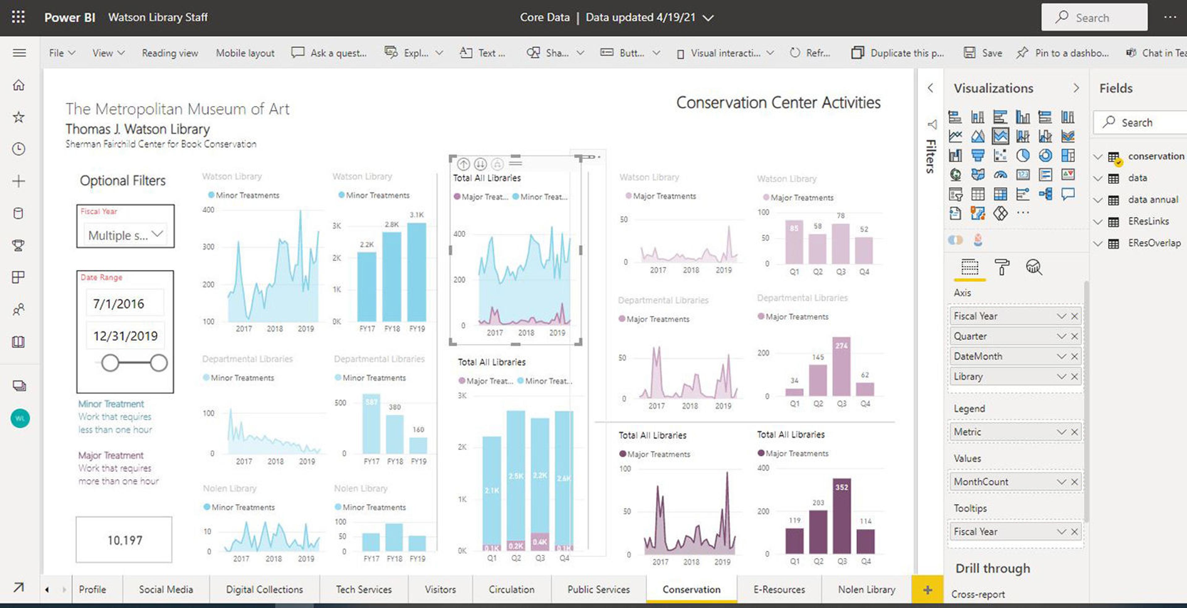
Screen shot of the report design software
The software we use to design our reports is Microsoft Power BI. Gartner, a research and advisory firm, compared Microsoft Power BI to similar software on the market and rated Microsoft highest in “completeness of vision” and the “ability to execute” development. The best products from their review appear in the top right quadrant of each of the below charts.
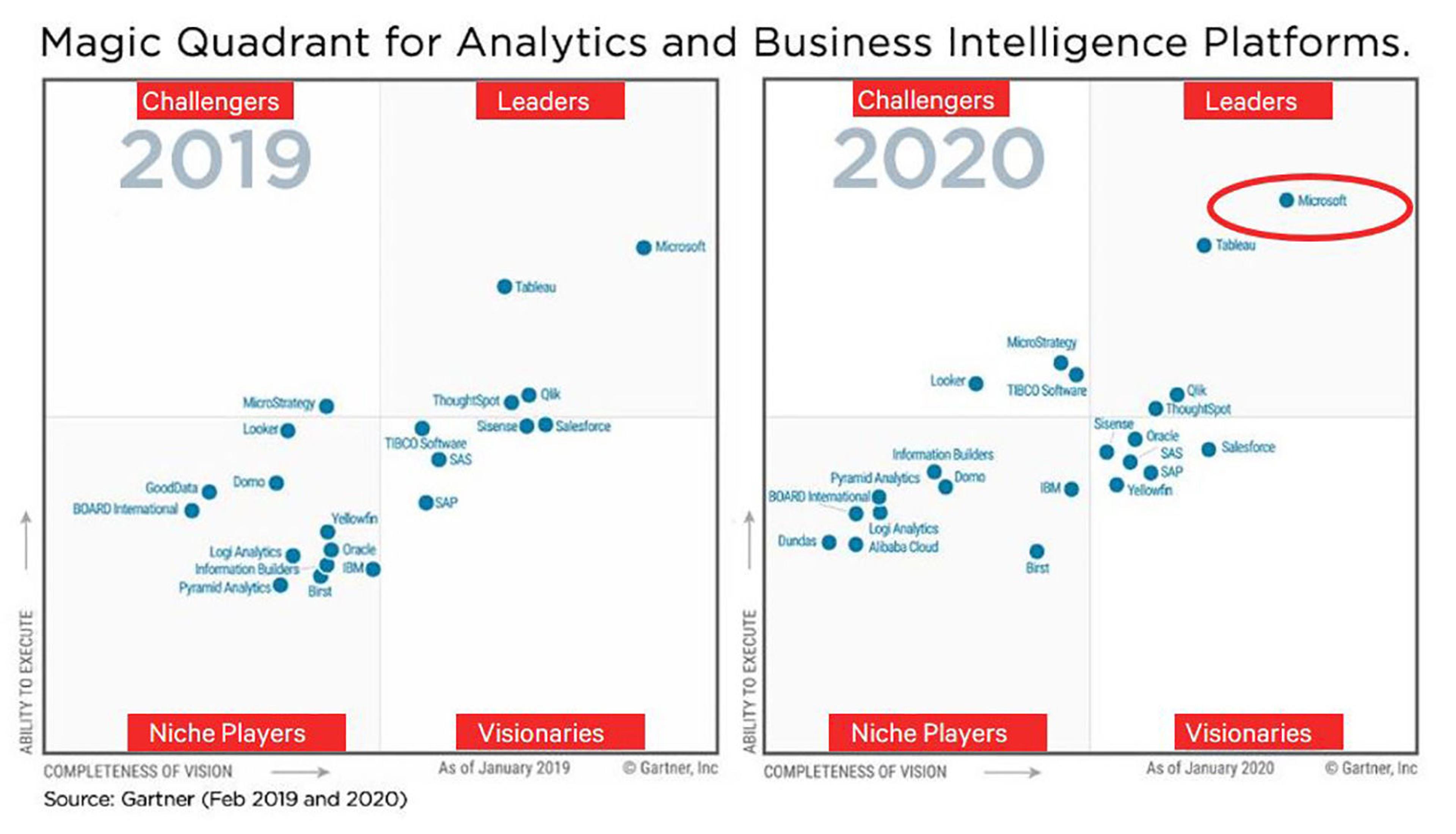
Gartner Magic Quadrant for Business Intelligence Platforms
We have been using Power BI to profile every department’s activity in the library going back six years. Cumulatively we have compiled well over four thousand data points of information. The visualizations of the data we produce with Power BI illustrate the growth of both our print and digital collections. While access to most of our Power BI statistical data and charts is restricted to library and Museum staff, we are pleased to share selected monthly report summaries covering four recent fiscal years on the Library Dashboard page on The Met’s website.
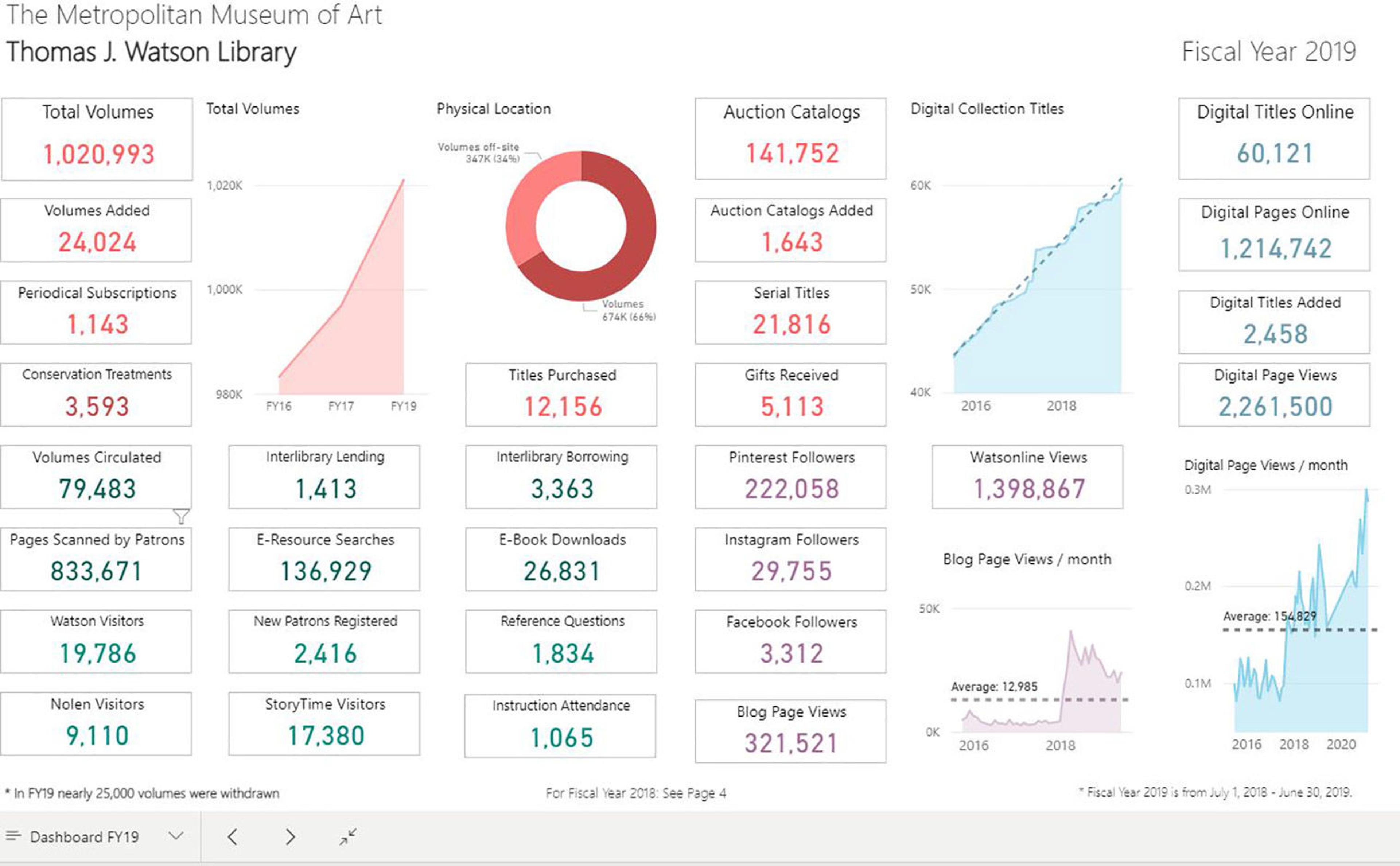
Screen shot of the Library Dashboard, Fiscal Year 2019 page
The image above shows the Fiscal Year 2019 page from the Library Dashboard on The Met’s website. Top-left, we see that we surpassed a significant milestone of one million total volumes. In the bottom-left corner, we see the number of pages scanned by patrons was over 833,000. Patrons helped us cut costs and perhaps spared a few trees by scanning.
In the top-right section of the dashboard, we see that the library has reached the point of providing over 1.2 million digital pages online. This online collection gives researchers access to rare and archival materials. Exploring the details of these statistics provides a sense of the level of staff and patron activity. These numbers attest to the value of library services we provide our patrons.
Now, take a closer look at two line graphs shown in the bottom-right corner of the above image—enlarged in the following image.
In the image below, left is an enlarged view of Blog Page Views chart. The sudden steep rise in the line is not an error. So what is the story here? The reason for the dramatic leap in page views is that in 2018 we moved the blog pages from an external web-hosting provider onto The Met’s website. The result of that move allowed visitors direct access to the blog and the volume of page visits increased quite drastically.
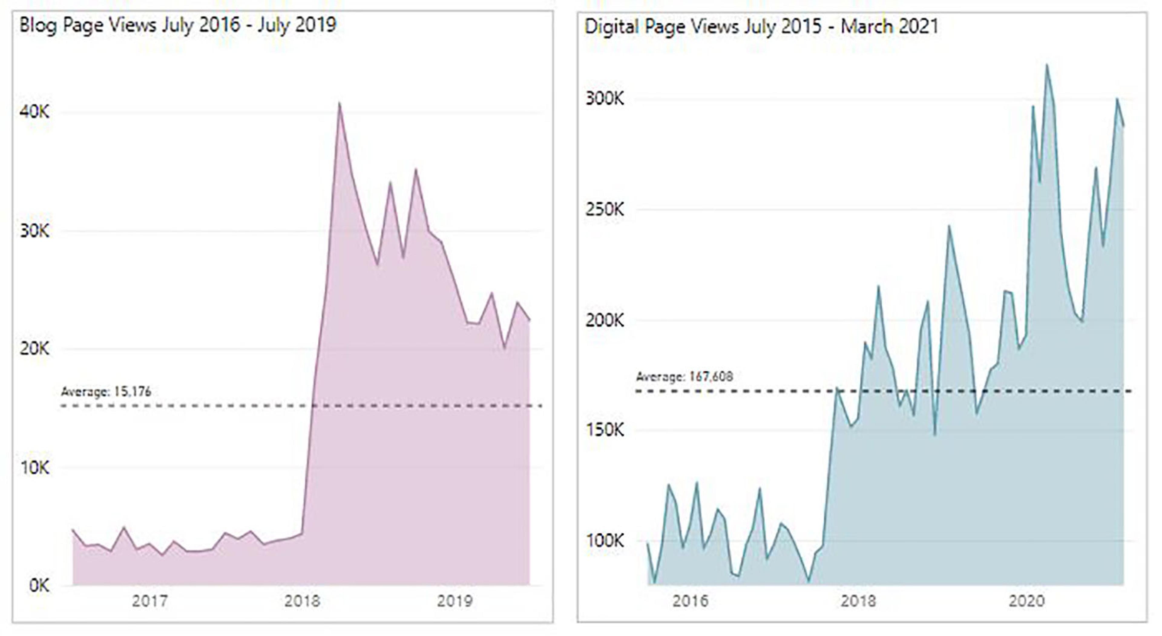
(Left) Dramatic increase in blog page views after moving the blog to The Met web site; (Right) Digital Collection page views
Another notable spike occurred in digital page views, which is a metric tracking visits to the Watson Digital Collections. In the above image to the right we again see an explosive uptick in 2018. The reason for this is partially due more content being posted on the Museum website with links to the Digital Collections. This change is also due to a concerted effort by the library to digitize, publish, and publicize more books in the Digital Collections. As part of that initiative, we enhanced the library catalog by providing images from the Digital Collections. We also added links to the objects in the Digital Collections. The chart confirms that our efforts have been successful.
The image below shows the last page of the Library Dashboard. Viewers can actively interact with the data in this report. The benefit of interactive dashboard reports is that different perspectives are available with just a few clicks: the interactive report provides multiple ways to explore the data.
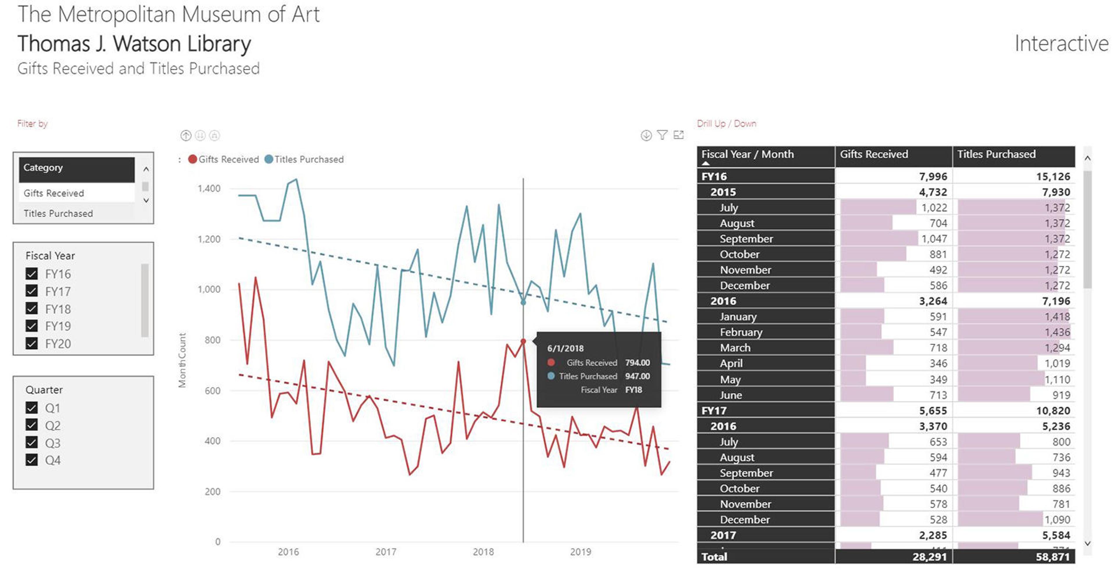
“Featured” interactive page of the Library Dashboard
The line graphs dynamically change based on selections made in the filters on the left. When the viewer clicks the line graph, both the graph and table change. A pop-up information box appears when the viewer hovers the mouse pointer over the line graph. In the table on the right, the viewer has options such as expanding or collapsing the years and months of the fiscal year. Since our focus is on change over time, we overlay average lines and trend lines on our bar graphs and line graphs to show how our current activity compares to past activity. We use the trend lines in lieu of gauges or cards highlighting “key performance indicators” (KPIs) that you might be familiar with from other business dashboards. What trends can you identify looking at the line graphs in the above image?
Another interactive Power BI report we published to the web is the Index of African American Artists (IAAA), seen in the image below. Included links provide access additional sources of information for all of the artists. In the near future, we plan on adding the ability to filter by the type of artwork. You can learn more about the IAAA project in our recent article, “Black Art and Artists Matter: Collection Assessment and Expansion in Watson Library.”
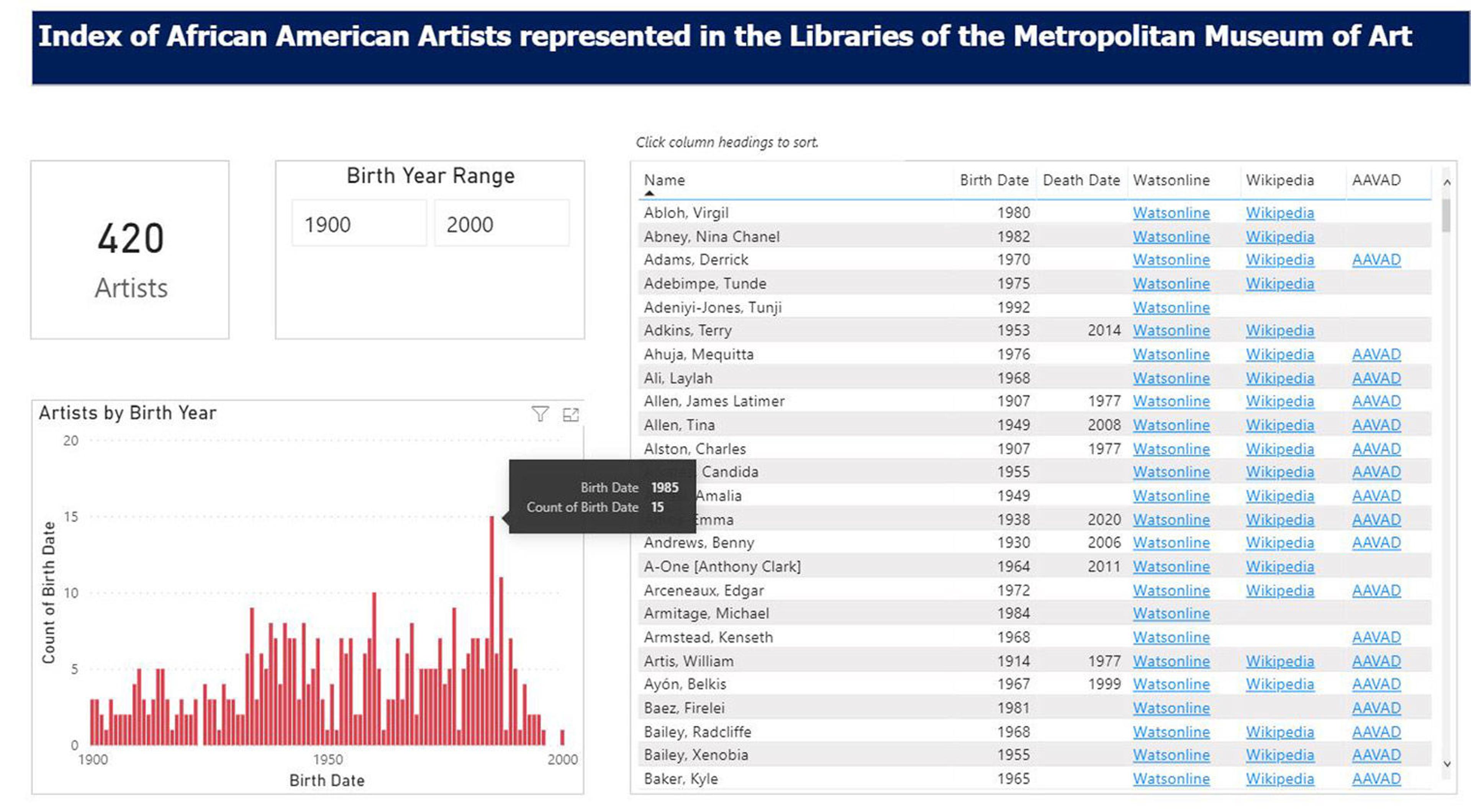
Research tool: Interactive Index of African American Artists
Serendipitously, one of the Watson Library book acquisitions that resulted from the IAAA project happens to be a book that uses data visualizations to support a narrative. We recently purchased a reprint of W.E.B. Du Bois Data Portraits, Visualizing Black America, The Color Line at the Turn of the Twentieth Century. The book was originally published in the early 1920s. Du Bois and his assistants wrote about conditions at the time and illustrated the related statistical data with dozens of fantastic graphs. The image below shows the book cover and a sample graph.
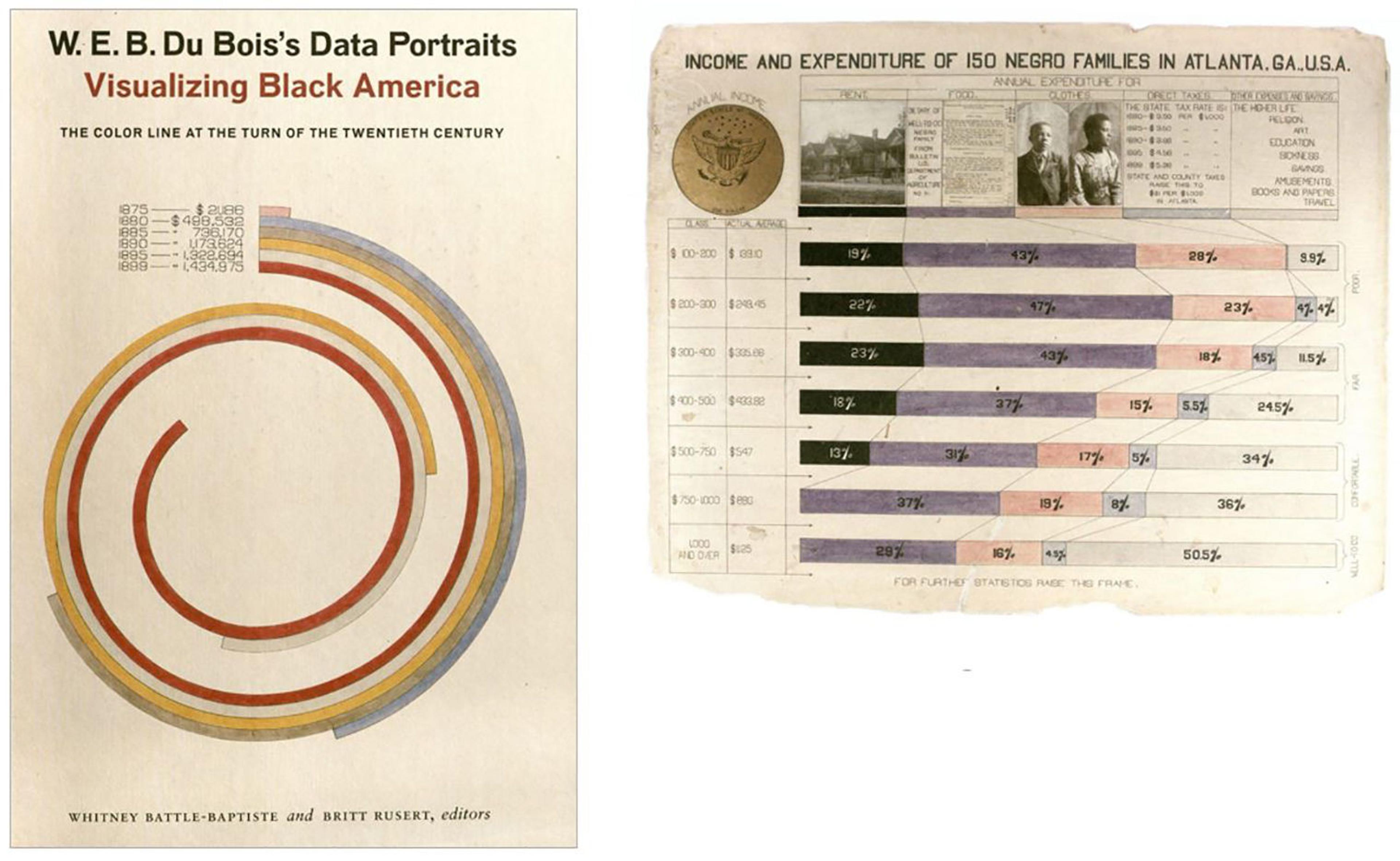
The data visualizations in the book are interesting from both statistical and artistic points of view. However, one might argue the artistic license taken in many of their graphics design make it difficult to compare numbers. The spiraling graphic on the book cover is a case in point.
The library collects outstanding titles on the subject of design. We also have a number of books specifically on the subject of effective data visualization design. Edward R. Tufte, professor emeritus of statistics at Yale University authored a series of books about data visualization that we highly recommend. Professor Tufte’s books take you through the history of data visualization and provide insightful critiques of data graphics from a variety of disciplines. His work provides examples of best practices for information design. These books from the Watson Library have influenced and inspired us and no doubt, they will inspire you too.
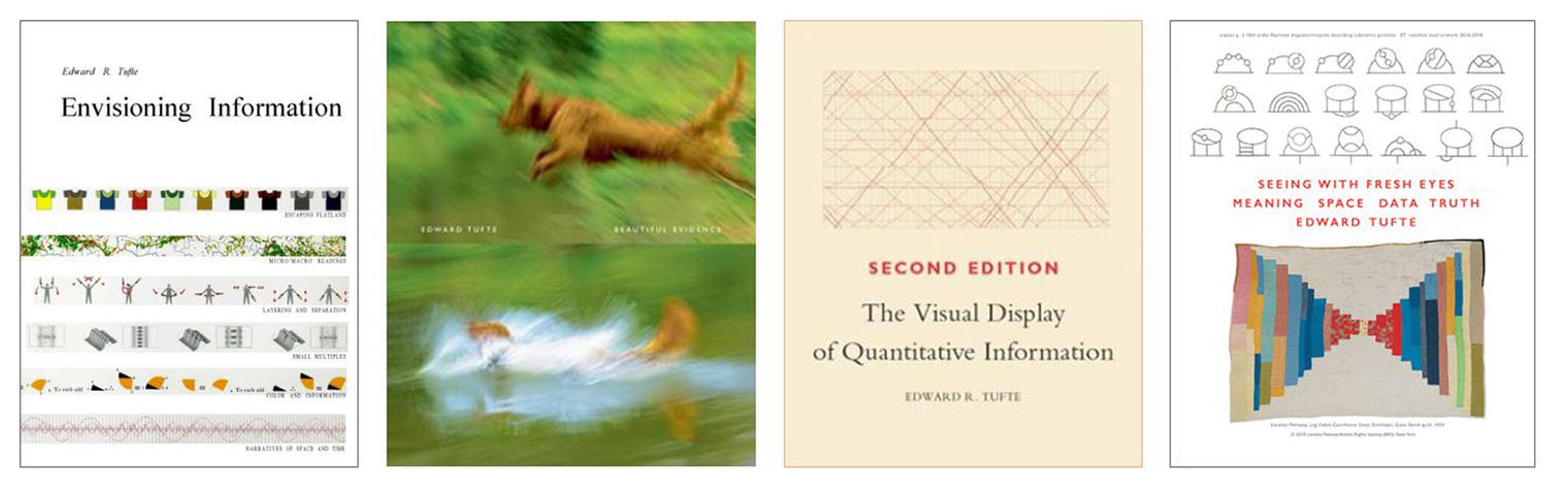
Books by E.R. Tufte, left to right, Envisioning Information, Beautiful Evidence, The Visual Display of Quantitative Information, and Seeing with Fresh Eyes
Going forward, we plan to develop more ways to analyze the data we collect about the library. Look for a future blog post here where we discuss more library data case studies, infographics, or Power BI reports. We are also planning to write about technical projects at Watson Library involving Python, SQL, APIs, and more.