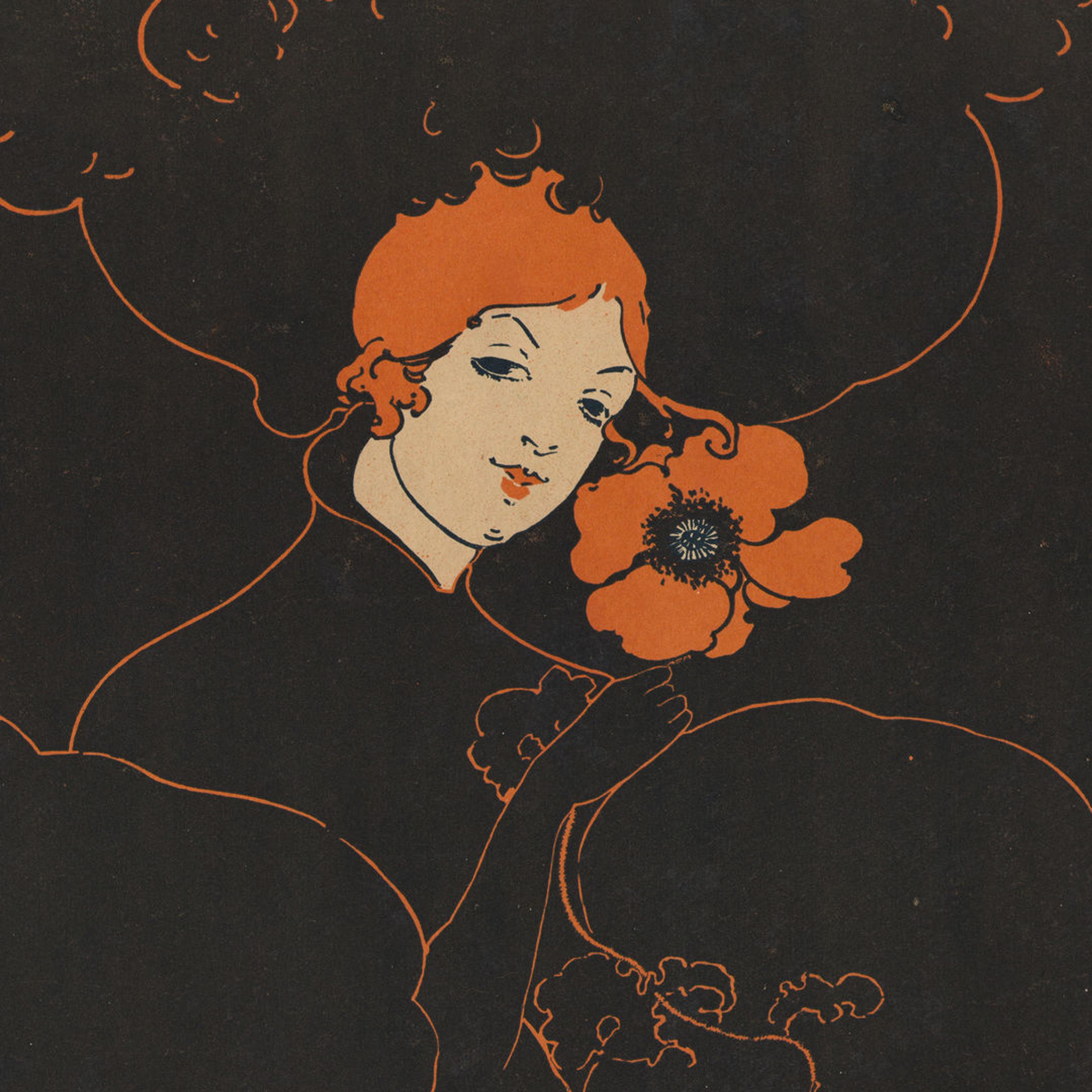
In November 1898, the London-based periodical The Poster published its first and only article to focus on the work of a woman artist. Written by the French critic S. C. de Soissons, “Ethel Reed and Her Art” opened with the following assessment of the progress American women had made in their quest to “conquer” the art world: “I am not sure whether the movement of the emancipation of woman was started in America, but I am positive that there is no other country where the tendency to shake off the fetters put on her by man is stronger than in the United States; hence the continuous striving of the fair sex to conquer certain fields of activity. . . and naturally they have not forgotten art.”[1]
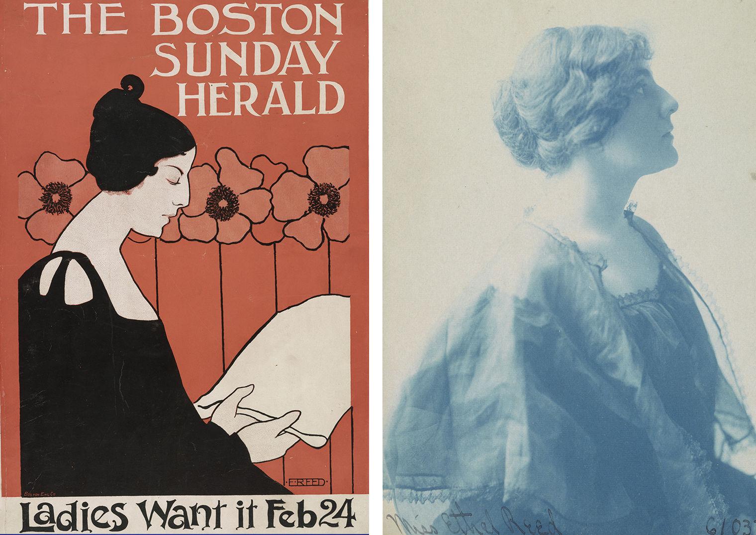
Right: Ethel Reed (American, 1874–1912), The Boston Sunday Herald, February 24, 1895. Lithograph, 17 1⁄4 x 11 7⁄8 in. (43.7 x 30.1 cm). Library of Congress, Washington, D.C., Prints and Photographs Division. Left: Frances Benjamin Johnston (American, 1864–1952), Miss Ethel Reed, ca. 1896. Cyanotype, 6 7/16 x 4 1⁄2 in. (16.3 x 11.4 cm). Library of Congress, Washington, D.C., Prints and Photographs Division
Reed’s first poster design was published by The Boston Sunday Herald on February 24, 1895. Although she initially conceived the composition for a work in stained glass, upon the suggestion of a friend, she instead submitted it to the Herald for reproduction as a poster. Set against a bold red background with large poppy flowers, a young woman reads a newspaper above the pithy advertising slogan “Ladies want it.” Believed to be a self-portrait of the artist, the figure—with her jet-black hair, low-cut dress, and elongated neck—closely resembles Reed in contemporary images, including a cyanotype portrait by the photographer Frances Benjamin Johnston.
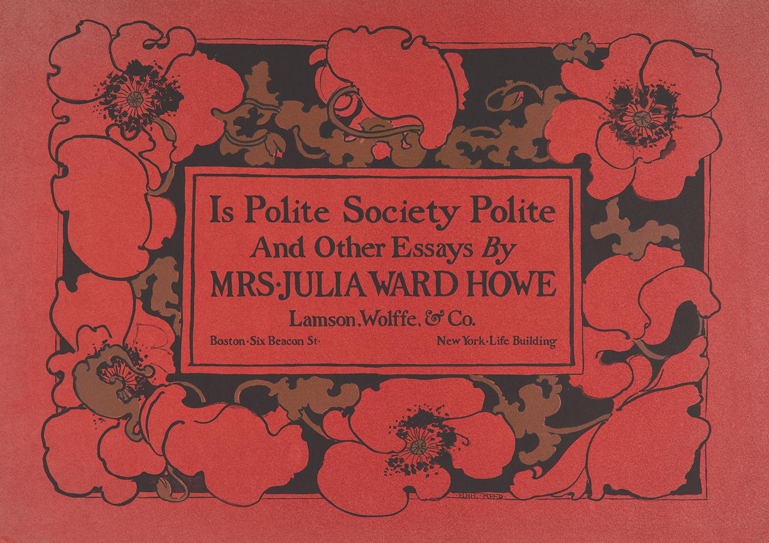
Ethel Reed (American, 1874–1912). Is Polite Society Polite and Other Essays by Mrs. Julia Ward Howe, 1895. Lithograph, 17 1/2 × 25 1/16 in. (44.5 × 63.6 cm). The Metropolitan Museum of Art, New York, Purchase, The Lauder Foundation, Evelyn H. and Leonard A. Lauder Fund Gift, 1986 (1986.1005.14)
By 1890, male artists and critics were increasingly insecure about the prominence of women in the art world, prompting a profound backlash against their work. As gender-based critical rhetoric “became more insistent, more absolute, and more explicitly aligned with sex,” argues the historian Kirsten Swinth, “critics called for greater individuality and virility in American art. However, only men could achieve such art: from women, critics now demanded the ‘essentially feminine,’ something fundamentally different and almost always lesser.”[2]
This shift in art criticism coincided with efforts by male illustrators to overcome what they negatively perceived as the feminization of their profession. The art historian Michele Bogart demonstrates that women were believed to stigmatize illustration as “unserious” and that their prevalence served as “an indicator that illustration was not fully established as a profession; it lacked the image of masculine strength considered requisite for any truly professional enterprise.”[3] Male illustrators thus aimed to dissociate their work from feminine (read: amateur) pursuits by elevating illustration to the more masculine (read: professional) realm of the so-called fine arts, on par with painting and sculpture.
Male illustrators thus aimed to dissociate their work from feminine (read: amateur) pursuits by elevating illustration to the more masculine (read: professional) realm of the so-called fine arts
As a result, critics tended to minimize or outright ignore women’s contributions to the field, creating an art-historical canon that for decades overlooked the importance of women artists to the history of American illustration and graphic design. However, critics and collectors could not simply ignore an artist such as Reed, who rivaled her male contemporaries in productivity and popularity. Between February 1895 and July 1896, she designed more than twenty art posters, many of which were critically acclaimed, publicly exhibited, and avidly collected.[4] Nevertheless, to limit the associations between women and illustration, Reed was portrayed in the press as an oddity and an anomaly—the exception to the rule, rather than a symbol of women’s progress within the art world. In 1896, Bradley: His Book—a magazine founded by the illustrator Will H. Bradley—advanced the idea of Reed as an outlier in what was considered an otherwise male-dominated profession:
It is worth noting that so far the so-called “poster movement” has brought into first prominence but one woman designer. Whether this is due to a defect in the ordinary course of training for artistic purposes, from which young women students too seldom have the courage to break away, or is owing altogether to the lack of original inventiveness which women themselves evince, it would be hard to say. Probably, both conventional training and inherent incapacity for making ventures into new fields of work are to blame for the undeniable fact that thus far men hold the honors in this new branch of art productions, with the single exception, it may be, of Miss Ethel Reed of Boston.[5]
Although Reed was the most prominent, prolific, and celebrated woman in the art-poster movement—a short-lived but widely popular phenomenon—an examination of the historical record reveals that she was by no means alone. Rather, she was part of a larger community of women artists in cities across the United States who pursued professional careers in illustration, including book, magazine, and poster design. Their participation in the graphic and commercial arts of the era was far-reaching, thus repudiating the late nineteenth-century notion that women lacked the courage, training, and ability to enter new fields of art. The women of the art-poster movement redefined themselves as more than mere passive consumers of advertising, instead emerging as active creators and producers of art and visual culture.
American Women in Illustration and Graphic Design
The so-called golden age of American illustration, dating from about 1880 to 1930, coincided with a flourishing of illustrated books and magazines. As advances in printing technology made the reproduction of images both simpler and cheaper, weeklies and monthlies flooded the homes of middle- and upper-middle-class Americans. Increased literacy rates and leisure time also led to a heightened demand for illustrated periodicals, which provided readers with both entertainment and education in an array of categories, from general-interest stories and self-improvement advice to serious literature, poetry, and fiction. By the 1890s, newly created job opportunities made illustration a popular and lucrative career path for aspiring artists. Nevertheless, women faced considerable obstacles, including limited access to education, exhibition venues, artists’ clubs, and professional networks.
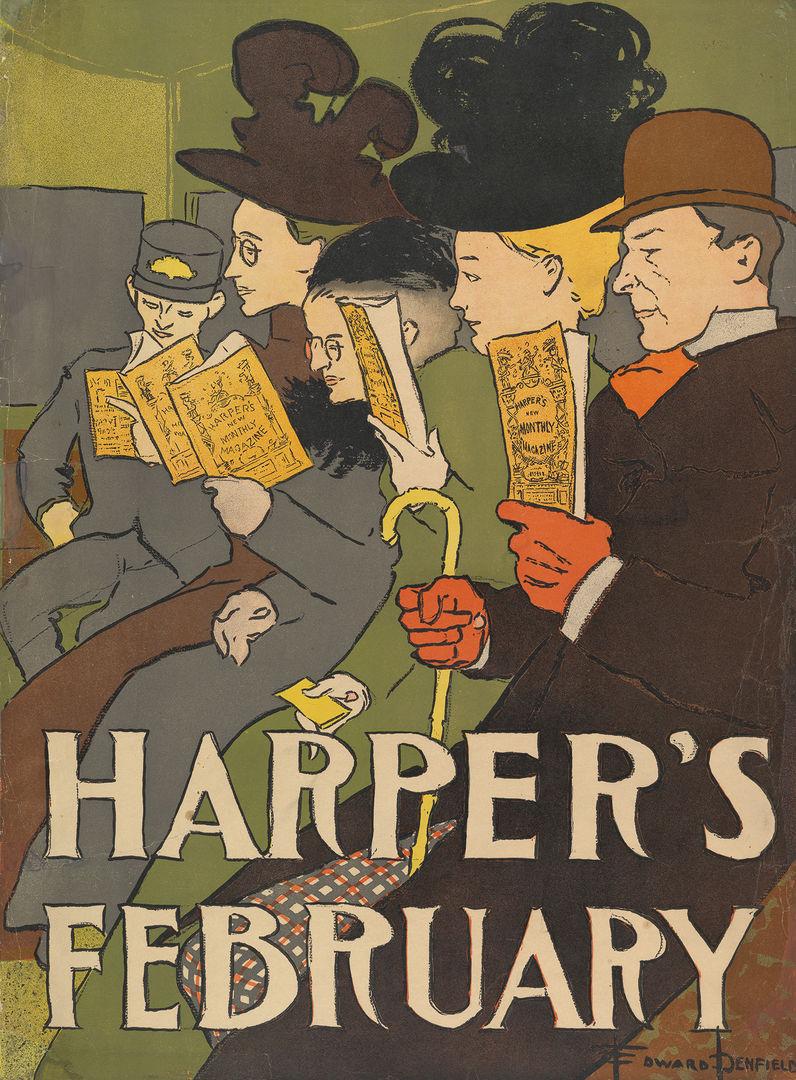
Edward Penfield (American, 1866–1925). Harper’s, February, 1897. Lithograph, 19 x 14 in. (48.3 x 35.5 cm). The Metropolitan Museum of Art, New York, Leonard A. Lauder Collection of American Posters, Gift of Leonard A. Lauder, 1984 (1984.1202.96)
During the first three decades of the nineteenth century, most women who achieved artistic recognition were related to successful male artists; it was through their fathers, uncles, husbands, or brothers that they obtained the apprenticeship training and professional connections necessary to succeed. By the late 1840s, social reformers began to address the scarcity of vocational training available to American women, who were entering the workforce in unprecedented numbers. Many believed that artmaking, specifically in the graphic and industrial arts, offered women a path for self-improvement and self-sustainment without compromising their femininity and status as “respectable” members of the middle class. In 1848, the Ohio-born philanthropist Sarah Worthington King Peter founded the Philadelphia School of Design for Women, the first of its kind in the nation.[6] It set an important precedent, and similar schools were soon established in New York, Boston, Cincinnati, and Pittsburgh, providing women with valuable instruction in drawing, wood engraving, lithography, etching, and industrial design.
By the 1860s printing and publishing firms were hiring women in a variety of new roles. Compared to men, they were less expensive to employ, and their temperament was believed to be better suited to detail-oriented work. A critic writing in The Crayon in 1861 argued: “Man is not made for sedentary life; woman, on the contrary, conforms to it without inconvenience Her nimble fingers, accustomed to wield[ing] the needle, lend themselves more easily to minute operations . . . Cutting on copper and steel demands also a patience and minutia much more compatible with the nature of woman.”[7] Although biologically essentializing, this perceived connection between femininity and artmaking worked to the advantage of women who, according to the art historian Laura Prieto, could use it as a point of entry into the professional art world: “Women gradually transmuted ladylike leisure activities into opportunities for serious study and finally some degree of professionalism.”[8]
Given that illustration was believed to be an extension of a woman’s natural ability to draw in graphite and watercolor, it was promoted as an acceptable art for women to pursue, although female illustrators were often restricted to subject matter viewed as feminine, notably domestic scenes and children’s literature. Moreover, the motives of some Arts and Crafts reformers were less than altruistic. Writing in 1877, Walter Smith, the Massachusetts State Director of Art Education, saw artistic training as a means to divert women’s attention away from their fight for equality: “Give our American women the same art facilities as their European sisters, and they will flock to the studios and let the ballot-box alone.”[9] As women enrolled in art schools across the country in unprecedented numbers, they did not, as Smith projected, abandon the fight for the right to vote. Instead, they used their skills, notably as illustrators, to advocate for equality in their profession and in society.
Women of the American Art-Poster Movement
In 1893, Harper and Brothers launched a new advertising campaign with a poster promoting the April 1893 edition of Harper’s Monthly Magazine. Designed by Edward Penfield, head of the magazine’s art department, it started a craze for literary posters in the United States. Over the next six years, Penfield designed a poster for each monthly issue of Harper’s, and its popularity with the public inspired other publishers to commission posters advertising their latest books and magazines. Literary posters differed dramatically from earlier examples for their embrace of avant-garde aesthetics and high-quality printing.
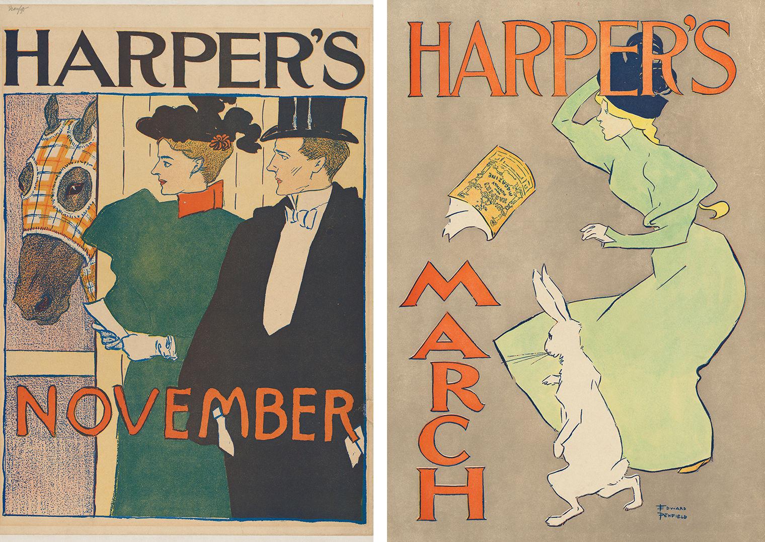
Left: Edward Penfield (American, 1866–1925). Harper's, November, 1897. Lithograph, 16 5/16 × 11 3/4 in. (41.4 × 29.8 cm). The Metropolitan Museum of Art, New York, Leonard A. Lauder Collection of American Posters, Gift of Leonard A. Lauder, 1984 (1984.1202.84). Right: Edward Penfield (American, 1866–1925). Harper's, March, 1895. Lithograph, 19 1/4 × 13 13/16 in. (48.9 × 35.1 cm). The Metropolitan Museum of Art, New York, Leonard A. Lauder Collection of American Posters, Gift of Leonard A. Lauder, 1984 (1984.1202.79)
As a new and relatively undefined art form, the poster appealed to aspiring women artists who could access their design training and drafting skills to create works that would prominently bear their names. Much like the recently revived media of etching, pastel, and watercolor portrait miniatures, posters offered these women opportunities to compete on equal ground with their male contemporaries. Designs could be produced at home using readily available materials, such as graphite and watercolor, both of which were already closely associated with women’s work.
The poster was, therefore, an art form that women could pursue without disrupting the status quo or threatening popular perceptions of their femininity. Moreover, women were often associated with the commercial arts and consumerism more generally. Consumption was long understood as a feminine activity, and publishers geared their advertisements toward women, who, Bogart argues, “were important not only as readers but as purchasers of the goods publicized.”[10] Within just two years of Penfield’s first advertisement, women—who had been not only a primary subject of the poster but also its target audience—emerged as accomplished producers of this new medium.
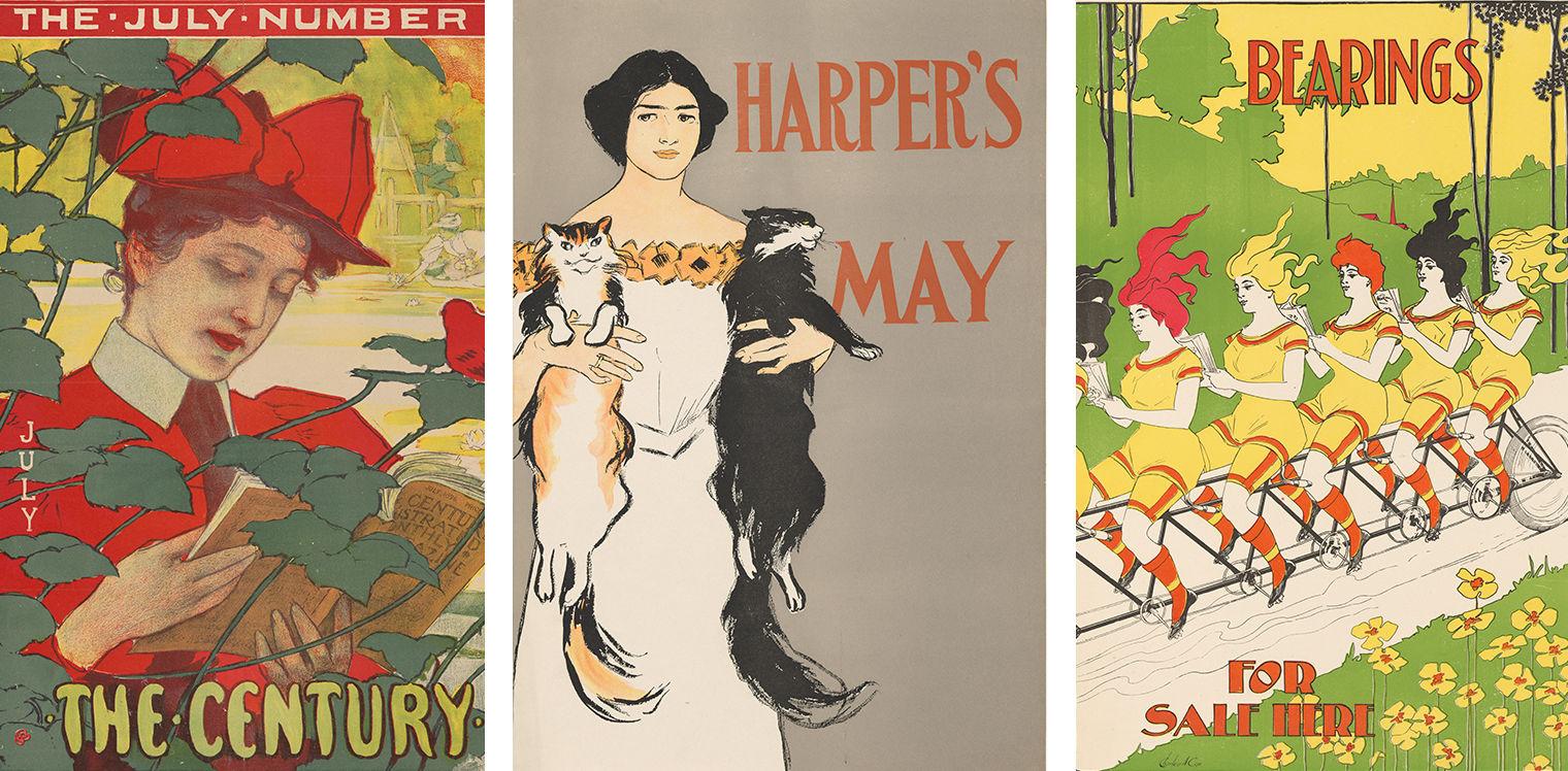
Left: Edward Henry Potthast. (American, 1857–1927). The Century, July, 1896. Lithograph, 207⁄8 x 151⁄16 in. (53.1 x 38.2 cm). The Metropolitan Museum of Art, New York, Leonard A. Lauder Collection of American Posters, Gift of Leonard A. Lauder, 1984 (1984.1202.126). Middle: Edward Penfield. (American, 1866–1925). Harper’s, May, 1896. Lithograph, 173⁄4 x 117⁄8 in. (45.1 x 30.2 cm).The Metropolitan Museum of Art, New York, Leonard A. Lauder Collection of American Posters, Gift of Leonard A. Lauder, 1984 (1984.1202.88). Right: Charles Arthur Cox. (American, born England, 1829–1901). Bearings, 1896. Relief print, 181⁄8 x 133⁄16 in. (46 x 33.5 cm). The Metropolitan Museum of Art, New York, Leonard A. Lauder Collection of American Posters, Gift of Leonard A. Lauder, 1984 (1984.1202.34)
Both male and female illustrators placed women in recognizable and relatable social scenarios—reading, boating,35 riding public transportation, ice skating, playing with cats, and bicycling. As Bogart notes, these women were “always financially comfortable, always Caucasian. Together they presented heartwarming, affirmative views of a pre-World War I world of shared values and experiences touted as American . . . As such, they represented a crucial shift from an older ideal of illustration as a purely artistic medium to its newer purpose as instrument and expression of consumerist commercial values.”[11]
The close relationship between publishers and artists during the 1890s provided women with an entrée into the field. Many of the book and magazine publishing firms that commissioned advertising posters already employed women as illustrators and cover designers. Morse, for example, began designing book covers for Charles Scribner’s Sons in 1887, and over the next decade she worked for several eminent firms, including Harper and Brothers, the Century Company, and Dodd, Mead and Company. Her eye-catching poster for Ian Maclaren’s book Kate Carnegie demonstrates her familiarity with the tenets of advertising and the so-called poster aesthetic. Integrating text and image, the work foregrounds a fashionably attired woman in a boldly simplified landscape. She appears to stride forward with some speed as her cape blows open to reveal a plaid lining, adding to the decorative quality of the work. With its broad, flat areas of color, strong outlines, and elevated perspective, Morse’s composition also shows the influence of popular Japanese wood-block prints and Art Nouveau aesthetics.
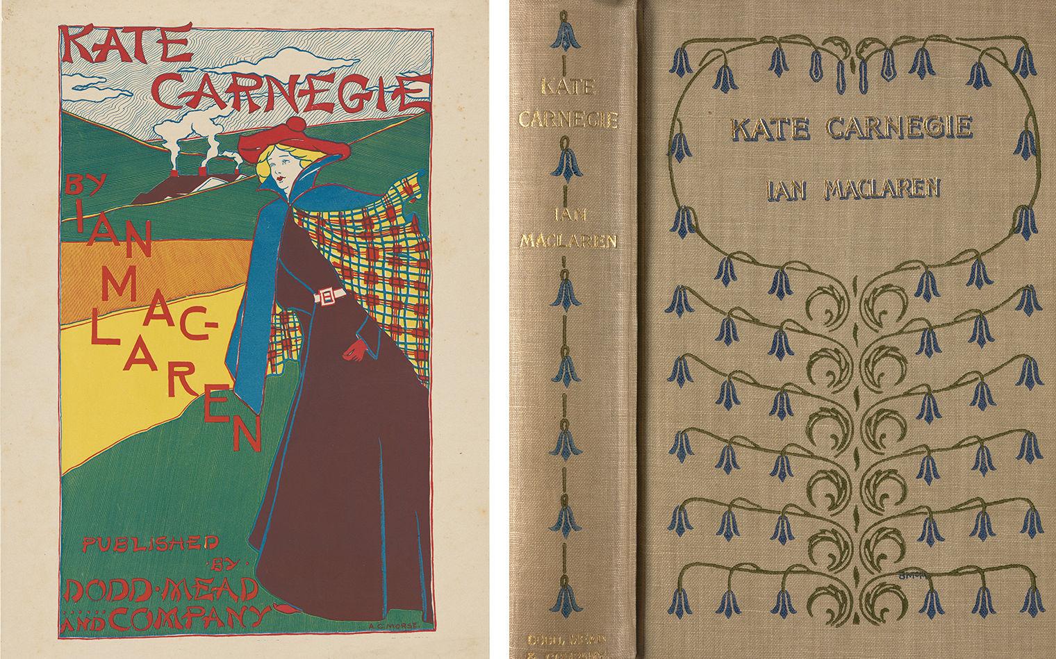
Left: Alice Cordelia Morse (American, 1863–1961). Kate Carnegie by Ian Maclaren, 1896. Lithograph, 17 1⁄2 x 12 1⁄16 in. (44.5 x 30.6 cm). The Metropolitan Museum of Art, New York, Purchase, Leonard A. Lauder Gift, 1988 (1988.1120.13). Right: Blanche McManus Mansfield (American, 1870–1929), cover design for Ian Maclaren, Kate Carnegie (New York: Dodd, Mead and Company, 1896). Widener Library, Harvard University, Cambridge, Mass
Stylistically, Morse’s poster departs from her book-cover designs, which tended to be ornamental rather than figural. The lack of uniformity between advertising posters and book covers was not uncommon in the era, as the two media developed independently, even though artists such as Morse often worked in both fields. Printed in 1896, the cover for Kate Carnegie, designed by Blanche McManus Mansfield, differs dramatically from Morse’s poster. On the binding, a decorative arrangement of bluebell flowers encircles the title and the author’s name, while the artist’s monogram “BMM” is entwined in a stem at lower right. Like Morse, McManus Mansfield designed book covers and advertising posters, varying her style to best suit the medium. Both art forms, despite their distinct qualities, required the illustrator’s skillful integration of text and imagery.
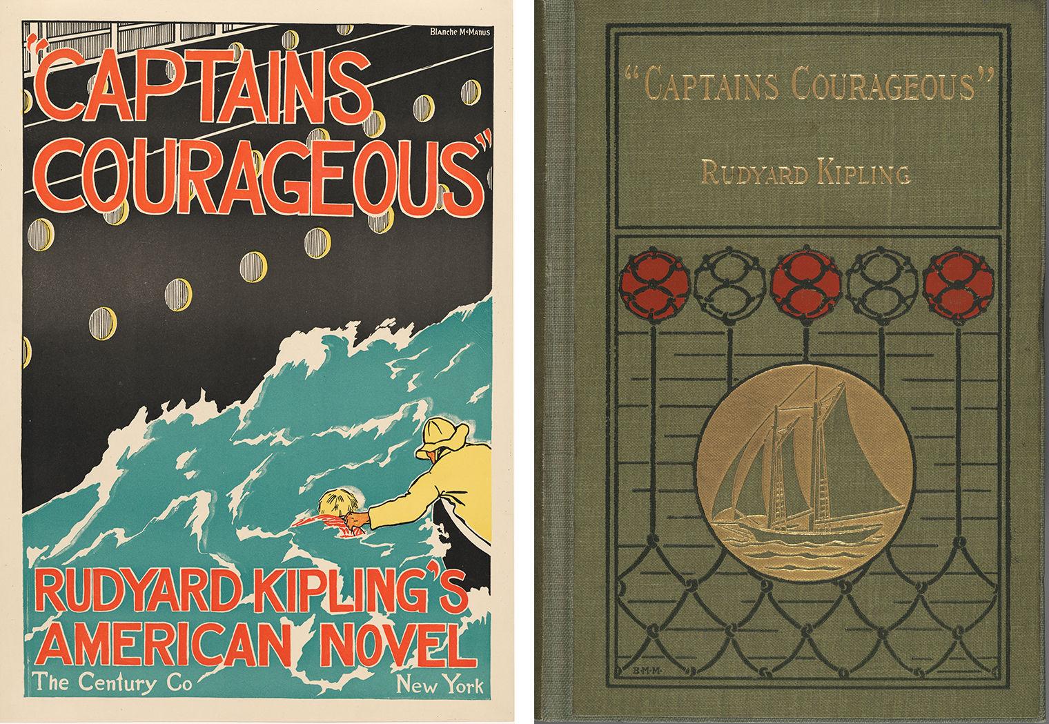
Left: Blanche McManus Mansfield (American, 1870–1929). Captains Courageous, Rudyard Kipling’s American Novel, 1897. Relief print, 17 11⁄16 x 12 5⁄8 in. (45 x 32.1 cm). The Metropolitan Museum of Art, New York, Leonard A. Lauder Collection of American Posters, Gift of Leonard A. Lauder, 1984 (1984.1202.67). Right: Blanche McManus Mansfield, cover design for Rudyard Kipling, Captains Courageous (New York: The Century Company, 1897). Houghton Library, Harvard University, Cambridge, Mass
The visual disparity between a book’s cover and its advertising poster is evident even when a publisher employed a single designer for both. For example, McManus Mansfield adopted two very different styles in the cover and the poster for Rudyard Kipling’s Captains Courageous. Published in 1897, the book follows the adventures of a wealthy New England teenager who is rescued by a fishing schooner after falling off a steamship in the North Atlantic Ocean. In her poster, the artist captured this critical moment: the black hull of the steamship bifurcates the composition on a diagonal as a fisherman reaches out to rescue the boy from rough, choppy waters. The poster’s angular composition and bold color palette enhance the drama of the scene, whereas the cover design, which sets a schooner against a highly stylized fishing net with glass floats, is elegant and subdued. Captains Courageous had no interior illustrations, but McManus Mansfield provided illustrations for later works by Kipling, including “Mandalay” (1898) and “Recessional: A Victorian Ode” (1899), both of which were published by her husband’s firm, M. F. Mansfield and A. Wessels.
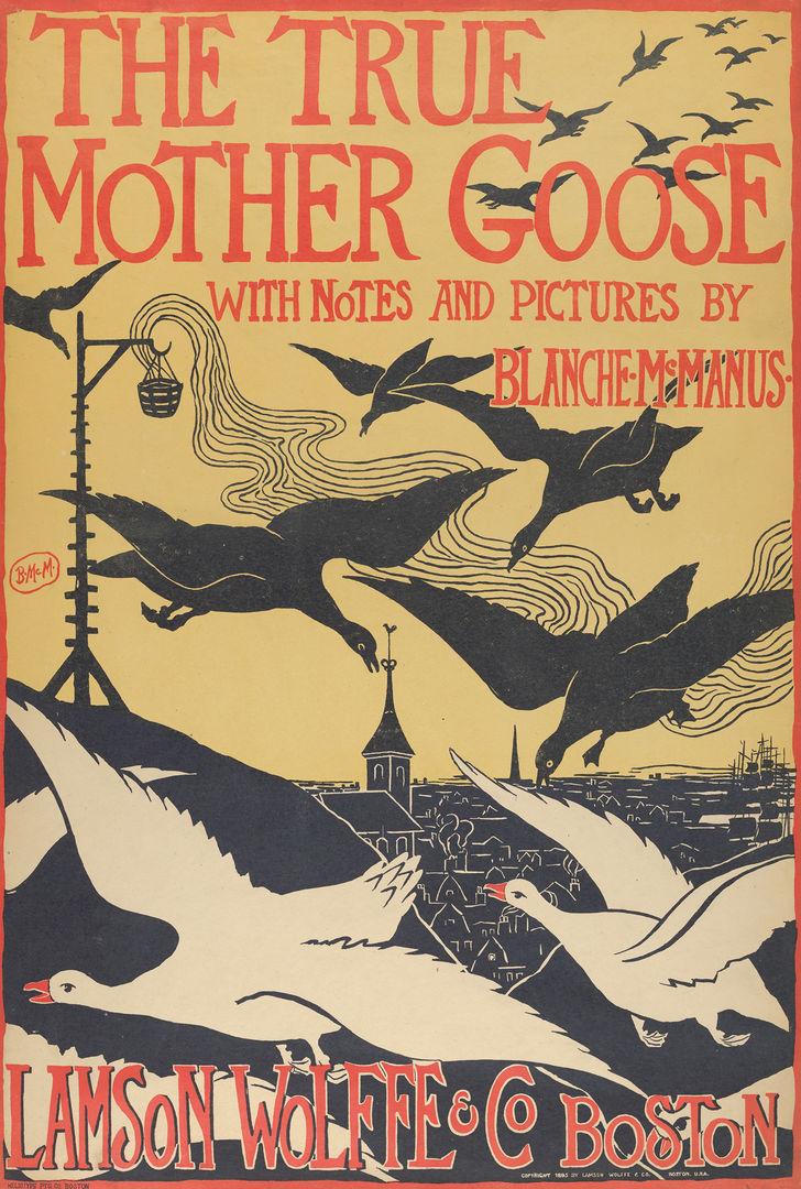
Blanche McManus Mansfield (American, 1870–1929). The True Mother Goose with Notes and Pictures by Blanche McManus, 1895. Relief print, 211⁄4 x 145⁄16 in. (53.9 x 36.4 cm). The Metropolitan Museum of Art, New York, Leonard A. Lauder Collection of American Posters, Gift of Leonard A. Lauder, 1984 (1984.1202.66)
McManus Mansfield also illustrated and authored several children’s books, a genre believed to be particularly well suited to the temperament of women artists. Her tour de force poster advertising The True Mother Goose with Notes and Pictures by Blanche McManus was published by Boston’s Lamson, Wolffe and Company in 1895. Both whimsical and ominous, it features a flock of black and white geese flying over a carefully delineated cityscape. In addition to the poster, she designed the cover and interior illustrations of the book, for which she also wrote the introduction. One year later, her poster for The True Mother Goose was included in an exhibition of contemporary American, French, British, and German posters held at the Pennsylvania Academy of the Fine Arts in Philadelphia. Aimed at promoting the poster as a collectible fine art, the exhibition included the work of more than one hundred artists, seven of whom were women.
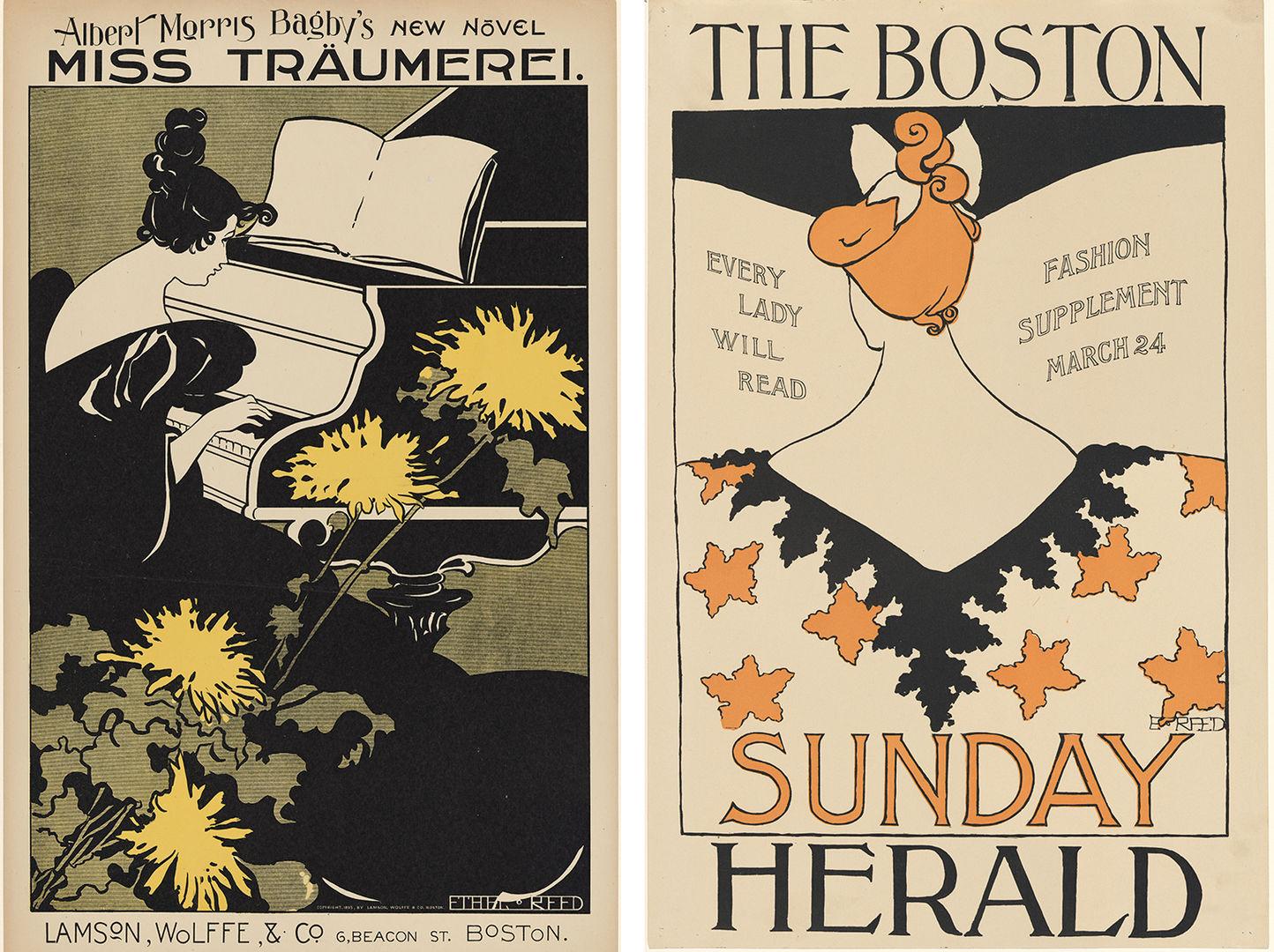
Left: Ethel Reed (American, 1874–1912). Albert Morris Bagby’s New Novel, Miss Träumerei, 1895. Lithograph, 21 15⁄16 x 139⁄16 in. (55.8 x 34.5 cm). The Metropolitan Museum of Art, New York, Leonard A. Lauder Collection of American Posters, Gift of Leonard A. Lauder, 1984 (1984.1202.129). Right: Ethel Reed (American, 1874–1912). The Boston Sunday Herald, March 24, 1895. Relief print, 18 15⁄16 x 123⁄8 in. (48.1 x 31.4 cm). The Metropolitan Museum of Art, New York, Leonard A. Lauder Collection of American Posters, Gift of Leonard A. Lauder, 1984 (1984.1202.135).
Ten posters by Reed were also displayed in the show, including The Boston Sunday Herald, March 24 and Albert Morris Bagby’s New Novel, Miss Träumerei—the latter praised in Bradley: His Book as “probably the best” of her designs.[12] In both posters young women engage in leisure activities, namely reading and playing music. Their upswept hairstyles and plunging low-backed dresses accentuate their bare shoulders and necks, which Reed dramatically elongated using a lithe, serpentine line. Although portrayed in a somewhat sensuous manner, the women are absorbed in their respective pastimes, as if oblivious to the viewer’s gaze. Her figures thus conform to contemporary depictions of idealized femininity and reflect the growing predominance of the modern woman—also known as the era’s “New Woman”—as the primary subject and consumer of art posters and illustrated periodicals.
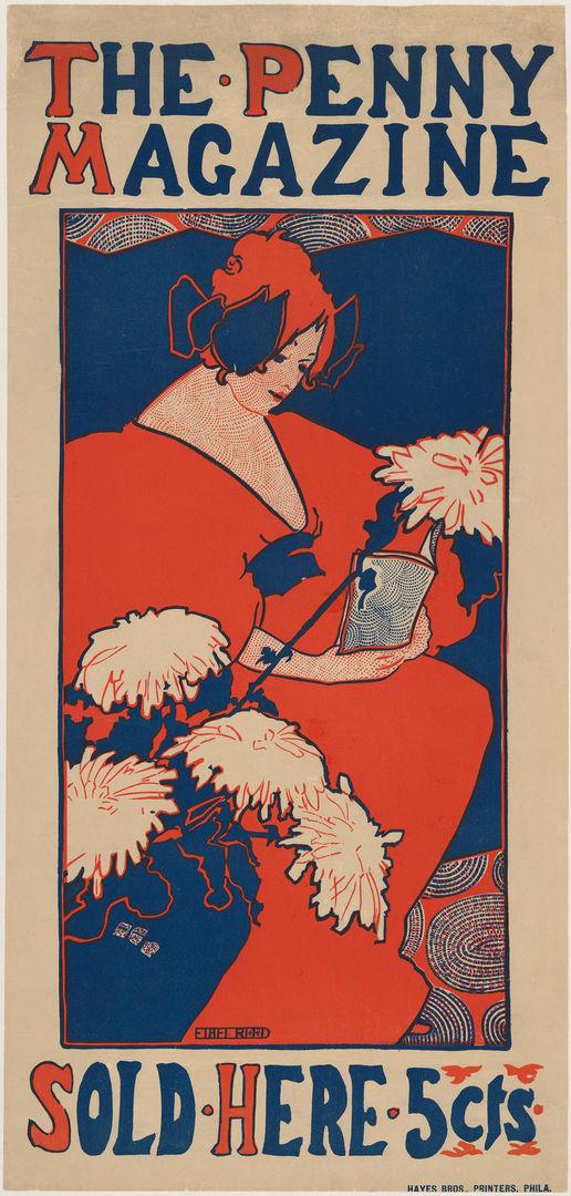
Ethel Reed (American, 1874–1912). The Penny Magazine, ca. 1896. Lithograph, 21 9⁄16 x 10 1⁄4 in. (54.7 x 26 cm). The Metropolitan Museum of Art, New York, Purchase, Leonard A. Lauder Gift, 1999 (1999.402)
Publishers undoubtedly believed that Reed’s identity as a woman gave her a particular aptitude for depicting other women, and the artist may have seized upon this essentializing notion to carve out space for herself as an illustrator and designer. She adopted the popular trope of the female reader in several of the posters she designed in 1895–96, including The Penny Magazine and Behind the Arras by Bliss Carman. Surrounded by natural elements, including chrysanthemums, lilies, and flowering trees, Reed’s stylish women gaze down as if spellbound by the very books their images aim to sell.
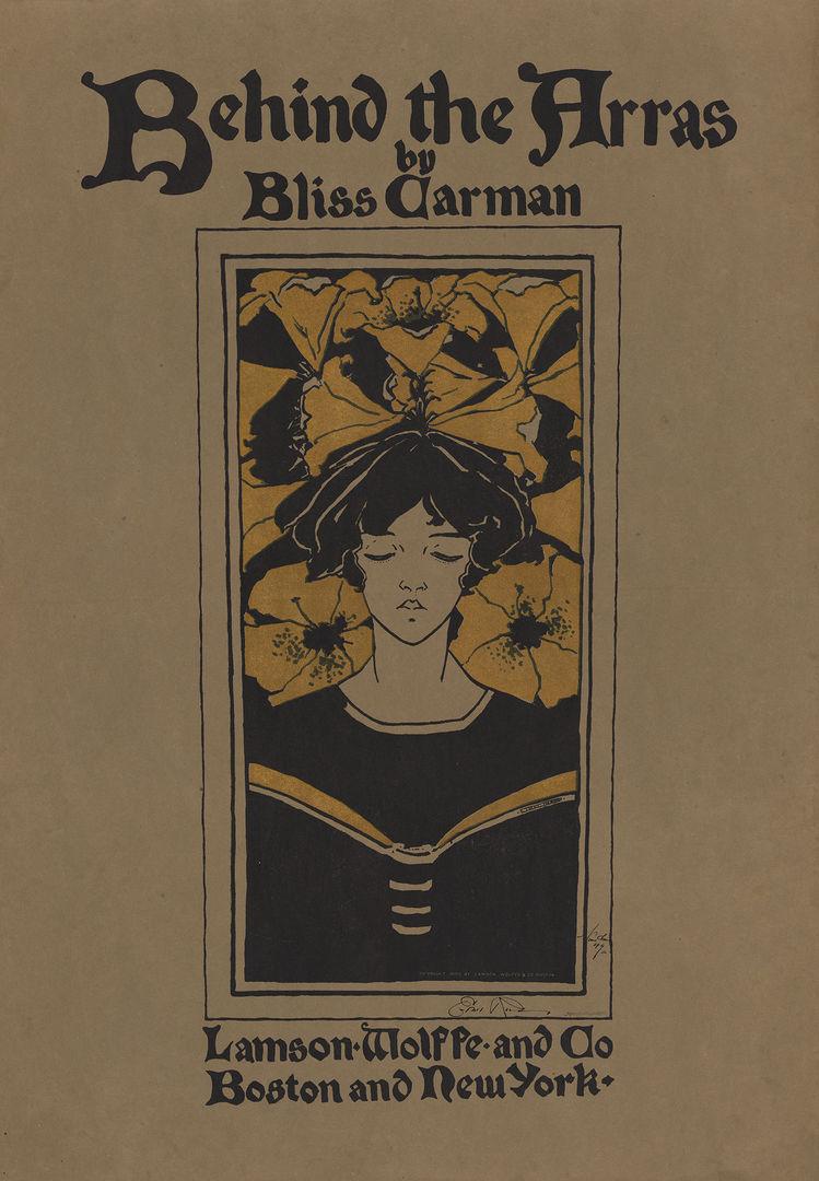
Ethel Reed (American, 1874–1912). Behind the Arras by Bliss Carman, 1895. Lithograph, 27 7⁄8 x 19 7⁄16 in. (70.8 x 49.4 cm). The Metropolitan Museum of Art, New York, Leonard A. Lauder Collection of American Posters, Gift of Leonard A. Lauder, 1984 (1984.1202.130)
A slightly unsettling, subversive quality runs through several of Reed’s posters, including those designed to advertise children’s books. As the art historian Erica Hirshler observes, Reed’s design for Louise Chandler Moulton’s In Childhood’s Country is “anything but juvenile . . . a young blonde girl teases the viewer: her eyes are partly closed, her lips are open, her blouse slips from her slim bare shoulders.”[13] Although one contemporary critic compared the young girl to “the delicious bambinos of Della Robbia”—a reference to the colorful glazed terracotta sculptures by the family of Italian Renaissance artists—she does not embody the sweetness and innocence present in Reed’s earlier designs, such as Fairy Tales; those qualities are here replaced by a disquieting sensuality characteristic of the British Decadent movement and the work of artists such as Aubrey Beardsley. After moving from Boston to London in 1896, she continued to design literary posters and was also appointed art editor of the London-based periodical The Yellow Book, taking over the position from Beardsley.
Founded in 1894, The Yellow Book was an innovative quarterly magazine featuring poems, short stories, and illustrations by leading authors and avant-garde artists. Published in London by John Lane and in Boston by Copeland and Day, it was bound in book form with a yellow cloth reminiscent of the yellow paper used to wrap illicit French novels. Its first four volumes had cover designs and illustrations by Beardsley, whose sexualized and macabre imagery helped shape its reputation. Reed, who had worked for Copeland and Day in Boston, may have obtained her new appointment through the publisher.
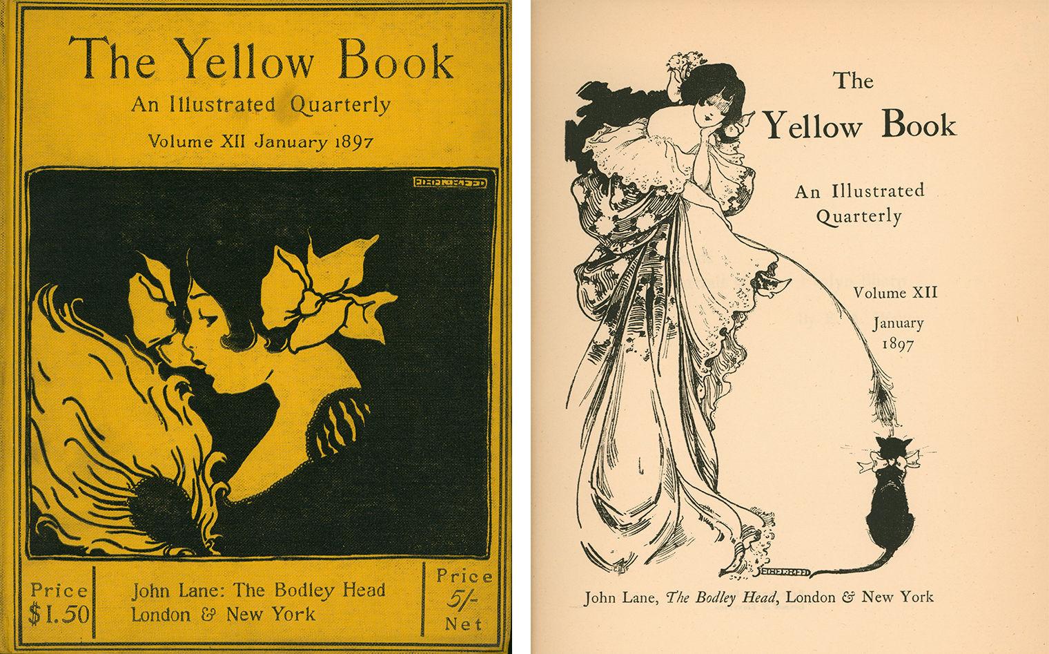
Ethel Reed, cover design and frontispiece for The Yellow Book: An Illustrated Quarterly, Volume XII (London and New York: John Lane, January 1897). Delaware Art Museum, Wilmington, Helen Farr Sloan Library and Archives
Her first works for The Yellow Book appeared in the January 1897 volume, for which she contributed the cover design and frontispiece, as well as four drawings, notably a self-portrait based on Frances Benjamin Johnston’s earlier photograph. Although she adopted an Art Nouveau style remarkably reminiscent of Beardsley’s, critics were nevertheless grateful to have Reed at the helm, comparing the transition between the two illustrators as having “passed from strong drink to tea.”[14] Despite their youthful beauty, alluring gazes, and seductive décolletage, Reed’s female figures were seen as the antithesis of Beardsley’s aggressively independent women, and the artist’s own femininity was believed to neutralize any untoward undercurrents in her art.[15]
Reed also contributed two drawings to The Yellow Book’s final volume, published in April 1897. Although the publication was short-lived, its influence was far-reaching, inspiring several so-called little magazines in cities across the United States, including The Chap-Book (1894–98) in Chicago, The Fly Leaf (1895–96) in Boston, M’lle New York(1895–98) in New York City, Moods (1895) in Philadelphia, The Lotus (1895–97) in Kansas City, and The Lark (1895–97) in San Francisco. Dedicated to promoting avant-garde art and literature, little magazines employed many of the advertising strategies used by mainstream publishers, most notably marketing their publications with art posters.
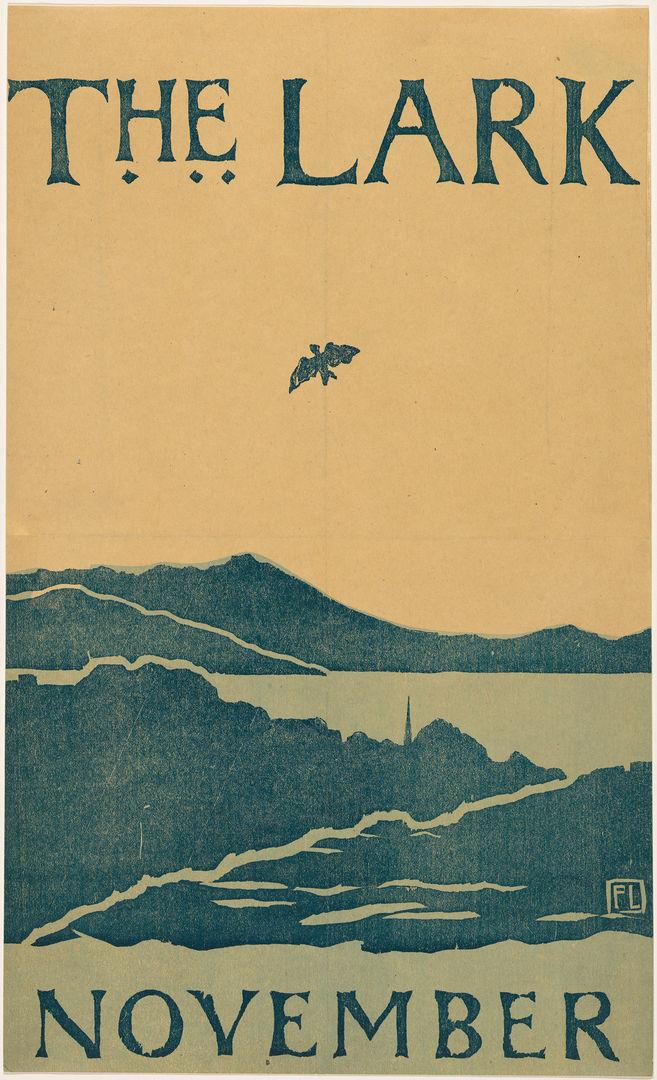
Florence Lundborg (American, 1871–1949). The Lark, November, 1895. Woodcut, 16 3⁄8 x 9 7⁄8 in. (41.6 x 25.1 cm). The Metropolitan Museum of Art, New York, Leonard A. Lauder Collection of American Posters, Gift of Leonard A. Lauder, 1984 (1984.1202.61)
The Lark commissioned female illustrator Florence Lundborg to design several promotional posters during the publication’s two-year run. Founded by artist-writers Frank Gelett Burgess and Bruce Porter, the publication aimed to promote a new “California style” in art and literature, which they hoped would garner respect and appreciation for the unique cultural production of the Golden State. In the end, Burgess and Porter’s attempts to distinguish The Lark and establish a truly regional style yielded mixed results; yet many of the magazine’s advertising posters, including those designed by Lundborg, represent an innovative departure from the East Coast poster movement, most notably in their technique of wood-block printing rather than lithography. Moreover, Lundborg looked to the unique topography of Northern California’s landscape for inspiration. Her posters advertising the November 1895 and November 1896 issues exemplify her distinctive style, in which she applied the aesthetic principles of the poster movement—including broad, flat areas of color; bold outlines; and simplified forms—to illustrations of Mount Tamalpais on the Marin Peninsula and the area’s redwood forests.
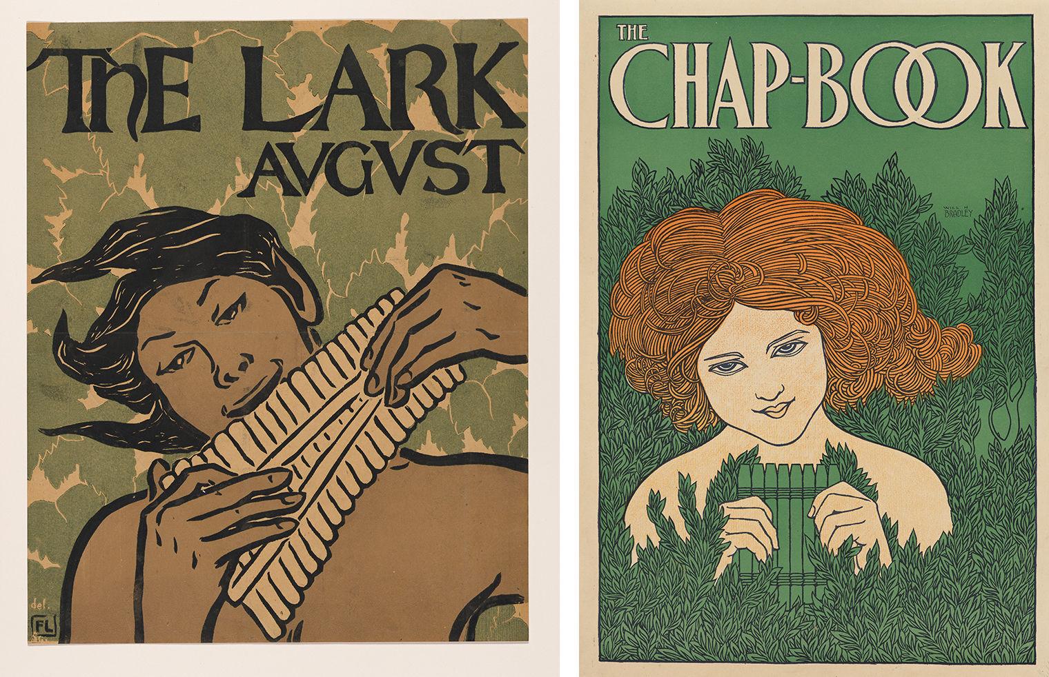
Left: Florence Lundborg (American, 1871–1949). The Lark, August, 1896. Woodcut, 16 1⁄16 x 12 15⁄16 in. (40.8 x 32.9 cm). The Metropolitan Museum of Art, New York, Leonard A. Lauder Collection of American Posters, Gift of Leonard A. Lauder, 1984 (1984.1202.64). Right: William Henry Bradley (American, 1868–1962). The Chap-Book [The Pipes], 1895. Lithograph, 21 3⁄8 x 14 15⁄16 in. (54.3 x 38 cm). The Metropolitan Museum of Art, New York, Leonard A. Lauder Collection of American Posters, Gift of Leonard A. Lauder, 1984 (1984.1202.10)
Lundborg’s poster for the August 1896 issue of The Lark centers on a nude, seemingly androgynous figure playing a pan flute against a decorative backdrop of green leaves. The design is reminiscent of Bradley’s fifth poster for The Chap-Book, which was published in 1895 and depicts a nude, albeit clearly female, figure holding a pan flute in a verdant landscape. Lundborg’s design may have been an artistic homage to Bradley, who had championed The Lark in his Chap-Book and, following the publication’s final issue in May 1897, would mourn its passing, noting that its cessation “snapped one of the threads which bound San Francisco, in a literary way, to the rest of the world.”[16] Lundborg soon turned her attention to other artistic pursuits, including book-cover design, illustration, and mural painting. Like Reed, she adapted the aesthetics of the art poster to the conventions of book illustration, providing drawings for the publisher William Doxey’s 1900 edition of The Rubáiyát of Omar Khayyám, as well as a cover design and interior illustrations for Bertha Smith’s Yosemite Legends, published in San Francisco in 1904.
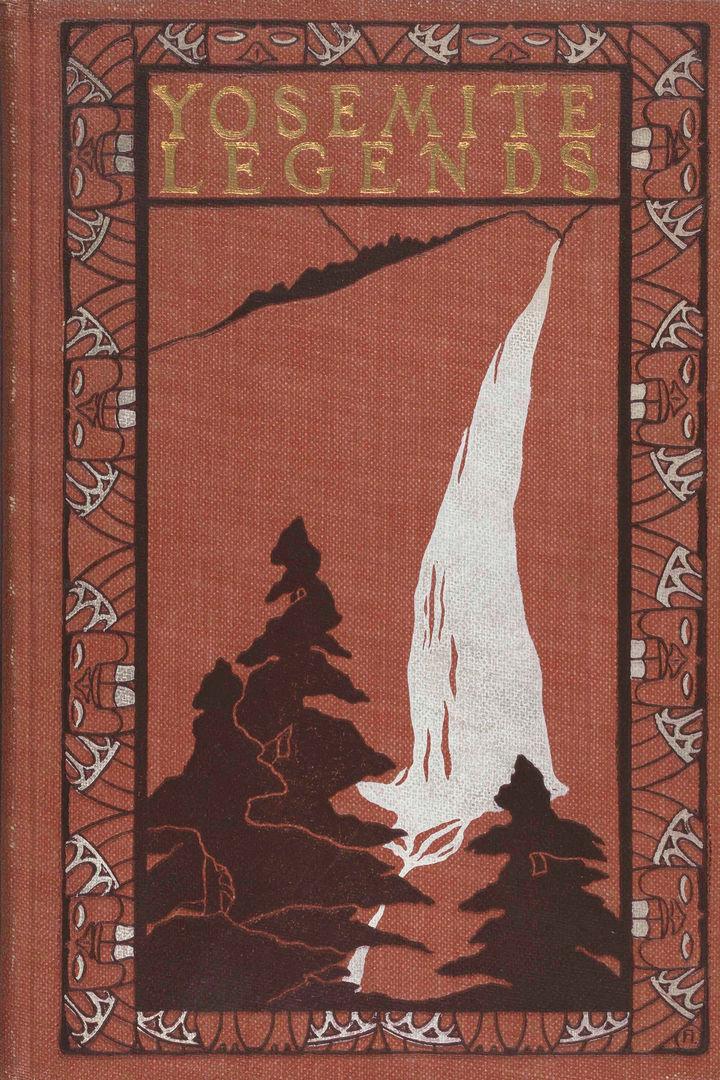
Florence Lundborg (American, 1871–1949), cover design for Bertha H. Smith, Yosemite Legends (San Francisco: Paul Elder and Company, 1904). The Metropolitan Museum of Art, New York, Watson Library Special Collections
The stylistic similarities between Lundborg’s posters for The Lark and her later cover for Yosemite Legends also reflect a major shift in book and magazine design around the turn of the twentieth century—one that ultimately led to the demise of the literary art poster. These popular and collectible works of art soon came to overshadow the books and magazines they were intended to advertise, and the poster’s failure to increase sales led publishers to lose interest in the medium. Instead, as the art historian Nancy Finlay explains, publishers commissioned artists to design book and magazine covers that looked like art posters.[17] Both male and female illustrators made the shift from poster to cover design, as evidenced by Lundborg’s Yosemite Legends, although several women, including Morse, McManus Mansfield, and Reed, had been designing book covers throughout the 1890s.
In 1899, the critic Mabel Key wrote: “The bright colors and weird fancies which we have associated with the poster world, for the past four or five years, seem to have faded from our rapidly changing modern life.”[18] Her retrospective look at the movement did not discuss the work of a single female artist, focusing instead on the contributions of male illustrators. Women were thus being written out of the art-poster movement’s history before the turn of the century, despite the prevalence and popularity of their work. By 1912, the critic Herbert Cecil Duce dismissed their contributions, writing: “Before poster advertising was established as one of the more important industries, poster art was one of the fads that greatly interested art amateurs and the host of gentle societies and women’s clubs. When it developed into a great advertising force and became the greatest and most successful of all advertising media, its vogue was less dilettante and more strenuous.”[19] Even after the passing of the literary art poster in the late 1890s, women continued to design and print posters, utilizing the format to promote women’s art and equality.
Posters for Women
In 1897 the artist-educator Emily Sartain and the illustrator Alice Barber Stephens established the Plastic Club in Philadelphia. As a women-only club, it aimed to provide the same professional development, networking, and socializing opportunities of other artists’ clubs, the vast majority of which prohibited women from joining. Among the Plastic Club’s founding members was the artist Violet Oakley, who worked as an illustrator, painter, muralist, and stained-glass designer. Like many women artists of the era, her versatility in various media reflected both the principles of the Aesthetic and Arts and Crafts movements, which aimed to bring art to all aspects of life and the reality of women’s lower wages, which often necessitated pursuing a wide array of work to earn a sustainable living.
In the 1890s, Oakley freelanced as an illustrator, contributing drawings to popular periodicals such as The Century and St. Nicholas. She also designed advertising posters, including A Puritan’s Wife by Max Pemberton, published by Dodd, Mead and Company in 1896. Morse designed the book’s cover, which like the poster includes red roses—a leitmotif of Oakley’s art and life. Along with the illustrators Jessie Willcox Smith and Elizabeth Shippen Green, Oakley rented the Red Rose Inn in Villanova, Pennsylvania, beginning in 1901, and the women soon became known as the Red Rose Girls.
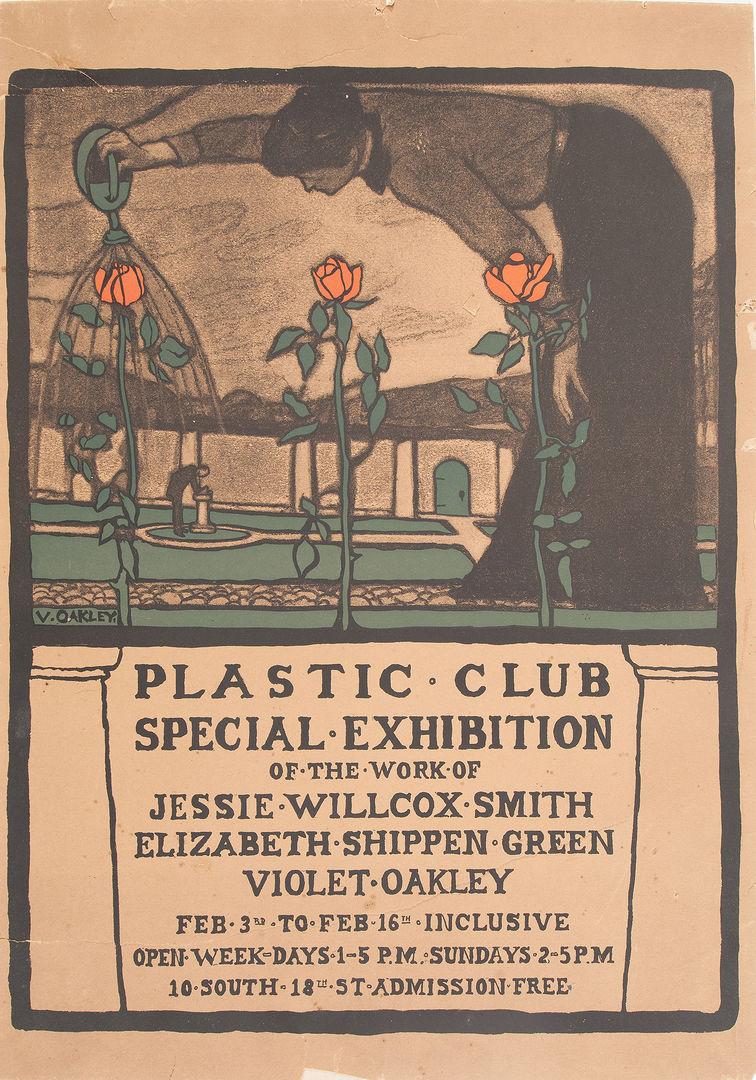
Violet Oakley (American, 1874–1961). Plastic Club Special Exhibition of the Work of Jessie Willcox Smith, Elizabeth Shippen Green, Violet Oakley, 1902. Lithograph. Collection of Patricia Likos Ricci
Rather than developing a signature style, Oakley altered her aesthetic depending on the medium and the subject. While A Puritan’s Wife reflects the influence of the English Pre-Raphaelites, a later poster advertising the Plastic Club’s special exhibition of works by Jessie Willcox Smith, Elizabeth Shippen Green, and Violet Oakley reveals her familiarity with the avant-garde art poster. Published in 1902, it depicts an oversize female figure watering three long-stemmed red roses and, in the background, a manicured garden and pergola. The bold typography, prominent outlines, flat planes of color, and asymmetrical composition are reminiscent of earlier literary posters.
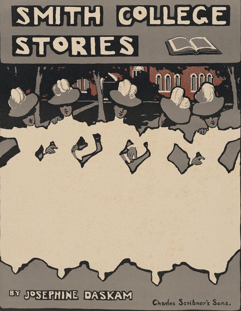
Jessie Wilcox Smith (American, 1863–1935). Smith College Stories by Josephine Daskam, 1900. Lithograph and relief print, 12 3⁄4 x 9 15⁄16 in. (32.4 x 25.2 cm). The Metropolitan Museum of Art, New York, Purchase, The Lauder Foundation, Evelyn H. and Leonard A. Lauder Fund Gift, 1985 (1985.1132.2)
Jessie Willcox Smith also experimented with poster design. Although widely known for her children’s book illustrations, in 1900 she was commissioned by Charles Scribner’s Sons to create a poster advertising the publication of Josephine Daskam’s Smith College Stories. The image presents a row of five young women, presumably Smith College students, interlocking arms as they confidently stride forward in modern sportswear. Like Smith and the Red Rose Girls, they embody the active, independent ethos that defined the “New Woman.”
Smith’s poster, with its expressive design and bold use of negative space, demonstrates the “abundantly justified” existence of women in American illustration, which, as noted, was one of the artistic professions female students were encouraged to pursue. Although some reformers hoped art education would distract women from larger political causes, they nevertheless employed their training, particularly in illustration, to advocate for equality, perhaps most notably in the fight for the right to vote. As male artists and critics worked to defeminize illustration by minimizing women’s contributions to the field, female artists and advocates saw the potential of the visual arts, particularly printed media, to advance the campaign for women’s suffrage. The art poster became a potent tool in this struggle.
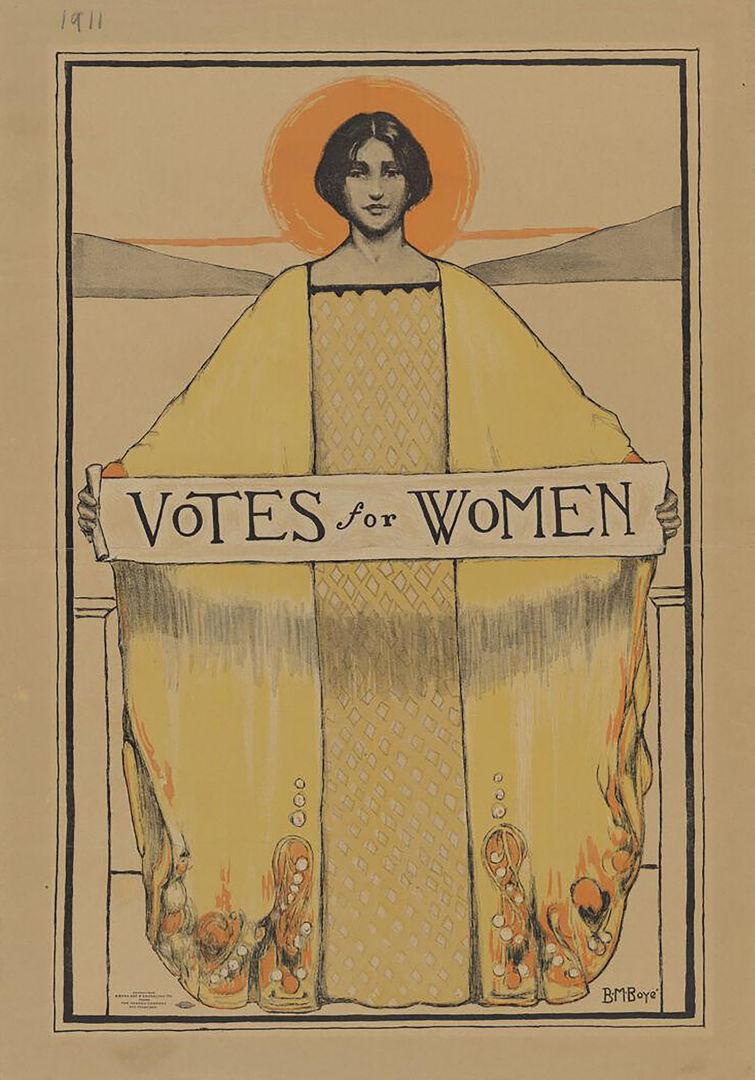
Bertha Margaret Boyé (American, 1883–1930), Votes for Women, 1911. Lithograph, 23 x 15 in. (63.5 x 38.1 cm). The Arthur and Elizabeth Schlesinger Library on the History of Women in America, Radcliffe Institute for Advanced Study, Harvard University, Cambridge, Mass.
In 1911 the San Francisco College Equal Suffrage League organized a poster contest to select the best design promoting women’s voting rights. The winning design by Bertha Margaret Boyé reveals the continued influence of the art poster even after critics pronounced the movement obsolete. Standing against a stylized rendition of San Francisco Bay, Boyé’s radiant female figure looks confidently at the viewer as she unfurls a banner reading “Votes for Women.” Her Art Nouveau–inspired gown is elegantly draped over her outstretched arms to create a pyramidal form that fills nearly the entire picture plane. Drawing on the tried-and-true aesthetics of the art-poster movement, Boyé’s simplified forms, bold outlines, striking color palette, and seamless integration of text and image led to the design’s instant success. The poster was displayed in storefronts throughout San Francisco in the week leading up to California’s vote for equal suffrage, which passed on October 10, 1911. As women continued their fight for equality, within both the art world and society at large, art posters by and for women proved to be powerful agents for change.
Notes
[1] S. C. de Soissons, “Ethel Reed and Her Art,” The Poster: An Illustrated Monthly Chronicle 1, no. 5 (November 1898): 199.
[2] Kirsten Swinth, Painting Professionals: Women Artists and the Development of Modern American Art, 1870–1930 (Chapel Hill: University of North Carolina Press, 2001), 131–32.
[3] Ibid, 30.
[4] Erica Hirshler, A Studio of Her Own: Women Artists in Boston, 1870–1940 (Boston: MFA Publications, 2001), 70.
[5] “Ethel Reed, Artist,” Bradley: His Book 1, no. 3 ( July 1896): 74.
[6] Nina de Angeli Walls, “Educating Women for Art and Commerce: The Philadelphia School of Design, 1848– 1932,” History of Education Quarterly 34, no. 3 (Autumn 1994): 330–31.
[7] “Woman’s Position in Art,” The Crayon 8, no. 2 (February 1861): 28.
[8] Laura R. Prieto, At Home in the Studio: The Professionalization of Women Artists in America (Cambridge, MA: Harvard University Press, 2001), 8.
[9] Walter Smith, The Masterpieces of the Centennial International Exhibition Illustrated, vol. 2, Industrial Arts (Philadelphia: Gebbie and Barrie, 1877), 95–96, quoted in Thomson, “Alms for Oblivion,” 44.
[10] Michele H. Bogart, Artists, Advertising, and the Borders of Art(Chicago: University of Chicago Press, 1995), 5.
[11] Ibid, 23–25.
[12] “Ethel Reed, Artist,” 76.
[13] Hirshler, Studio of Her Own, 71.
[14] “The Decadent’s Progress, The Yellow Book. A Quarterly. Vol. XII,” The Chap-Book 6, no. 9 (March 15, 1897): 370.
[15] Jessica Todd Smith, “Ethel Reed: The Girl in the Poster” (master’s thesis, Harvard University, 1991), 103–11.
[16] “Notes,” The Chap-Book 7, no. 7 (August 15, 1897): 227.
[17] Nancy Finlay, “American Posters and Publishing in the 1890s,” in American Art Posters of the 1890s in The Metropolitan Museum of Art, including the Leonard A. Lauder Collection, ed. David W. Kiehl (New York: The Metropolitan Museum of Art, 1987), 50–54.
[18] Mabel Key, “The Passing of the Poster,” Brush and Pencil 4, no. 1 (April 1899): 12.
[19] Herbert Cecil Duce, Poster Advertising (Chicago: Blakely Printing Company, 1912), 129.
