Exhibition
Modern Times: British Prints, 1913–1939
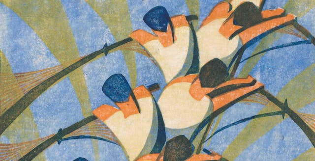
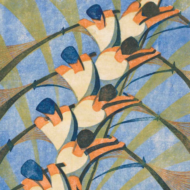
Speed
Claude Flight (British, 1881–1955)
ca. 1922
Yorkshire Village
Edward Alexander Wadsworth (British, Cleckheaton, West Yorkshire 1889–1949)
1914
The Winch
Sybil Andrews (Canadian (born England), Bury St. Edmunds, Suffolk 1898–1992 Victoria, British Columbia)
1930
The Tube Station
Cyril E. Power (British, London 1872–1951 London)
ca. 1932
The King's Horses
William Greengrass (British, 1892–1970)
1931
Troops Resting
Christopher Richard Wynne Nevinson (British, London 1889–1946 London)
1916
Play Between 6 and 12--The Bright Hours
Various Artists
1930; printed 1931
Speedway
Sybil Andrews (Canadian (born England), Bury St. Edmunds, Suffolk 1898–1992 Victoria, British Columbia)
1934
Concert Hall
Sybil Andrews (Canadian (born England), Bury St. Edmunds, Suffolk 1898–1992 Victoria, British Columbia)
1929
From Winters Gloom to Summers Joy
Various Artists
1927
The Factory
Dorothy Burroughes (British, 1883-1963)
ca. 1925
Rush Hour
Sybil Andrews (Canadian (born England), Bury St. Edmunds, Suffolk 1898–1992 Victoria, British Columbia)
1930
The Windmill
Sybil Andrews (Canadian (born England), Bury St. Edmunds, Suffolk 1898–1992 Victoria, British Columbia)
1933
The New Cable
Sybil Andrews (Canadian (born England), Bury St. Edmunds, Suffolk 1898–1992 Victoria, British Columbia)
1931
Tillers of the Soil
Sybil Andrews (Canadian (born England), Bury St. Edmunds, Suffolk 1898–1992 Victoria, British Columbia)
1934
Straphangers
Sybil Andrews (Canadian (born England), Bury St. Edmunds, Suffolk 1898–1992 Victoria, British Columbia)
1929
Bringing in the Boat
Sybil Andrews (Canadian (born England), Bury St. Edmunds, Suffolk 1898–1992 Victoria, British Columbia)
1933
The Gale
Sybil Andrews (Canadian (born England), Bury St. Edmunds, Suffolk 1898–1992 Victoria, British Columbia)
1930
In Full Cry
Sybil Andrews (Canadian (born England), Bury St. Edmunds, Suffolk 1898–1992 Victoria, British Columbia)
1931
Oranges
Sybil Andrews (Canadian (born England), Bury St. Edmunds, Suffolk 1898–1992 Victoria, British Columbia)
1929
Sledgehammers
Sybil Andrews (Canadian (born England), Bury St. Edmunds, Suffolk 1898–1992 Victoria, British Columbia)
1933
Fall of the Leaf
Sybil Andrews (Canadian (born England), Bury St. Edmunds, Suffolk 1898–1992 Victoria, British Columbia)
1934
Haulers
Sybil Andrews (Canadian (born England), Bury St. Edmunds, Suffolk 1898–1992 Victoria, British Columbia)
1929
Hyde Park
Sybil Andrews (Canadian (born England), Bury St. Edmunds, Suffolk 1898–1992 Victoria, British Columbia)
1931
Racing
Sybil Andrews (Canadian (born England), Bury St. Edmunds, Suffolk 1898–1992 Victoria, British Columbia)
1934
Lord's, Oval
Various Artists
1934
To Hire A Bus or Coach
Various Artists
1934
Russian Ballet
David Garshen Bomberg (British, Birmingham 1890–1957 London)
1919
Three Speeds
Claude Flight (British, 1881–1955)
ca. 1922
Swing-Boats
Claude Flight (British, 1881–1955)
1921
Street Singers
Claude Flight (British, 1881–1955)
1925
Paris Omnibus
Claude Flight (British, 1881–1955)
1923
Brooklands
Claude Flight (British, 1881–1955)
c. 1929
Poplar Trees and Telegraph Poles
Ursula Fookes (British, 1906–1991)
ca. 1930
Mining Town, No. 2
Ursula Fookes (British, 1906–1991)
ca. 1932
Dublin Under Snow
Robert John Gibbings (Anglo-Irish, Cork 1889–1958 Oxford)
1918
Port
Edith Lawrence (British, Surrey 1890–1973)
ca. 1930
Promenade No.1
Paul Nash (British, Kensington 1889–1946 Hampshire)
1920
A Road, Perhaps Over a Moor
Paul Nash (British, Kensington 1889–1946 Hampshire)
1923
Nerves of an Army
Christopher Richard Wynne Nevinson (British, London 1889–1946 London)
1918
Swooping Down on a Taube from The Great War: Britain's Efforts and Ideals
Christopher Richard Wynne Nevinson (British, London 1889–1946 London)
1917 (published 1918)
Returning to the Trenches
Christopher Richard Wynne Nevinson (British, London 1889–1946 London)
1916
The Blue Wave
Christopher Richard Wynne Nevinson (British, London 1889–1946 London)
1917
The Workers
Christopher Richard Wynne Nevinson (British, London 1889–1946 London)
1919
That Cursed Wood
Christopher Richard Wynne Nevinson (British, London 1889–1946 London)
1918
A Dawn 1914
Christopher Richard Wynne Nevinson (British, London 1889–1946 London)
1916
Column on the March
Christopher Richard Wynne Nevinson (British, London 1889–1946 London)
1916
Southampton
Christopher Richard Wynne Nevinson (British, London 1889–1946 London)
1916
The Tube Station (Unique Experimental Proof)
Cyril E. Power (British, London 1872–1951 London)
ca. 1932
The Sunshine Roof
Cyril E. Power (British, London 1872–1951 London)
ca. 1934
Lifts Speed; reproduced in an advertisement from The Builder, January 10, 1930
Cyril E. Power (British, London 1872–1951 London)
1930
Lifts (Proof in Red)
Cyril E. Power (British, London 1872–1951 London)
ca. 1930
Lifts (Proof in Green)
Cyril E. Power (British, London 1872–1951 London)
ca. 1930
Lifts; reproduced in H & C (Hammond Bros & Champness, Ltd.), Lifts & Cranes
Cyril E. Power (British, London 1872–1951 London)
ca. 1930
Lifts
Cyril E. Power (British, London 1872–1951 London)
ca. 1930
The Giant Racer
Cyril E. Power (British, London 1872–1951 London)
ca. 1930
Acrobats (experimental proof)
Cyril E. Power (British, London 1872–1951 London)
ca. 1933
Speed Trial
Cyril E. Power (British, London 1872–1951 London)
ca. 1932
Whence & Whither?
Cyril E. Power (British, London 1872–1951 London)
ca. 1930
The Tube Staircase
Cyril E. Power (British, London 1872–1951 London)
1929
The Merry-Go-Round
Cyril E. Power (British, London 1872–1951 London)
ca. 1930
'Appy 'Ampstead
Cyril E. Power (British, London 1872–1951 London)
ca. 1933
The Eight
Cyril E. Power (British, London 1872–1951 London)
1930
The Tube Train
Cyril E. Power (British, London 1872–1951 London)
ca. 1934
London Buses
Lill Tschudi (Swiss, Schwanden 1911–2004 Schwanden)
1949
Jazz Band
Lill Tschudi (Swiss, Schwanden 1911–2004 Schwanden)
1930
In the Circus
Lill Tschudi (Swiss, Schwanden 1911–2004 Schwanden)
1932
Village Fair I
Lill Tschudi (Swiss, Schwanden 1911–2004 Schwanden)
1934
Sticking up Posters
Lill Tschudi (Swiss, Schwanden 1911–2004 Schwanden)
1933
Sailors
Lill Tschudi (Swiss, Schwanden 1911–2004 Schwanden)
1930
Haymaking
Lill Tschudi (Swiss, Schwanden 1911–2004 Schwanden)
1932
Guards
Lill Tschudi (Swiss, Schwanden 1911–2004 Schwanden)
1936
Fixing the Wires
Lill Tschudi (Swiss, Schwanden 1911–2004 Schwanden)
1932
Underground
Lill Tschudi (Swiss, Schwanden 1911–2004 Schwanden)
1930
Tour de Suisse
Lill Tschudi (Swiss, Schwanden 1911–2004 Schwanden)
1935
Street Decoration
Lill Tschudi (Swiss, Schwanden 1911–2004 Schwanden)
1937
Fixing the Wires (double-sided drawing)
Lill Tschudi (Swiss, Schwanden 1911–2004 Schwanden)
1932
Fixing the Wires
Lill Tschudi (Swiss, Schwanden 1911–2004 Schwanden)
1932
Sticking Up Posters (preparatory drawing)
Lill Tschudi (Swiss, Schwanden 1911–2004 Schwanden)
1933
Tugs
Edward Alexander Wadsworth (British, Cleckheaton, West Yorkshire 1889–1949)
1918
Minesweepers in Port
Edward Alexander Wadsworth (British, Cleckheaton, West Yorkshire 1889–1949)
1918
Landscape
Edward Alexander Wadsworth (British, Cleckheaton, West Yorkshire 1889–1949)
1914
Bradford: View of a Town
Edward Alexander Wadsworth (British, Cleckheaton, West Yorkshire 1889–1949)
1914
Blast Furnaces I (Netherton Furnaces)
Edward Alexander Wadsworth (British, Cleckheaton, West Yorkshire 1889–1949)
1919
Yorkshire
Edward Alexander Wadsworth (British, Cleckheaton, West Yorkshire 1889–1949)
1920 (dated 1921)
View of a Town
Edward Alexander Wadsworth (British, Cleckheaton, West Yorkshire 1889–1949)
1916
Tarmac
Edward Alexander Wadsworth (British, Cleckheaton, West Yorkshire 1889–1949)
1919
Riponelli: A Village in Lemnos
Edward Alexander Wadsworth (British, Cleckheaton, West Yorkshire 1889–1949)
1917
Newcastle
Edward Alexander Wadsworth (British, Cleckheaton, West Yorkshire 1889–1949)
1913
Interior
Edward Alexander Wadsworth (British, Cleckheaton, West Yorkshire 1889–1949)
1917
Street Singers
Edward Alexander Wadsworth (British, Cleckheaton, West Yorkshire 1889–1949)
ca. 1914
S.S. Jerseymoor
Edward Alexander Wadsworth (British, Cleckheaton, West Yorkshire 1889–1949)
1918
Black Country
Edward Alexander Wadsworth (British, Cleckheaton, West Yorkshire 1889–1949)
1919
Liverpool Shipping
Edward Alexander Wadsworth (British, Cleckheaton, West Yorkshire 1889–1949)
1918
The Forest Glades of Epping
Various Artists
1920
Studies for "Steeplechasing" and "Whence & Whither?"
Various Artists
ca. 1930
Preparatory drawing of a London bus
Claude Flight (British, 1881–1955)
1922–1934
The Art and Craft of Lino Cutting and Printing by Claude Flight
Various Artists
1934
Godstone
Various Artists
1915, printed 1916
Rowing Study
Cyril E. Power (British, London 1872–1951 London)
ca. 1930
Drawing for The Eight
Cyril E. Power (British, London 1872–1951 London)
ca. 1930
Rowing Study
Cyril E. Power (British, London 1872–1951 London)
ca. 1930
Study for "Whence & Whither?" (Study of escalators IV)
Cyril E. Power (British, London 1872–1951 London)
ca. 1930
To Lovers' Lane
Various Artists
1921
Home Counties; no. 4 Kent
Various Artists
1924
Charing Cross Station
Cyril E. Power (British, London 1872–1951 London)
ca. 1930–32
Study for "The Tube Station"
Cyril E. Power (British, London 1872–1951 London)
ca. 1932
Preparatory sketch for London Buses (recto); lighthouse and harbor (verso)
Lill Tschudi (Swiss, Schwanden 1911–2004 Schwanden)
1949
Trafalgar Square (preparatory sketch for London Buses)
Lill Tschudi (Swiss, Schwanden 1911–2004 Schwanden)
1949
Reigate
Various Artists
1915
Haymaking (preparatory drawing)
Lill Tschudi (Swiss, Schwanden 1911–2004 Schwanden)
1932
Village Fair (double-sided drawing)
Lill Tschudi (Swiss, Schwanden 1911–2004 Schwanden)
1934
Sketchbook, with preparatory sketches for Jazz Band, Sword Drill, and Clive Brook
Lill Tschudi (Swiss, Schwanden 1911–2004 Schwanden)
1930
The North Downs
Various Artists
1915, printed 1916
Sketchbook, with preparatory sketches for Workmen, Dancers, Slalom, Bells, People coming out of church, Life Class
Lill Tschudi (Swiss, Schwanden 1911–2004 Schwanden)
1937
Tools accompanying The Art and Craft of Lino Cutting and Printing by Claude Flight
Claude Flight (British, 1881–1955)
1934