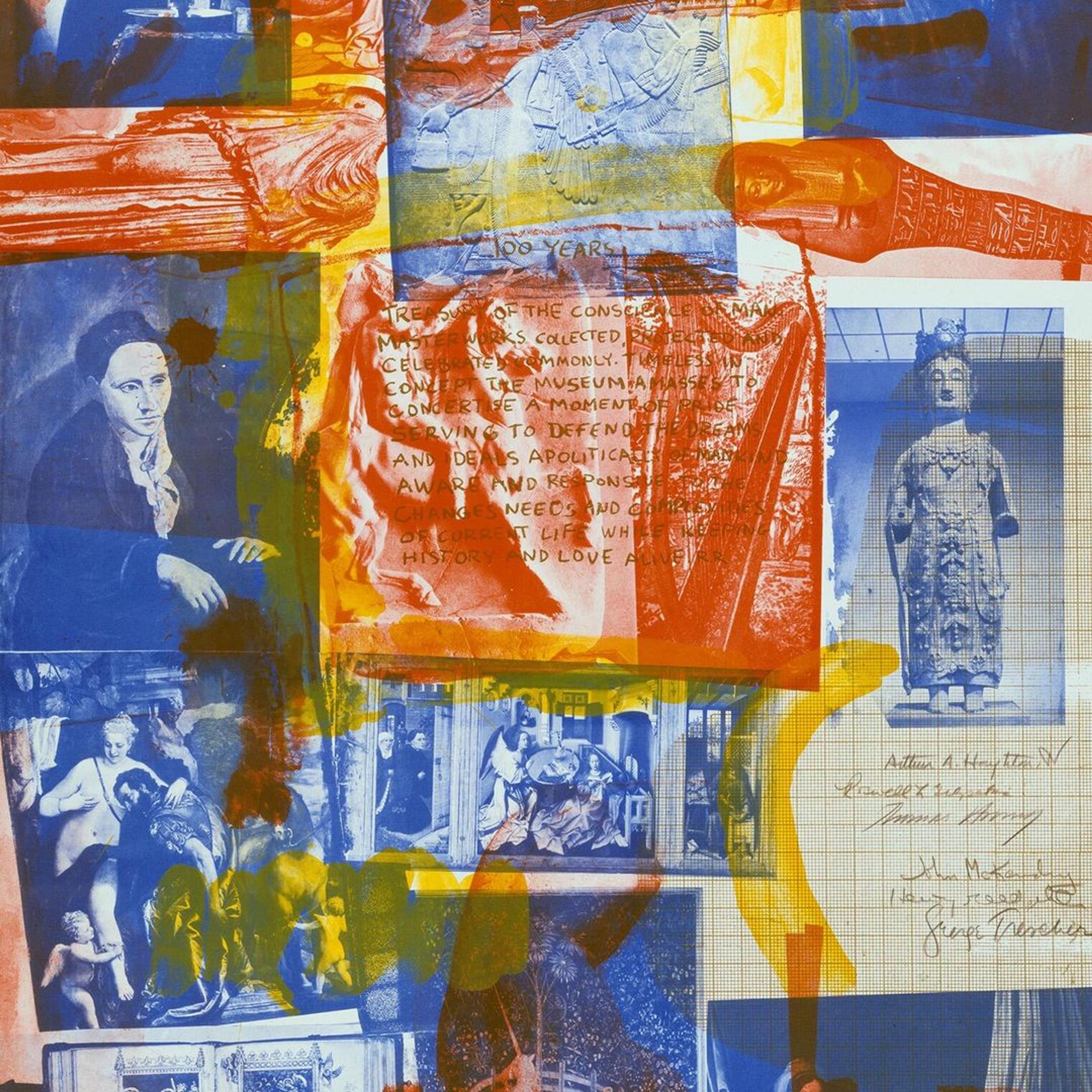
As part of the festivities to commemorate The Met’s one-hundredth birthday, the Museum approached the artist Robert Rauschenberg to create a limited edition print. [1] Published in 1969, slightly ahead of the anniversary year of 1970, Centennial Certificate MMA is a compelling lithograph on handmade paper that refers to the Museum’s mission and collection, while also reflecting the artist’s own concerns and working process.
Given his interest in found imagery, as well as his deep ties to printmaking, Rauschenberg was a natural choice to create a commemorative piece to celebrate the Museum’s landmark anniversary. Integral to his art is the process of collage and the attendant perceptual and sensorial shifts that arise from the radical juxtapositions the practice allows. Early in his career, he revealed an interest in combining materials, objects, and visual elements from a variety of sources including personal photographs, text and pictures from newspapers, and reproductions of artworks. By the 1950s, the instinct to create works that demanded a dramatic rethinking of pictorial space was so great that he termed his artworks “combines” in reference to this heterogeneous approach. Rauschenberg’s all-over compositions created further disruptions. Rather than creating an illusionistic space, such compositions have been described as evoking “a flatbed picture plane” in which multiple images culled from both fine art and everyday life are extended across pictorial surfaces in a nonhierarchical order.
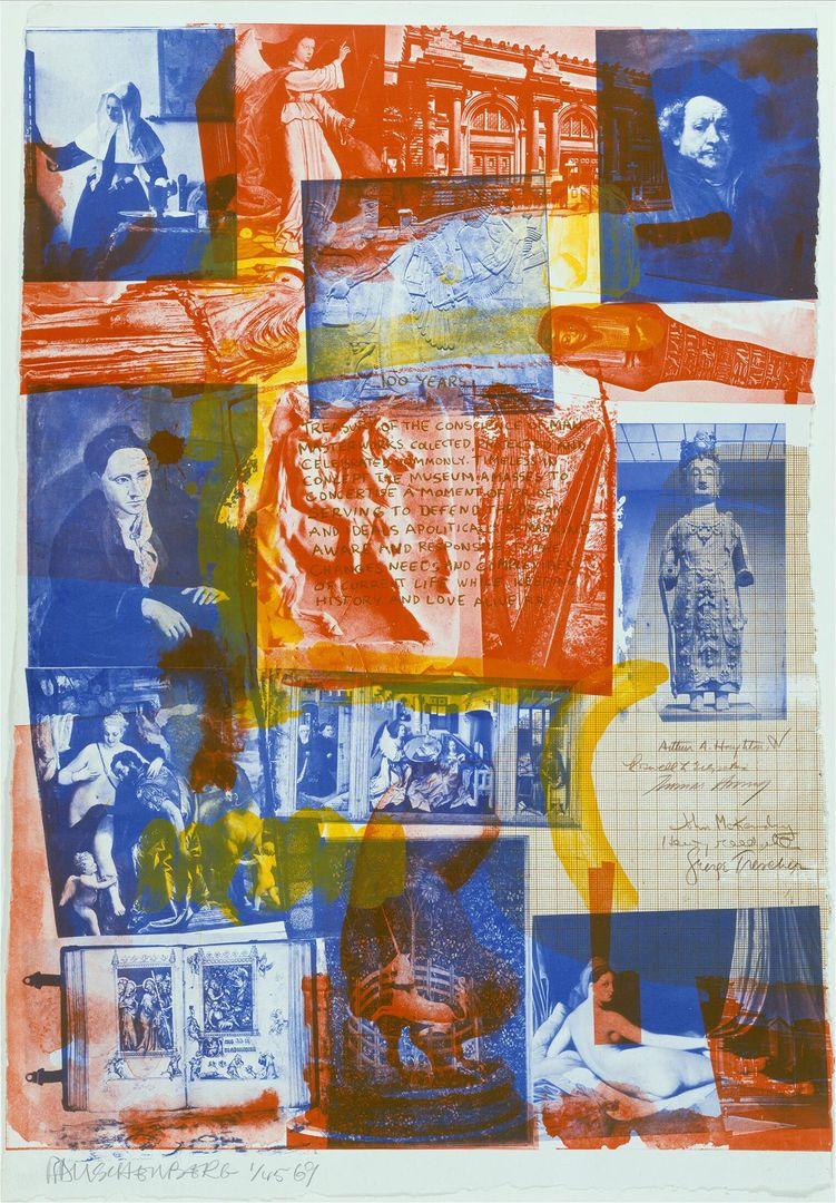
Robert Rauschenberg (American, 1925–2008); printed by Frank Akers, Zigmunds Priede, Donn Stewad, and Dan Socha; published by Universal Limited Art Editions. Centennial Certificate MMA, 1969. Color lithograph, 36 x 25 in. (91.4 x 63.5 cm). The Metropolitan Museum of Art, New York, Florence and Joseph Singer Collection, 1972 (69.630). © Robert Rauschenberg Foundation
With its inherent potential for layering, reversals, and repetitions, printmaking proved a natural fit for Rauschenberg’s artistic vision and working process. In addition to creating a rich catalogue of prints, Rauschenberg featured printmaking practices and materials in work made in other mediums. During the fall of 1962, he began to incorporate screenprinting in paintings and assemblages, which allowed him to transfer and layer text and images from personal and commercial sources while maintaining their two-dimensionality. That same year, he began to work at the prominent print studio and publisher Universal Limited Art Editions (ULAE) and made his first print—a lithograph—at the studio. [2] Initially, he rejected lithography, famously declaring that “the second half of the twentieth century was no time to start writing on rocks” in reference to the use of limestone matrixes. [3]
Working at ULAE, however, allowed him to incorporate photographic imagery into his work, something he had used different tried to do using a variety of different methods for several years. In his 1963 lithograph, Accident, for instance, he combined a reproduction of a painting by the eighteenth-century Italian artist Giovanni Battista Tiepolo with photographs of a baseball player, race cars, and refugees on an inflatable raft taken from a discarded New York Times printing plate. Linking the different sections are broad swaths of printer’s ink that recall the sweeping brushstrokes of the Abstract Expressionists, as well as the giant crack that runs diagonally across the surface. This unplanned addition was created when the stone broke during printing, creating a gash Rauschenberg embraced as part of the composition. Accident was so successful that Rauschenberg received the Grand Prize at the Fifth International Exhibition of Prints in Ljubljana for it in 1963, becoming the first American to receive such an honor.
By 1969, Rauschenberg was using an innovative technique that ULAE director Bill Goldston helped develop that enabled photographs to be transferred with a great degree of detail and accuracy to photo-sensitive lithographic stones. In prints such as Centennial Certificate MMA, Rauschenberg arranged acetate negatives of both of his own photographs and that of others on the surface of a lithographic stone that had been covered with photo emulsion. A thin sheet of glass covered the acetate collage and, after exposure to ultraviolet light, the images were transferred to the surface of the stone. Once the emulsion was developed, the stone was inked, printed, and run through a lithographic press.
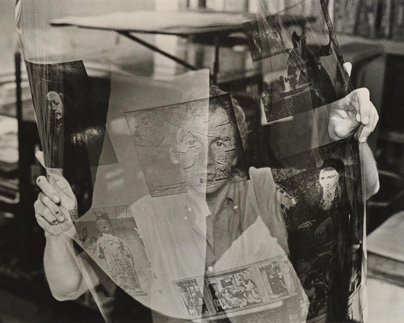
Hans Namuth (American, 1915–1990). [Robert Rauschenberg Holding Film for Metropolitan Museum's Centennial Certificate], 1970. Gelatin silver print, 10 11/16 x 14 in. (27.1 x 35.6 cm). The Metropolitan Museum of Art, New York, Museum accession 1971 (1971.652) © Hans Namuth Estate. Courtesy Center for Creative Photography
Rauschenberg described thinking about The Met as a kind of “live encyclopedia,” and indeed Centennial Certificate MMA can be read as reflecting the experience of flipping through an illustrated guidebook, something he noted The Met did not yet have at the time the print was made. [4] Although Rauschenberg had hoped that Met curators would provide input on the selection of artworks featured in the print, curatorial input was not forthcoming; he ended up selecting the works himself. He had planned to visit the Museum and take photographs of works that interested him, but after a visit to The Met with ULAE’s founder, Tatyana Grosman, he discovered that many pieces were not on view. [5] For these, he requested photography from the Museum so that they might be considered for inclusion in his print.
The end result represented what the curator Henry Geldzahler called in an unpublished interview as “Bob’s idea of the Metropolitan Museum.” [6] However, Rauschenberg challenged that claim, noting in the same interview that “my idea about what the Metropolitan is has changed in looking for the work.” He continued: “I have a more organic idea about the place now. And that came out of the hopelessness of trying to get enough material together to actually represent it….”[7]
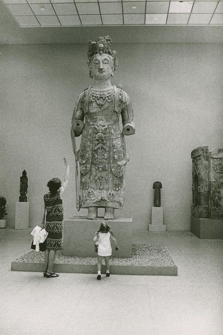
Source photograph for Centennial Certificate MMA showing a female and child in front of large female stone statue at The Metropolitan Museum of Art. Robert Rauschenberg papers. Robert Rauschenberg Foundation Archives, New York. Photo: Adelaide de Menil
As with his other works, Centennial Certificate MMA contains a multitude of images and colors. Beneath a photograph of The Met’s facade—a structure designed by the renowned American architect Richard Morris Hunt—is an array of works drawn from the collection. Included are European paintings from the fifteenth through nineteenth centuries, Greek and Roman antiquities, an Assyrian relief, a medieval tapestry from the Cloisters, a French manuscript, a bodhisattva from the Northern Qi dynasty, an Egyptian mummy, a portable harp, and Pablo Picasso’s iconic portrait of Gertrude Stein. [8] Despite drawing from the collections of several departments, the selection notably omits works from the twentieth century (aside from Picasso’s portrait), as well as art from Central and South America and Africa, areas from which the Museum had possessed works since 1877 and which they would expand in 1969—the same year the print was begun—with the establishment of the Department of the Arts of Africa, Oceania, and the Americas.
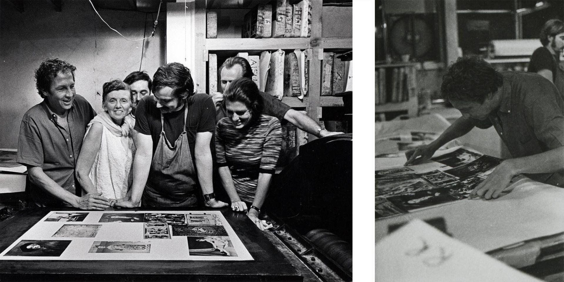
Left: (from left to right) Robert Rauschenberg, Tatyana Grosman, Bill Goldston, Frank Akers, Zigmunds Priede, and Marion Javitts observing the print Centennial Certificate MMA in 1969. Photograph by Hans Namuth © Hans Namuth Estate. Image courtesy United Limited Art Editions. Right: Robert Rauschenberg looking at a proof for his print Centennial Certificate MMA in 1969. ©Hans Namuth Estate. Image courtesy United Limited Art Editions
Centennial Certificate MMA also contains text, reproduced graphic paper, and even signatures, all prominently displayed. Rauschenberg described the process of creating the print as akin to “designing a currency.” [9] It was printed from two stones and two aluminum plates in red, yellow, blue, and brown on Angoumois à la main paper made especially for the edition. The paper, handmade in France, provided challenges. Grosman, who served as the print’s publisher, described it as “a kind of medieval paper” that, in addition to providing slight irregularities (such as the non-standardized dimensions), resulted in an edition in which “each print is really unique.” [10]
Among the original documents that established the Museum in 1870 was a page containing signatures on graph paper. [11] These archival documents had a great impact on Rauschenberg, who decided to pay homage to them by incorporating signatures of contemporary Museum officials. [12] On October 20, 1969, the six Museum officials—Arthur A. Houghton, Jr., President; Roswell Gilpatric, Vice President; Thomas Hoving, Director; John J. McKendry, Curator of Prints; Henry Geldzahler, Curator of Contemporary Arts; and George Trescher, Secretary of the 100 Years Committee—hand-signed each of the forty-five prints in the edition. [13] Rauschenberg signed the print twice: once in graphite under the image alongside the edition number and date, and again in the print itself, where, written on the lithographic stone with his meditation on the Museum, his initials (“RR”) appear.
In the center of the work is a short passage inspired by the The Met’s 1870 charter in which the Museum’s founders stated their goals for the institution. Rauschenberg made slight adjustments to the text, changing two words in a passage he wrote on the lithographic stone and then outlined in crayon for further emphasis, overlaying images of an Egan’s harp and a fragment from a Greek frieze. [14]
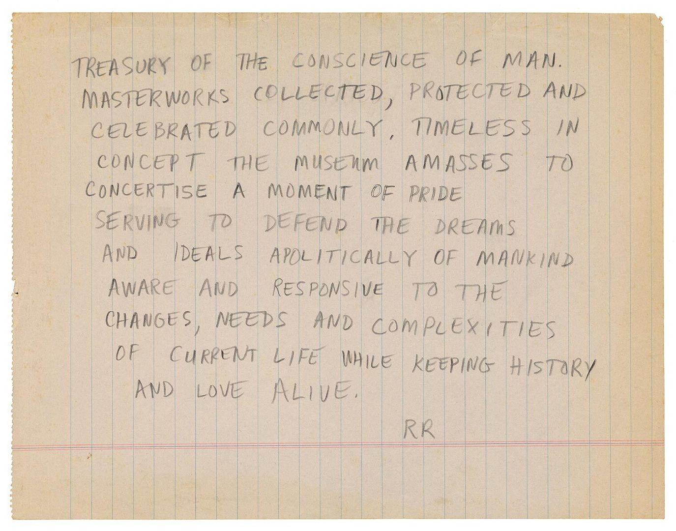
Robert Rauschenberg's handwritten draft of a statement on The Metropolitan Museum of Art, "Treasury of the conscience of man..." Robert Rauschenberg papers. Robert Rauschenberg Foundation Archives, New York. Creator: Robert Rauschenberg
100 Years
Treasury of the conscience of man.
Masterworks collected, protected and
celebrated commonly. Timeless in
concept the museum amasses to
concertise a moment of pride
serving to defend the dreams
and ideals apolitically of mankind
aware and responsive to the
changes, needs and complexities
of current life while keeping
history and love alive.
RR
Notes
[1] The Met subsequently released a Centennial Certificate MMA “DeLuxe Edition poster,” printed on the same Angoumois à la main handmade paper limited to an edition of 140 impressions and an unlimited poster in an edition of over ten thousand. Return
[2] ULAE was founded by Tatyana Grosman in 1957. Rauschenberg met Grosman in 1960; he first went to the studio in April 1962. Return
[3] Rauschenberg noted his reservations in the extended quote: “I began lithography reluctantly, thinking that the second half of the twentieth century was no time to start writing on rocks. This biased idea was soon consumed in the concentration any unfamiliar medium requires. Lack of preconception and recognition of the unique possibilities in working on stone, not paper or canvas, suggested that the approach acknowledge this.” Rauschenberg in a press release issued by the Museum of Modern Art, New York, on June 20, 1963. Return
[4] As Rauschenberg noted in an unpublished interview: “The original idea was that I was going to do all the photographs. And I knew that wasn’t the right time to do that since the Museum was being cleaned up and all the paintings were down, and all the Egyptian collection was wrapped in plastic.” Undated and unpublished interview with Henry Geldzahler, John McKendry, Tatyana Grosman, and Robert Rauschenberg, p. 2. Return
[5] Ibid, p. 2. Return
[6] Ibid, p. 1. Return
[7] Ibid, p. 1. Return
[8] Johannes Vermeer (Dutch,1632–75) Young Woman with a Water Pitcher, ca. 1662; Gerard David (Netherlandish, ca. 1455–1523), panel of Archangel Gabriel from The Annunciation, 1506; Rembrandt van Rijn (Dutch, 1606–69), Self-Portrait, 1660; Workshop of Roger Campin (Netherlandish, ca. 1375–1444), Annunciation Triptych (Merode Altarpiece), ca. 1427–32; Paolo Veronese (Paolo Caliari) (Italian, 1528–88), Mars and Venus United by Love, 1570s; Jean Auguste Dominique Ingres (French, 1780–1867), Odalisque in Grisaille ca. 1824–34; a Roman copy of a Greek statue by Kephisodotos, ca. A.D. 14–68; an Assyrian relief (Relief of Ashurnasirpal II), ca. 883–59 B.C.; a cast of Parthenon Frieze; a medieval tapestry from The Met Cloisters, The Unicorn in Captivity, 1495–1505; Jean Pucelle (French, active 1319–34), spread from The Hours of Jeanne d’Evreau, Queen of France, ca. 1324–28; a Chinese bodhisattva, probably Avalokiteshvara (Guanyin), ca. 550–60; an Egyptian mummy (Shawabty of Yuya), ca. 1390–52 B.C.; a portable harp by John Egan (active ca. 1804–1841), 1889; and Pablo Picasso (Spanish, 1881–1973), Gertrude Stein1905–6. Return
[9] Rauschenberg: “It is more as though I were actually designing a currency.” Undated and unpublished interview with Henry Geldzahler, John McKendry, Tatyana Grosman, and Robert Rauschenberg, p. 2. Return
[10] Tatyana Grosman: “…the printing was very difficult because there was the paper…it was really a kind of medieval paper.” Undated and unpublished interview with Henry Geldzahler, John McKendry, Tatyana Grosman, and Robert Rauschenberg, p.3. Return
[11] The stone marked with the graph paper design was first used in his 1965 work Visitation I. Return
[12] Rauschenberg: “…I was filtering and going to the Museum and seeing the original declaration or whatever it’s called … and it was in this what looks like a child’s notebook that possibly cost a nickel then. And it had the signatures and I really was encouraged after seeing it. A hundred years is a long time…” Undated and unpublished interview with Henry Geldzahler, John McKendry, Tatyana Grosman, and Robert Rauschenberg, p.5. Return
[13] There was also a deluxe edition, which was an offset lithograph. Return
[14] Rauschenberg added the word “amasses” and used a second spelling for “concertize” as “one has a strong idea of music and concerts.” Undated and unpublished interview with Henry Geldzahler, John McKendry, Tatyana Grosman, and Robert Rauschenberg, p. 4. It would be interesting to compare this passage with Rauschenberg’s photo essay “Random Order,” first presented in 1961 at the Museum of Modern Art for a symposium that accompanied The Art of Assemblage exhibition. Rauschenberg later published his text in Location 1 (spring 1963). Return
